
From Data to HTML: Creating Tables and Plots with Python
In data analysis and visualization, tables and plots are essential for displaying data meaningfully. While generating tables and plots in formats such as PDF or PNG is common, HTML provides a more interactive and dynamic option. In this article, we will explore the steps to generate HTML for tables and plots using Python.

Preparing the Data
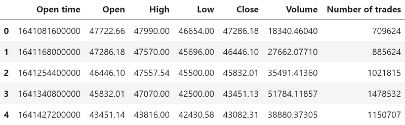
For example, let’s work with a csv file containing the historical daily prices of BTC/USDT in 2022, downloadable following this guide: Automating Binance Historical Zipped Data Download. Here’s a snippet of market price data in the CSV file:
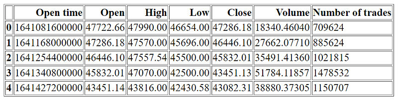
The first step would be to load the CSV file into a Pandas DataFrame:
import pandas as pd

df = pd.read_csv('data.csv')
Here’s a snippet of the DataFrame for market price:
Generating HTML tables
An HTML table could easily be generated using the built-in method in pandas: DataFrame.to_html() . Try the method on the first few rows of the DataFrame:
print(df.head().to_html())The generated HTML is as follows:
<table border="1" class="dataframe">
  <thead>
    <tr style="text-align: right;">
      <th></th>
      <th>Open time</th>
      <th>Open</th>
      <th>High</th>
      <th>Low</th>
      <th>Close</th>
      <th>Volume</th>
      <th>Number of trades</th>
    </tr>
  </thead>
  <tbody>
    <tr>
      <th>0</th>
      <td>1641081600000</td>
      <td>47722.66</td>
      <td>47990.00</td>
      <td>46654.00</td>
      <td>47286.18</td>
      <td>18340.46040</td>
      <td>709624</td>
    </tr>
    <tr>
      <th>1</th>
      <td>1641168000000</td>
      <td>47286.18</td>
      <td>47570.00</td>
      <td>45696.00</td>
      <td>46446.10</td>
      <td>27662.07710</td>
      <td>885624</td>
    </tr>
    <tr>
      <th>2</th>
      <td>1641254400000</td>
      <td>46446.10</td>
      <td>47557.54</td>
      <td>45500.00</td>
      <td>45832.01</td>
      <td>35491.41360</td>
      <td>1021815</td>
    </tr>
    <tr>
      <th>3</th>
      <td>1641340800000</td>
      <td>45832.01</td>
      <td>47070.00</td>
      <td>42500.00</td>
      <td>43451.13</td>
      <td>51784.11857</td>
      <td>1478532</td>
    </tr>
    <tr>
      <th>4</th>
      <td>1641427200000</td>
      <td>43451.14</td>
      <td>43816.00</td>
      <td>42430.58</td>
      <td>43082.31</td>
      <td>38880.37305</td>
      <td>1150707</td>
    </tr>
  </tbody>
</table>
Save the strings to an HTML file and you get the table:
You may find the table not pretty enough, but don't worry; we will get to the styling part soon. Let’s take a quick look at the process of converting plots to HTML first.
Generating HTML plots
In addition to tables, we can also generate HTML plots. To create an HTML plot, we can use Matplotlib or Plotly. In this case I am using mplfinance as it is more suitable for financial market data.
import mplfinance as mpfHowever mpf.plot() has certain requirements for the input DataFrame:
DataFrame.indexneeds to beDatetimeIndex- The open, high, low, close, volume columns needs to be named “Open”, “High”, “Low”, “Close”, “Volume” respectively, which my data already follows
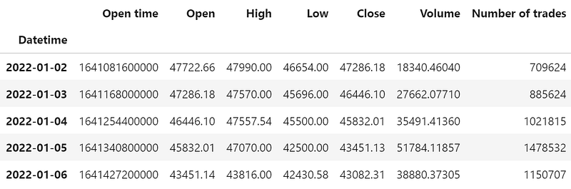
To convert the index according to the first requirement:
# convert unix timestamp (in milliseconds) to datetime
df["Datetime"] = pd.to_datetime(df["Open time"], unit="ms")

# set datetime as the index
df.set_index("Datetime", inplace=True)
Head of the resulting data obtained:
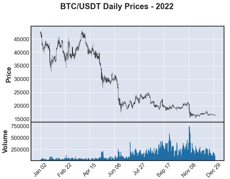
Now you could plot the data:
fig, axes = mpf.plot(
    df,
    type="candle",
    title="BTC/USDT Daily Prices - 2022",
    volume=True,
    returnfig=True
)
Here’s a screenshot of the generated HTML plot:
Now there are a few ways to convert the plot to HTML format, the simplest way might be using mpld3.fig_to_html(fig) but the formatting could be tricky. Instead, I am encoding the plot as it is and converting the image file later:
import base64
from io import BytesIO

# store the figure into a temp file
tmpfile = BytesIO()
fig.savefig(tmpfile, format="png")

# encode png file and convert to HTML image tag
data_uri = base64.b64encode(tmpfile.getvalue()).decode('utf-8')
img_tag = '<img src="data:image/png;base64,{0}">'.format(data_uri)

# close object and detele temp file
tmpfile.close()
print(img_tag)
The resulting tag is going to be super long. With some tweaks to the plot style, add the plot HTML to the table HTML generated in the previous section and write into an HTML file. You should get the table and plots displayed as follows:
with open(f'table_and_plot.html', 'w') as f:
    f.write(table_html + "<br>" + img_tag)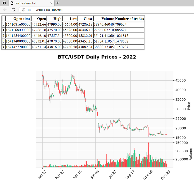
HTML Styling
Since we are saving the plotted figure into a file and converting the file, the image looks exactly like the plot generated, all the styling will need to be done in the plotting. So I will only be talking about the styling of tables for this part, with 2 examples for showing.
1. Basic Table Formatting
Below is a sample code for some basic formatting, including text alignment, font style and size, padding and margin, alternating colors for row, and hiding the index of table:
TABLE_STYLE= [
    dict(selector="th, td",
         props=[("text-align", "center"),
                ("font-family", "monospace"),
                ('font-size', '15px'),
                ("padding", "5px 3px"),
                ("margin", "0px 3px"),
                ("border", "1px solid #ddd")]),
    dict(selector="tbody tr:nth-child(even)", props=[("background-color", "#f2f2f2")]),
]

styled_df = df.head().style \
    .set_table_styles(TABLE_STYLE) \
    .hide_index()

table_html = styled_df.render()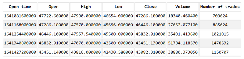
2. Coloring Based on Values
Let’s say you want to highlight the days with the number of trades above a certain threshold:
def highlight_n_trades(n_trades):
    color = 'blue' if n_trades < 800000 else 'orange' if n_trades > 1100000 else 'black'
    return f'<font color="{color}">{n_trades}</font>'

styled_df = df.head().style \
    .format({'Number of trades': highlight_n_trades}) \
    .set_table_styles(TABLE_STYLE) \
    .hide_index()

table_html = styled_df.render()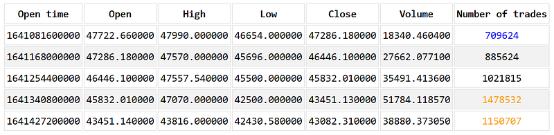
Conclusion
Python provides powerful tools for generating HTML code for tables and plots, allowing you to display and share your data in a clear and interactive way. With the right packages, you can create aesthetically pleasing HTML templates to showcase your data and insights, whether for scientific, business, or personal purposes. So, next time you need to present your data, give Python a chance and see how easy and fun it can be to create HTML tables and plots that engage and inform your audience!
Gain unlimited access at https://medium.com/@coucoucamille/membership


