Formating and visualizing time series data
Data wrangling and visualization with Pandas, Matplotlib and Seaborn

Well, it’s time for another installment of time series analysis. This time I’m focusing on two things: a) converting a normal dataframe into the right format for analysis; and b) making sense of that data through visualization.
The first objective is quite essential. Wrangling and cleaning up data is a big thing in data science, and it’s more so in time series analysis. Even for basic analysis, it is easier to work with data that is in a good shape. For advanced modeling such as forecasting, it’s often mandatory to have the right format so that the programming library can recognize it as a time series object.
The rest of the article is divided into two parts: in the first part I’ll go through the usual ritual of formating and exploratory data analysis and in the second part I will focus on different ways to visualize time series data.
Let’s dive right in!
Part A: Data wrangling
Upfront I want to say what I am not covering in this section — renaming columns, subsetting data, change of data types (e.g. string to int) and missing value treatments. To keep this writing focused on time series formating I will not cover them here, but if interested you could check out my previous article — A checklist for data wrangling.
i) Import libraries
As usual, I’m using pandas for data wrangling and I’ll go with matplotlib and seaborn for visualization.
# pandas for data wrangling
import pandas as pd
# seaborn and matplotlib for visualization
import seaborn as sns
import matplotlib.pyplot as pltii) Import data
For this exercise, I’ve downloaded an interesting dataset on monthly retail book sales (million US$) reported by book stores all across the US. The date range is between 1992 and 2018.
You can download the data from Census Bureau (census.gov) databases to follow along, but I’d encourage picking a different one that you are more familiar with.
So after some initial clean-up, I load in data and examine a few things by calling the head() and info()functions.
# load in data
df = pd.read_csv("BookSales.csv")
# data structure
df.head()
df.info()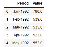
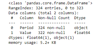
One key thing I’m looking at is that the time dimension is written in “mm/yyyy” format and is stored as a string/object (see output of the info() function).
iii) Creating a datetime object
In this part we want to achieve 3 objectives:
- convert the “Period” column into datetime object
- set the new datetime column as the index of the dataframe
- create additional “month” and “year” columns for ease of visualization
# converting dates/time columns into a datetime object
df["Period"] = pd.to_datetime(df["Period"])
# set the new datetime column as the index
df = df.set_index("Period")# create new columns from datetime index
df["year"] = df.index.year
df["month"] = df.index.month# new dataframe
df.head()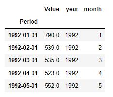
iv) Converting long-form to wide-form
Our current dataframe is in long format, meaning every time point (month-year) gets its own row. In the wide-format, years are in the rows, months are in the columns and each cell stores corresponding values.
Long format data will have many more rows than wide format but that’s what data scientists prefer because it’s easy to work with “tidy” data in programming libraries.
x = df.groupby(["year", "month"])["Value"].mean()
df_wide = x.unstack()
df_wide.head()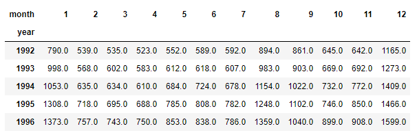
v) Filtering by datetime index
Now that we have converted a “normal” dataframe into a datetime object, it's time to put this new-found strength into action! You can now query data based on any specific date you want.
# filter by date
df.loc["2016-01-01"]
>> Value 1428.0
year 2016.0
month 1.0
Name: 2016-01-01 00:00:00, dtype: float64You can also filter data by date, month and year range. Filtering is as easy and intuitive as it gets.
# filter by a date range
df.loc["2016-01-01": "2016-12-01"]
# filter by month
df.loc["2008-01"]# filter by month range
df.loc["2010-01": "2010-05"]# filter by year
df.loc["2006"]# filter by year range
df.loc["2011": "2012"]vi) Resampling
Resampling is a way to group data by time units — day, month, year etc. Below is an example of resampling by month (“M”). You can also use “A” for years and and “D” days as appropriate.
# resampling by month
df["Value"].resample("M").mean()
Vii) Moving average
Moving average is a powerful technique to smooth out variations in temporal trend and is done by taking an average of past observations. We’ll see how to visualize moving averages in the following section but here’s how the code works.
# rolling window/moving average of N past observations
df["Value"].rolling(window=6).mean()
Part B: Visualization
Time series data is best analyzed and understood through visualization. We can write all the codes to do resampling and moving averages etc. and create new data frames all we want but in the end, we can’t understand anything until they are visualized.
Below is a sample of 8 different techniques for visualization. Is that all you need to know? The short answer is — if you know how to create and interpret these 8 visualizations, you are in pretty good shape!
I am not going to write complex codes to create beautiful figures, instead, use the default seaborn parameters in one-liner codes. As an individual, you can customize these figures however you wish based on your taste and sense of beauty!
Also as you will notice, I’m only using seaborn as the plotting library. There are all kinds of fancy libraries out there, but again, I’d keep things simple and sweet.
i) Simple plot
The simple plot is really simple, it is just plotting values column against the time dimension.
# simple time series plot
sns.lineplot(data = df["Value"])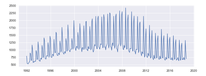
ii) Slicing
Sometimes you may want to zoom in to a specific date range and period in time.
# zooming in on specific date range
drange = df.loc["2011": "2015"]
sns.lineplot(data = drange["Value"])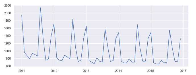
iii) Resampling
We talked about resampling in the previous section but now let’s see how resampled data looks like.
# plotting resampled data
resampled = df["Value"].resample("A").mean()
sns.lineplot(data = resampled)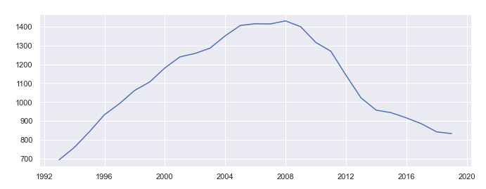
iv) Moving average
Moving average is similar to resampling but has more flexibility, you can specify any number of past observations as a rolling window. Below is an example using a moving window of 6 past observations.
# plotting moving average (window = N past observations)
ma = df["Value"].rolling(window=6).mean()
sns.lineplot(data = ma)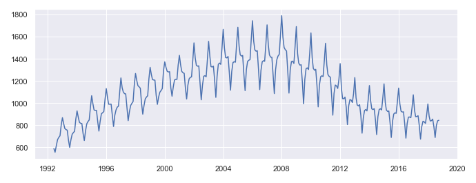
v) Boxplot
In any exploratory data analysis, boxplots are the most useful statistical graphics to understand both the central tendency and the distribution of data. It is somewhat similarly useful in time series data. Below is an example of monthly boxplots of values.
# boxplots by month
sns.boxplot(x = 'month', y='Value', data = df)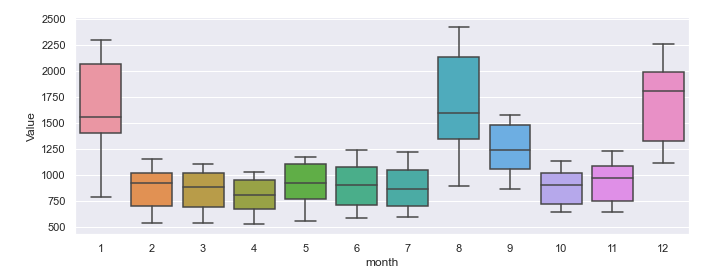
[I didn’t try but I think you can also draw violin plots with the same line of code. Go ahead give it a try, just replace boxplot with violinplot!]
vi) Barplot
Bar plots are an old-school visualization technique and I don’t know if people use them too often in their projects. But I’m including this here so you know they exist!
# barplot
sns.barplot(x = 'month', y='Value', data = df)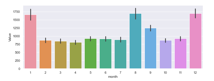
vii) Time series with confidence intervals
It is also possible to visualize time series showing both the trend and confidence intervals (i.e. variation of data at each time point).
# plotting with confidence intervals
sns.lineplot(x="year", y="Value", data=df)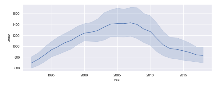
viii) Plotting wide-form data
Last, but not least, remember we’ve created wide-form data in the beginning and now it’s time to put that into use. Using the visualization technique below we are now seeing trends in data for each month separately.
# plotting wideform data
sns.lineplot(x="year", y="Value", data=df, hue="month", palette="Dark2")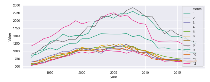
Final thought
The purpose of this article was to put in one place most of the data wrangling and visualization techniques you’d need as a beginner or intermediate time series analyst. First, we saw how to convert an ordinary dataframe into a powerful datetime object and put that into use for filtering and visualizing. In the second part, we’ve created 8 different plots using different techniques to visualize time series. The next step would be to go ahead and pick a different dataset, reproduce the results and play with different plotting parameters.
I hope this was a useful post. If you have comments feel free to write them down below. You can follow me on Medium, Twitter or LinkedIn.