
Folium Map: How to Create a Table-Style Pop-up with HTML Code
A Step-by-Step Guide to Level-up Your Folium Skills for Geospatial Data Visualization

Introduction
Folium is a very popular Python visualization library that is specifically developed for the purpose of creating maps and visualizing geospatial data. On Folium’s official documentation page, it says:
foliummakes it easy to visualize data that’s been manipulated in Python on an interactive leaflet map. It enables both the binding of data to a map forchoroplethvisualizations as well as passing rich vector/raster/HTML visualizations as markers on the map.
There are many great articles and tutorials on the internet about the basics of Folium such as how to create a Folium map object, how to display the various map styles, how to add markers etc. Often times we will need to go beyond these basics and use additional techniques or tricks to make the visualization more compelling and useful for story-telling.
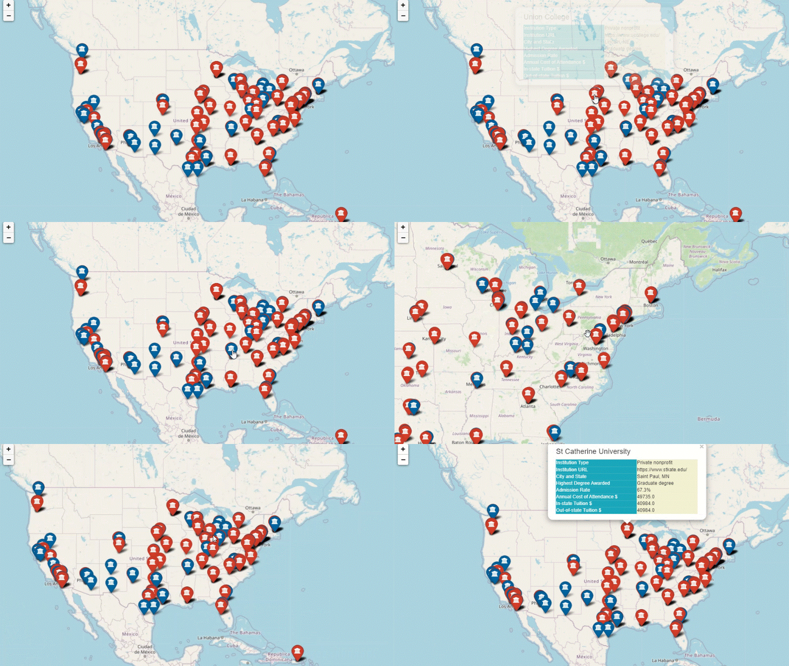
In this article, I wanted to share with you a python project I recently completed in which I used HTML code to create a customized, table-style pop-up in the Folium map. I plotted major U.S. universities in large cities on an interactive map using Folium and HTML code. When users click a marker in the map, a small window appears and the users can view additional information about that institution in a nicely-formatted, table-style pop-up.
The interactive map with the table-style pop-up is shown below:

About the Data
The data behind this visualization was created from a raw open dataset that can be downloaded from DATA.ED.GOV . The original raw dataset contains institution-level data for over 6000 higher education institutions and a variety of metrics that populate the college scorecard dashboard created by the U.S. Department of Education.
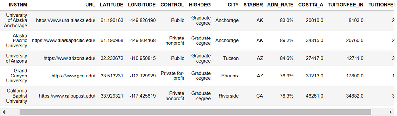
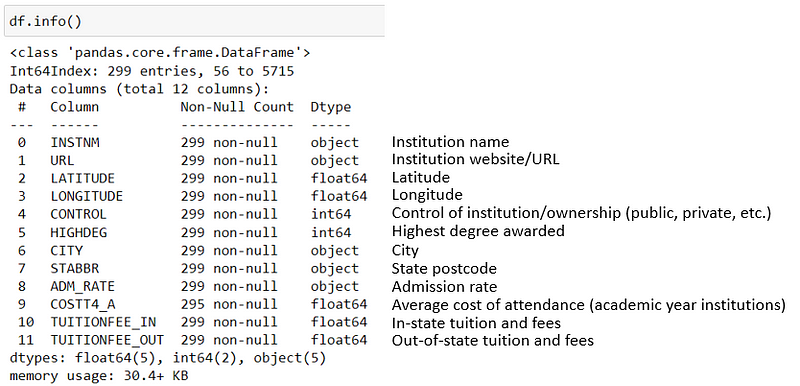
In this tutorial, I only selected a small sample of institutions and a few common metrics, for the ease of demonstration purpose. The sample dataset is shown below:
Create a Basic Folium Map
First, let’s warm up a little bit and refresh our Folium knowledge by creating a basic Folium map. We start by creating an empty map object. We then add markers to superimpose the locations of the institutions onto the map. Finally, we add a simple pop-up to each marker to show the name of the institution when clicked upon.
Notice that in lines 10–17 we created a color field so that public and private institutions are represented by blue and brown colors respectively. We also created a label that is the name of the institution and assign it to the popup parameter in line 21. When Folium adds a marker for each institution, it will loop through the dataset using for loop, and color-code each marker as well as add each institution’s name in the pop-up.
One nice little thing about Folium is that you can choose customized icons for markers. For example, in line 22, we can specify icon=‘university’ to have a nice-looking university icon for each marker.

Create A Folium Map with Table-Style Pop-up Using HTML
Now we want to go beyond the basics and try making the pop-up a bit fancier with a customized, table-style format, like the one we showed earlier in the introduction. In order to do this, we will need to use HTML code to create the table format and then pass it to folium.popup().
The code below defines a function popup_html that will create a table with two columns and a table header using HTML code. The table header shows the institution’s name. The left column of the table shows the information/metrics we want to include in the pop-up window; the right column shows the actual value for each metric. We can also choose whatever column colors by specifying the HTML color code.
This long section of code looks scary, but it is really not that complex. For each metric (institution_url, institution_type, admission_rate, etc.) shown in the pop-up table, the HTML code structure is always the same; only the metric name and metric value need to be changed accordingly in the code.

Now let’s pass HTML code to Folium and re-create the map by adding the table-style pop-up to markers. This is achieved by the code below. Specifically, lines 15–19 create the HTML table using the for loop and popup_html function and then add the table to the markers on the map using folium.Marker(). The same concept and process can also be used to create a customized tooltip (for a tooltip, instead of clicking the marker, the user just hovers over the marker and the tooltip appears).
There you go! You now have created an interactive map with a nicely formatted pop-up using Folium and HTML code. Thank you for reading and I hope you enjoyed this article. Happy Learning!
If you are completely new to HTML and are having a hard time following and understanding the code, please read my latest article about the basics of HTML and how to use it to add dynamic images, links, and tables to Folium map pop-ups, with detailed explanations of the code!
Reference List and Data Source:
- Folium official documentation page in Github: http://python-visualization.github.io/folium/
- ‘Fancy Folium’ by David Baker: https://www.kaggle.com/dabaker/fancy-folium
- Data Source: U.S. Department of Education’s College Scorecard open data (https://data.ed.gov/dataset/college-scorecard-all-data-files-through-6-2020)


