
Flutter: Solving the Overflow Problem
So you are new to Flutter? You must be new to the overflow problem as well ;)
It comes to all of us and it must be solved. I remember investing two hours of my time trying to investigate the problem and solve it. Now, I know how to solve it in more than one way.
So, without further delay, let’s get to it.
Overflow: What does it look like to the developer?
Case # 1:
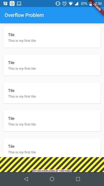
Bottom Overflow:
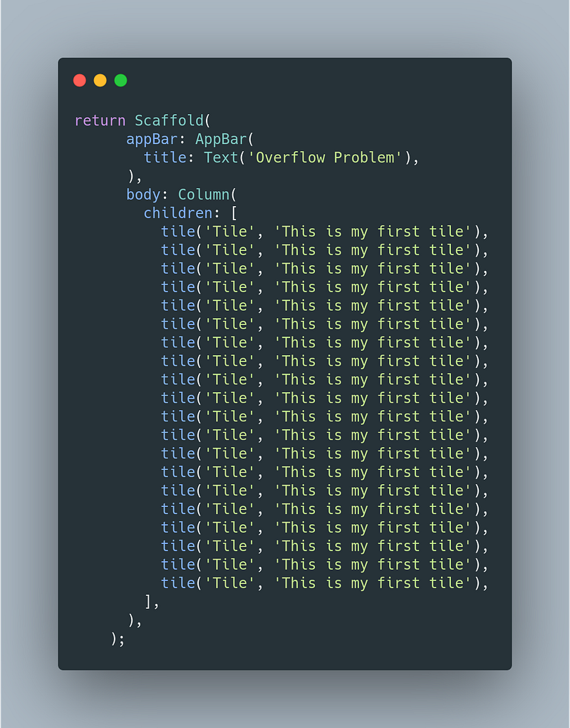
In the image above(figure 1), inside a Column widget, I simply repeated the tile as many times so that it requires more screen size and creates an overflow problem for me. As a developer, I can see the black and yellow striped overflow indicator with information that with how many pixels the bottom is being overflowed; 1408 in this case. As a user, I won’t be able to see this striped box resulting in a bad user experience; unable to scroll, missing hidden widgets and thus realizing how bad a job the developer did.
Figure 2 contains code for generating the overflow in figure 1.
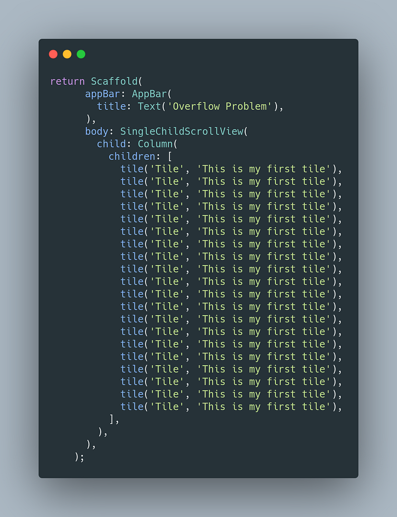
Solution:
This case is a simple one. We are going to simply wrap the Column widget with another widget named SingleChildScrollView which allows the user to scroll through the contents of its child if they take more than the screen size.
Let’s run the above code and see the results for ourselves.
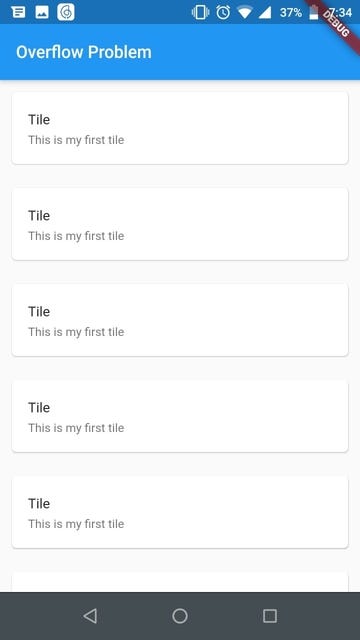
Looks nice! Doesn’t it? Go ahead and test it for yourself and try different variations.
Case # 2:
Horizontal Overflow:
We were able to make the screen scrollable when it came to vertical overflow. Can we do the same for horizontal overflow? Um, yeah but it would look ugly.
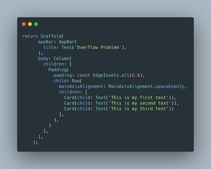
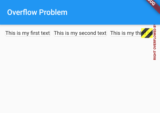
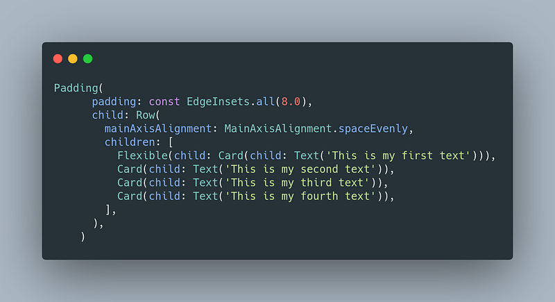
Here, I created a horizontal overflow by putting too much content inside a Row widget. See figures 5 and 6.
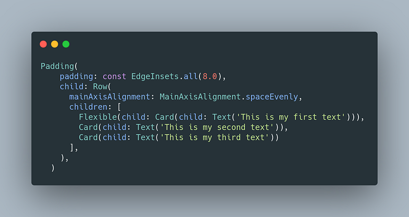
Introducing Flexible:
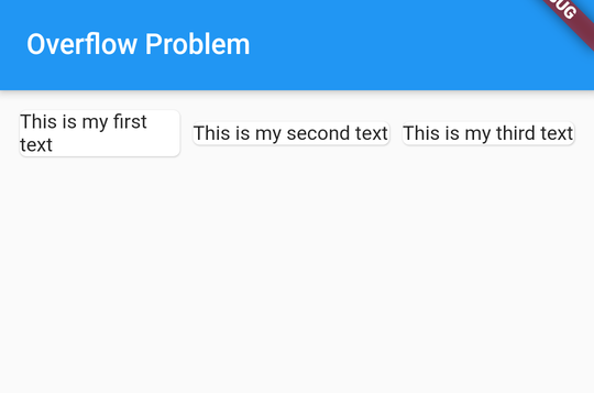
Flexible widget can be placed inside Column, Row and similar widgets to surround any of their children. Flexible helps the child to avoid overflow by displaying it only in the available space. In figure 7, you can see that I wrapped the first child of the Row and in figure 8, you can see that it solved our problem (for now).
Now we add another similar-looking child inside our Row widget and see what happens. Refer to figure 9 where I added another child to test if the flexibility holds.
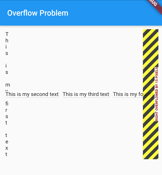
As shown in figure 10 above, flexibility isn’t holding now. The simple solution to that is we wrap each of our children in the same Flexible widget.
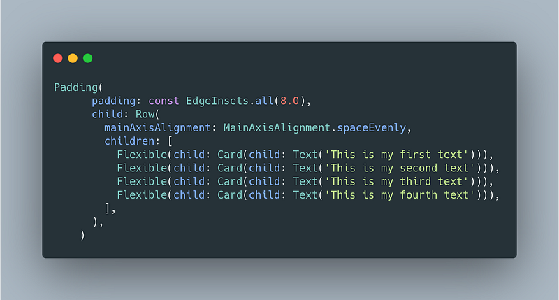
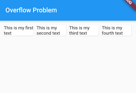
Figure 12 displays how each child inside Row took equal space available. This shows us that Flexible widget is really helpful when we have to display our data in a horizontal format and need it displayed neatly.
Introducing the flex property:
For now, each child of our Row widget was taking equal space. What if we want one of the children to take up more space than the others? Worry not! Flexible comes with a flex property. By default, it is 1 i.e. each child will take one part of the total partition. Let’s change it to 2 for the first child and see what happens. Refer to figure 13 below for code.
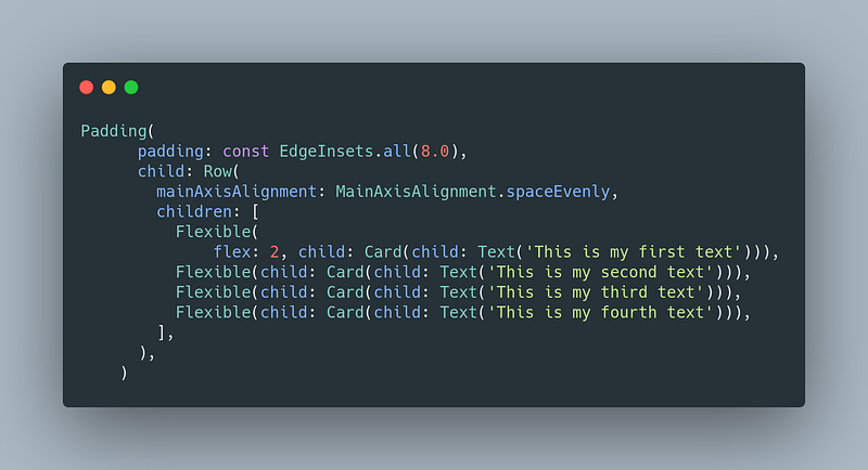
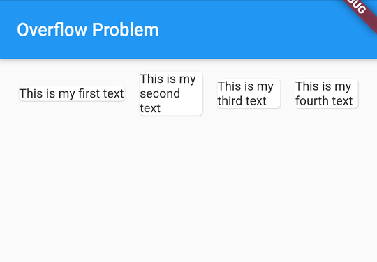
We see in figure 14 above that now the first child is taking more space than others i.e. there were four children but now there are five partitions of space and the first one is taking two parts of it. See figure 15 for a visual explanation of the discussed scenario.
If it helped you, do support me by sharing this in your circle and leaving some claps 😊


