
Flutter Screenutil — Create Responsive Application
Hai, My name is Muhamad Duta Chandra. I am Mobile Developer from Indonesia.
Welcome to the PackageOfTheDay, my journey to explore Flutter packages on pub.dev!
In this article i wan’t to share about my understanding of Flutter Screenutil packages. I hope you like it.
I provide the full code below :
Introduction
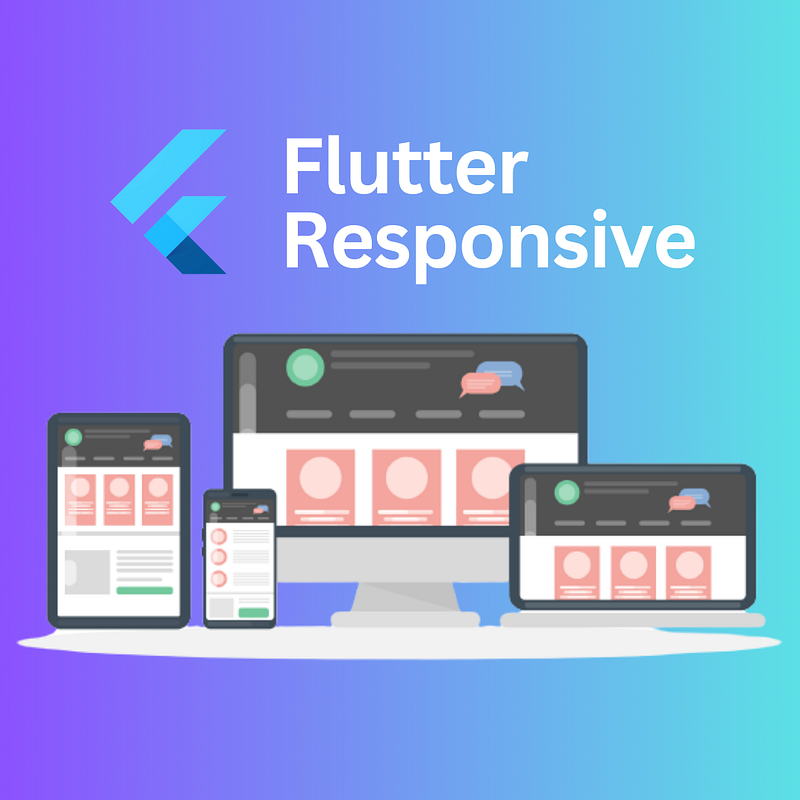
As you know flutter is a framework for multi platform application, every platform have a different screen size, so we need to create our app is responsive with all that platform.
I introduce you to Flutter ScreenUtil, a package for creating responsive user interfaces in Flutter. With this package, you can easily adapt your app’s layout and font size to different screen sizes, ensuring a consistent and visually pleasing experience for users on any device. With flutter screenutil we can create user-friendly interfaces that adapt effortlessly to various screen sizes!
Install and Setup Flutter Screenutil
Before we start to use all the feature we need to install and setup the packages to our flutter app.
Step 1: Add Dependency in
pubspec.yaml
Open project’s pubspec.yaml file and add the Flutter Screenutil dependency under the dependencies section:
...
dependencies:
  flutter:
    sdk: flutter
  # https://pub.dev/packages/flutter_screenutil
  flutter_screenutil: ^5.7.0
...
make sure you install the version that work with your flutter sdk in Flutter Screenutil documentation pub.dev.
Step 2: Run
flutter pub get
After adding the dependency, run the following command in your terminal to fetch and install the package:
flutter pub getHow to use Flutter Screenutil
After the installation and setup was finished, time to use the flutter screenutil to create our responsive app.
First, we need to initialization this package with our design. Usually if you have UI/UX design in figma there are width and height of the frame screen design.

You need to define it in the “designSize: Size(width, height)”
import 'package:flutter/material.dart';
import 'package:flutter_screenutil/flutter_screenutil.dart';
import 'package:flutter_screenutil_potd/pages/profilepage.dart';

void main() {
  runApp(const App());
}

class App extends StatelessWidget {
  const App({super.key});

  @override
  Widget build(BuildContext context) {
    return ScreenUtilInit(
      designSize: const Size(390, 844),
      minTextAdapt: false,
      builder: (context, child) {
        return const MaterialApp(
          debugShowCheckedModeBanner: false,
          home: ProfilePage(),
        );
      },
    );
  }
}
After we init the screenutil now time to use the responsive design of the package. So as i mentioned above, this package can make responsive design like width, height, and text size with less effort. How Come ?
Simply like this, if you have container with 100px width and 100px height you write the code like this :
Container(
  width: 100,
  height: 100,
),
Now to make it responsive with flutter screenutil you need to write this like this :
Container(
  width: 100.w,
  height: 100.h,
),
Yes it’s easy and less effort but it’s powerfull. You just need to add .w for width and .h for height. Not just width and height but you can use the responsive for text.
You just need to add .sp after the fontsize like this :
Text('namakuchandra',
      style: TextStyle(fontWeight: FontWeight.bold, fontSize: 18.sp),
),
You can use it for radius also, so you need to add .r after the number.
Container(
  decoration: BoxDecoration(
    borderRadius: BorderRadius.circular(10.r)
  ),
),
Conclusion
Flutter Screenutil is a valuable tool for flutter developers seeking to create responsive Flutter apps. This article provided a step-by-step guide on how to install, set up, and utilize it in our projects. With Flutter Screenutil, developers can effortlessly adapt their app’s layout, font size, and other design elements to different screen sizes, ensuring a consistent and visually pleasing user experience across various devices. This package simplifies the process of making responsive designs, making it easy to adjust width, height, text size, and even radius with minimal effort. By incorporating Flutter Screenutil into your Flutter projects, you can enhance the user-friendliness of your interfaces and ensure they adapt seamlessly to different screen sizes.
This is the end for the #PackageOfTheDay.
Thank You.
Writer : Muhamad Duta Chandra
Github : 0x1m4o
Contact : [email protected]