
Financial Market Dashboards Are Awesome, and Easy To Create!
A step-by-step guide to making your own with streamlit
I made my own financial market dashboard, and I love it.
If you have not seen a dashboard before, think of this as your own custom user interface to explore data. This is super useful if you’re a busy person and want to make some quick analysis without bouncing around several websites.
For example, on my dashboard, I have programmed:
- Charts to show where money-flow is in the market, with controllable charts types, time-lengths and aggregation types.
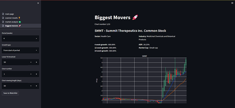
- Show me the largest gainers in the stock-market, with controllable time-lengths and a minimum percentage threshold.
- Charts from my own stock-market scanner, which show me their position in terms of price performance in the market.
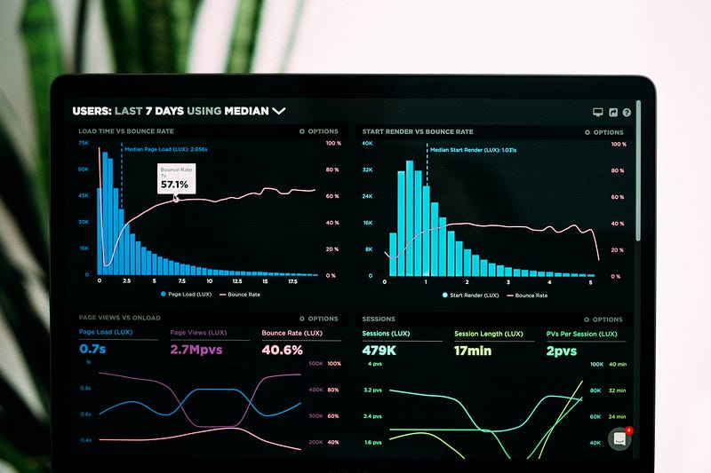
Here is an example screenshot (it’s still work in progress and I add to it all the time!):
Thing is, making a dashboard is super simple using the python package streamlit!
The more complicated part is any code you want in the backend. For example, my scanner needs 100’s of lines of code; but the dashboard page shown is less than 80 lines.
Through this article, we’ll consider a very simple dashboard which:
- Shows you the candlestick chart of a stock (the stock chosen as text).
- Plots a moving average (with a controllable length and type).
- Shows you a customisable plot of the time-evolution of the balance sheet (where you can remove items on the balance sheet).
- Has a button to update the input data.
Obviously, this is a simple example, but it will give you the basics to develop something better using your imagination!
I included the full working code at the end, and you can find more description on this through each section 🙂
⚠️There is a git issue for the fundamental data not downloading corretly from yfinance (see here) — please ignore the fundamental data sections of this article until resolved! ⚠️
Step 0: Installing the Necessary Packages
We are going to be using Python for this; if you don’t have that installed, I recommend using anaconda which will install Python, Spyder (the interactive development environment) and a bunch of other goodies!
For this project we’ll need to install:
yfinance— for downloading data from yahoo finance.pandas— for data manipulations.streamlit— for making the dashboard.plotly— to make the charts.
You should install these after you install python, using the command prompt pip install XXX.
Step 1: The Dashboard Controls
Got Python and the packages installed? Great! Let’s start by putting in place the dashboard controls:
import streamlit as st

# Sidebar controls -----------------------------------------------------------
ticker = st.sidebar.text_input(
    label='Stock ticker',
    value='TSLA',
)

ma_type = st.sidebar.selectbox(
    label='Moving average type',
    options=['Simple', 'Exponential'],
)

ma_length = st.sidebar.number_input(
    label='Moving average length',
    value=10,
    min_value=2,
    step=1,
)

st.sidebar.button(
    label='Update data',
)
And that’s it, simple, right? By the way, you can find all the different types of controls over on the streamlit website.
The button will eventually be linked to a function — this is just a placeholder for now and won’t do anything if pressed.
I saved this code in in a folder called “stock_market_dashboard”, I chose “dashboard.py” as the file name.
How do we visualise this?
It’s generally a good idea to run your dashboard as you develop, it’ll update once you save your code and you can instantly see the changes you’ve made.
We can do this by:
- Opening up a command prompt (I’m using the anaconda prompt).
- Changing your directory to where the dashboard.py file lives (i.e. the one you made using the above instructions).
- Typing in the prompt
streamlit run dashboard.py.
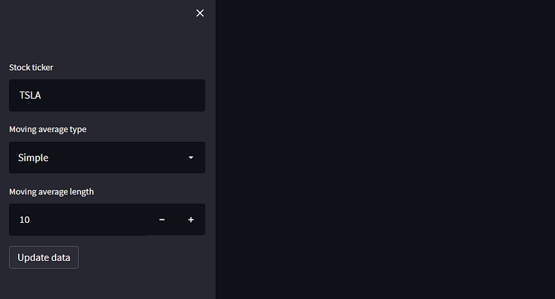
This will open the dashboard in your browser, and, if successful you’ll have this rather sad looking empty dashboard.
Note! Once you update the dashboard code and save it, streamlit will ask you on the dash whether you want to always update when changed, I suggest doing so.
Step 2: Downloading the Data
We have the basic dashboard in place, so let’s grab some data to make some fancy charts!
We are going to use the excellent yfinance package to get the stock data and the balance sheet; these will be stored in a folder called “data”, create this folder in the main project directory now.
import os
import pandas as pd
import yfinance as yf
import streamlit as st

def get_data(ticker: str):

    try:
        price_data = yf.download(ticker)
        balance_sheet = yf.Ticker(ticker).quarterly_balance_sheet

        # Format the balance sheet so the date is the index
        balance_sheet = balance_sheet.T
        balance_sheet.index.name = 'Date'

        # Save them in the data directory to access them again later without
        # redownloading the files
        price_data.to_csv(f'data/{ticker}_prices.csv')
        balance_sheet.to_csv(f'data/{ticker}_balance_sheet.csv')
    except Exception as e:
        st.write(e)

    return (
        price_data.reset_index(),
        balance_sheet.reset_index()
    )

# Sidebar controls -----------------------------------------------------------
ticker = st.sidebar.text_input(
    label='Stock ticker',
    value='TSLA',
)

ma_type = st.sidebar.selectbox(
    label='Moving average type',
    options=['Simple', 'Exponential'],
)

ma_length = st.sidebar.number_input(
    label='Moving average length',
    value=10,
    min_value=2,
    step=1,
)

st.sidebar.button(
    label='Update data',
    on_click=get_data,
    kwargs={'ticker': ticker},
)

# Check if we have the stock data, if not, download it
if os.path.isfile(f'data/{ticker}_prices.csv'):
    price_data = pd.read_csv(f'data/{ticker}_prices.csv')
    balance_sheet = pd.read_csv(f'data/{ticker}_balance_sheet.csv')
else:
    price_data, balance_sheet = get_data(ticker)
So, what has changed here?
To summarise:
- The function
get_data(ticker)takes the ticker input from the dashboard, downloads the data, and saves it in a folder called “data”. If there is a problem with the download, streamlit will display the error. - The download function has now been linked to the button.
- We check if the file has already been downloaded, if it has, there isn’t any need to redownload it. If it doesn’t exist, the
get_datafunction is called automatically.
How can we see if things are working?
Easily! For example, we can these two lines to the end of the code above:
st.write(price_data)
st.write(balance_sheet)
The dashboard should then show something like this:
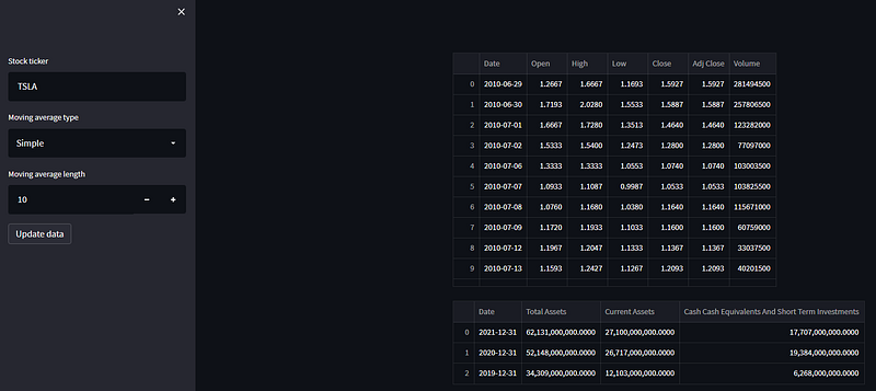
Note you can play around with data too. For example, we can click on a column to sort it, or scroll through on longer datasets.
Step 3: Including the Charts
Here’s what we have so far:
- Controls ✅
- Data ✅
So let’s get cracking on making some charts!! Firstly, let’s add in the candlestick chart. Add this code to the top of the python code (after the imports)
import plotly.graph_objects as go

def get_candlestick_chart(price_data, ma_type, ma_length):

    if ma_type == 'Simple':
        price_data['ma'] = price_data['Close'].rolling(int(ma_length)).mean()
    else:
        price_data['ma'] = price_data['Close'].ewm(int(ma_length)).mean()

    fig = go.Figure()

    fig.add_trace(
        go.Candlestick(
            x=price_data['Date'],
            open=price_data['Open'],
            high=price_data['High'],
            low=price_data['Low'],
            close=price_data['Close'],
            showlegend=False,
        )
    )

    fig.add_trace(
        go.Line(
            x=price_data['Date'],
            y=price_data['ma'],
            name=f'{int(ma_length)} Period {ma_type} Moving Average'
        )
    )

    fig.update_xaxes(
        rangebreaks = [{'bounds': ['sat', 'mon']}],
        rangeslider_visible = False,
    )

    fig.update_layout(
        legend = {'x': 0, 'y': -0.05, 'orientation': 'h'},
        margin = {'l': 50, 'r': 50, 'b': 50, 't': 25},
        width = 800,
        height = 800,
    )

    return fig
And at the bottom of the code, put this:
st.plotly_chart(
    get_candlestick_chart(price_data, ma_type, ma_length)
)
You should end up with something like this:
⚠️Important note ⚠️
The variables we assigned from the controls on the sidebar will always be in a string format, to make sure that we can use them in moving average calculations we need to convert to integer using int(variable).
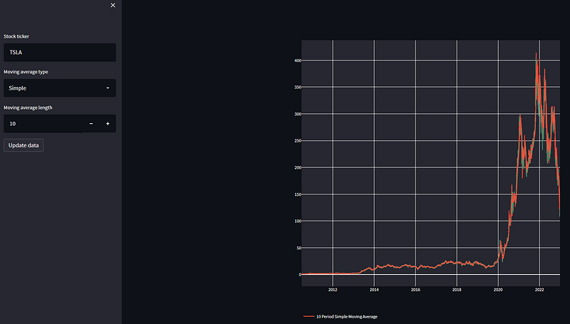
Urm, the chart looks awful?
Yes, indeed! This is the importance of viewing as we develop!
The problem here is that we are plotting the entirety of TSLA’s stock history. We may only want to see the last few weeks or months. Let’s introduce a simple hack!
Modify the section of the code where the sidebar controls are to have another, one which shows how many days you’d like to view:
# OTHER CONTROLS ABOVE HERE

ma_length = st.sidebar.number_input(
    label='Moving average length',
    value=10,
    min_value=2,
    step=1,
)

plot_days = st.sidebar.number_input(
    label='Chart viewing length',
    value=120,
    min_value=1,
    step=1,
)

st.sidebar.button(
    label='Update data',
    on_click=get_data,
    kwargs={'ticker': ticker},
)

# REST OF THE CODE BELOW HERE
Then, we can modify the function get_candlestick_chart to only plot plot_days amount of candles:
# REST OF THE CODE ABOVE
def get_candlestick_chart(price_data, ma_type, ma_length, plot_days):
if ma_type == 'Simple':
price_data['ma'] = price_data['Close'].rolling(int(ma_length)).mean()
else:
price_data['ma'] = price_data['Close'].ewm(int(ma_length)).mean()
price_data = price_data[-int(plot_days):]
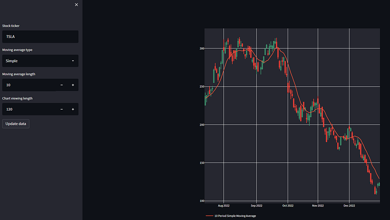
# REST OF THE PLOTTING FUNCTION BELOWNotice that an extra input is required to the function, so we need to add this into the function call at the bottom of the script:
st.plotly_chart(
    get_candlestick_chart(price_data, ma_type, ma_length, plot_days)
)
Now you’ll end up with this — much better!
And the balance sheet plot!
Add this code to the functions area:
def plot_balance_sheet(balance_sheet):

    fig = go.Figure()

    for col in balance_sheet.columns:

        if col != 'Date':
            fig.add_trace(
                go.Line(
                    x=balance_sheet['Date'],
                    y=balance_sheet[col],
                    name=col,
                )
            )

    fig.update_layout(
        legend = {'x': 0, 'y': -0.05, 'orientation': 'h'},
        margin = {'l': 50, 'r': 50, 'b': 50, 't': 25},
        width = 800,
        height = 800,
    )

    return fig
And this to the bottom of the code:
st.plotly_chart(
    plot_balance_sheet(balance_sheet)
)
You’ll end up with a chart like this:
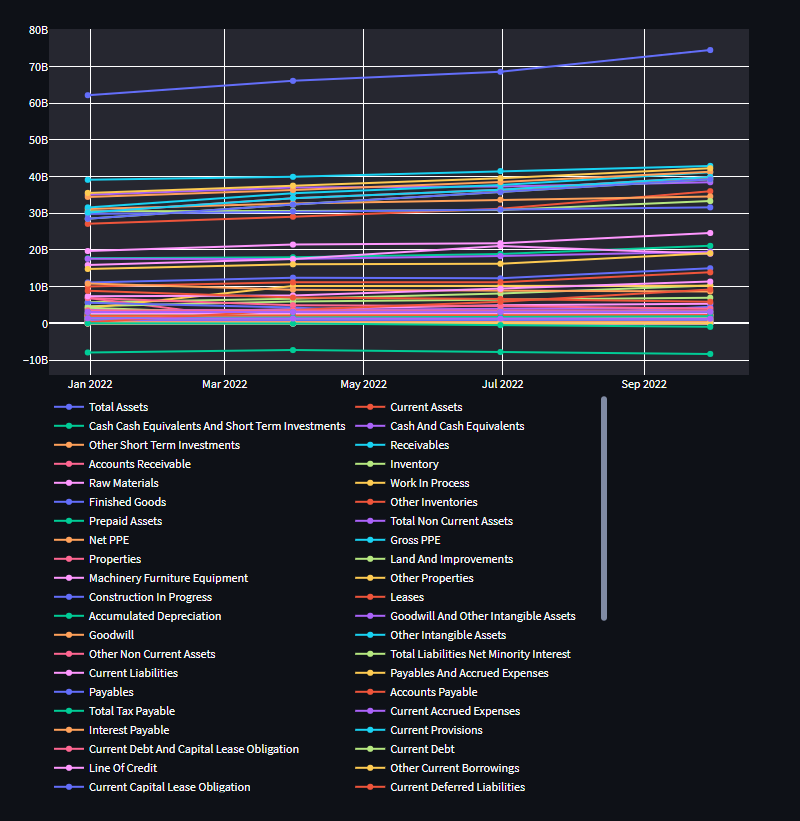
Yikes! This is a total mess!
Agreed! Let’s limit the amount of things we are plotting by adding in a global variable to the top of the code:
FUNDAMENTALS_TO_PLOT = [
    'Cash And Cash Equivalents',
    'Current Debt',
    'Long Term Debt',
    'Invested Capital',
]
And also replace the plotting code with this:
def plot_balance_sheet(balance_sheet):

    fig = go.Figure()

    for col in FUNDAMENTALS_TO_PLOT:

        fig.add_trace(
            go.Line(
                x=balance_sheet['Date'],
                y=balance_sheet[col],
                name=col,
            )
        )

    fig.update_yaxes(type='log')

    fig.update_layout(
        legend = {'x': 0, 'y': -0.05, 'orientation': 'h'},
        margin = {'l': 50, 'r': 50, 'b': 50, 't': 25},
        width = 800,
        height = 400,
    )

    return fig
Note that I have also added two updates:
- I changed the size of the figure, so that it’s a little larger.
- I made the y-scale logarithmic so we can easily see trends across different scales.
You’ll now have this — much better!
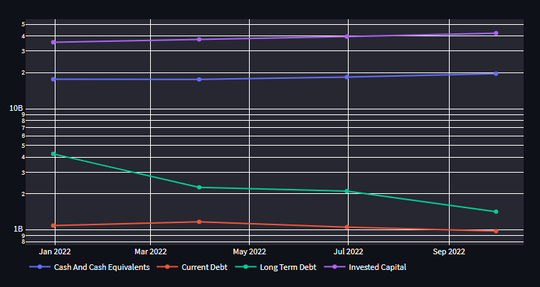
Note! You can remove things from the plot by clicking the corresponding object in the legend, how cool!
Step 4: Tidy Up
We now have a functional dashboard, awesome! But let’s be honest, it’s a little bland. Let’s introduce:
- A title to the dashboard.
- The ability to view the stock business summary in an expandable section.
- Titles to the charts.
To achieve this, change the bottom of the code (below the controls) to:
st.header(f'{ticker} Dashboard 💵')

# Check if we have the stock data, if not, download it
if os.path.isfile(f'data/{ticker}_prices.csv'):
    price_data = pd.read_csv(f'data/{ticker}_prices.csv')
    balance_sheet = pd.read_csv(f'data/{ticker}_balance_sheet.csv')
else:
    price_data, balance_sheet = get_data(ticker)

with st.expander('Open to see the stock information'):
    st.write(yf.Ticker('TSLA').info['longBusinessSummary'])


st.subheader('Price Chart 📈')
st.plotly_chart(
    get_candlestick_chart(price_data, ma_type, ma_length, plot_days)
)

st.subheader('Balance Sheet Chart 📊')
st.plotly_chart(
    plot_balance_sheet(balance_sheet)
)
Your dashboard will now look like:
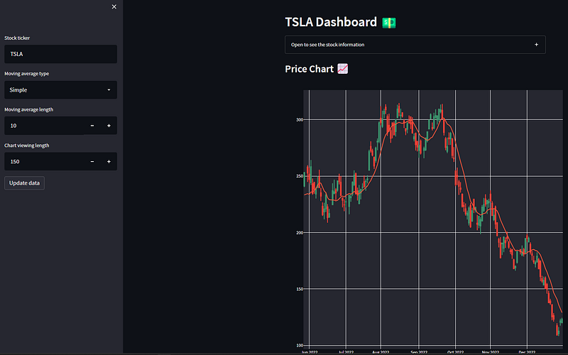
Pretty neat, huh?!
Wrapping Up
Creating financial market dashboards is honestly a breeze with streamlit. Here we have considered a simple toy example to demonstrate the flexibility of the package; the only real limitation is your imagination!
For some more inspiration, why not check out the streamlit examples? There’s some great ones on there 🙂
Thank you for reading, I hope you enjoyed the article! Thank you for reading, I hope you enjoyed the article! Please feel free to connect with me on LinkedIn — I’d love to hear from you! Also feel free to follow/DM me on twitter.
If you are thinking getting a medium account, then please consider supporting me and thousands of other writers by signing up for a membership. For full disclosure, signing up through this link grants me a portion of your membership fee, at no additional cost to you (a win-win for sure!).
Or if you’d like another way to support my content creation, then you could

Because I work a full-time job, go to the gym, trade, and write on Medium, I use a lot of coffee!
The Full Code
⚠️Make sure you have a folder called “data” in the directory where this code lives, that’s where the downloaded files will be stored! ⚠️
import os
import pandas as pd
import yfinance as yf
import streamlit as st

import plotly.graph_objects as go

FUNDAMENTALS_TO_PLOT = [
    'Cash And Cash Equivalents',
    'Current Debt',
    'Long Term Debt',
    'Invested Capital',
]

def get_data(ticker: str):

    try:
        price_data = yf.download(ticker)
        balance_sheet = yf.Ticker(ticker).quarterly_balance_sheet

        # Format the balance sheet so the date is the index
        balance_sheet = balance_sheet.T
        balance_sheet.index.name = 'Date'

        # Save them in the data directory to access them again later without
        # redownloading the files
        price_data.to_csv(f'data/{ticker}_prices.csv')
        balance_sheet.to_csv(f'data/{ticker}_balance_sheet.csv')

    except Exception as e:
        st.write(e)

    return (
        price_data.reset_index(),
        balance_sheet.reset_index()
    )

def get_candlestick_chart(price_data, ma_type, ma_length, plot_days):

    if ma_type == 'Simple':
        price_data['ma'] = price_data['Close'].rolling(int(ma_length)).mean()
    else:
        price_data['ma'] = price_data['Close'].ewm(int(ma_length)).mean()

    price_data = price_data[-int(plot_days):]

    fig = go.Figure()

    fig.add_trace(
        go.Candlestick(
            x=price_data['Date'],
            open=price_data['Open'],
            high=price_data['High'],
            low=price_data['Low'],
            close=price_data['Close'],
            showlegend=False,
        )
    )

    fig.add_trace(
        go.Line(
            x=price_data['Date'],
            y=price_data['ma'],
            name=f'{int(ma_length)} Period {ma_type} Moving Average'
        )
    )

    fig.update_xaxes(
        rangebreaks = [{'bounds': ['sat', 'mon']}],
        rangeslider_visible = False,
    )

    fig.update_layout(
        legend = {'x': 0, 'y': -0.05, 'orientation': 'h'},
        margin = {'l': 50, 'r': 50, 'b': 50, 't': 25},
        width = 800,
        height = 800,
    )

    return fig


def plot_balance_sheet(balance_sheet):

    fig = go.Figure()

    for col in FUNDAMENTALS_TO_PLOT:

        fig.add_trace(
            go.Line(
                x=balance_sheet['Date'],
                y=balance_sheet[col],
                name=col,
            )
        )

    fig.update_yaxes(type='log')

    fig.update_layout(
        legend = {'x': 0, 'y': -0.05, 'orientation': 'h'},
        margin = {'l': 50, 'r': 50, 'b': 50, 't': 25},
        width = 800,
        height = 400,
    )

    return fig


# Sidebar controls -----------------------------------------------------------
ticker = st.sidebar.text_input(
    label='Stock ticker',
    value='TSLA',
)

ma_type = st.sidebar.selectbox(
    label='Moving average type',
    options=['Simple', 'Exponential'],
)

ma_length = st.sidebar.number_input(
    label='Moving average length',
    value=10,
    min_value=2,
    step=1,
)

plot_days = st.sidebar.number_input(
    label='Chart viewing length',
    value=120,
    min_value=1,
    step=1,
)

st.sidebar.button(
    label='Update data',
    on_click=get_data,
    kwargs={'ticker': ticker},
)

# The dashboard plots --------------------------------------------------------

st.header(f'{ticker} Dashboard 💵')

# Check if we have the stock data, if not, download it
if os.path.isfile(f'data/{ticker}_prices.csv'):
    price_data = pd.read_csv(f'data/{ticker}_prices.csv')
    balance_sheet = pd.read_csv(f'data/{ticker}_balance_sheet.csv')
else:
    price_data, balance_sheet = get_data(ticker)

with st.expander('Open to see the stock information'):
    st.write(yf.Ticker('TSLA').info['longBusinessSummary'])


st.subheader('Price Chart 📈')
st.plotly_chart(
    get_candlestick_chart(price_data, ma_type, ma_length, plot_days)
)

st.subheader('Balance Sheet Chart 📊')
st.plotly_chart(
    plot_balance_sheet(balance_sheet)
)


