
Fancy Bubble Plot using ggplot2
What is ggplot2?
If you are new to ggplot2, it is a popular R library to create graphs and charts. Don’t worry, I will take you through some of the basic ggplot2 terminology. For more details, you can refer to — https://ggplot2.tidyverse.org/
What do we want to achieve?
Feeling a little fancy, are we? Let us try to replicate the below chart.
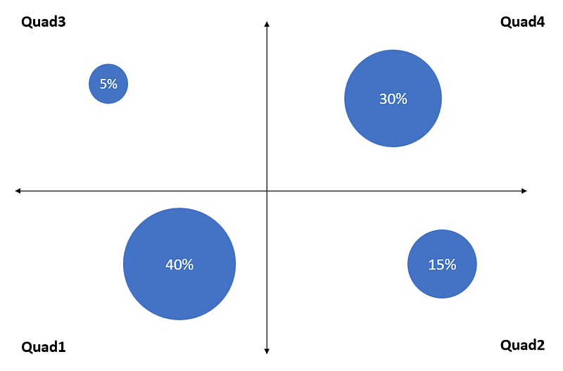
A fancy looking bubble chart that you could use to plot your data on two variables represented by the x and y axis respectively. The scales might be going from good to bad, agree to disagree etc. as you move from left to right or top to bottom. Accordingly, you could come up with special names for the quadrants that actually do make sense. The %s in the 4 bubbles add up to a 100%.
I will be creating a synthetic data for the purpose of generating this plot and for convenience, have used generic label for each of the 4 quadrants.
Isn’t it easier to create this chart using say PowerPoint?
Yes, of course. You could create it in mins using PowerPoint or Excel or Word. So why go through the trouble of creating it through code?
- As a learning activity. Creating a chart like this helped me get a deeper understanding of how ggplot2 works.
- Can be very handy if you had to add a chart like this on a web-based dashboard or re-create this chart periodically like biweekly or monthly.
Let’s get started then
Load libraries
First step is to ensure we have the necessary libraries. I am going to use data.table, scales and ggplot2. You could stick with the base data.frame class but I like using data.table. ‘scales’ library helps display numbers as percent, comma or dollar or other formats.
I will however call the pacman library first. The advantage of using ‘pacman’ to load libraries is that instead of throwing an error, it will install the required libraries if they aren’t already available in your environment.
# install 'pacman' package if it isn't already installed
if (!require(pacman)) install.packages("pacman")

# load the 'pacman' library in the environment
library(pacman)

# load 'data.table' and 'ggplot2'
p_load(data.table, ggplot2, scales)
Get your data
I am going to create a dummy dataset for this demonstation. The dataset contains 6 columns:
- “Quad”: Names/Labels of the 4 quadrants.
- “Values”: The values to be displayed in the bubbles. These also determine the size of the bubbles.
- “fillCol”: The colors for each bubble. I am giving different color to each bubble but if you want to stick with blue, you can either replicate the same color 4 times or provide it as a string to ‘fill’ argument in ‘geom_point’ function call. This will come later in the document.
- “fontCol”: The colors for value labels to be shown inside each bubble. Again, if you plan on sticking with the same color, either replicate the same color 4 times or provide is as a string to ‘color’ argument in ‘geom_text’ function call.
- ‘x’ and ‘y’: These are x and y coordinates for the 4 bubbles. I have chosen the following coordinates to begin with:
- (0.35, 0.2) for Quad1 bubble
- (0.85, 0.25) for Quad2 bubble
- (0.25, 0.8) for Quad3 bubble
- (0.65, 0.7) for Quad4 bubble
We can change the coordinates later if needed.
DT <- data.table(
  Quad = c("Quad1", "Quad2", "Quad3", "Quad4"),
  Values = c(40, 15, 5, 30),
  fillCol = c("#4472C4", "#ED7D31", "#70AD47", "#FFC000"),
  fontCol = c("black", "black", "white", "white"),
  x = c(0.35, 0.85, 0.25, 0.65),
  y = c(0.2, 0.25, 0.8, 0.7)
)
Plot your chart
Now that we have all the required information, lets start building the plot.
‘ggplot2’ builds your chart in layers, following the sequence in which the functions are called. The plot is instantiated using the ‘ggplot’ function and then you can call other functions like:
- ‘geom_point’ (scatter plot)
- ‘geom_line’ (line chart)
- ‘geom_bar’ (bar chart)
- ‘geom_text’ (labels)
So, if we were to call ggplot + geom_point + geom_line + geom_text, ggplot will create the scatter plot first, overlay the line plot on top of it and the labels generated by ‘geom_text’ will be the topmost or final layer.
Each of these functions, including ‘ggplot’ can take:
- data — The dataset that is to be used for plotting
- aes (short for aesthetics) — The reference columns for x-axis and y-axis, columns that have information about grouping the data before plotting, colors, labels etc.
If we know that each element is going to use the same data, x and y coordinates, it is easier to mention these in ‘ggplot’ function call and the subsequent functions by default will ‘inherit’ this information.
In addition to these, each function has its own set of parameters.
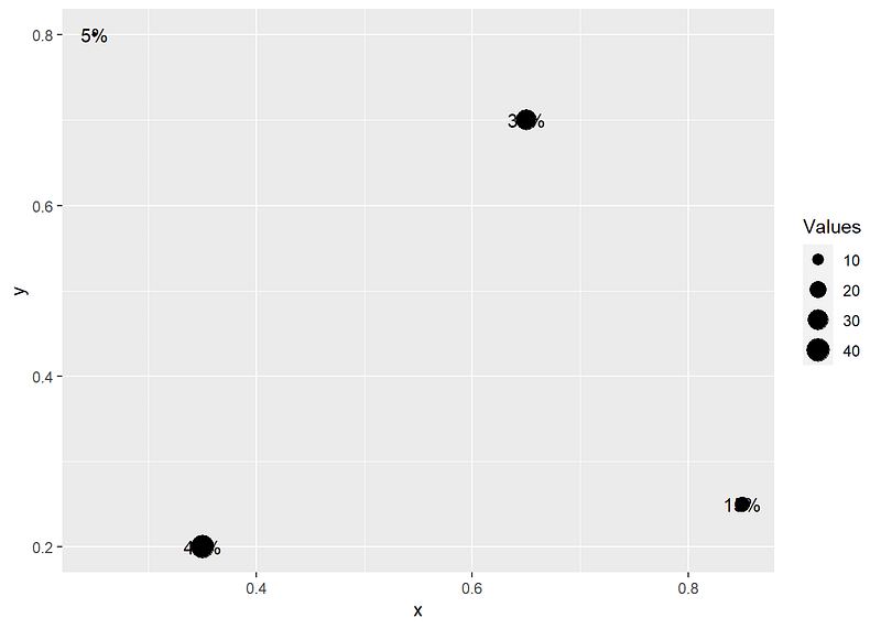
To begin with, I will create a chart with standard theme formats.
# 'ggplot' instantiates the plot
ggplot(
  data = DT, # The main dataset for the plot that other functions can inherit
  # aesthetics
  aes(
         x = x, # Column in dataset with x coordinates
           y = y # Column in dataset with y coordinates
         )) +
  geom_point(
    # aesthetics specific to 'geom_point' function
    aes(
      size = Values # Column in dataset that determines size of the bubbles
      )) +
  geom_text(
    # aesthetics specific to 'geom_text' function
    aes(
      label = scales::percent(Values/100, 1) # Column in dataset to be used for labels. We divide the values by 100 and apply 'percent' formatting from 'scales' library
      ))
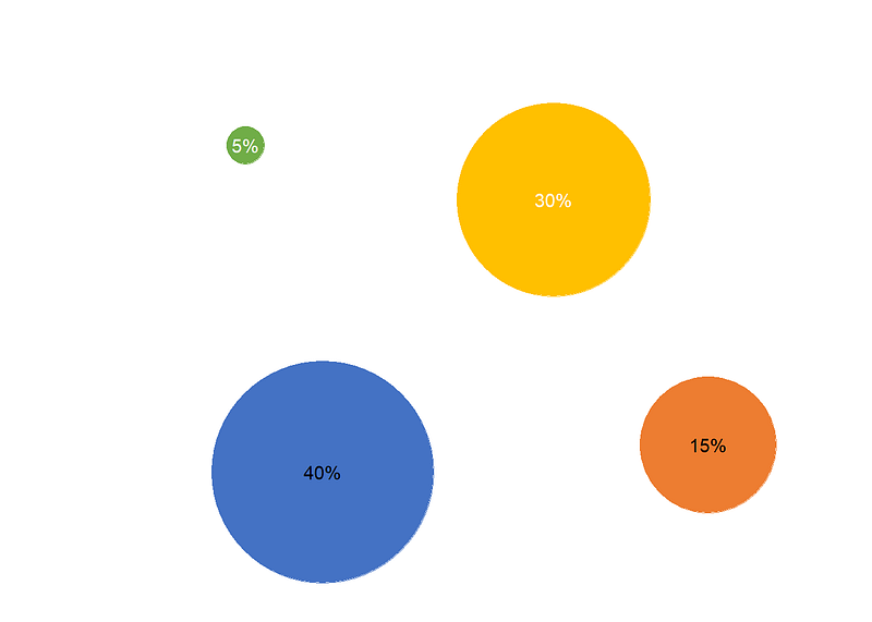
We are getting there but, lots more to be done:
- Extend the limits of x and y axis to be 0 to 1
- The bubble size needs to be bigger
- Apply colors for labels and bubbles
- Get rid of
- x and y axis labels and titles
- legend
- grid lines
ggplot(data = DT,
       aes(x = x,
           y = y)) +
  geom_point(aes(
    size = Values),
    color = DT$fillCol # Column in dataset that has color information
    ) +
  scale_size(
    range = c(10, 60) # Rescales the values so the bubbles are bigger
    ) +
  geom_text(aes(
    label = scales::percent(Values/100, 1)),
    color = DT$fontCol # Column in the dataset that as color information
    ) +
  ylim(0, 1) + # Sets limits of y-axis
  xlim(0, 1) + # Sets limits of x-axis
  theme_minimal() + # preset theme with 'white' background
  theme(
    axis.text = element_blank(), # Remove x and y axis labels
    axis.title = element_blank(), # Remove x and y axis titles
    panel.grid = element_blank(), # Remove major and minor gridlines
    legend.position = "none" # Remove legend
  )
Notice how we specify DT$fillCol instead of fillCol. This is because we are setting the ‘color’ parameter outside of ‘aesthetics’. If we had specified ‘color’ parameter inside of ‘aesthetics’, we would have used fillCol. Depending on where the parameter is set, impacts how it is treated by ggplot. I am not getting into further details as it is beyond the purpose of this article but I do encourage you to try it out.
Alright, our chart looks decent enough.
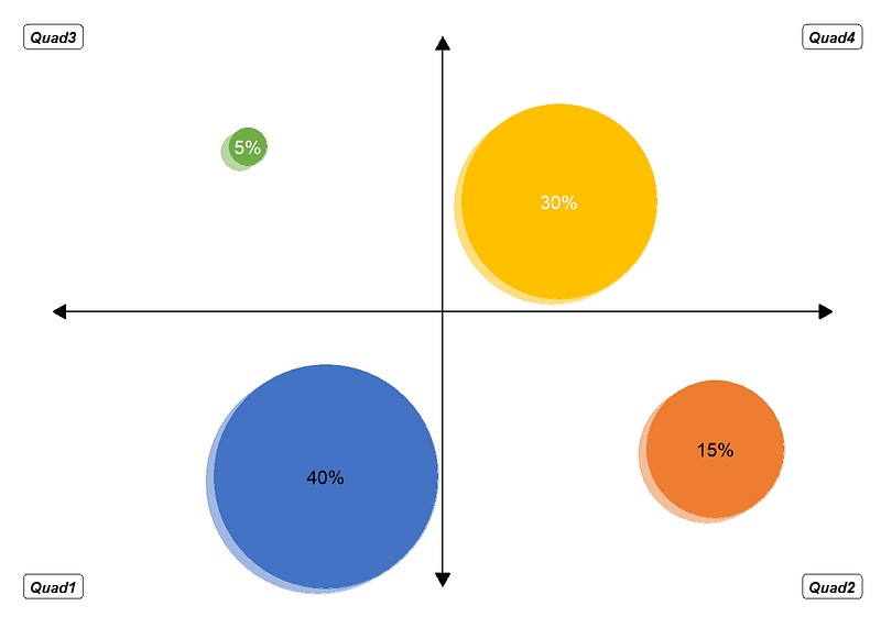
We are getting close. Last few tweaks:
- Add the horizontal and vertical lines with arrows on both ends
- Quad labels
These elements however use different x and y coordinates. For example, the vertical line cuts the plot in half, with the left and right halves being equally sized. So, we can imagine this line connecting (0.5, 0) and (0.5, 1) coordinates. Similarly the horizontal line cuts the plot in half, with the top and bottom halves being equally sized. In this case, we can imagine the horizontal line connecting (0, 0.5) and (1, 0.5) coordinates.
On the same lines, we can imagine the Quadrant labels to have the following coordinates:
- Quad1: (0, 0)
- Quad2: (1, 0)
- Quad3: (0, 1)
- Quad4: (1, 1)
The way to get around this is to supply x and y coordinates in the respective function calls instead of letting them ‘inherit’ this information from the ‘ggplot’ function call.
ggplot(data = DT,
       aes(x = x,
           y = y)) +
  # Vertical line
  geom_line(
    # Dataset for plotting the vertical line
    data = data.table(
      x = c(0.5, 0.5), # x coordinates for the vertical line
      y = c(0, 1) # y coordinates for the verticle line
    ),
    # aesthetics
    aes(
      x = x,
      y = y
    ),
    # draw arrows
    arrow = arrow(
      ends = "both", # arrows required on both ends of the line
      length = unit(0.3, "cm"), # size of the arrow
      type = "closed" # type of the arrow. 'closed' creates an arrows that resembles a filled triangle. 'open' creates an arrows that looks like > or < depending the end of the line
      )
  ) +
  # horizontal line. I am not repeating the comments as they are similar to what we used for creating the 'vertical' line except for the x and y coordinates
  geom_line(
    data = data.table(
      x = c(0, 1),
      y = c(0.5, 0.5)
    ),
    aes(
      x = x,
      y = y
    ),
    arrow = arrow(
      ends = "both",
      length = unit(0.3, "cm"),
      type = "closed"
      )
  ) +
  geom_point(aes(
    size = Values),
    color = DT$fillCol) +
  scale_size(range = c(10, 60)) +
  geom_text(aes(
    label = scales::percent(Values/100, 1)),
    color = DT$fontCol) +
  # Label for quadrants
  geom_text(
    # Dataset used for labeling the Quadrants
    data = data.table(
      Quad = DT$Quad, # We pull the quardrant labels from 'Quad' column of 'DT' dataset
      x = c(0, 1, 0, 1), # x coordinates
      y = c(0, 0, 1, 1) # y coordinates
    ),
    # aesthetics
    aes(x = x, y = y, label = Quad)) +
  ylim(0, 1) +
  xlim(0, 1) +
  theme_minimal() +
  theme(
    axis.text = element_blank(),
    axis.title = element_blank(),
    panel.grid = element_blank(),
    legend.position = "none"
  )
We define the ‘geom_line’ functions to create the vertical and horizontal lines before calling the ‘geom_point’ so that the bubbles are plotting over the lines and not the other way around. Notice how the ‘yellow’ bubble in ‘Quad4’ overlaps the horizontal line. If we had called ‘geom_line’ after ‘geom_point’ the horizontal line would have overlapped the ‘yellow’ bubble.
Can we make it even more fancier? Maybe,
We can add another bubble plot to add-in shadow effect. This can be achieved by simply replicating the code that generates the bubble plot and altering the x and y coordinates by a small margin, and then relying on the ‘alpha’ parameter of ‘geom_point’ to add transparency.
ggplot(data = DT,
       aes(x = x,
           y = y)) +
  # Vertical line
  geom_line(
    # Dataset for plotting the vertical line
    data = data.table(
      x = c(0.5, 0.5), # x coordinates for the vertical line
      y = c(0, 1) # y coordinates for the verticle line
    ),
    # aesthetics
    aes(
      x = x,
      y = y
    ),
    # draw arrows
    arrow = arrow(
      ends = "both", # arrows required on both ends of the line
      length = unit(0.3, "cm"), # size of the arrow
      type = "closed" # type of the arrow. 'closed' creates an arrows that resembles a filled triangle. 'open' creates an arrows that looks like > or < depending the end of the line
      )
  ) +
  # horizontal line. I am not repeating the comments as they are similar to what we used for creating the 'vertical' line except for the x and y coordinates
  geom_line(
    data = data.table(
      x = c(0, 1),
      y = c(0.5, 0.5)
    ),
    aes(
      x = x,
      y = y
    ),
    arrow = arrow(
      ends = "both",
      length = unit(0.3, "cm"),
      type = "closed"
      )
  ) +
  # Create another set of bubbles to add shadow effect
  geom_point(aes(
    x = (x - 0.01), # x coordinates from the 'DT' dataset are shifted by 0.01
    y = (y - 0.01), # y coordinates from the 'DT' dataset are shifted by 0.01
    size = Values),
    color = DT$fillCol,
    alpha = 0.5 # makes the bubbles transparent
    ) +
  geom_point(aes(
    size = Values),
    color = DT$fillCol) +
  scale_size(range = c(10, 60)) +
  geom_text(aes(
    label = scales::percent(Values/100, 1)),
    color = DT$fontCol) +
  # Label for quadrants
  ## Geom label is essentially same as 'geom_text' except that it adds a background to the text.
  geom_label(
    # Dataset used for labeling the Quadrants
    data = data.table(
      Quad = DT$Quad, # We pull the quardrant labels from 'Quad' column of 'DT' dataset
      x = c(0, 1, 0, 1), # x coordinates
      y = c(0, 0, 1, 1) # y coordinates
    ),
    # aesthetics
    aes(x = x, y = y, label = Quad),
    size = 3, # Size of the labels
    fontface="bold.italic" # Make the font bold and italic
    ) +
  ylim(0, 1) +
  xlim(0, 1) +
  theme_minimal() +
  theme(
    axis.text = element_blank(),
    axis.title = element_blank(),
    panel.grid = element_blank(),
    legend.position = "none"
  )
Recap
In this article, we covered:
- Intro to ggplot
- Concept of layering
- Key functions — ggplot, geom_point, geom_line, geom_text
- How to supply data, aesthetics and other function parameters
- Controlling different aspects of the plot like ‘axis labels’, ‘axis titles’, ‘gridlines’, ‘legend’ through ‘theme’
Leave a comment if you found this article useful and have any feedback. Happy learning 👍.


