
Fade to Black…and White
Color me curious
Are black and white colors? This question was asked and answered in a brief but engrossing Britannica.com article I read recently. The answer is yes and no! As I understand it, white is all the colors of light together; black is the absence of light. Yet, in the manner humans perceive color (the article describes it succinctly), black and white have a rightful place in our crayon box!
And in our photography. When I was a young man 70 years ago, there was no choice. It was black and white or nothing — at least for young hobbyists with home darkrooms. Developing and printing color eventually became available, but by then I was devoted to black and white.
It was still my preferred medium twenty years later for Isla de Mona, an exhibition of my photos of the remote Caribbean island. Although virtually all my work for both fun and profit has been in color since then, I returned for my book Tropical Color In Black & White (now also a Medium story).
So why does it attract me? Maybe because it both simplifies and complicates images. It forces the eye to ignore color and focus on form, light, shadows, textures, shapes, moods — the whole rather than a part. A black and white photo is not necessarily a better photo, but it is a different photo.
I specifically have chosen from my travel photos for the examples below. They are typically colorful: the eye goes toward the crayon box, and they are usually serendipitous —there’s no time to plan. The color version is what we like to remember. The “colorless” version shifts the eye toward the structure, the form, the architecture of the scene.
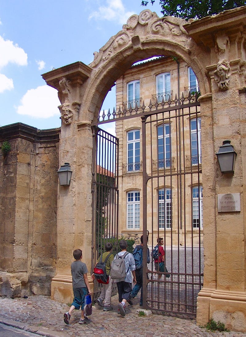
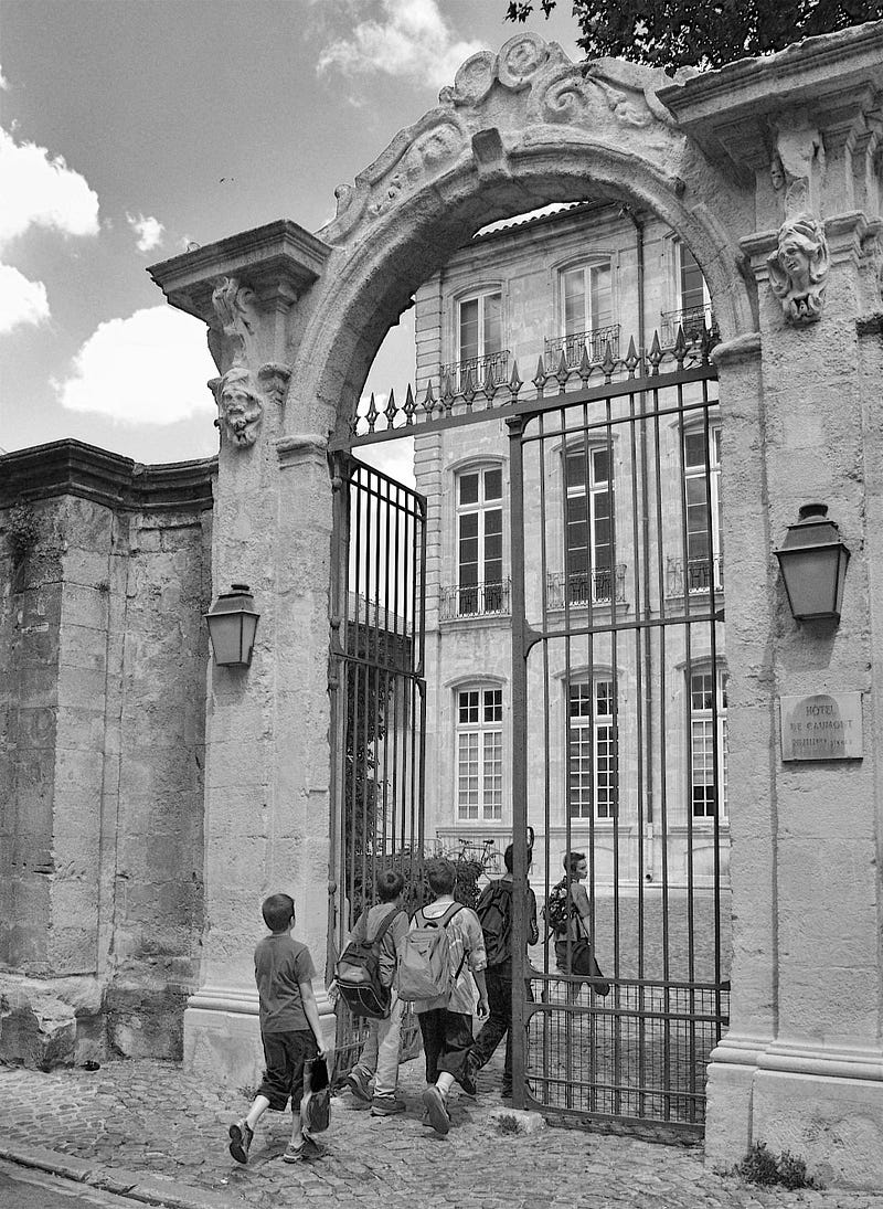
“A black and white photo is not necessarily a better photo, but it is a different photo.” My eye goes to the boys as the center of attention in the color photo. In the monochrome, it shifts to the school — a former hospital. I notice the sign, the whole of the scene, the framing of the arch.
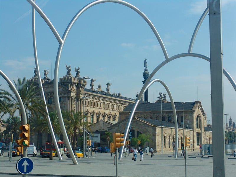
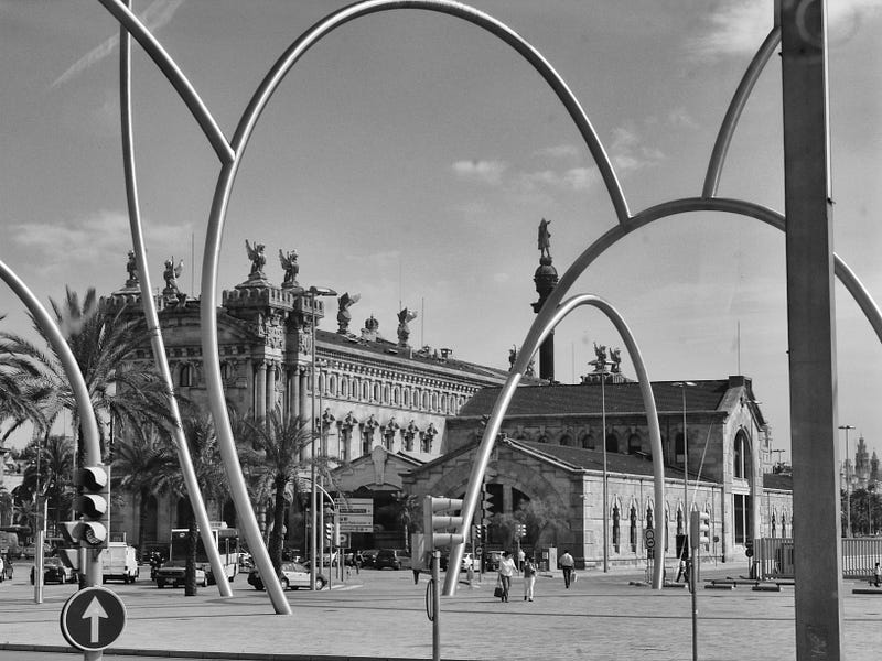
My first photo upon arriving in Barcelona was sort of bland, even with the flair of the sculptural hoops. I believe the black and white version adds life to it, so — in spite of my resisting the word — for me it is a “better” photo. By neutralizing the traffic lights and vehicles, it lets the eye go directly to the unique buildings, which stand out against the grayed sky.
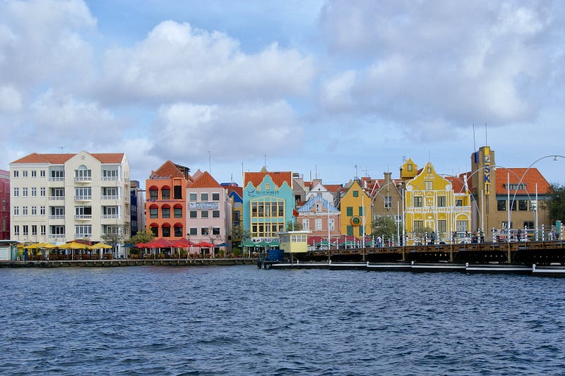
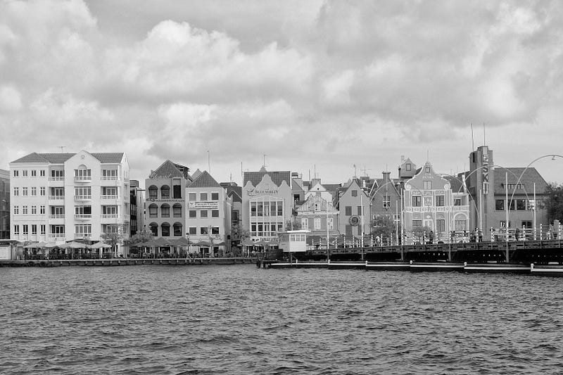
The opposite may be true of this view of Willemstad on the Caribbean island of Curaçao: color makes the photo. The colorless version is now the bland one: even the Dutch architecture does not rescue it — it needed the crayons and that sky and sea!
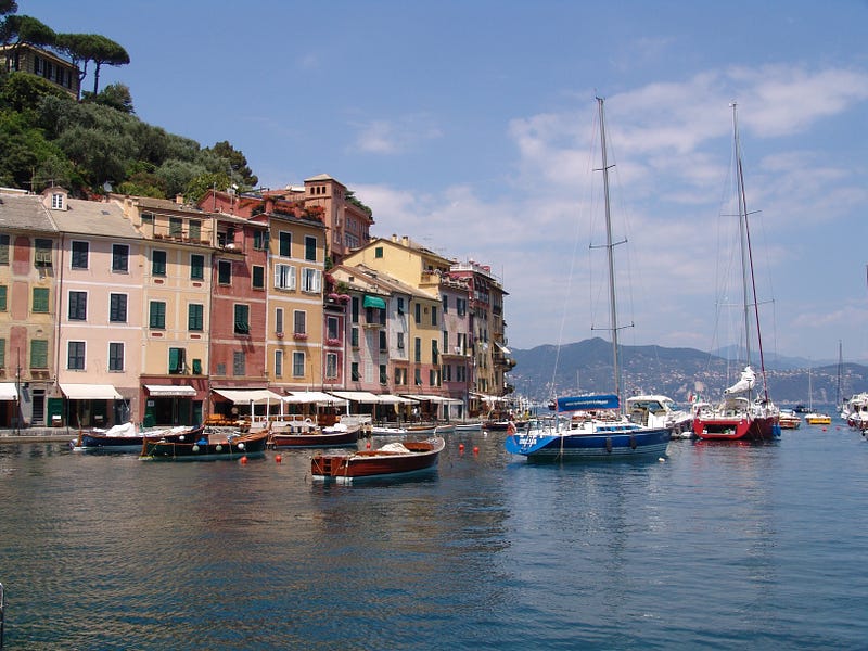
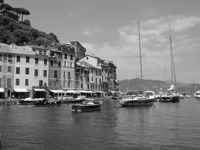
We all know that “Beauty is in the eye of the beholder.” I find the black and white version of the Portofino photo more interesting — and more memorable — than the full color version. My eye doesn’t linger on the different colored boats and buildings but travels through the entire scene. It may be just me, of course.
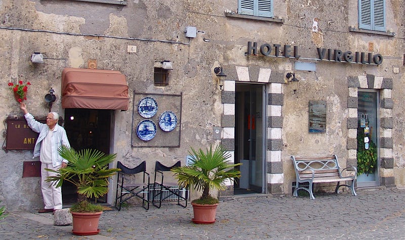
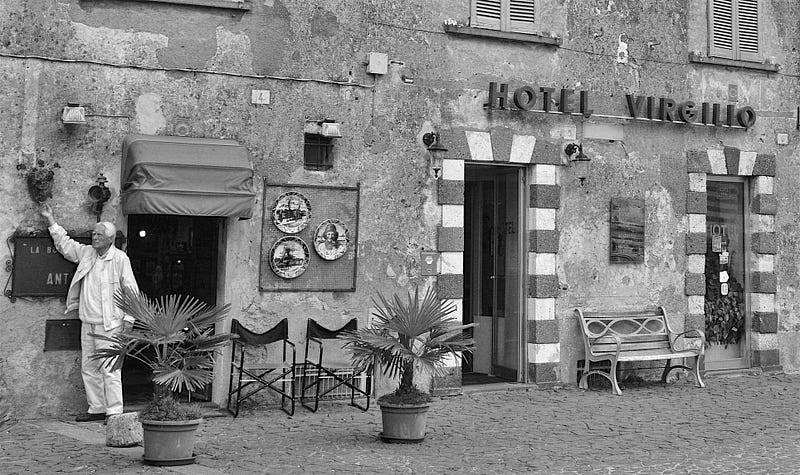
I captured this scene in the medieval section of Oviedo, Spain. In the left photo, the colors of the plates and plants draw my attention directly to the gentleman with the bouquet of flowers — and that makes me smile. In the black and white version, the man with the flowers no longer captures my attention, although I find the old building and the details interesting. One version is not “better” than the other: it is simply different. (If I had to choose, I’d take the roses!)
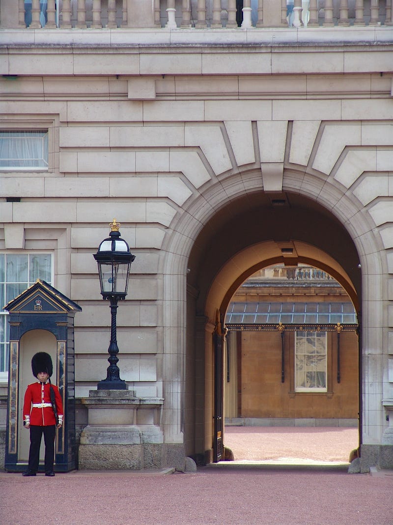
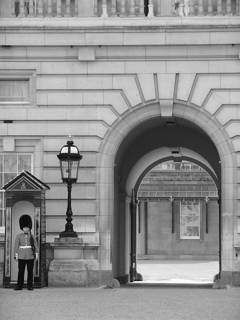
This photo is probably a cliché. Who goes to London and doesn’t take a photo of the colorful guards at the royal palace? I was surprised at the youth of this one — if you see his face you can see he appears to be hardly a teen. I like the way the black and white photo plays down the red of his uniform and those annoying blue things in the archway. You can concentrate on his face better, as a result (zoom in on the kid!). However, as the Spanish say, “For the tastes, God made the colors.”
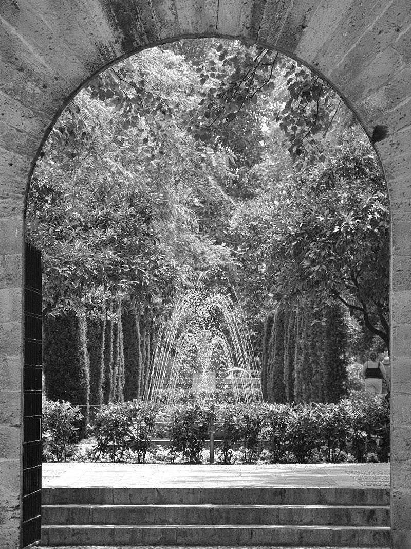
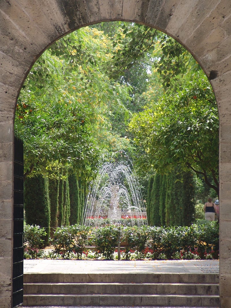
This is a hard one. Two very different effects: the left photo lets me take in the whole vista — a characteristic of most monochrome photos. It contrasts light and shadow, the several textures of the flora, and the symmetrical streams of water. On the right, my eye goes directly to the row of red flowers behind the fountain. Color defines (pleasantly enough!) that photo.
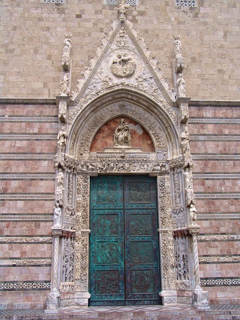
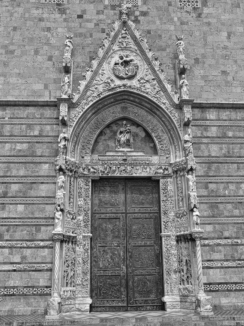
This is a toss-up…with the color version predominating in my view. I found this church in Sicily and its rococo ornaments fascinating, but the tarnished bronze on the metal door attracted me most. (Unfortunately, it is hard to see the relief figures on it in either photo.) If it were not for that pleasing patina, my favorite would be the black and white version because of its texture and greater overall detail.
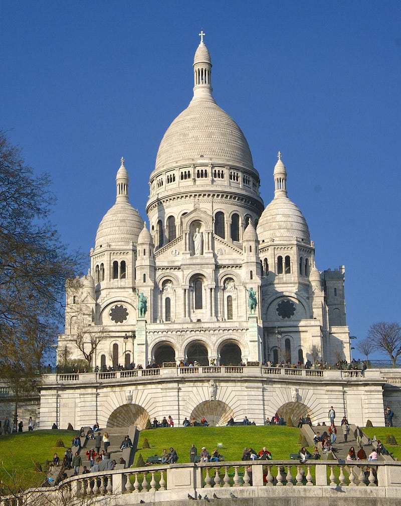
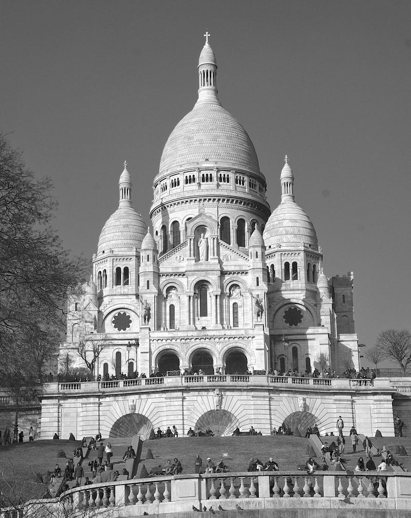
Last but not least is my capture of the Basilica of the Sacred Heart of Montmartre in Paris. None of my travel photos were planned — they were taken at the time I happened to be at a place. Here I lucked out: there was wonderful sunlight illuminating the facade of the basilica at a slight angle (note the shadow on the right tower)…and a brilliant blue sky. I like the way the monochrome version minimizes attention on the crowds, especially on the lawn and stairs, and on the sky. My eye goes right to the Neo-Byzantine-Romanesque basica. C’est Magnifique!
What are your thoughts on photos in (living) color or in black and white? I welcome your comments!
For (plenty) more of my photo essays, please visit:


