
6 Ways To Configure Global Styles for Storybook
A detailed guide for better use of Storybook
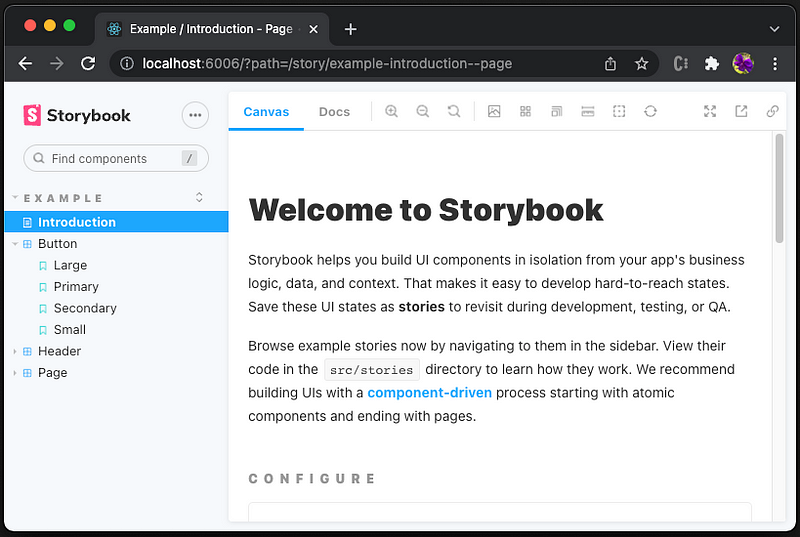
Storybook is an open source tool for building UI components and pages in isolation. This allows us to work on one component at a time. It streamlines UI development, testing, and documentation.
We have written about Storybook and its features — zero-configuration setup, dynamic component editing, multiple Storybook composition, and documentation improvement.
It is a common task to configure global styles for Storybook, such as background color, color, font family, and font sizes. In this article, we use setting the background color as an example to accomplish the task in 6 different ways. To differentiate the solutions, each way sets a unique background color. In the process, we see which method takes the higher precedence.
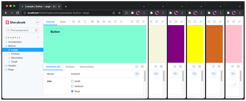
- Pink background: Use stylesheet in
preview-head.html. - Chocolate background: Configure
previewHead in main.js. - Yellow background: Import stylesheet in
preview.js. - Purple background: Configure
previewBody in main.js. - Beige background: Set style inside
preview-body.html. - aquamarine background: Configure decorator in
preview.js.
Let’s go into the details on how each method works.
Set up Storybook in Create React Environment
We use Create React App as a base to explore Storybook. The following command creates a React project:
npx create-react-app react-storybook
cd react-storybook
Type the command, npx sb init, and Storybook is installed.
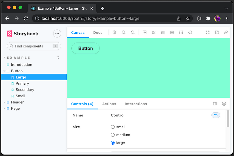
Type the command, npm run storybook, and the example Storybook runs at http://localhost:6006.
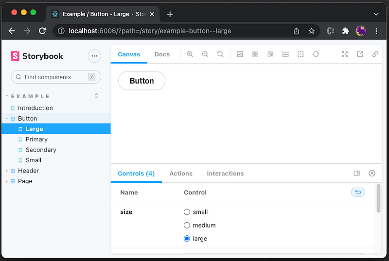
By default, the background color is white. We want to configure it to a different color, without going to each story to set it.
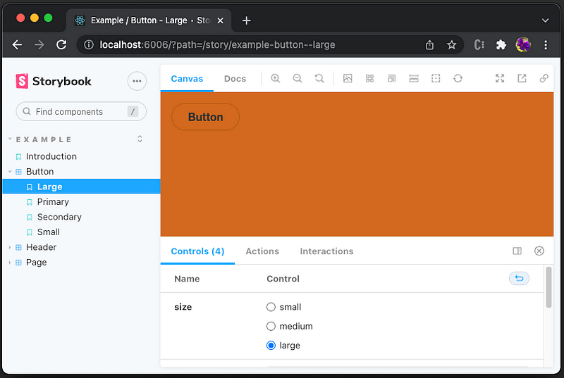
Pink Background: Use Stylesheet in preview-head.html
In Storybook, stories are rendered in a particular “preview” iframe (the Canvas tab). The Storybook web application reads .storybook/preview-head.html if it exists, which directly controls the <head> element in the rendered HTML.
Create .storybook/preview-head.html as follows:
Line 1 defines the <link> element for an external resource, stylesheets or site icons. href specifies the URL of the linked resource, which is defined as public/style.css:
Restart the Storybook, and we see the background is changed to pink.
We can verify that the global style changes have been applied to every story.
However, the style change does not apply to any document page.
This is the expected behavior. For every story, selecting the Docs tab, we can verify that the markdown page is not impacted by story styling.
Well, we put a story into src/stories/introduction.stories.dx.
The document is automatically converted to a story. Then, the Canvas tab shows the pink background.

Chocolate Background: Configure previewHead in main.js
Inside the .storybook folder, there is a file named main.js, which controls the Storybook server’s behavior. This configuration file is a preset and has an interface to control stories, addons, webpackFinal, babel, framework, etc.
Here is the default content of .storybook/main.js:
It is also possible to modify the preview head HTML programmatically using a preset defined in the main.js file.
Lines 16–23 are added to overwrite the existing previewHead with the chocolate background.
Since the style element (lines 18–22) is placed after the existing head (line 17). The new style overwrites the existing styles in head.
Restart the Storybook, and we see the background is changed to chocolate.
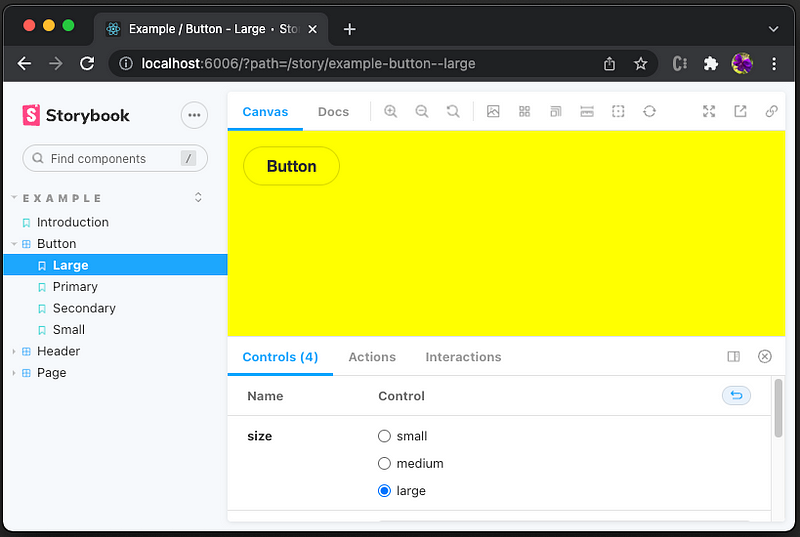
Yellow Background: Import stylesheet in preview.js
Inside the .storybook folder, there is a file named preview.js, which sets the global setting for decorators, parameters, and global types.
Here is the default content of .storybook/preview.js:
Create the stylesheet, .storybook/style.css:
Import this style file into .storybook/preview.js (line 1):
This import has higher precedence than the head styling.
Refresh the Storybook, and we see the background is changed to yellow.
Purple Background: Configure previewBody in main.js
Similar to previewHead, we can modify the preview body HTML programmatically using a preset defined in the main.js file.
It is recommended to have the CSS declared before <body> starts. Therefore, the styling should be set in previewHead, instead of previewBody.
However, it still works. The browser re-renders the page when the body styles are parsed.
Here is the modified ./sotrybook/main.js:
Lines 24–31 are added to overwrite the existing previewBody with the purple background.
Since the CSS should be declared before <body> starts, the style element (lines 25–29) is placed before the existing body (line 30).
Restart the Storybook, and we see the background is changed to purple.

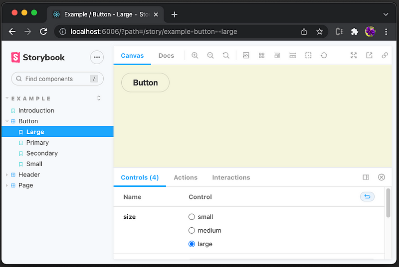
Beige Background: Set Style Inside preview-body.html
Similar to preview-head.html. The Storybook web application reads .storybook/preview-body.html if it exists, which directly controls the <body> element in the rendered HTML.
As we have said, the styling should be set in head, i.e. preview-head.html, instead of preview-body.html.
However, it still works.
Create .storybook/preview-body.html as follows:
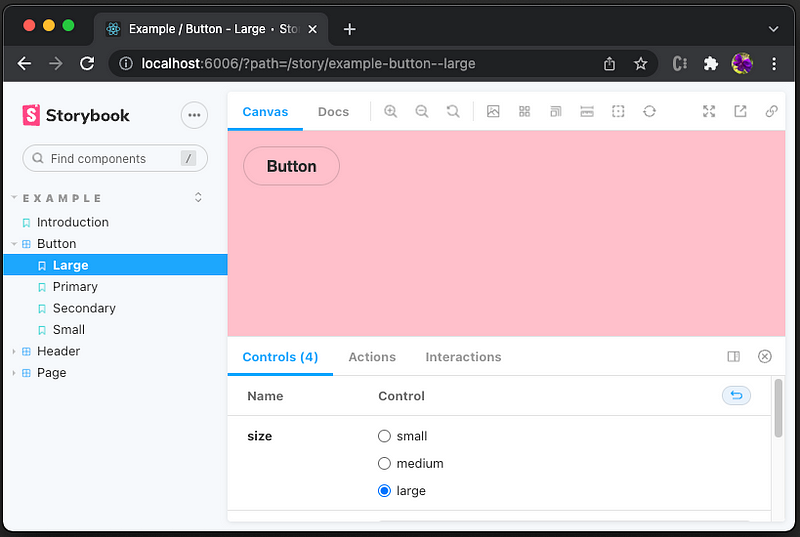
Restart the Storybook, and we see the background is changed to beige.
Aquamarine Background: Configure Decorator in preview.js.
A decorator is a way to wrap a story in extra “rendering” functionality. Naturally, we can use a decorator to wrap stories with additional styling, extra markup, context mocking, or anything.
Here is the modified ./storybook/preview.js:
Lines 13–17 define the decorator, withBackground, which defines the html background color (line 14) and body background color (line 15). Since this is an HOC (High Order Component), there are many possible ways to set styling.
Line 19 configures decorators with withBackground.
Refresh the Storybook, and we see the background is changed to aquamarine.
Conclusion
We have gone through 6 ways to configure global styles for Storybook. Different background colors are used to show the precedence of these solutions.
During the process, we have looked at main.js, preview.js, preview-head.html, and preview-body.html. Among these files, it is preferred to set styles in head, instead of body. In this way, styles are loaded earlier to avoid a possible blank screen before the CSS is rendered. Also, it avoids the browser re-rendering the page when the styles declared in body are parsed.
There are different ways to style a Storybook, imports, desecrators, link elements, and style elements. Among them, we prefer the imports way. It imports a global style file in preview.js. It is simple, and the changes are live-loaded to the Storybook (only need refresh, instead of restart).
Which way to pick? It depends on the specific Web application and personal preference. After all, there are 6 ways to choose from.
Thanks for reading. I hope this was helpful. If you are interested, check out my other Medium articles.
Note: Thanks, Taylor Laubach and Sebastian Kessel, for assigning me the task to configure global styles for Storybook.


