
Design a Dribbble-like UITabBar in iOS App Using Swift 5
Create beautiful UIs for your UITabBar on iOS — Part 1
Who else is bored of the same old tab bars?
Yes, yes, I know: we still need them for navigation. I know they are more catchy than navigation bars, for sure. Chances are, users will likely not mind a plain design if your app is great. But… what stops it from being great-er?
The thing is, I’ve seen round-cornered tab bars for a few years now and I still get excited when I see one. So when the time came for me to develop my own stuff, I thought, why not make my own version?
Still reading? Means you’re ready to take this step too! Read on to implement this on your app, and if you’re just practicing, download the starter material here and work with me on my sample app!
Ready, set, go!
Premise: the sample app
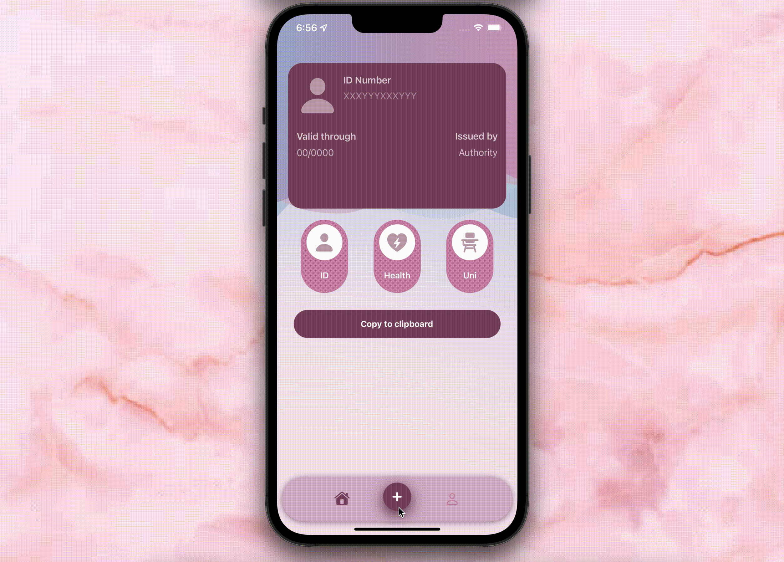
Some government-issued services nowadays will ask for our personal documents’ details before proceeding with any request online. Driver’s license number, ID’s expiry date, health care card issuer. And I’m fine with it, but do I really have to get off the couch and find my wallet for that? In 2022? Sounds like a problem worth fixing.
Step 1: Create the tab bar
On the storyboard, select the view controller. Open the Editor menu and pick Embed in > Tab Bar Controller.
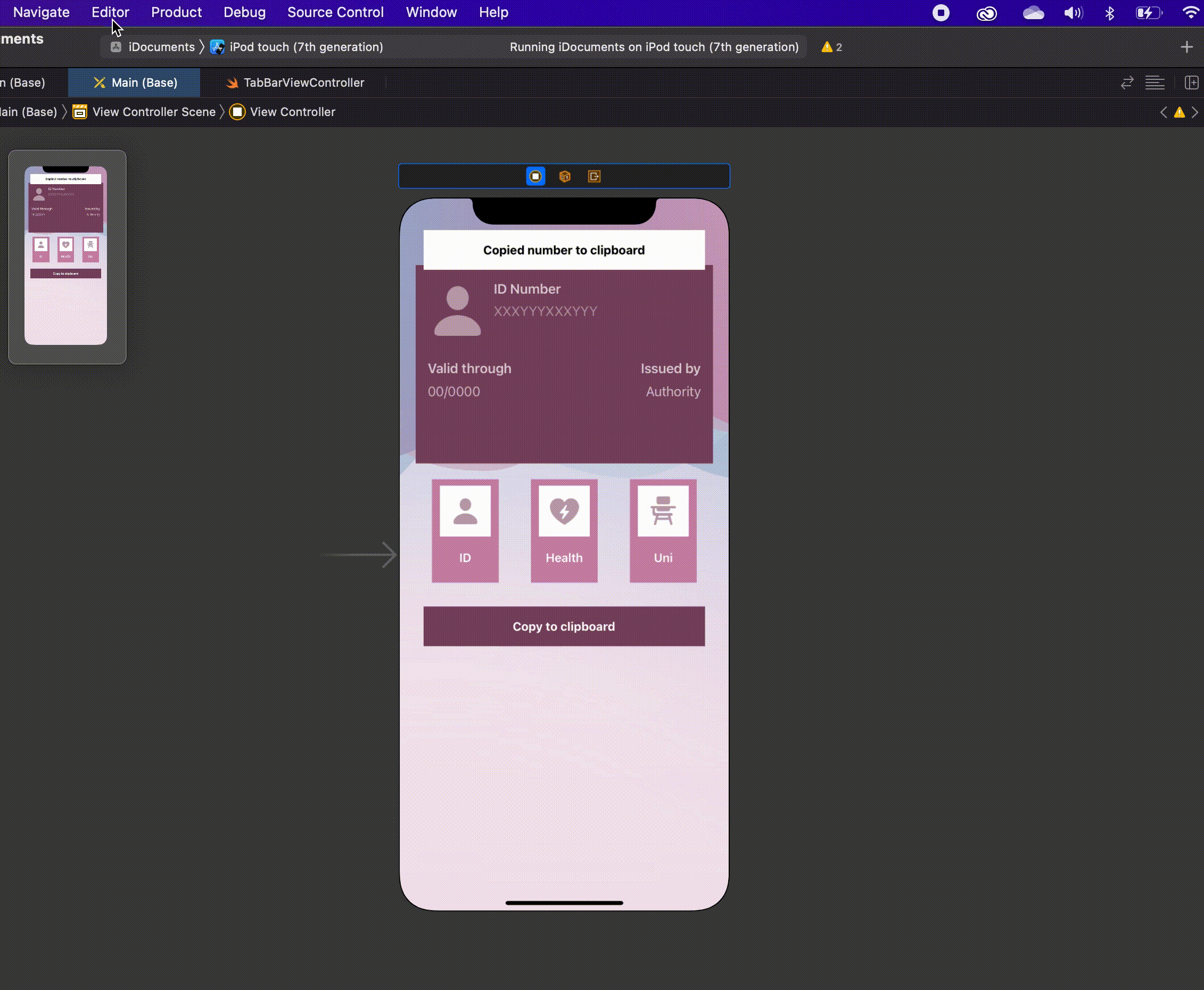
Select the Tab Bar View Controller and connect it to our TabBarViewController() class that I already created in my sample app. If you are working on your own project, you can download the class from the GitHub starter project here.
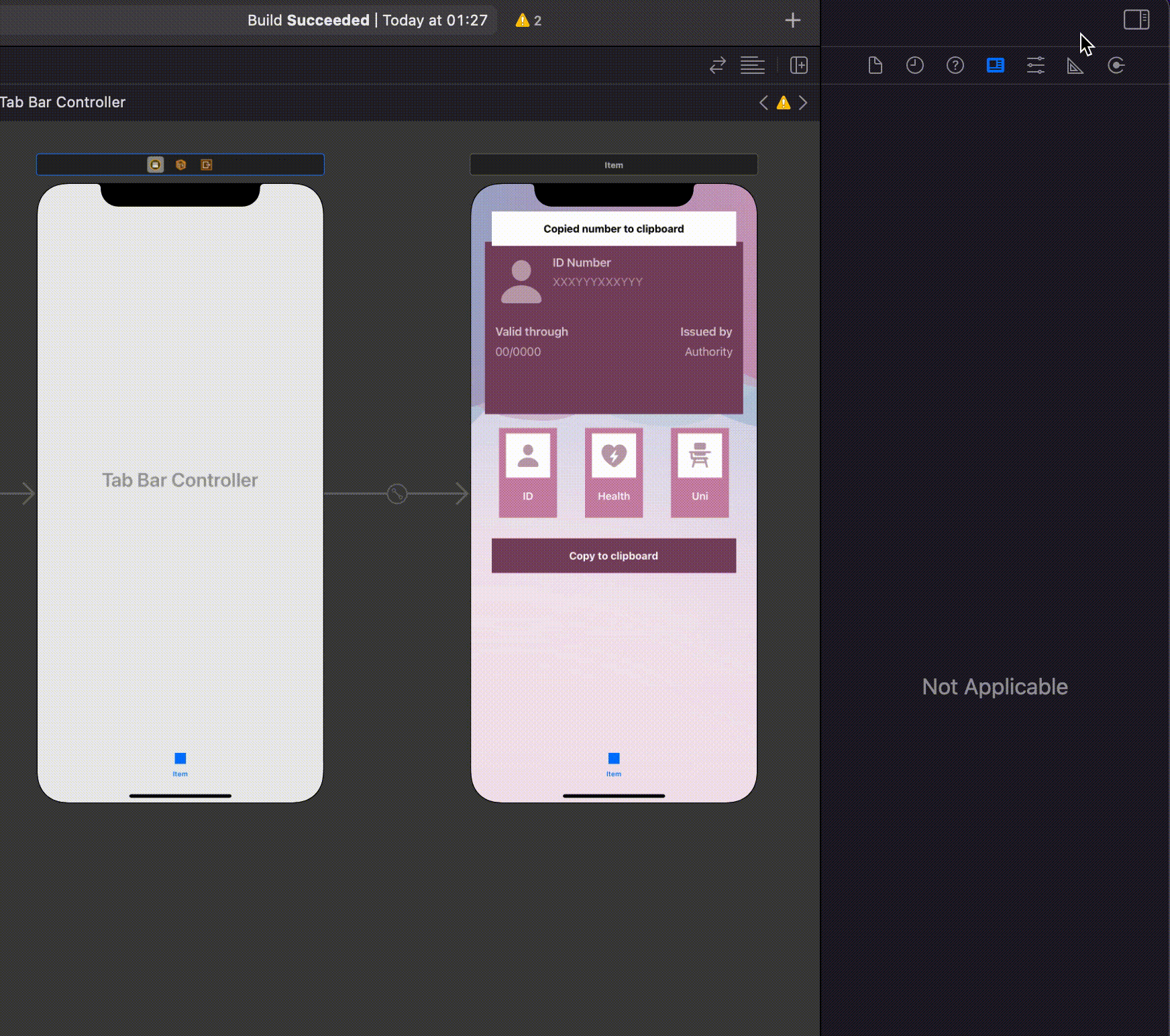
Now that we have our tab bar, it’s time to add some items to it and connect them to the corresponding views. To do that, you need to add the remaining number of view controllers to our Storyboard. I will add two so my tab bar has a total of three items:
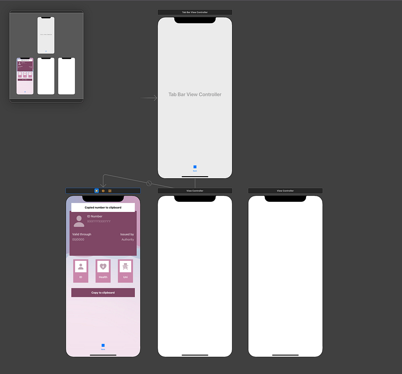
Click on the Tab Bar View Controller and ctrl-drag to the new view controllers, one by one. Then, select Relationship Segue > View Controllers.
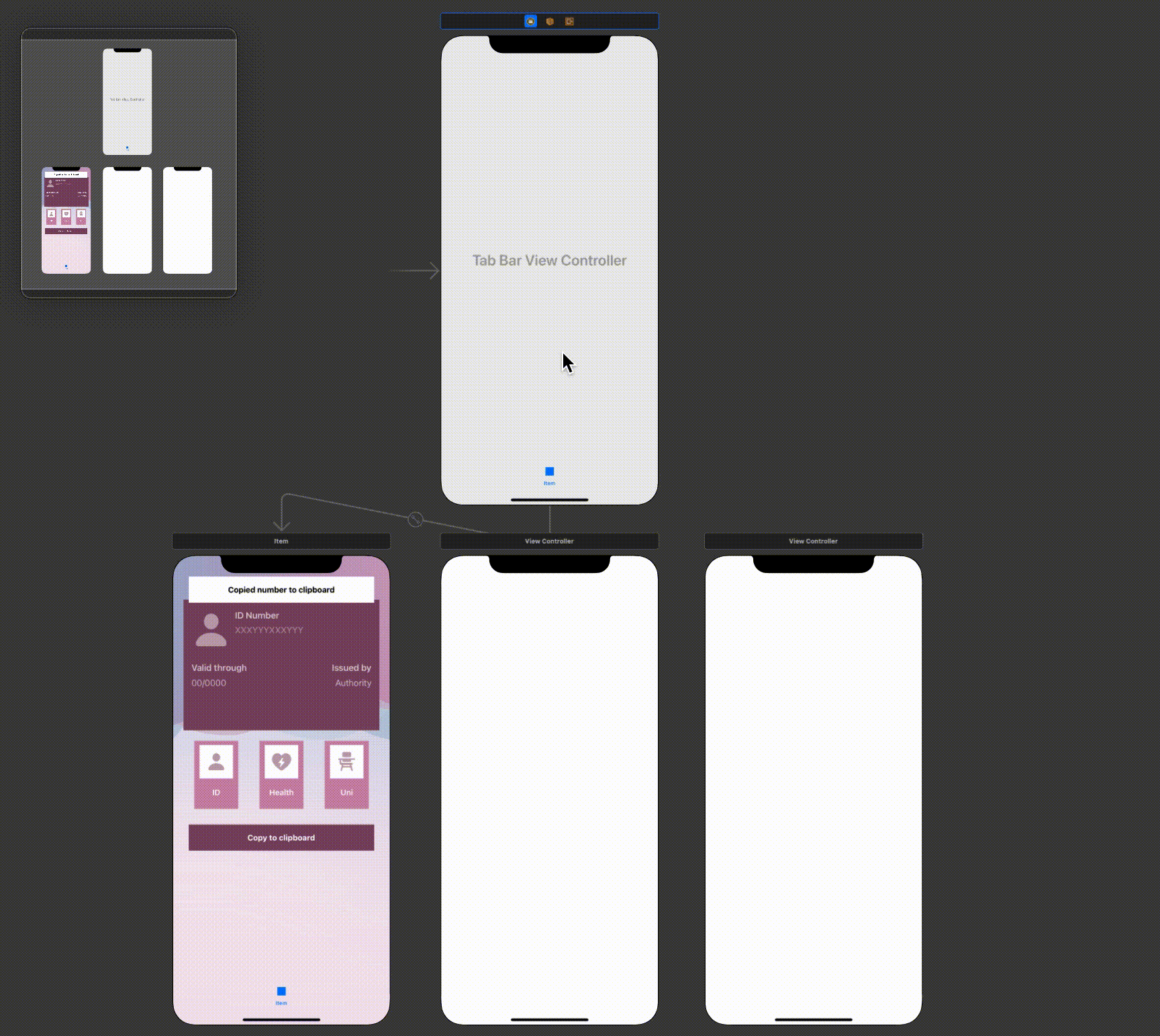
Step 2: basic styling for our tab bar
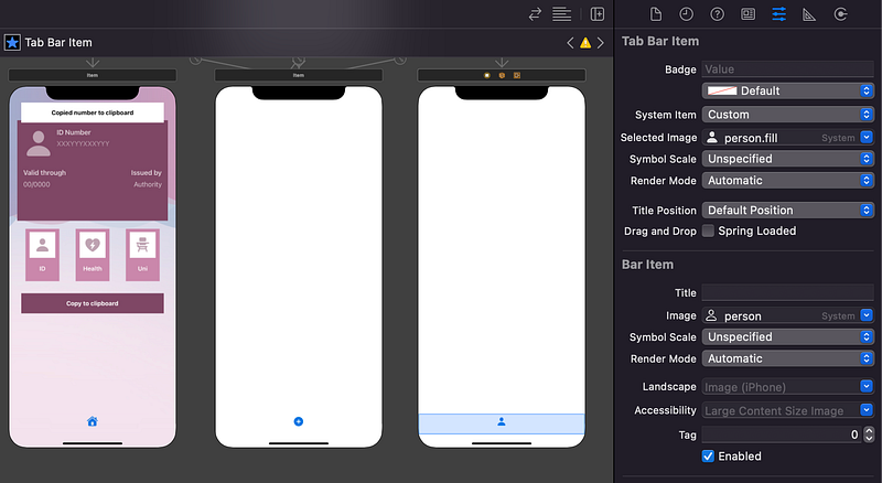
Once every view controller is connected, I will select an image for each tab bar item. For my sample app, I will use the following:
- system’s
houseimage for my first view controller, serving as a Home Screen, and system’shouse.fillfor when it is on selected state; - system’s
plusimage for my second view controller, which will be where the user will add a card, and system’splus.circle.fillfor when it is on selected state; - system’s
personimage for my third view controller, which will be the user’s information and profile, and system’sperson.fillfor when it is selected.
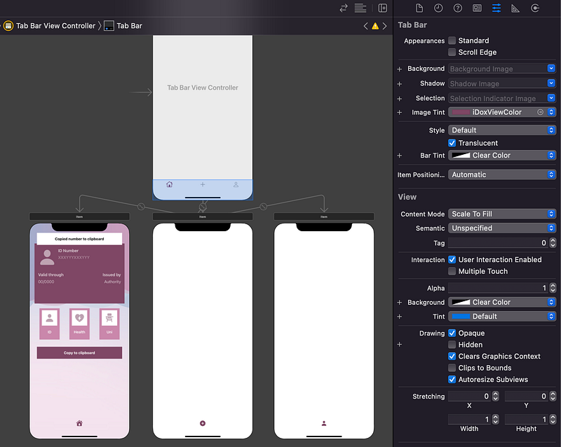
But what’s with that blue colour? Let’s change it to a better one by selecting the Tab Bar on the Tab Bar View Controller and selecting an Image Tint that matches our app’s colour. For my sample app, I selected:
iDoxViewColorfrom my assets as Image Tint,- Clear Color for my Bar Tint,
- Clear Color for my Background colour.
Run the app and make sure you have the result you were looking for. You should see something like this now:
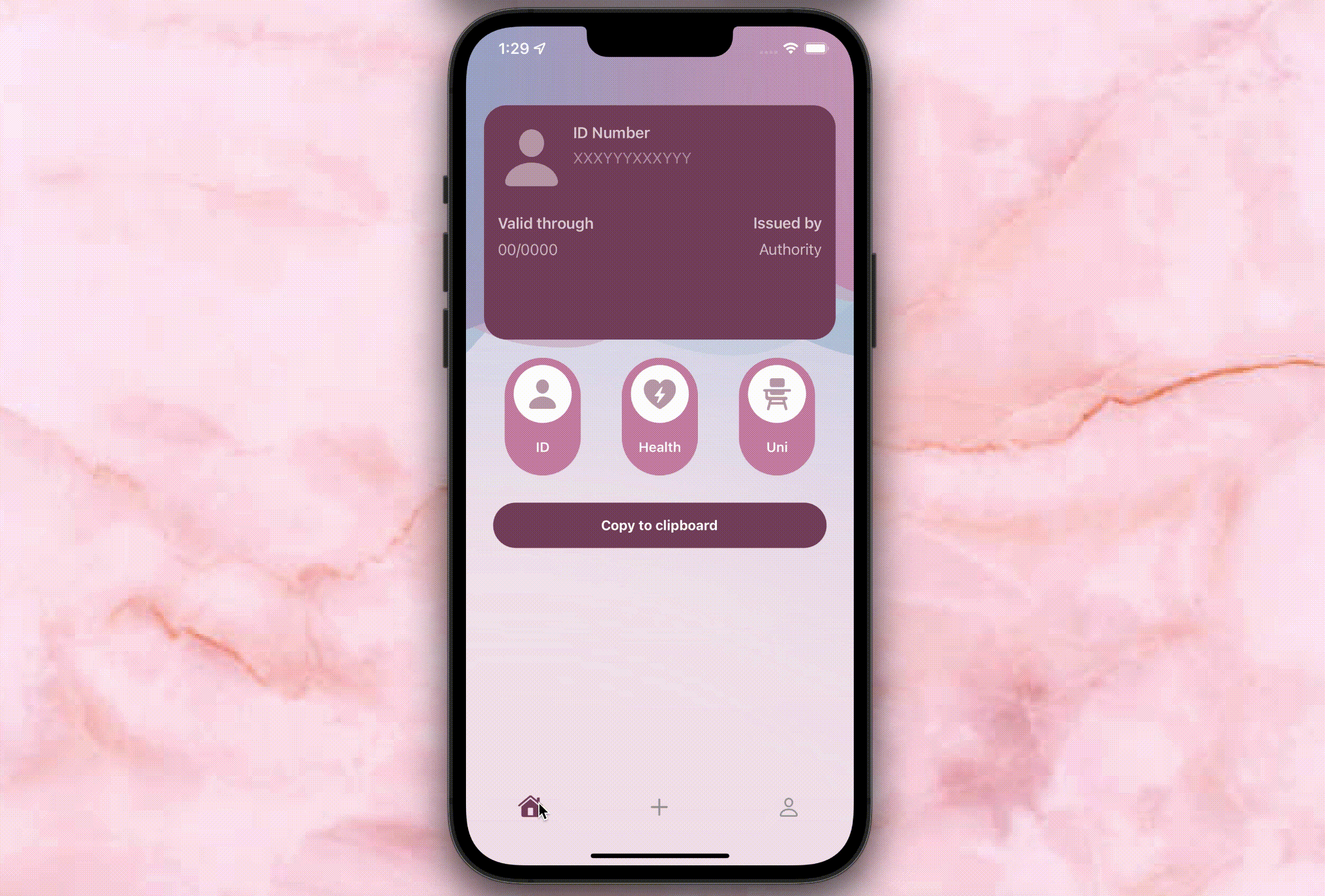
Now it’s time to make our tab bar look even cuter!
Step 3: creating the rounded tab bar effect
Since editing the tab bar’s edges to make them look rounded was almost an impossible task, the easiest way to create a rounded tab bar effect is by using a CAShapeLayer().
We will start by creating one in our TabBarViewController() class:
let layer = CAShapeLayer()Also create a layerHeight property that we will use in part 2 to position our custom middle button inside the tab bar:
var layerHeight = CGFloat()In my sample app, I set a number of colours that I will use in my tab bar. I will create a reference to them in order to access those specific colours more easily. My idea is to have:
- a background colour, which will be the colour for your tab bar;
- a secondary colour, for the unselected items of your tab bar (unless you want them to be automatically grey);
- a third colour that will be used as the shadow of the tab bar (if you want one).
It will look like this in my class:
let bgColor = UIColor(named: “iDoxLightColor”)
let sColor = UIColor(named: “iDoxAccentColor”)
let tColor = UIColor(named: “iDoxShadowColor”)
Now it’s time to give a shape to our layer. To make it look exactly like the one in the first picture, I used the following guidelines:
- the x position, namely the layer’s distance from the left edge of the screen, should be set to 10;
- consecutively, the width of the layer should be the same as the screen, minus 20 (so the distance to the right side of the screen will also be 10);
- the y position, namely the layer’s distance from the top of the screen, should correspond to the original tab bar’s y position, minus 20;
- the height of the layer should be the same as the tab bar’s height, plus 30.
I also added:
- a shadow, using the third colour I referenced above;
- items width and positioning to make them more centred;
- a colour for the unselected items, using the secondary colour.
Finally, I memorised the layer’s height as the layerHeight property. We will need to access it later to set the constraints to our custom middle button of the tab bar.
I put everything in one function called setUpTabBar() like this:
This function will be called in our TabBarViewController()class inside the viewDidLoad() function:
Run your project and you should see something like this:
Ta-dah! Looking nice already!
This is already a lot of stuff, I know, but the tutorial continues with instructions as to how to add a middle button to our tab bar! Are you ready?
Then head over to the part-2 from here:
Did you enjoy this tutorial? Did it work well with your project? Let me know your feedback!
Want to Connect?Follow me on…
❤️ YouTube
💖 Dribbble
💜 Instagram
💙 Ko-Fi
🖤 GitHub


