
How to create outstanding animated scatter maps with Plotly and Dash
Animated maps in Plotly can be tricky to configure. In this tutorial, you will learn how to proceed, step by step, and realize a scatter map to follow the Covid pandemic all over the world, day after day.
Maps in Dash
Dash is a Python framework built on top of Flask and Plotly, designed to make data-driven web applications. Thanks to Plotly it provides some basic charts such as histograms and pie charts, and it also comes with a multitude of highly customizable controls such as dropdowns, checkbox, date sliders, and many more.
To build an app you can combine all of these controls and charts in one or more tabs. But when it comes to map drawing, it gets touchy. Plotly has some basic built-in maps plots: enough to show data, but not as nice as 2020 web maps should be. To tackle that weakness, Plotly made a partnership with Mapbox. Together they provide a great service.
Today we’ll see how to use Mapbox with Plotly within a dash application, and how to create animated scatter maps.
As this post is written in April 2020 during the coronavirus pandemic, I suggest working with Covid-19 Open Data to discover scatter maps.
Register to Mapbox
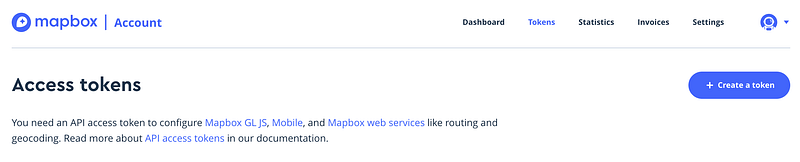
Some Mapbox representations require a token, and Scatter Maps is part of these. Don’t worry, this easy and free.
Go to www.mapbox.com and create an account. For this step, you only need an email for account verification. When it’s done you get your token on the “Tokens” page and clicking on the “Create a token” button.
With this token, you can draw 50000 maps/month for free. By the end of the article, we’ll see how to store maps and minimize the number of requests needed.
It is common to store this information in a separate file from scripts. A usual way to do is using a *.ini file for storing, and then the python built-in configparser module for accessing it.
config.ini
[mapbox]
secret_token=your-token
any_file_needing_token.py
import configparser
config = configparser.read('config.ini')
mapbox_token = config['mapbox']['secret_token']
Create the Scatter Map
Loading data
As mentioned before, we’ll work with Covid pandemic data. We’ll use the dataset from Hopkins University which is updated on a daily basis during the crisis. It is available on opendatasoft.
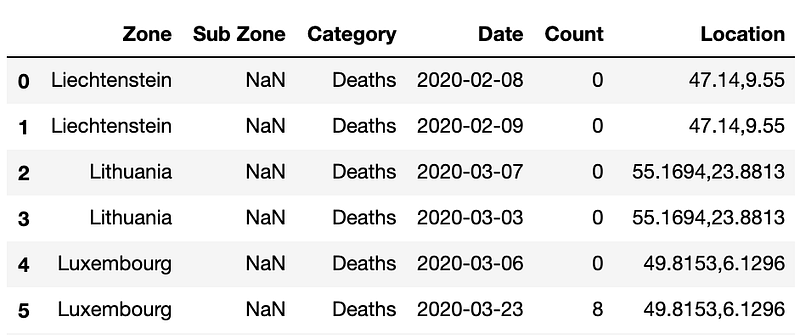
Data are quite easy to understand: it contains daily information about covid in many countries, about either Death, Confirmed, or Recovered persons, with GPS information.
Processing data
This dataset has to be transformed to fit the Mapbox inputs. Let’s be clear about the input needed.
The purpose of scatter maps is to plot bubbles on a map, with variable sizes and eventually variable colors. In today’s example we want:
- A single bubble per country
- Bubble latitude: latitude of the specified country
- Bubble longitude: longitude of the specified country
- Bubble size: number of confirmed cases
- Bubble color: ratio of recovered persons
- Bubble hover: a summary of the country’s situation
Let’s get this information in different columns.
- First step: extract the
Locationcolumn into latitude and longitude - Second step: get a tidy dataset by splitting the single
categorycolumn with 3 lines per key (date&zone) into three columns :confirmed,deaths&recovered. - Third step: while pivoting the table we lost the location information. We now merge them back, thanks to the
country_positiondataset. - Fourth step: define the size of each bubble
- Fifth step: define the color of each bubble
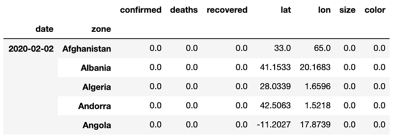
Here is a full Data Frame with multi-index : date & zone , which makes filtering very convenient.
As an example, to extract information of a single day, we’d do :
day = '2020-05-01'
df_day = df.xs(day)
This will be very handy for our scatter map, and later for the map animation!
The map
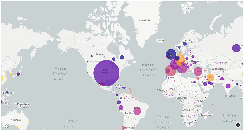
Here we define a figure with all the necessary parameters, and then we update its layout property with Mapbox information: the token, where to center the map, and how much we want to zoom in. We use a zoom of 1 as we want to see the whole globe. To zoom in, you just have to increase this value.
Small improvements
Our scatter map is nice but lacking of information. Before diving into the animation part, let’s make some basic modifications and enhance the quality of the map.
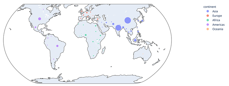
- Adding a colormap.
In the previous picture, we see orange, purples, and yellow boxes but have no clue about their meaning. Let’s add a colormap to make it clear. To add the colormap, add showscale = True into the marker parameter. Then with the colorbar attribute, you can add more specifications such as the title, the size of the color bar, or any other information about the ticks.
It will now be clear that yellow bubbles relates to countries with the highest rate of recovered people. And the darker the bubble gets, the smallest the recovered rate is.
2. Adding custom hover information
In addition to the color comprehension, it would be interesting to display the number when the user hovers the bubble with its mouse. To do so, we can add a text parameter to the go.Scattermapbox() specifying which column information display. But here we’d like to display multiple information, so we’ll use hovertemplate with customdata. The latter allows us to store data into the control and to display the value of any columns from the original dataset. Thus we store the necessary columns into the customdata inside a np.stack() and access it from the Html template defined in the hovertemplate.
Note :
<extra></extra>is used to overwrite the original part of the hover box where the trace name (trace0) was written. The trace being the object in which we store the data of the figure.
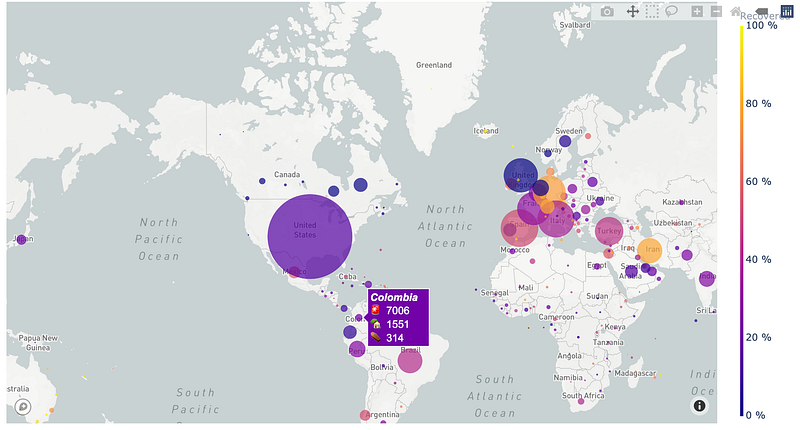
And here are the results of our previous modification. Looks great, doesn’t it?
Create the animation
Now we are able to plot data on a map for a specific date. Let’s animate it and observe the world situation day after day.
For information, there are 2 ways of animating maps with Plotly and Dash :
- Create a Plotly animated map with multiple frames (Explained below)
- Create a single Plotly map with updatable trace, updated through a dash callback, monitored by a time slider. This is technically feasible, but much heavier and computationally expensive since it is necessary to modify the map data at each step. (Whereas the Plotly animated map is computed a single time and navigation through frames is then optimized.)
Frames
To create a Plotly animation, instead of providing a single trace as we did previously in the go.Figure() statement, we’ll provide multiple frames to the figure. Frames are basically the content of a go.Scattermapbox(), but stored in a list.
Note :
daysbeing the list of the days available :df.index.levels[0].tolist()
Sliders
Then to navigate through this frame, we’ll create a slider. Each slider is defined as a dictionary, and stored in the sliders list. We’ll only have one here.
A slider is defined by its characteristics (such as x, y , len, etc.), its initial state (currentvalue) and its steps. To link a step to a specific frame, we’ll need to have the same values in the frame name and in the steps[i]['args'][0][0]. steps[i]being one of the steps, i in [0 ; nb_frame]. Not the easiest guess, but working.
Play button
Once we have a nice slider, it can be a good idea to add a “play button” which will run all the iterations one after another. Here is how we do so.
Putting it altogether
Now that we’ve all the pieces, we can assembly the puzzle and finally create our interactive map.
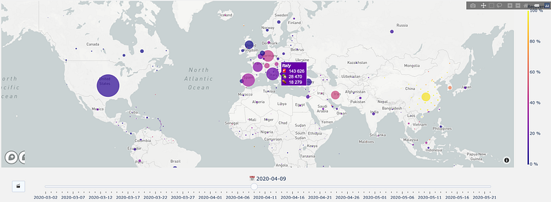
And that’s it! Here is the result! A nice interactive scatter map! Let’s hope that bubbles won’t get bigger and that we’ll soon see lots of yellow bubbles in this graphic.
Conclusion
You’ve learned how to plot scatter maps with Plotly and how to animate it. Now you can plot your own interactive maps, with your own data, with colormaps, sliders and make them live with a play button. I hope you enjoyed it!
In my next article, I will embed this map in a Dash application and you’ll discover how to deploy Python web apps on Heroku. You’ll manage to access this scatter map live version! Stay tuned!
(Update — You can check it right there)
And if you enjoyed the Scatter Map version, you might also like the Choropleth Map story 😉
To discover more about Plotly and how to showcase your ML projects and results, I suggest you this great post from Neptune.ai
See you soon 🤠


