
Extracting (digitising) data from plots in scientific papers or images
Often we see a graphic of interest and want to apply the data to our own interest and designs. This frequently occurs within academia, where research needs to be compared to that already existing within scientific journals and in data visualisation where historic figures can be built upon and improved (with the addition of new data/designs).
How do we extract the data
The extraction of data from images is called digitization. This is the conversion of an analogue figure into a quantized digital (numerical) format — to be used for manipulation and analysis.
The simplest process works by defining the range of data within a plot and calculating the value of the points on a plotted line within it. To do this we can make use of the WebPlotDigitizer (WPD).
Usage Case for WebPlotDigitizer
This can with a range of plots ranging from 2D (X-Y) plot to Bar Plots, Ternary and Polar Diagrams. The web-based nature of WPD means that it can run on a range of operating systems or even an online interface. Access to this can be found at :
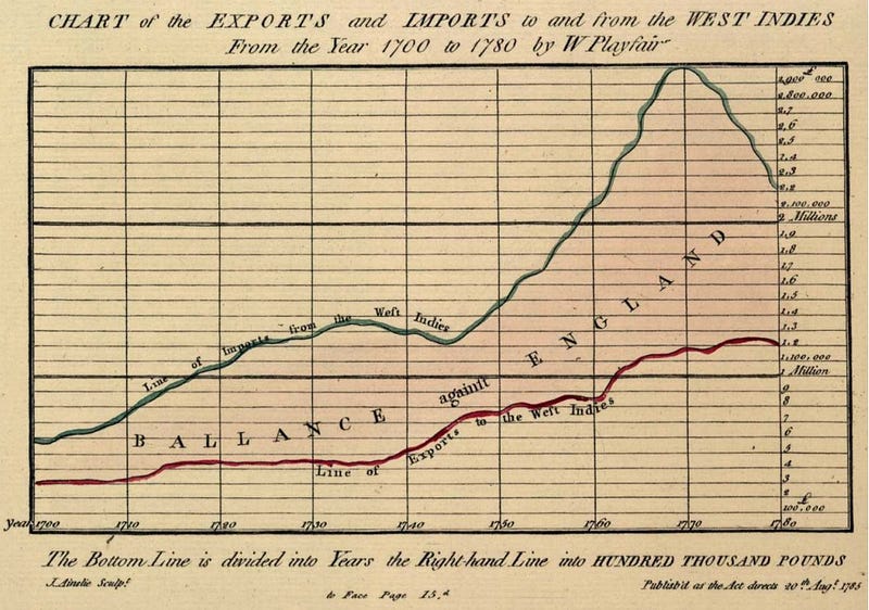
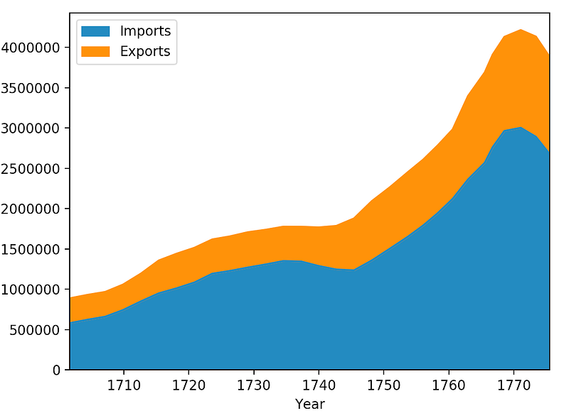
https://automeris.io/WebPlotDigitizer/In this article, we take a figure showing the import and export profits from trades to the West Indies between 1700 and 1780. This is a lovely figure which was hand plotted by W. Playfair. In the sections below we describe the process of digitizing the figure and then provide a couple of quick plots in python of the extracted data.
Digitization Process
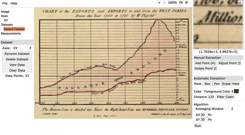
The general digitization process is relatively simple using the WPD software. The algorithmic functions are hidden in the background, and the user only needs to change a handful of ‘point and click’ parameters on the interface. The procedure for this is outlined below:
- Click on
file>Load Image>select the type of plotand upload your image. - For an
x-yplot select your boundaries. These begin with the minimal known x value, then the maximum known x value, followed by the minimum and maximum known y values - Enter the values for the known points and select if a
logscale has been used (You may add additional configuration points after pressing the confirm button.) - Adjust settings such as
mask(selecting the area to explore),foreground(line) andbackgroundcolours, and thepixel samplingintervals — note sometimes a larger averaging area within the pixel sampling intervals gives a better result (in the example case 30 pixels was used). - Click
runwithin the algorithm box.
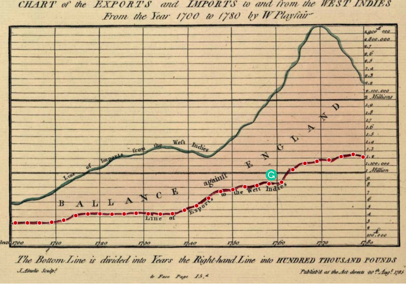
This produces a selection as shown below.
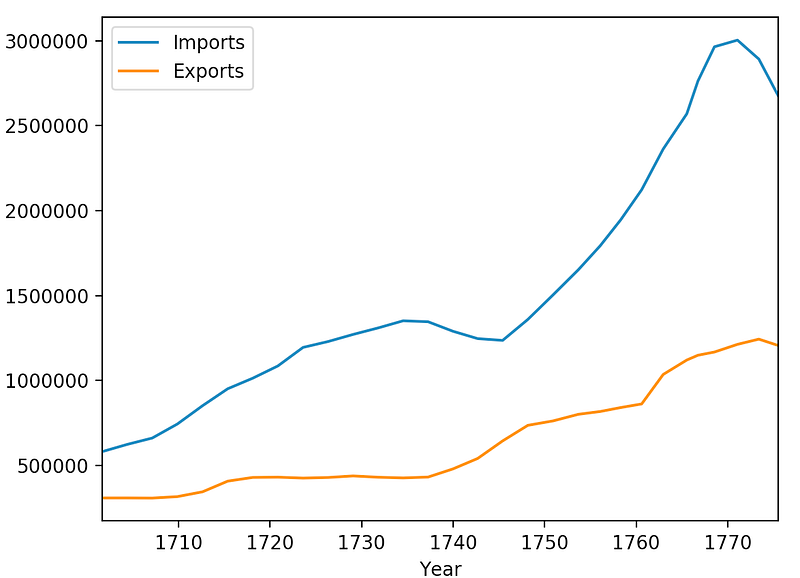
DataMunging
Finally, we can extract the generated comma separated file (CSV) for plotting in another program (e.g. JS, Python, R …). A quick example in python using pandas gives the following:
Conclusions
The WebPlotDigitizer is very simple to use program with many practical applications. Its HTML and javascript nature makes it capable of running both online and on most popular operating systems. Finally, the ability to extract data from publications (especially ones where the raw data has been lost) makes it an invaluable tool for the modern-day scientist.


