
Exploring the Power of ggplot2: A Guide for ggplot2 Geometric Objects
Geometric Objects and Annotations in ggplot2 for Python Data Visualization

Data visualization is an essential aspect of data analysis and storytelling. It helps us explore patterns, relationships, and trends hidden within our datasets, allowing us to effectively communicate insights to a broader audience. Python, a versatile and popular programming language, offers a myriad of tools and libraries for data visualization, with ggplot2 being one of the most prominent choices.
Originally developed for the R programming language, ggplot2 quickly gained recognition for its elegance, flexibility, and ability to create visually stunning plots. Thanks to the ggplot package, Python users can now experience the power of ggplot2 firsthand. Whether you are a seasoned data scientist or a novice programmer, ggplot2 for Python provides an intuitive and efficient framework to create captivating visualizations.
One of the key components that make ggplot2 so powerful is its extensive range of Geometric Objects (geoms). Geoms form the foundation of ggplot2 plots, defining the visual elements that represent the data points. From scatter plots to bar charts, geoms offer a wide array of options to customize and tailor visualizations to the specific needs of your data.
Below, some options which ggplot2 offers for the Geoms are delved. To show their result, several data bases provided by ggplot2 will be used. First of all, we need to import the ggplot2 functions and the data bases to be used:
from plotnine import *
from plotnine.data import economics, msleep, midwest
Data bases to be used are economics (US economic dataset) and msleep (mammals sleep dataset).
Geometric Objects
Basic data representation
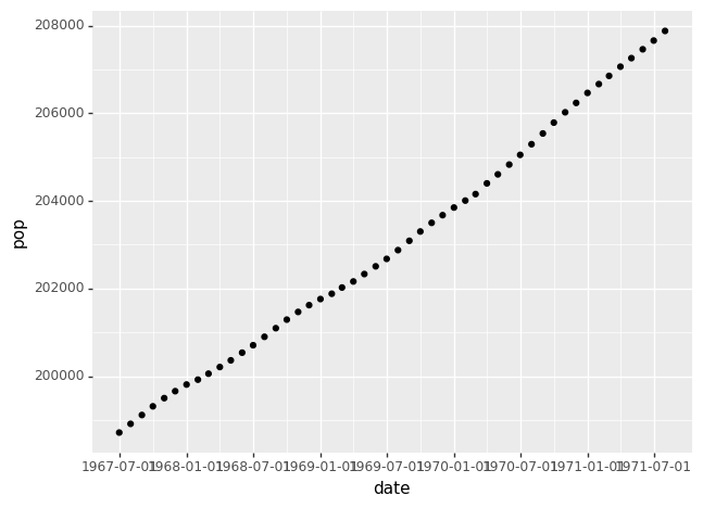
The basic code to plot information includes the data, the aesthetic mapping and the geometric object. For example, the following code plot the US population in function of the date from the economics dataset:
(ggplot(economics) +    # Data
aes('date', 'pop') +    # Aesthetics
geom_point())           # Geometrical object
The geom_point() represents the data with points.
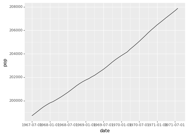
However, we can represent information with a line, with geom_line():
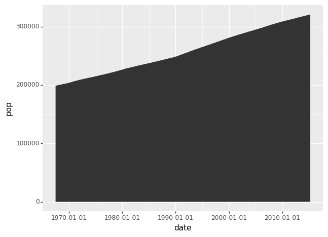
Or geom_area() for the following graph:
Also, several curves my be plotted. The code to plott total population and unemployed population is:
(ggplot(economics) +                # Data
aes(x = 'date') +                   # Aesthetics
geom_line(aes(y = 'pop'))+          # Geometrical objects
geom_line(aes(y = 'unemploy'))) 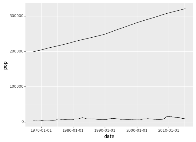
Statistics
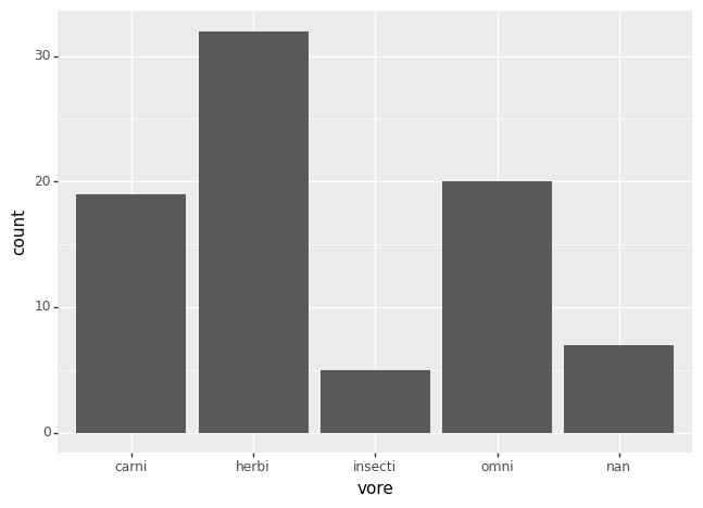
ggplot2 also allows you to analyze a dataset and plot some statistics graph. To show some examples, the msleep dataset is used. For example, the following code shows the following code plot the number of carnivores, herbivores, omnivores and insecti which were considered in the dataset.
(ggplot(msleep) +  # Data
aes('vore') +      # Aesthetics
geom_bar())        # Geometrical object
The Geometrical object geom_bar() is used to plot bars:
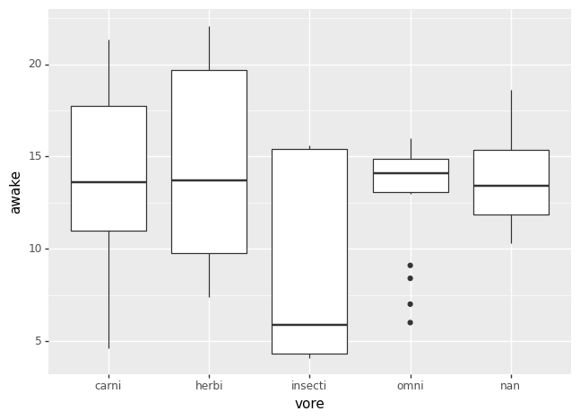
Furthermore, some data may be added to each class. As an example, a boxplot (geom_boxplot()) may be plotted to show the time awake of each animal cathegory:
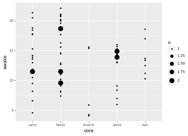
This info may be represented in a different way with geom_count(), which shows points to count the number of individual in the dataset:
Also, data histograms may be represented with geom_histogram, as the following example to plot the histogram of the awake time:

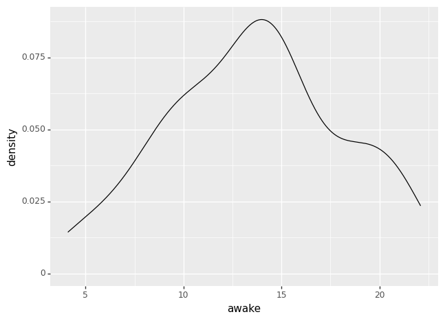
Which also may be plotted with geom_density(), whose result is:
Annotations
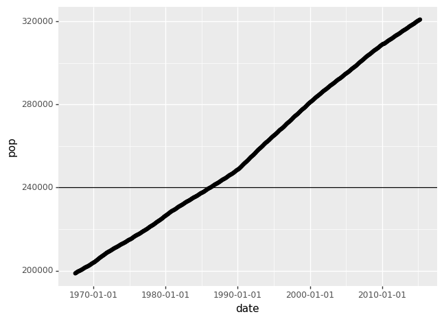
Extra information may be added to your plots to show some points in the graphs. For example, horizontal or vertical lines are plotted in the following way:
# Horizontal line
(ggplot(economics) + # Data
aes('date', 'pop') + # Aesthetics
geom_point() +
geom_hline(yintercept = 240000)) # Geometrical object
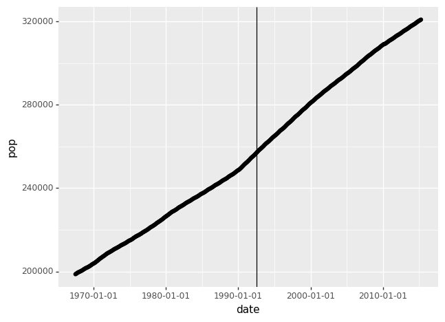
# Vertical line
(ggplot(economics) + # Data
aes('date', 'pop') + # Aesthetics
geom_point() +
geom_vline(xintercept = economics['date'][300])) # Geometrical objectWhich plots the following graphs:
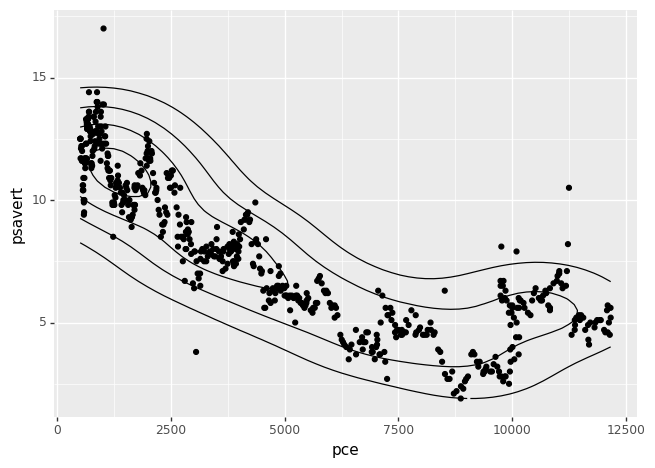
And density estimation may also be plotted, for example with geom_density_2d(), which plots a density estimation with an axis-aligned bivariate normal kernel:
Do you want to learn Python:
Have you spent your learning budget for this month, you can join Medium here:


