
Exploring Responsive Type Scales
Finding your (Appropriate, Multi-Device and Vertical) Rhythm
Stackswell’s latest release generates responsive type scales with a click of a button!
Below you’ll find some guidelines I use when selecting a type scale for projects and how I extend type scales across a diverse set of screen sizes.
The problem In the past when I started to design a website my process would go something like this: visit a site like type-scale.com or modularscale.com look at a few type scales, grab one I liked, and keep my fingers crossed that it would work out. At times I would get to the middle of a project and realize the scale I selected didn’t work for new pages like the blog or the shopping cart. At that point I would have to go back, select a different type scale and update everything I had already designed.
The problem was I didn’t understand that some type scales are better suited to the needs of certain website archetypes more then others. I wasn’t thinking about the wholistic demands of the site and what type scale it would require. To solve these problems I needed to understand more about type scales and how ratios affected them.
Getting Started — What is a type scale
A modular scale, like a musical scale, is a prearranged set of harmonious proportions. — Robert Bringhurst.
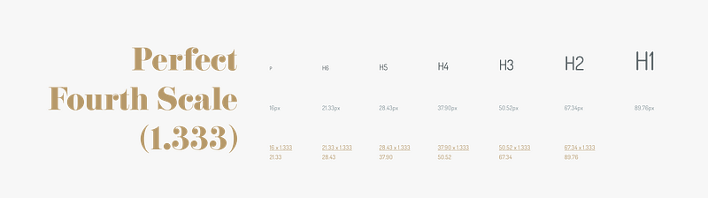
A modular type scale is a series of type sizes that relate to each other because they increase by the same ratio. You start with a base font size and multiply it by the selected ratio. Let’s look how different ratios affect the type size between levels in scale.
Note: I left the decimals in all the examples for this post as a reminder that using scales to build your type systems isn’t perfectly cut and dry. You as the designer are going to have to make decisions for example if you want to round up or down, or if you want your type units to be multiples of 4 and so on. I suggest using the scale as a base to get started then build and tweak the scale to fit your solution.
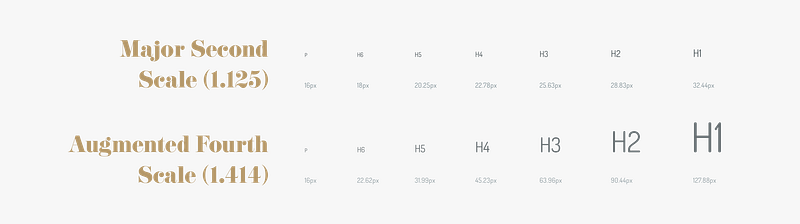
The Major Second type scale has a ratio of 1.125 and the Augmented Fourth type scale has the ratio of 1.414, a difference of 0.289. Both type scales start with the base font size of 16px and increase by their respective ratios. The H1 font size for the Major Second scale is 32.44px whereas the H1 font size for the Augmented Fourth is 127.88 a difference of 95.44px! Understanding the size contrast between levels of type will help you when selecting a scale for your projects.
Selecting a scale for your project
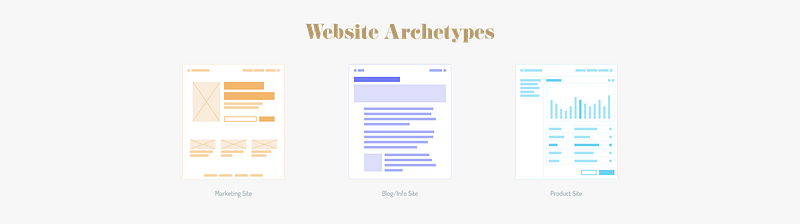
I came across Elliot Dahl’s post: 8-Point Grid: Typography On The Web and appreciated how he broke out websites into 3 categories of archetypes: Marketing Sites, Blog/Info Sites and Product Sites. When analyzing his images of web archetypes I noticed that each of his examples used different proportions in the wireframes. That’s when I realized certain type scales are better suited to different site archetypes. Looking at the images of the site archetypes you can see the Marketing Site has more contrast between type sizes than the Blog/Info Sites and the Product site has the least contrast between levels of type. Let’s explore each site archetype a little more.
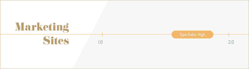
Marketing Sites
Recommended Type Ratio: High For the marketing sites there should be a fair amount of contrast between the levels of type. The high contrast will help guide users through your narrative focusing them on the most important ideas first.
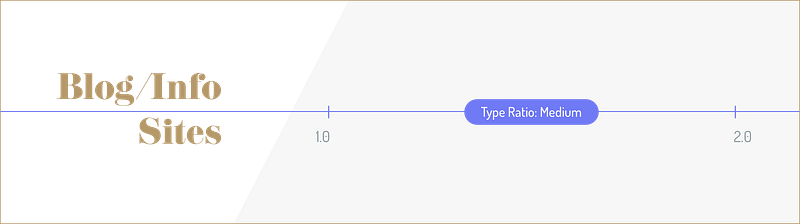
Blog/Info Site
Recommended Type Ratio: Medium
For blog and info sites a medium ratio will still provide a nice contrast between the levels of type but help reduce the length of a page. For example with less contrast the article’s title will be smaller, which enables fitting more words on a line and reducing line breaks.
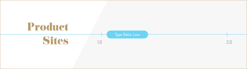
Product Site
Recommended Ratio Range: Low When it comes to laying out dashboards and product sites. You will want a variety of font sizes. They type will need to be flexible and allow for longer words but also versatile enough to support smaller type needs like input titles.
Extending the type scale to be responsive
In this next section let’s extend the type scale across multiple breakpoints.
Breakpoints are the point at which your sites content will respond to provide the user with the best possible layout to consume the information.” — responsivedesign.is
I like to think about breakpoints as devices, this helps me contextualize how the content will be seen and used. For example the extra-small breakpoint are for phones and the extra-large breakpoint are for desktop screens.
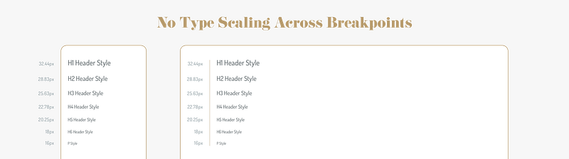
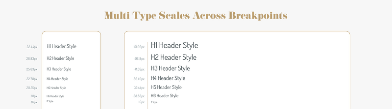
No Type Scaling Across Breakpoints Let’s look at the major second scale on a extra-small breakpoint and an extra-large breakpoint. Without scaling the type it gets lost at the extra-large breakpoint. You could certainly pick a different ratio so it has more contrast for all potential screen sizes but this can lead to future problems. For example it can leave you wanting more contrast between type levels or with a type that is to big for a breakpoint.
To fix this we need to create a type scale that is responsive and feels more comfortable to read across multiple breakpoints. Here are two different ways to approach scaling type systems across devices.
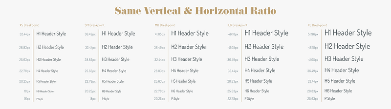
Approach 1: Single Type Scale For Both Pages and Breakpoints This approach uses the same ratio 1.125 down each page and across each breakpoint. Pretty straightforward, we multiply everything down and across by the same ratio.
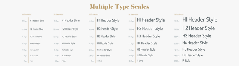
Approach 2: A Type Scale For Pages and A Different Type Scale Between Breakpoints I think there could be some benefits to using two different type ratios for the same design. This approach could be useful for scaling across a vast spectrum of breakpoint sizes. One type scale should be used down the page and the other scale would be used across breakpoints.
For example, let’s keep using the Major Second scale (1.125) but between each breakpoint we will increase the type scale by a Major Third (1.250). As you’ll notice you can see the type on the extra-small has less contrast than the extra-large breakpoint. Blending type scales can give you certain flexibility at different points of your breakpoint range. For example the ratios we use below start us off with lower contrast on the extra-small breakpoint and extends to a higher level contrasts at the extra-large breakpoint.
Conclusion
With the understand of type scales I’ve reduced the number of times I’ve had to restart projects, making me more efficient and saving me frustration. In certain projects you could need one or more scales. For example, having both a public facing site and an internal dashboard may require multiple type ratios. Be sure to experiment with different type scales and find the ratios that you like best for your designs. Remember typography is the base of all design be sure to get it right!
Note: This post offers suggestions on how to handle type scales. The ideas presented are not hard and fast rules. I encourage you to experiment and explore all different types scales and find the right one for your project.


