
Exploring Data Visualization with Seaborn in Python
Why Seaborn?
Seaborn is a highly acclaimed data visualization library in Python, widely employed in data science and machine learning endeavors. Leveraging the capabilities of the underlying Matplotlib library, Seaborn enables robust exploratory data analysis by facilitating the creation of interactive and insightful plots.

Topics Covered in this Tutorial:
- Importing Libraries in Jupyter Notebook
- Loading a Dataset
- Seaborn Plotting Functions in Python
- Bar Plot
- Count Plot
- Distribution Plot
- Heatmap
- Scatter Plot
- Pair Plot
- Linear Regression Plot
- Box Plot
Importing Libraries in Jupyter Notebook
When embarking on an exploratory data analysis project in Python, it’s essential to include the libraries: NumPy, Pandas, Matplotlib, and Seaborn. Let’s proceed by importing them.
Loading Dataset
For this learning exercise, it’s recommended to utilize the well-known mtcars dataset. This dataset originates from the 1974 Motor Trend US magazine and encompasses details regarding fuel consumption as well as ten distinct attributes related to automobile design and performance, encompassing 32 different cars.
mtcars = pd.read_csv('mtcars.csv')
mtcars.head()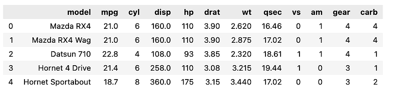
Next, employ the info() function to display a concise summary of the data frame. This summary encompasses details about the index data type, column data types, the presence of non-null values, and memory utilization.
mtcars.info()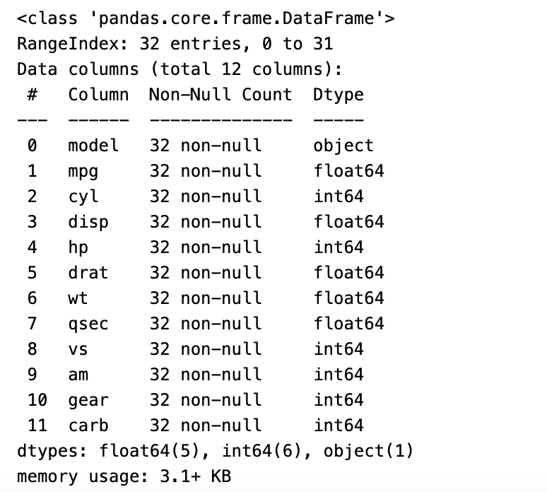
Check the shape of the mtcars dataframe.
mtcars.shape
(32, 12)
Seaborn Plotting Functions
Barplot
A bar plot offers an approximation of the central tendency of a numeric variable, represented by the height of each bar. It also incorporates error bars to provide insight into the level of uncertainty surrounding this estimate. Typically, when constructing this plot, a categorical column is selected for the x-axis, while a numerical column is chosen for the y-axis.
res = sns.barplot(x=mtcars['cyl'], y=mtcars['carb'])
plt.show()
In the preceding plot, the `barplot()` function was employed, with the `cylinder (cyl)` column designated for the x-axis and `carburetors (carb)` for the y-axis.
Below is an alternative code snippet to generate the same bar plot.
res = sns.barplot(x='cyl', y='carb', data=mtcars)
plt.show()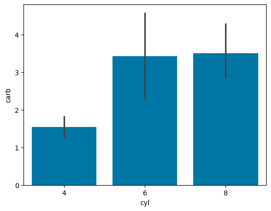
Using Python Seaborn, users have the flexibility to assign specific colors to the bars. In the following bar chart, all bars have been assigned a vibrant red hue.
res = sns.barplot(x='cyl', y='carb', data=mtcars, color='red')
plt.show()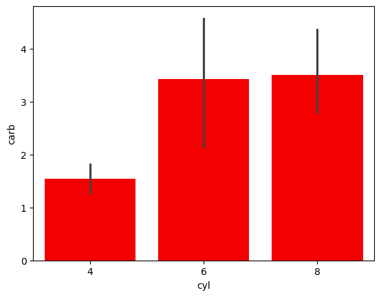
The Seaborn library provides the `palette` attribute, which allows you to assign a variety of colors to the bars.
res = sns.barplot(x=mtcars['gear'], y=mtcars['hp'], hue=[], palette='rocket')
plt.show()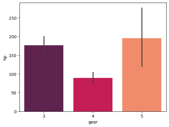
Countplot
The `countplot()` function in the Seaborn library of Python displays the total count of values for each category using bars.
In the following count plot, you can observe the count of vehicles for each category of cylinders.
sns.countplot(x='cyl', data=mtcars, palette='Set1', legend=False)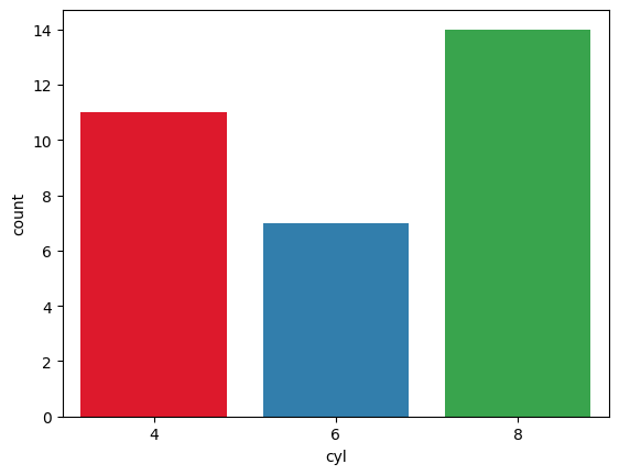
Seaborn in Python enables the creation of horizontal count plots, where the feature column is positioned on the y-axis, while the count is represented along the x-axis.
sns.countplot(y='gear', data= mtcars, palette='rocket')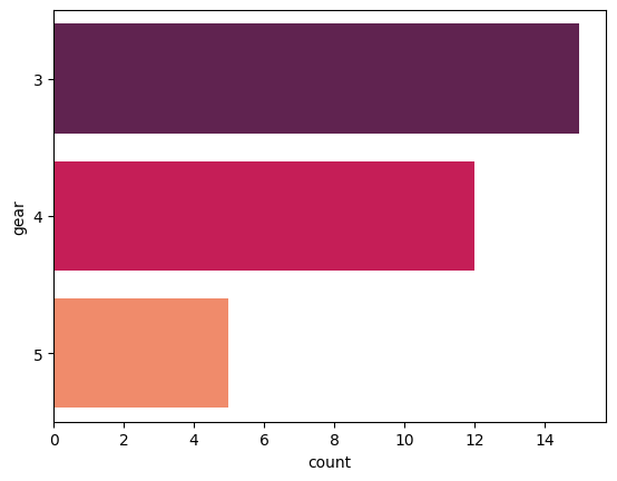
Additionally, you can generate a grouped count plot by employing the `hue` parameter. This parameter allows you to specify the column for color encoding.
In the following count plot, the count of cars for each category of gears is displayed, and the data is grouped based on the number of cylinders.
sns.countplot(x='gear', hue='cyl', data=mtcars, palette='Set1')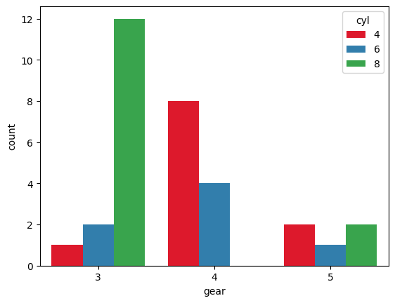
Distribution Plot
Seaborn’s library incorporates the `distplot()` function, which is designed to illustrate the distribution of continuous data.
In this particular example, you’ll be plotting the distribution of miles per gallon for various vehicles. The `mpg` metric quantifies the total distance a car can travel per gallon of fuel.
sns.distplot(mtcars.mpg, bins=10, color='r')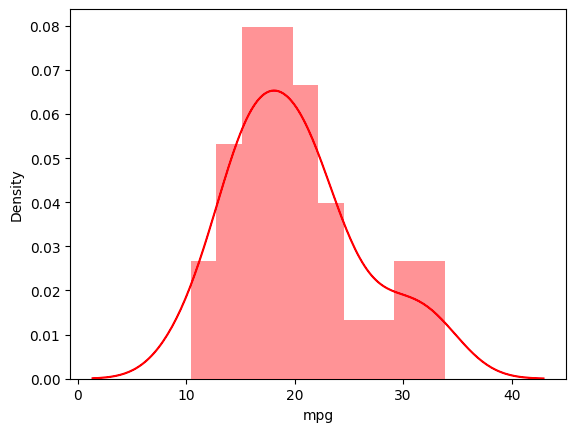
Heatmap
Seaborn’s library provides the capability to visualize matrix-like data through heatmaps. These heatmaps represent the values of variables within a matrix as distinct colors.
The following example showcases a heatmap depicting the correlation between each variable in the mtcars dataset.
sns.heatmap(df.corr(), cbar=True, linewidths=0.5)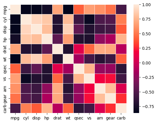
Scatterplot
The Seaborn `scatterplot()` function is a valuable tool for visualizing relationships between two continuous variables.
To gain a deeper understanding of scatter plots and other plotting functions, it’s recommended to use the IRIS flower dataset.
Let’s proceed by loading the iris dataset.
iris = sns.load_dataset('iris')
iris.head()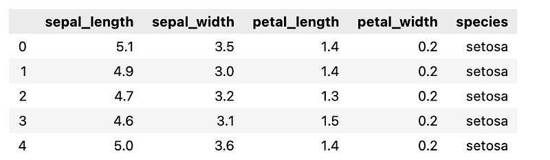
The following scatter plot illustrates the correlation between sepal length and petal length across various species of iris flowers.
sns.scatterplot(x='sepal_length', y='petal_length', data=iris)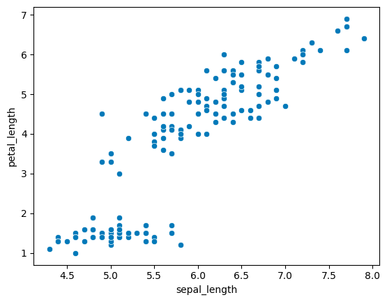
You can now employ the `hue` parameter in the function and set it to “species” to categorize the different flower species.
In the plot below, the three types of iris flowers are distinctly discernible based on their sepal length and petal length.
sns.scatterplot(x='sepal_length', y='petal_length', data=iris, hue='species')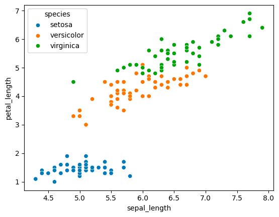
Pairplot
Seaborn in Python provides the capability to visualize data through pair plots, which generate a matrix showcasing relationships between each variable in the dataset.
In the plot below, all the individual plots are histograms, offering a visual representation of the distribution for each feature.
sns.pairplot(iris)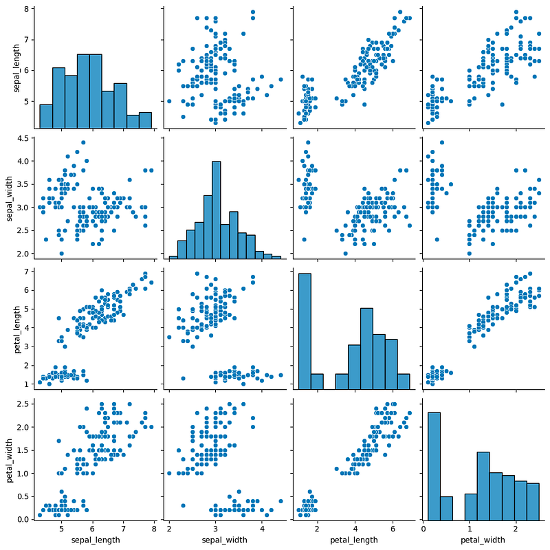
By utilizing the `hue` parameter, you can transform the diagonal visuals into KDE plots, while the remaining plots become scatter plots. This adjustment enhances the pairplot’s effectiveness in classifying each type of flower.
sns.pairplot(iris, hue='species', palette='Set1')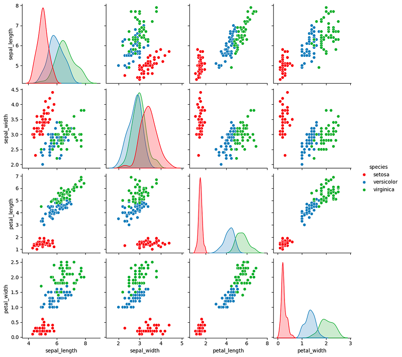
Linear Regression Plot
Seaborn’s `lmplot()` function is employed to depict a linear relationship as deduced through regression analysis for continuous variables.
In the plot below, you can observe the relationship between petal length and petal width across various species of iris flowers.
sns.lmplot(x='petal_length', y='petal_width', data= iris)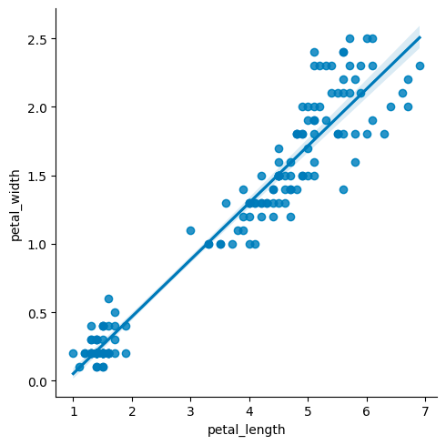
By utilizing the `hue` parameter, you can distinguish between each species of flower, and further customize the visualization by setting distinct markers for each species.
sns.lmplot(x='petal_length', y='petal_width', hue='species', data= iris, markers=['o',"*","^"])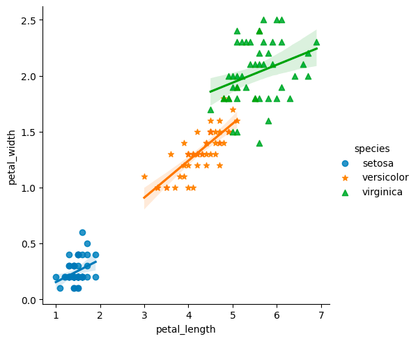
Boxplot
A boxplot, often referred to as a box and whisker plot, provides a visual representation of the distribution of quantitative data. The box encapsulates the quartiles of the dataset, while the whiskers extend to showcase the remaining distribution, excluding outlier points.
In the boxplot displayed below, you can discern the distribution of sepal widths for the three distinct species of iris flowers.
sns.boxplot(x='species', y='sepal_width', data=iris)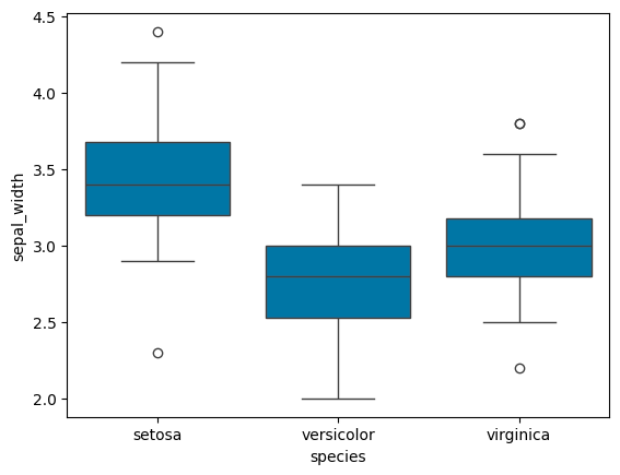
Conclusion
Effective data visualization is crucial in exploratory data analysis, and the Seaborn library streamlines this process by offering a range of built-in plotting functions. Throughout this tutorial, we’ve delved into some of these functions, leveraging two datasets — mtcars and iris — to demonstrate their capabilities.
Get all the code in GitHub in the format of Jupyter Notebook.
Stay Connected
If you enjoyed this article, we invite you to become a Medium member and gain access to thousands of similar articles.
Thanks for reading.
In Plain English
Thank you for being a part of our community! Before you go:
- Be sure to clap and follow the writer! 👏
- You can find even more content at PlainEnglish.io 🚀
- Sign up for our free weekly newsletter. 🗞️
- Follow us: Twitter(X), LinkedIn, YouTube, Discord.
- Check out our other platforms: Stackademic, CoFeed, Venture.


