
Exploratory Data Analysis(EDA) with PySpark on Databricks
bye-bye, Pandas…

EDA with spark means saying bye-bye to Pandas. Due to the large scale of data, every calculation must be parallelized, instead of Pandas, pyspark.sql.functions are the right tools you can use. It is, for sure, struggling to change your old data-wrangling habit. I hope this post can give you a jump start to perform EDA with Spark.
There are two kinds of variables, continuous and categorical. Each of them has different EDA requirements:
Continuous variables EDA list:
- missing values
- statistic values: mean, min, max, stddev, quantiles
- binning & distribution
- correlation
Categorical variables EDA list:
- missing values
- frequency table
I will also show how to generate charts on Databricks without any plot libraries like seaborn or matplotlib.
Now first, Let’s load the data. The data I used is from a Kaggle competition, Santander Customer Transaction Prediction.
# It's always best to manually write the Schema, I am lazy heredf = (spark
.read
.option("inferSchema","true")
.option("header","true")
.csv("/FileStore/tables/train.csv"))EDA for continuous variables
The built-in function describe() is extremely helpful. It computes count, mean, stddev, min and max for the selected variables. For example:
df.select('var_0').describe().show()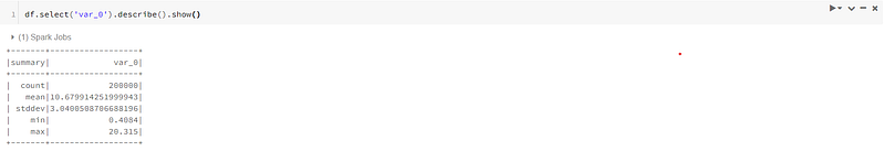
However, when you calculate statistic values for multiple variables, this data frame showed will not be neat to check, like below:
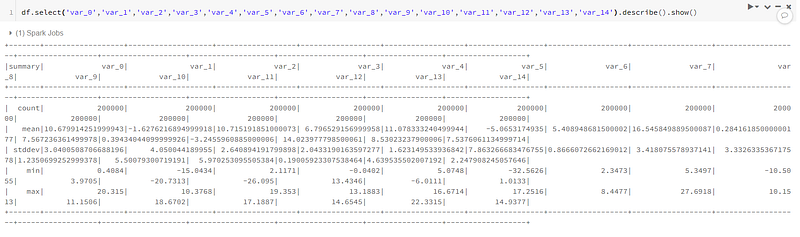
Remember we talked about not using Pandas to do calculations before. However, we can still use it to display the result. Here, the describe() function which is built in the spark data frame has done the statistic values calculation. The computed summary table is not large in size. So we can use pandas to display it.
df.select('var_0','var_1','var_2','var_3','var_4','var_5','var_6','var_7','var_8','var_9','var_10','var_11','var_12','var_13','var_14').describe().toPandas()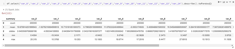
Get the quantiles:
quantile = df.approxQuantile(['var_0'], [0.25, 0.5, 0.75], 0)
quantile_25 = quantile[0][0]
quantile_50 = quantile[0][1]
quantile_75 = quantile[0][2]
print('quantile_25: '+str(quantile_25))
print('quantile_50: '+str(quantile_50))
print('quantile_75: '+str(quantile_75))
'''
quantile_25: 8.4537
quantile_50: 10.5247
quantile_75: 12.7582
'''Check the missings:
Introduce two functions to do the filter
# where
df.where(col("var_0").isNull()).count()
# filter
df.filter(col("var_0").isNull()).count()
These two are the same. According to spark documentation, “where” is an alias of “filter”.
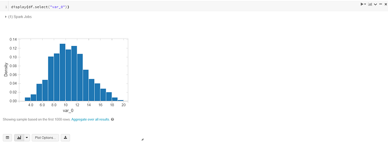
Binning:
For continuous variables, sometimes we want to bin them and check those bins distribution. For example, in financial related data, we can bin FICO scores(normally range 650 to 850) into buckets. Each bucket has an interval of 25. like 650–675, 675–700, 700–725,…And check how many people in each bucket.
Now let’s use “var_0” to give an example for binning. From previous statistic values, we know “var_0” range from 0.41 to 20.31. So we create a list of 0 to 21, with an interval of 0.5.
Correlation:
EDA for categorical variables
To check missing values, it’s the same as continuous variables.
To check the frequency table:
freq_table = df.select(col("target").cast("string")).groupBy("target").count().toPandas()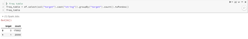
Visualization on Databricks
Databricks actually provide a “Tableau-like” visualization solution. The display() function gives you a friendly UI to generate any plots you like.
For example:
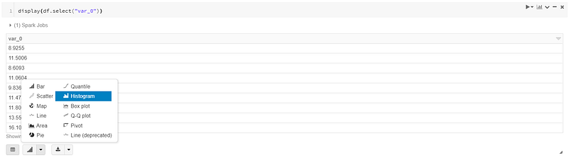
Choose the chart type you want.
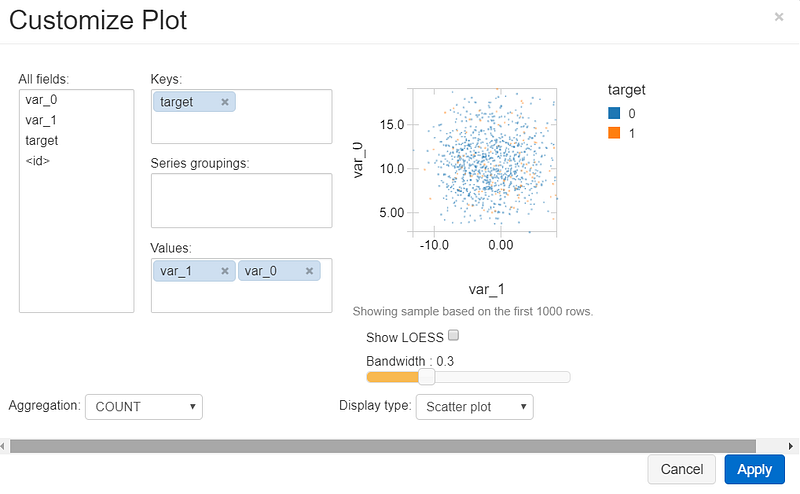
You can also create charts with multiple variables. Click on the “Plot Options” button. You can modify the plot as you need:
If you like to discuss more, find me on LinkedIn.


