
Exploratory Data Analysis (EDA) Using MATLAB: A Step-by-Step Guide
Exploratory Data Analysis (EDA) is a critical step in the data analysis process. It involves visually and statistically exploring a dataset to understand its structure, identify patterns, detect anomalies, and generate insights. MATLAB is a powerful tool for performing EDA due to its extensive data visualization and analysis capabilities. In this tutorial, we’ll walk through the process of conducting EDA using MATLAB, using a sample dataset that is available within MATLAB.
Prerequisites
Before we begin, ensure you have the following:
- MATLAB installed on your computer.
- A basic understanding of MATLAB’s syntax and functionality.
Dataset Selection
For this tutorial, we’ll use the “fisheriris” dataset, which is available in MATLAB’s sample dataset collection. This dataset contains measurements of petal and sepal length and width for three species of iris flowers.
Loading the Dataset
Let’s start by loading the “fisheriris” dataset into MATLAB:
% Load the dataset
load fisheriris
Now, the dataset is loaded into memory, and you can access it using the variable names meas (measurements) and species (flower species).
Basic Dataset Information
Let’s begin exploring the dataset by getting some basic information:
% Display the first few rows of the dataset
disp('First few rows of the dataset:');
disp(meas(1:5, :));
The output of the above code segment is given below:
First few rows of the dataset:
    5.1000    3.5000    1.4000    0.2000
    4.9000    3.0000    1.4000    0.2000
    4.7000    3.2000    1.3000    0.2000
    4.6000    3.1000    1.5000    0.2000
    5.0000    3.6000    1.4000    0.2000
We can compute the basic summary statistics as follows:
% Calculate summary statistics for the measurements
mean_meas = mean(meas);
median_meas = median(meas);
min_meas = min(meas);
max_meas = max(meas);
std_dev = std(meas);

% Display the summary statistics
disp('Summary Statistics for the Measurements:');
disp(['Mean: ', num2str(mean_meas)]);
disp(['Median: ', num2str(median_meas)]);
disp(['Minimum: ', num2str(min_meas)]);
disp(['Maximum: ', num2str(max_meas)]);
disp(['Standard Deviation: ', num2str(std_dev)]);
The outputs are mentioned below:
Summary Statistics for the Measurements:
Mean: 5.8433      3.0573       3.758      1.1993
Median: 5.8           3        4.35         1.3
Minimum: 4.3           2           1         0.1
Maximum: 7.9         4.4         6.9         2.5
Standard Deviation: 0.82807     0.43587      1.7653     0.76224
We can also determine the number of unique species present in the dataset as follows:
% Count the number of unique species
unique_species = unique(species);
num_species = numel(unique_species);
disp(['Number of species: ', num2str(num_species)]);
disp('Unique species: ');
disp(unique_species);
The outputs are mentioned below:
Number of species: 3
Unique species:
    'setosa'
    'versicolor'
    'virginica'
Data Visualization
Visualization is a key component of EDA. Let’s create some visualizations to gain insights into the dataset:
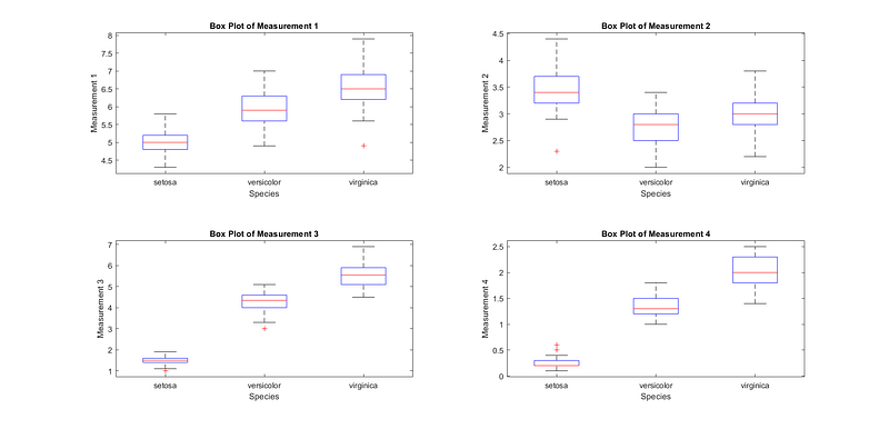
Box Plot
The box plot shows the distribution of measurements (petal and sepal lengths and widths) for each species, allowing us to identify any variations or outliers.
% Create a box plot of measurements for each species
figure;
for i = 1:size(meas, 2)
    subplot(2, 2, i);
    boxplot(meas(:, i), species, 'Labels', unique(species));
    title(['Box Plot of Measurement ', num2str(i)]);
    xlabel('Species');
    ylabel(['Measurement ', num2str(i)]);
end
In this code, we loop through each measurement column in ‘meas’ and create a separate box plot for each one, specifying the ‘species’ variable as the grouping variable with unique labels. The generated figures areshown in Fig. 1.
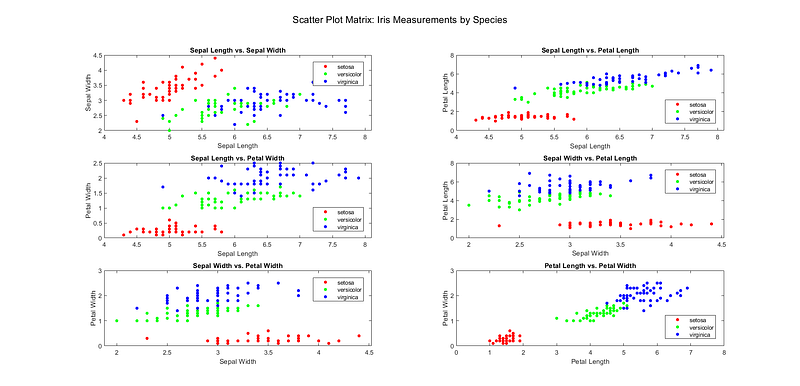
Scatter Plot Matrix
The scatter plot matrix helps visualize relationships between variables. In this case, it shows how measurements are related to different species. The generated figures are shown in Fig. 2.
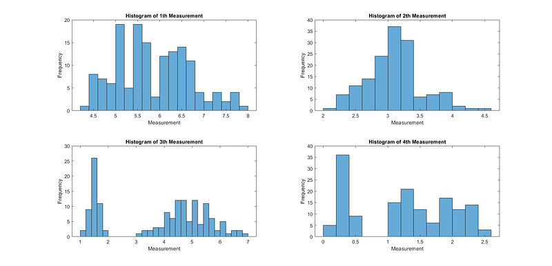
Histograms
Histograms provide insights into the distribution of each measurement, helping to identify patterns and potential outliers.
% Create histograms for each measurement
figure;
for i = 1:size(meas, 2)
    subplot(2, 2, i);
    histogram(meas(:, i), 'BinWidth', 0.2);
    title(['Histogram of ', num2str(i), 'th Measurement']);
    xlabel('Measurement');
    ylabel('Frequency');
end
The generated figures are shown in Fig. 3.
Data Exploration
EDA also involves exploring relationships and patterns within the data:
Correlation Matrix
The correlation matrix shows the degree of linear correlation between different measurements. A high positive or negative correlation indicates a strong relationship between variables.
% Calculate the correlation matrix
corr_matrix = corrcoef(meas);
disp('Correlation Matrix:');
disp(corr_matrix);
The output is given below:
Correlation Matrix:
    1.0000   -0.1176    0.8718    0.8179
   -0.1176    1.0000   -0.4284   -0.3661
    0.8718   -0.4284    1.0000    0.9629
    0.8179   -0.3661    0.9629    1.0000
Outlier Detection
Outliers can significantly impact your analysis. Let’s use MATLAB to detect potential outliers in the dataset using the z-score method.
% Calculate z-scores for each measurement
z_scores = zscore(meas);

% Define a threshold for outliers (e.g., z-score > 2 or < -2)
threshold = 2;

% Find indices of potential outliers
outlier_indices = any(abs(z_scores) > threshold, 2);

% Display the rows containing potential outliers
disp('Potential Outliers:');
disp(meas(outlier_indices, :));
The output is shown below:
Potential Outliers:
    5.8000    4.0000    1.2000    0.2000
    5.7000    4.4000    1.5000    0.4000
    5.2000    4.1000    1.5000    0.1000
    5.5000    4.2000    1.4000    0.2000
    5.0000    2.0000    3.5000    1.0000
    7.6000    3.0000    6.6000    2.1000
    7.7000    3.8000    6.7000    2.2000
    7.7000    2.6000    6.9000    2.3000
    7.7000    2.8000    6.7000    2.0000
    7.9000    3.8000    6.4000    2.0000
    7.7000    3.0000    6.1000    2.3000
Data Preprocessing
EDA often reveals the need for data preprocessing. For example, you might need to handle missing values, normalize data, or encode categorical variables. Here, we’ll demonstrate data normalization.
% Normalize the measurements to have zero mean and unit variance
normalized_meas = zscore(meas);

% Display the first few rows of the normalized data
disp('Normalized Data (First Few Rows):');
disp(normalized_meas(1:5, :));
The output is mentioned below:
Normalized Data (First Few Rows):
   -0.8977    1.0156   -1.3358   -1.3111
   -1.1392   -0.1315   -1.3358   -1.3111
   -1.3807    0.3273   -1.3924   -1.3111
   -1.5015    0.0979   -1.2791   -1.3111
   -1.0184    1.2450   -1.3358   -1.3111
Hypothesis Testing
EDA can lead to the formulation of hypotheses about the data. You can use statistical tests to investigate these hypotheses. Here, we’ll perform a t-test to compare the sepal length between two species.
% Select two species for comparison (e.g., 'setosa' and 'versicolor')
species1 = 'setosa';
species2 = 'versicolor';

% Filter data for the selected species
data_species1 = meas(strcmp(species, species1), 1);
data_species2 = meas(strcmp(species, species2), 1);

% Perform a two-sample t-test
[h, p] = ttest2(data_species1, data_species2);
disp(['t-test p-value: ', num2str(p)]);
The output is shown below:
t-test p-value: 8.9852e-18Conclusion
In this tutorial, we’ve demonstrated how to perform exploratory data analysis (EDA) using MATLAB. We loaded the “fisheriris” dataset, displayed basic information, created various data visualizations, and explored relationships within the data. We’ve also covered outlier detection, data preprocessing, and hypothesis testing. EDA is an essential step in understanding your data and is crucial for making informed decisions in data analysis and modeling. You can apply similar techniques to other datasets and adapt the analysis to your specific needs.
Interested readers can read the following tutorials:


