
Analyze, Explain, Predict, Working of Machine Learning Models
Explainer Dashboard — Build interactive dashboards for Machine learning models
Python Package to Quickly build an interactive dashboard that explains the inner workings of a fitted machine learning model.
Explainerdashboard is a python library for quickly building interactive dashboards for analyzing and explaining the predictions and workings of (scikit-learn compatible) machine learning models, including xgboost, catboost and lightgbm.
This python package makes it easy to quickly deploy a dashboard web app that explains the workings of a machine learning model. The dashboard provides interactive plots on model performance, feature importances, feature contributions to individual predictions, “what if” analysis, partial dependence plots, SHAP (interaction) values, visualization of individual decision trees, etc.
The library is designed to be modular so that it should be easy to design your own interactive dashboards with plotly dash, with most of the work of calculating and formatting data, and rendering plots and tables handled by explainerdashboard, so that you can focus on the layout and project-specific textual explanations. (i.e. design it so that it will be interpretable for business users in your organization, not just data scientists)
Alternatively, there is a built-in standard dashboard with pre-built tabs (that you can switch off individually)
With explainerdashboard any data scientist can create an interactive explainable AI web app in minutes, without having to know anything about web development or deployment.
It allows us to investigate SHAP values, permutation importance, interaction effects, partial dependence plots, all kinds of performance plots, and even individual trees in a random forest by deploying an interactive dashboard with just two lines of code.
It is very easy to interactively explore components of the dashboard in a notebook/colab environment (or just launch a dashboard straight from there). Or design a dashboard with your own custom layout and explanations (thanks to the modular design of the library).
Installation
You can install the package through pip:
pip install explainerdashboard
Example
Fitting a model, building the explainer object, building the dashboard, and then running it can be as simple as:
ExplainerDashboard(ClassifierExplainer(RandomForestClassifier().fit(X_train, y_train), X_test, y_test)).run()Below a multi-line example, adding a few extra parameters. You can group onehot encoded categorical variables together using the cats parameter. You can either pass a dict specifying a list of onehot cols per categorical feature or if you encode using e.g. pd.get_dummies(df.Name, prefix=['Name']) (resulting in column names 'Name_Adam', 'Name_Bob') you can simply pass the prefix 'Name':
from sklearn.ensemble import RandomForestClassifier
from explainerdashboard import ClassifierExplainer, ExplainerDashboard
from explainerdashboard.datasets import titanic_survive, titanic_names

feature_descriptions = {
    "Sex": "Gender of passenger",
    "Gender": "Gender of passenger",
    "Deck": "The deck the passenger had their cabin on",
    "PassengerClass": "The class of the ticket: 1st, 2nd or 3rd class",
    "Fare": "The amount of money people paid",
    "Embarked": "the port where the passenger boarded the Titanic. Either Southampton, Cherbourg or Queenstown",
    "Age": "Age of the passenger",
    "No_of_siblings_plus_spouses_on_board": "The sum of the number of siblings plus the number of spouses on board",
    "No_of_parents_plus_children_on_board" : "The sum of the number of parents plus the number of children on board",
}

X_train, y_train, X_test, y_test = titanic_survive()
train_names, test_names = titanic_names()
model = RandomForestClassifier(n_estimators=50, max_depth=5)
model.fit(X_train, y_train)

explainer = ClassifierExplainer(model, X_test, y_test,
  cats=['Deck', 'Embarked',
  {'Gender': ['Sex_male', 'Sex_female', 'Sex_nan']}],
  descriptions=feature_descriptions, # defaults to None
  labels=['Not survived', 'Survived'], # defaults to ['0', '1', etc]
  idxs = test_names, # defaults to X.index
  index_name = "Passenger", # defaults to X.index.name
  target = "Survival", # defaults to y.name
  )

db = ExplainerDashboard(explainer,
  title="Titanic Explainer", # defaults to "Model Explainer"
  whatif=False, # you can switch off tabs with bools
                        )
db.run(port=8050)
or for a regression model:
X_train, y_train, X_test, y_test = titanic_fare()
model = RandomForestRegressor().fit(X_train, y_train)
explainer = RegressionExplainer(model, X_test, y_test,
cats=['Deck', 'Embarked', 'Sex'],
descriptions=feature_descriptions, # defaults to None
idxs = test_names, # defaults to X.index
index_name = "Passenger", # defaults to X.index.name
target = "Fare", # defaults to y.name
units = "$", # defaults to ""
)db = ExplainerDashboard(explainer).run()(y is actually optional, although some parts of the dashboard like performance metrics will obviously not be available: ExplainerDashboard(ClassifierExplainer(model, X_test)).run())
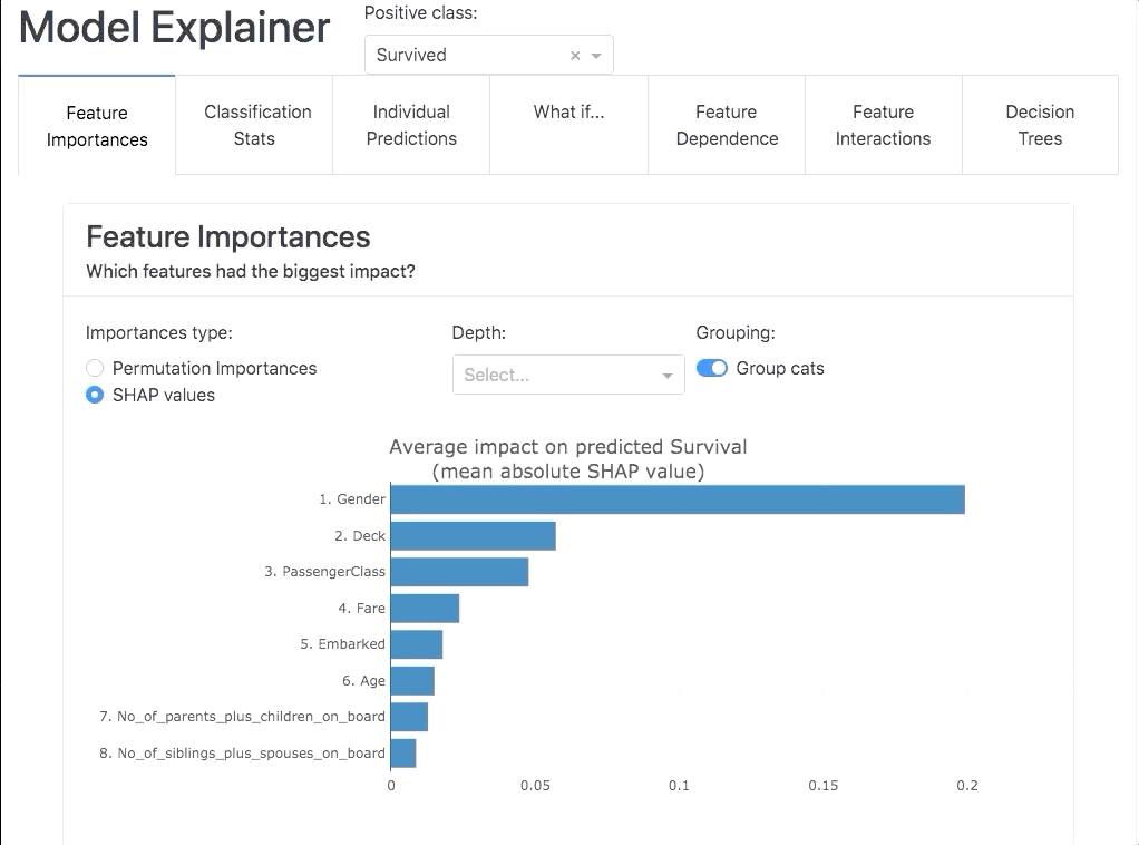
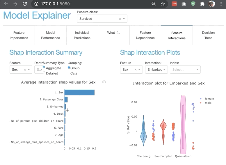
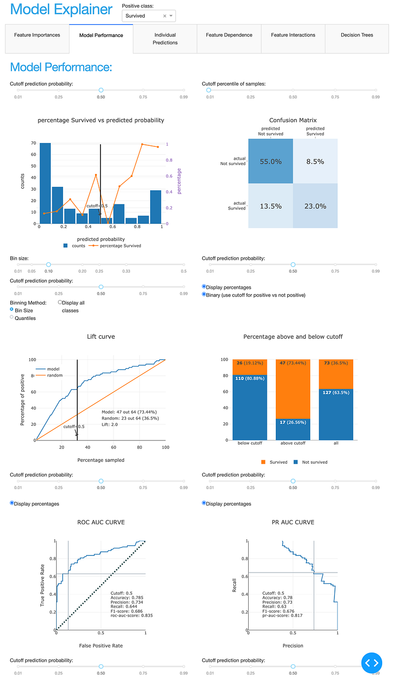
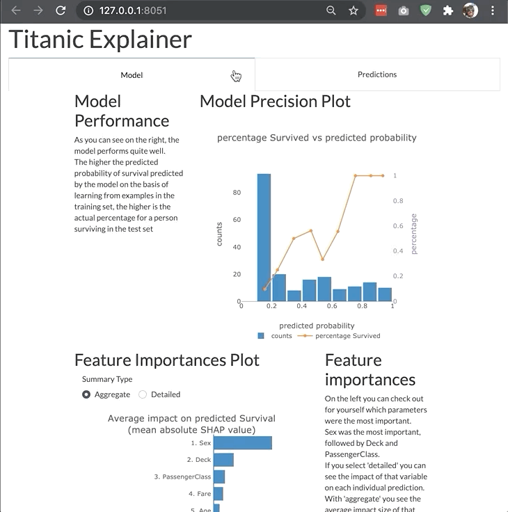
ModelExplainer demo. Image Credit: explainerdashboardInlineExplainer
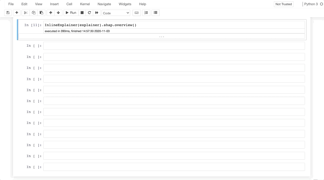
For viewing and customizing individual components or tabs directly inside your notebook you use the InlineExplainer:
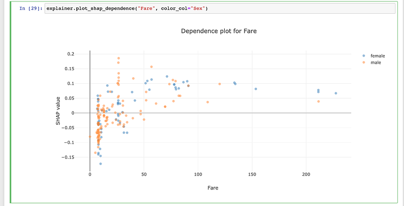
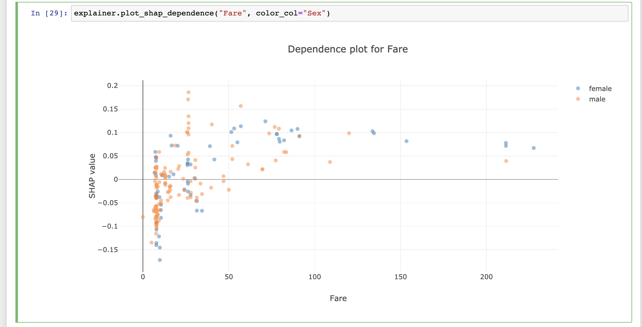
from explainerdashboard import InlineExplainerInlineExplainer(explainer).shap.dependence()
InlineExplainer(explainer).shap.dependence(hide_cats=True, hide_index=True, col="Fare")
InlineExplainer(explainer).shap.overview()
InlineExplainer(explainer).tab.importances()
The explainer object itself is also a plot factory that you can use to directly make plots inline in your notebook:
Launching from within a notebook
When working inside Jupyter or Google Colab you can use ExplainerDashboard(mode='inline'), ExplainerDashboard(mode='external') or ExplainerDashboard(mode='jupyterlab'), to run the dashboard inline in the notebook, or in a separate tab but keep the notebook interactive.
There is also a specific interface for quickly displaying interactive components inline in your notebook: InlineExplainer().
For example, you can use InlineExplainer(explainer).shap.dependence() to display the shap dependence component interactively in your notebook output cell.
Command-line tool
You can store explainers to disk with explainer.dump("explainer.joblib") and then run them from the command-line:
$ explainerdashboard run explainer.joblibOr store the full configuration of a dashboard to .yaml with e.g. dashboard.to_yaml("dashboard.yaml") and run it with:
$ explainerdashboard run dashboard.yamlYou can also build explainers from the command line with explainerdashboard build.
See explainerdashboard CLI documentation for more details.
Custom dashboards
All the components in the dashboard are modular and re-usable, which means that you can build your own custom dash dashboards around them.

By using the built-in ExplainerComponent class it is easy to build your
own layouts, with just a bare minimum of knowledge of html and bootstrap.
For example, if you only wanted to display the ShapDependenceComponent, but hide a few toggles:
from explainerdashboard.custom import *import dash_bootstrap_components as dbc
import dash_html_components as htmlclass CustomTab(ExplainerComponent):
def __init__(self, explainer):
super().__init__(explainer, title="Custom Tab")
self.dependence = ShapDependenceComponent(explainer,
hide_selector=True, hide_cats=True, hide_title=True)
self.register_components()
def layout(self):
return dbc.Container([
dbc.Row([
dbc.Col([
html.H3("Shap Dependence Plot:"),
self.dependence.layout()
])
])
])
ExplainerDashboard(explainer, CustomTab).run()You can use this to define your own layouts, specifically tailored to your own model, project, and needs.
See custom dashboard documentation for more details.
Switching off tabs
You can switch off individual tabs using boolean flags. This also makes sure that expensive calculations for that tab don’t get executed:
ExplainerDashboard(explainer,
                    importances=False,
                    model_summary=True,
                    contributions=True,
                    whatif=True,
                    shap_dependence=True,
                    shap_interaction=False,
                    decision_trees=True)
Hiding components
You can also hide individual components on the various tabs:
ExplainerDashboard(explainer,
        # importances tab:
        hide_importances=True,
        # classification stats tab:
        hide_globalcutoff=True, hide_modelsummary=True,
        hide_confusionmatrix=True, hide_precision=True,
        hide_classification=True, hide_rocauc=True,
        hide_prauc=True, hide_liftcurve=True, hide_cumprecision=True,
        # regression stats tab:
        # hide_modelsummary=True,
        hide_predsvsactual=True, hide_residuals=True,
        hide_regvscol=True,
        # individual predictions tab:
        hide_predindexselector=True, hide_predictionsummary=True,
        hide_contributiongraph=True, hide_pdp=True,
        hide_contributiontable=True,
        # whatif tab:
        hide_whatifindexselector=True, hide_inputeditor=True,
        hide_whatifcontribution=True, hide_whatifpdp=True,
        # shap dependence tab:
        hide_shapsummary=True, hide_shapdependence=True,
        # shap interactions tab:
        hide_interactionsummary=True, hide_interactiondependence=True,
        # decisiontrees tab:
        hide_treeindexselector=True, hide_treesgraph=True,
        hide_treepathtable=True, hide_treepathgraph=True,
        ).run()
Hiding toggles and dropdowns inside components
You can also hide individual toggles and dropdowns using **kwargs. However they are not individually targeted, so if you pass hide_cats=True then the group cats toggle will be hidden on every component that has one:
ExplainerDashboard(explainer,
     no_permutations=True, # do not show or calculate permutation importances
     hide_cats=True, # hide the group cats toggles
     hide_depth=True, # hide the depth (no of features) dropdown
     hide_sort=True, # hide sort type dropdown in contributions graph/table
     hide_orientation=True, # hide orientation dropdown in contributions graph/table
     hide_type=True, # hide shap/permutation toggle on ImportancesComponent
     hide_dropna=True, # hide dropna toggle on pdp component
     hide_sample=True, # hide sample size input on pdp component
     hide_gridlines=True, # hide gridlines on pdp component
     hide_gridpoints=True, # hide gridpoints input on pdp component
     hide_cutoff=True, # hide cutoff selector on classification components
     hide_percentage=True, # hide percentage toggle on classificaton components
     hide_log_x=True, # hide x-axis logs toggle on regression plots
     hide_log_y=True, # hide y-axis logs toggle on regression plots
     hide_ratio=True, # hide the residuals type dropdown
     hide_points=True, # hide the show violin scatter markers toggle
     hide_winsor=True, # hide the winsorize input
)
Setting default values
You can also set default values for the various dropdowns and toggles. All the components with their parameters can be found in the documentation. Some examples of useful parameters to pass:
ExplainerDashboard(explainer,
    higher_is_better=False, # flip green and red in contributions graph
    col='Fare', # initial feature in shap graphs
    color_col='Age', # color feature in shap dependence graph
    interact_col='Age', # interaction feature in shap interaction
    cats=False, # do not group categorical onehot features
    depth=5, # only show top 5 features
    sort = 'low-to-high', # sort features from lowest shap to highest in contributions graph/table
    orientation='horizontal', # horizontal bars in contributions graph
    index='Rugg, Miss. Emily', # initial index to display
    pdp_col='Fare', # initial pdp feature
    cutoff=0.8, # cutoff for classification plots
    round=2 # rounding to apply to floats
    )
You can define your own layouts, specifically tailored to your own model, project, and needs. You can use the ExplainerComposites that are used for the tabs of the default dashboard as a starting point, and edit them to reorganize components, add text, etc.
See custom dashboard documentation for more details. A deployed custom dashboard can be found here(source code).
ClassifierModelStatsComposite
Deployment
If you wish to use e.g. gunicorn or waitress to deploy the dashboard you should add app = db.flask_server() to your code to expose the Flask server. You can then start the server with e.g. gunicorn dashboard:app (assuming the file you defined the dashboard in was called dashboard.py).
See also the ExplainerDashboard section and the deployment section of the documentation.
It can be helpful to store your explainer and dashboard layout to disk, and then reload, e.g.:
Due to the modular design, it is also really easy to design your own custom dashboards
generate_dashboard.py:
from explainerdashboard import ClassifierExplainer, ExplainerDashboard
from explainerdashboard.custom import *
explainer = ClassifierExplainer(model, X_test, y_test)# building an ExplainerDashboard ensures that all necessary properties
# get calculated:
db = ExplainerDashboard(explainer, [ShapDependenceComposite, WhatIfComposite],
title='Awesome Dashboard', hide_whatifpdp=True)# store both the explainer and the dashboard configuration:
explainer.dump("explainer.joblib")
db.to_yaml("dashboard.yaml")You can then reload it in dashboard.py:
from explainerdashboard import ClassifierExplainer, ExplainerDashboardexplainer = ClassifierExplainer.from_file("explainer.joblib")
# you can override params during load from_config:
db = ExplainerDashboard.from_config(explainer, "dashboard.yaml", title="Awesomer Title")app = db.flask_server()And then run it with:
$ gunicorn dashboard:appJupyterNotebook Files
1. Example notebook on how to launch dashboards for different model types here: dashboard_examples.ipynb.
2. Example notebook on how to interact with the explainer object here: explainer_examples.ipynb.
3. Example notebook on how to design a custom dashboard: custom_examples.ipynb.
Deployed example
You can find an example dashboard at titanicexplainer.herokuapp.com
(source code at https://github.com/oegedijk/explainingtitanic)
Demonstrations
1. Classifier Dashboard — Predicting the probability of surviving the titanic.
2. Regression Dashboard — Predicting the fare paid for a ticket on the titanic.
3. Multiclass Dashboard — Predicting the departure port for passengers on the titanic.
4. Custom Dashboard — Showing a custom design for a classifier dashboard.
Documentation
Documentation can be found at explainerdashboard.readthedocs.io.
Conclusion:
In a lot of organizations, it is becoming more and more important to be able to explain the inner workings of the machine learning algorithms. Customers have to some extent a right to an explanation why they received a certain prediction, and more and more internal and external regulators require it. With recent innovations in explainable AI (e.g. SHAP values) the old black box trope is no longer valid, but it can still take quite a bit of data wrangling and plot manipulation to get the explanations out of a model. This library aims to make this easy. The goal is manyfold:
- Make it easy for data scientists to quickly inspect the workings and performance of their model in a few lines of code
- Make it possible for non-data scientist stakeholders such as managers, directors, internal and external watchdogs to interactively inspect the inner workings of the model without having to depend on a data scientist to generate every plot and table
- Make it easy to build an application that explains individual predictions of your model for customers that ask for an explanation
- Explain the inner workings of the model to the people working (human-in-the-loop) with it so that they gain an understanding of what the model does and doesn’t do. This is important so that they can gain an intuition for when the model is likely missing information and may have to be overruled.
The library includes:
- Shap values (i.e. what is the contributions of each feature to each individual prediction?)
- Permutation importance (how much does the model metric deteriorate when you shuffle a feature?)
- Partial dependence plots (how does the model prediction change when you vary a single feature?
- Shap interaction values (decompose the shap value into a direct effect an interaction effects)
- For Random Forests and xgboost models: visualization of individual decision trees
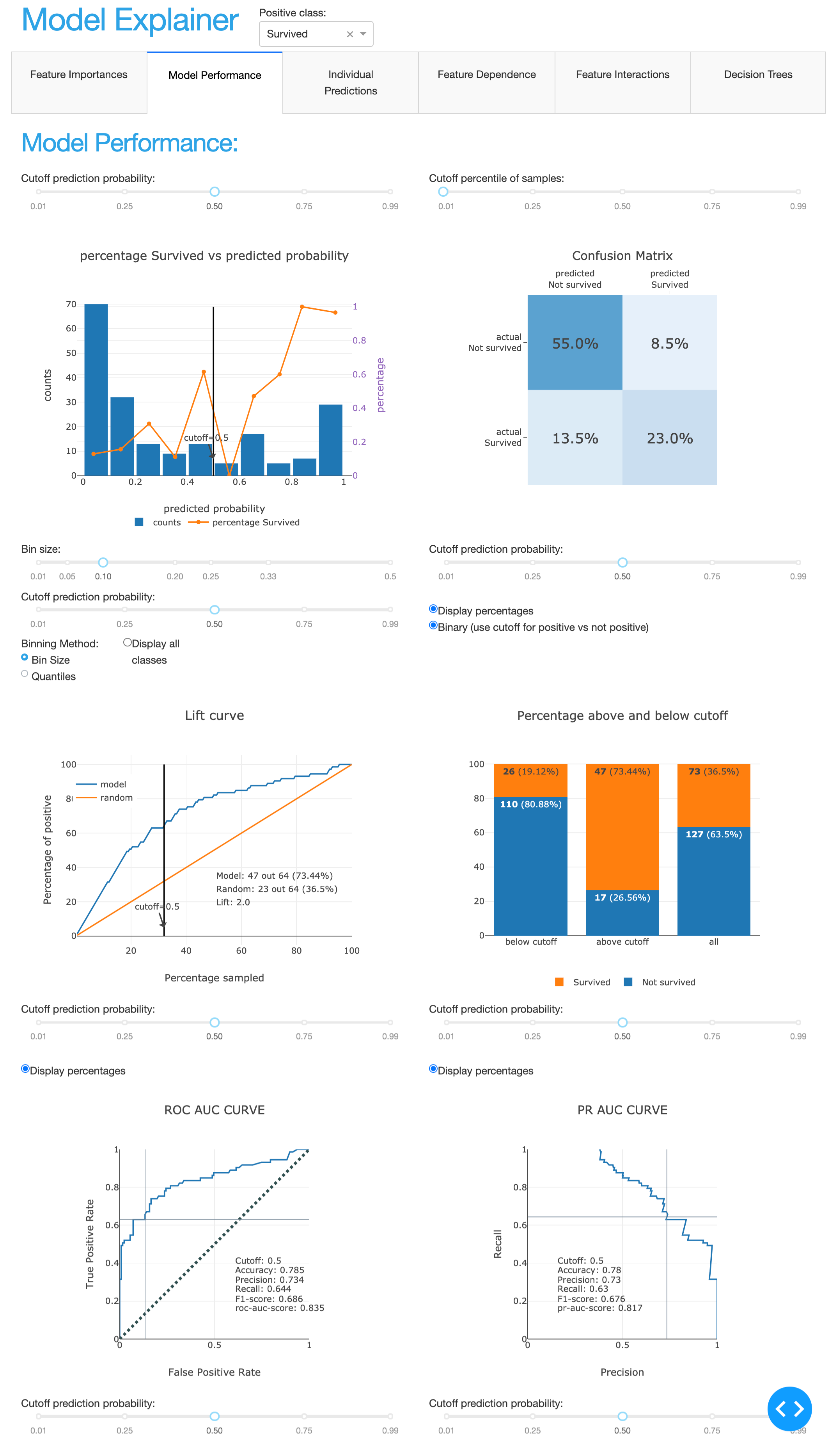
- Plus for classifiers: precision plots, confusion matrix, ROC AUC plot, PR AUC plot, etc
- For regression models: goodness-of-fit plots, residual plots, etc.
The lack of explainability and trust hampers our ability to fully trust AI systems. We want computer systems to work as expected and produce transparent explanations and reasons for the decisions they make.


