
Everything Wrong with Your Cover Image, and How to Fix It (According to a Visual Designer)
A complete guide to master your blog’s open rate
Working with visuals in my full-time job as a designer also revealed how visuals impact all kinds of content we see online.
Being a writer alongside a designer makes you two sets of eyes to question the visual appeal of blogs and different contents.
Having the right blog image can be more impactful than we give it credit. People notice the first thing in a blog is the cover image, then the headline and the tagline.
These images decide whether people read your blog or not.
Your blog cover image can make your article go viral or just sit with millions of blog posts nobody clicks other than your mom.
When I started writing, my only focus was writing a decent piece. Working on my headlines and cover images never crossed my mind. However, 8 years of writing online taught me the importance of visuals for my blog posts.
Let’s learn how to ace the visual appeal of your blog.
Using Images Which Are Overly Used
When I started writing on Medium in 2020, I’d only see blogs with a cover image of a smiling girl or a guy jumping in the air.
I never felt like reading any of those articles because they all looked and felt alike. So I mostly clicked on quirky images and the unique ones.
We may spend working on a piece for a few hours or even weeks, but most of us don’t even get to the second of Google or Unsplash to find a unique image for our content piece.
I read this tweet by Stephen Moore about his writing philosophy of not writing what he’s read, which was valid for the visuals we use on a blog.
“If you’ve seen it before don’t use it.”
Using what everyone else uses makes your blog compete with hundreds and thousands of others. Instead, try using widely different visuals that make people drop off their chairs and stop them from scrolling past your piece.
I know how badly you want to get done with that piece, but those extra 2 minutes to find the right visual can give you 10X results.
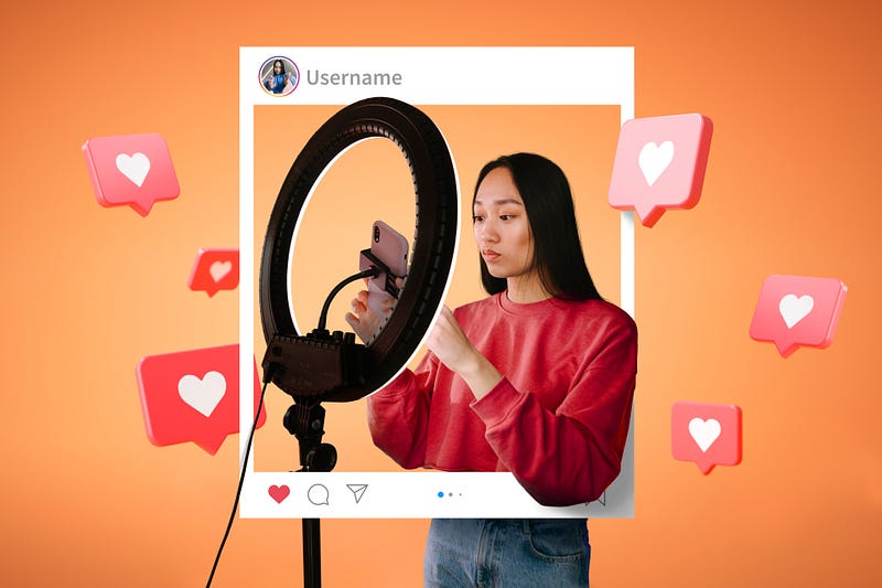
Use visuals that make people want to click on your work among millions of others.Showing Your Face Too Often
Showing your face on your blogs is a personal choice. Some people do it for fame, and some people do it to build a brand. But if you want to have a successful blog, you need to know if your images work for you or against you.
This is a new trend among bloggers. They show off their picture in every piece they write. Instead, they’d be talking about building a start-up and adding their image of having a cocktail.
Before doing that, ask whether your audience wants to see your face. It is necessary or is it essential to your story.
If it’s an image of your transformation like Neeramitra Reddy keeps sharing, there’s a ton of benefit you’re providing to the audience by showing a preview of your transformational journey.
Your blog image has to provide a story or add a relevant hook to your existing piece.
When a reader shares your image with your face, they promote a person, but when there’s a visual that depicts the central idea, they’re endorsing a concept.
Nicolas Cole may have started building a brand by sharing his high-resolution pictures lately. Still, he began by sharing the transformation image that got viral on Quora kickstarted his writing journey.
People clicking on your articles for substance will always benefit you more than them clicking for your beauty unless you are a model or love flaunting yourself.Let’s Get A Bit Technical
You can pick the right subject and still be making mistakes.
Now, I can’t teach you what I have learned for four years in the Visual Communications course, but I can share a few things you can keep in mind.
- Contrast: Your object is merging with the background. Using contrast in a balanced way ensures that your design or image will be attractive. There’s no contrast and focus; hence hard to know where to focus. Color contrast is another great way to differentiate your imagery from other writers.
- Dimension: When you use a portrait or horizontal image, the preview only shows the top 20% of it and leaves the most crucial aspect of the picture.
- Balance: When the central entity of the image is tiny compared to the foreground, it won’t be visible when readers come across it on mobile devices.
- Focus: If you’re using photos taken yourself, make sure they’re well focused and sharp. Poor image quality may not send the right message to your audience.
Breaking rules also help in smashing monotony, but that only works once we’ve mastered the basics.
The Psychology Behind the Image
Do people care about the image?
Well, if you weren’t aware 93% of communication is non-verbal.
While designing a poster, creative, or ad, a designer needs to be prudent about what image they use. For example, we can’t use Americans when designing for an Indian audience.
Writers tend to ignore it because we know how to play with words. However, every picture or graphic we use sends a message to your reader.
It’s invoking thought and a trigger that will make them click on your blog. But, unfortunately, you may not pay attention to when you’re editing it for the third time, and the cover image gets ignored all this time.
If you don’t know how to use the covers to increase your blog open rate, remember this checklist 👇🏻
- Is it creating a hook?
- Is it intriguing to the reader?
- Is it complementing your story?
- Does it align with the feel of your blog?
- Would you click on it if it appears on your feed?
Putting yourself in your reader's shoes would make selecting your cover image more straightforward. Spending five minutes extra on your cover selection can increase your open rate to 20–25%.
Try it.
A picture should either add onto your story or create a hook for people to click and increase your opening rate.Not Creating Positive Triggers
Have you noticed a pattern in every cover image used by Tim Denning?
All of his cover images are high contrasted with neon glare. The bright colors make his blogs pop in tons of explicit images much use. That’s his unique style.
Darius Foroux uses his art as his blog covers. It adds a striking touch when everyone is aggressively using Unsplash.
You don’t need to be an artist or an illustrator to do so, but you can choose to follow a pattern of images like Amardeep Parmar uses in his blogs with the help of Canva.
A unique style makes your blog stand out in millions of others and creates a reoccurrence in your readers' minds. These are mini branding exercises you can use while selecting the cover image for your blog.
This also creates nostalgia and helps your readers connect with you. In the words of Dr. Filippo Cordaro, a researcher of nostalgia and consumer decision-making
“On a basic level, recalling these positive memories simply puts us in a more positive mood. On a more complex level, recalling these experiences makes us feel a stronger sense of social connectedness with others.”
Summary
Do you know why people say don’t judge a book by its cover?
We judge what we see.
First impressions are more important than we think. It applies to blind dates, book covers, and even blog covers. Next time you add a cover to your blog, remember to
- Use visuals that make people want to click on your work
- Does Your Audience Want To See Your Face?
- Don’t add irreverent images as our parents do on Facebook.
- Take care of the design hygiene
- Pick an image with a hook and story
- Add some personalization
People decide in the first three seconds to consume your content. This decision is highly dependent on your heading and blog visuals.
Once you’ve mastered your writing, the next step to master is the visual appeal of your blog post.


