
Enhancing Investment Strategies Portfolio Optimization and Analysis
Leveraging Financial Data and Advanced Analytics to Maximize Portfolio Performance
In the complex and ever-changing world of investment, making informed decisions is crucial for maximizing returns while managing risk. This comprehensive guide delves into the nuanced process of portfolio optimization and analysis, utilizing a blend of financial data and advanced analytical techniques. By exploring methods to optimize portfolio weights, calculate the Sharpe ratio, and visualize investment data, investors can gain deeper insights into their asset allocation strategies. Whether you’re a seasoned investor or just starting out, this guide provides valuable tools and knowledge to help you navigate the financial landscape, enhancing your investment approach for better performance outcomes.
Reading and plotting stock data involves retrieving and visualizing information from stocks’ performance, usually done using software or programming languages like Python.Libraries imported and seaborn-darkgrid style applied
import yfinance as yf
import numpy as np
import pandas as pd
import matplotlib as mlp
import matplotlib.pyplot as plt
mlp.style.use('seaborn-darkgrid')
This code imports libraries needed to work with stock data. It includes the yfinance library for fetching data, numpy for mathematical operations, pandas for data manipulation, and matplotlib for creating plots. The code also sets the plot style to ‘seaborn-darkgrid’ for a more visually appealing display.
In stock market data, you will find information about stocks including the date, opening price, highest and lowest prices, closing price, trading volume, and adjusted closing price. The adjusted close considers factors like stock splits and dividend payments to provide a more accurate representation of the stock’s performance.
Data collected from Yahoo Finance for the specified tickers
tickers = ['AAPL','SPY','MSFT']
info = yf.Tickers(' '.join(tickers))
history = pd.DataFrame(info.history(period='10y'))[*********************100%***********************] 3 of 3 completedThis code creates a list called tickers with the stock symbols for Apple (AAPL), S&P 500 ETF (SPY), and Microsoft (MSFT). It combines these symbols into a single string separated by spaces and uses it to retrieve historical stock market data from these companies using the yf.Tickers method. The code then generates a DataFrame named history with the 10-year historical stock market data for these specific companies.
Column names concatenated with underscores.
history.columns = ['_'.join(tup) for tup in history.columns.values]
history.head()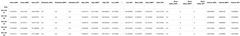
The code combines each column name in a DataFrame with an underscore to rename the columns. Then, it shows the first few rows of the DataFrame to display the updated column names.
Retrieves 10-year stock history.
history.columnsIndex(['Close_AAPL', 'Close_MSFT', 'Close_SPY', 'Dividends_AAPL',
'Dividends_MSFT', 'Dividends_SPY', 'High_AAPL', 'High_MSFT', 'High_SPY',
'Low_AAPL', 'Low_MSFT', 'Low_SPY', 'Open_AAPL', 'Open_MSFT', 'Open_SPY',
'Stock Splits_AAPL', 'Stock Splits_MSFT', 'Stock Splits_SPY',
'Volume_AAPL', 'Volume_MSFT', 'Volume_SPY'],
dtype='object')This code retrieves the column names from a pandas DataFrame named “history” using the columns attribute. It then generates a list containing the names of the columns in the DataFrame.
Normalizing and plotting data involves adjusting the scale of values within a dataset to facilitate comparison and analysis. By transforming values to a standard scale, patterns and trends can be more easily recognized. Following normalization, the data is then graphed to visually represent relationships and insights present within the data. Normalizing data is a crucial step to ensure fair comparisons of stocks. To do this, we use the values from the first observation as a reference point for normalization. Normalized values are obtained by dividing a set of values by the corresponding values from the first day.
Plots historical stock data
colors = ['coral', 'darkslateblue', 'mediumseagreen']
ax1 = plt.subplot(1,2,1)

(history[['Close_AAPL','Close_SPY','Close_MSFT']]/history.loc[history.index.min(),['Close_AAPL','Close_SPY','Close_MSFT']])\
.plot(ax=ax1,figsize=(20,5),color= colors)
ax2 = plt.subplot(1,2,2)
history[['Volume_AAPL','Volume_SPY','Volume_MSFT']].rolling(30).mean().plot(kind='area',ax=ax2,figsize=(20,5),alpha=1,color=colors)
plt.suptitle('Historical Data For SPY Index, Apple and Microsoft Stocks');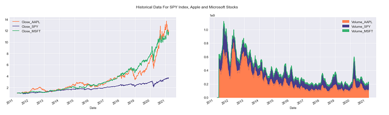
This code generates a figure with two adjacent subplots. The first subplot contains line plots showing the normalized historical closing prices of Apple (AAPL), S&P 500 (SPY), and Microsoft (MSFT) stocks. The colors of the lines in the plot are defined using a custom color palette. In the second subplot, it shows the 30-day average volume data for three stocks using area plots with a custom color palette. Finally, a title is included in the figure to describe the data being shown.
It’s crucial to note that stocks are not traded every day in the New York Stock Exchange or any market. Typically, there are around 252 trading days in a year.
Yahoo Finance data retrieval and plotting
import yfinance as yf
import numpy as np
import pandas as pd
import matplotlib as mlp
import matplotlib.pyplot as plt
mlp.style.use('seaborn-darkgrid')
def prepare_data(tickers=['SPY','AAPL','GOOG','MSFT'],period='5y'):
    if len(tickers)>1:
        try:
            df_information = yf.Tickers(' '.join(tickers))
            df = pd.DataFrame(df_information.history(period=period))
            df.columns = ['_'.join(tup) for tup in df.columns.values]
            return df
        except:
            base_info = yf.Ticker(tickers[0])
            base_df = pd.DataFrame(base_info.history(period=period))
            base_df.columns = [col+'_'+tickers[0] for col in base_df.columns.values]

            for ticker in tickers[1:]:
                temp_info = yf.Ticker(ticker)
                temp_df = pd.DataFrame(temp_info.history(period=period))
                temp_df.columns = [col+'_'+ticker for col in temp_df.columns.values]
                base_df = base_df.join(temp_df,how='outer')
            return base_df

    else:
        info = yf.Ticker(tickers[0])
        df = pd.DataFrame(info.history(period=period))
        df.columns = [column+'_'+tickers[0] for column in df.columns]
        return df
def plot_data(df,tickers=['SPY','AAPL','GOOG','MSFT'],
column = 'Close',kind='line',title='Historical Close Price Data',
ylabel='Close Prices',xlabel='Date',**kwargs):
columns_interest = [column+'_'+ticker for ticker in tickers]
ax = df[columns_interest].plot(kind=kind,title=title,**kwargs)
plt.xlabel(xlabel)
plt.ylabel(ylabel)
return ax
class FinancialData(object):
and prepares it in a dataframe
INPUTS:
tickers (list): a list of all the tickers that you want to analize
period (string): a string with the period of the data you want to
analize
OUTPUTS:
df (pandas Data Frame): Data frame with the data required
assuming that the index of the dataframe is the x axis of the plot
INPUTS:
df (pandas dataframe): dataframe with the information to be plotted
tickers (list): list of the tickers to be plotted
column (string): the kind of data to be plotted
OUTPUTS:
None
INPUTS:
ticker (string): name of the ticker added
OUTPUTS:
df (pandas DataFrame): dataframe with the information for all tickersThis code uses the yfinance library to gather historical financial data for a list of stock tickers. It arranges this data into a pandas DataFrame for further evaluation and visualization through matplotlib. The prepare_data function retrieves historical stock data for either multiple tickers or a single ticker during a specific timeframe. Meanwhile, the plot_data function displays the chosen data column (such as closing prices) for the selected tickers in a line graph. The prepare_data function receives a list of stock tickers and a chosen time period, then produces a DataFrame containing historical price data for those tickers. If multiple tickers are provided, the function merges the data into one DataFrame. The plot_data function, on the other hand, generates a line plot using the DataFrame created by prepare_data, enabling users to see the historical price trends of the chosen tickers visually. This code is designed as a basic tool to retrieve, arrange, and display historical stock price data for the purpose of visualization and analysis.
Creates a 3D NumPy array
np.empty((2,2,2))array([[[0.00000000e+000, 0.00000000e+000],
[0.00000000e+000, 0.00000000e+000]], [[0.00000000e+000, 1.11461210e-320],
[4.23079447e-307, 2.12199579e-314]]])This code uses the NumPy library to create a 3D array with dimensions 2x2x2. The array is populated with random values and not pre-set to any specific numbers.
Creates a 3x4 NumPy array filled with ones of integer type
np.ones((3,4),dtype=np.int_)array([[1, 1, 1, 1],
[1, 1, 1, 1],
[1, 1, 1, 1]])This code snippet initializes a 3x4 array with all elements set to 1. It’s set to contain only integer data type elements.
Creating random numbers is a common task in programming. Random numbers are generated to add variety and unpredictability to applications. This can be achieved by using built-in functions that generate random numbers in programming languages such as Python, Java, or JavaScript. These functions give developers a way to create randomness and introduce unpredictability in their programs.
Create a 3x3 array of random numbers
np.random.random((3,3))array([[0.32325973, 0.51599754, 0.98826882],
[0.44181575, 0.78526823, 0.15029207],
[0.49705801, 0.77948895, 0.58875742]])This code creates a 3x3 array containing random decimal numbers between 0 and 1. It utilizes the random module from numpy to generate the matrix with 3 rows and 3 columns, populating each element with a random decimal value within the specified range.
Generate a 3x3 array of random numbers
np.random.rand(3,3)array([[0.28334021, 0.63304372, 0.44916754],
[0.874534 , 0.79864784, 0.28497148],
[0.33016149, 0.78766406, 0.09482154]])This code creates a 3x3 array filled with random numbers ranging from 0 to 1. It uses the np.random.rand function from the NumPy library to generate the array with the desired dimensions and random values inside it.
Generates random numbers from a normal distribution.
np.random.normal(loc=3,scale=4,size=(3,3,2))array([[[ 9.88644055, 4.35379826],
[ 3.95953109, -4.0575919 ],
[ 6.78268362, 2.47744966]], [[ 9.00606853, 6.23664852],
[ 6.90060368, -10.25505257],
[ 2.70417378, 4.86988088]], [[ 5.36033961, 7.0094723 ],
[ 1.51785233, -0.74632205],
[ 1.66305871, 1.5339755 ]]])This code creates a 3D array filled with random numbers that have a normal distribution. The numbers have an average of 3 and a spread of 4. The array is structured with 3 rows, 3 columns, and 2 layers. Each value in the array is randomly generated according to the specified normal distribution parameters.
A random integers generator is a tool that creates random whole numbers without any predictable pattern.
Generates random integers
print(np.random.randint(10))  # a single integer in [0,10)
print(np.random.randint(0,10)) # the same, but with [low, high) explicit
print(np.random.randint(0,10,size=5)) # 5 rnadom integers as a 1D array
print(np.random.randint(0,10,size=(2,3))) # 2x3 array of random integers
4
1
[9 5 1 3 2]
[[6 1 1]
[1 1 9]]This code uses NumPy to create random integers. The first line displays a random whole number from 0 to 9. The second line repeats the information from the first line, but it clarifies that the range is from 0 to 10. The code on the third line creates a 1D array containing 5 random integers between 0 and 9, and then prints those integers. The fourth line creates a 2x3 array containing random integers from 0 to 9, and then displays the array.
Generates 3D array, prints properties
array_test = np.random.randint(0,100,size=(3,2,5))
print('Shape of the array',array_test.shape)
print('Number of dimensions of the array',array_test.ndim)
print('Number of elements in the array',array_test.size)
print('Data type of elements in the array',array_test.dtype)
Shape of the array (3, 2, 5)
Number of dimensions of the array 3
Number of elements in the array 30
Data type of elements in the array int32This code uses NumPy to create random integers. The first line displays a random whole number from 0 to 9. The second line repeats the information from the first line, but it clarifies that the range is from 0 to 10. The code on the third line creates a 1D array containing 5 random integers between 0 and 9, and then prints those integers. The fourth line creates a 2x3 array containing random integers from 0 to 9, and then displays the array.
Operations with arrays refer to the various actions or manipulations that can be performed on arrays in programming. These operations include tasks such as adding elements to an array, removing elements from an array, finding the length of an array, and sorting the elements in an array. Array operations are essential in programming for managing and working with collections of data efficiently.
Operations on a 2D array.
array = np.random.randint(0,10,(5,10))
print('Array:\n',array)
print('\nThe sum of all elements inside the array:\n',array.sum())
print('\nThe sum by rows:',array.sum(axis=0))
print('\nThe sum by columns:\n',array.sum(axis=1))
print('\nMaximum value per row:\n',array.max(axis=0))
print('\nMinimum value:\n',array.min())
print('\nMean value:\n',array.mean())
Array:
[[1 4 9 4 4 4 1 1 9 7]
[4 7 9 5 1 3 0 4 7 9]
[8 3 9 4 5 5 7 0 2 8]
[5 6 6 5 9 8 0 8 8 5]
[1 2 5 0 8 9 3 0 0 5]]The sum of all elements inside the array:
237The sum by rows: [19 22 38 18 27 29 11 13 26 34]The sum by columns:
[44 49 51 60 33]Maximum value per row:
[8 7 9 5 9 9 7 8 9 9]Minimum value:
0Mean value:
4.74This code creates a 5x10 array with random integers from 0 to 10. It then computes and displays different statistics about the array, like the total sum of all elements, sum of each row and column, maximum value in each row, minimum value in the entire array, and the average value of all elements.
This is about finding the highest value.
Indices of maximum values per row.
array.argmax(axis=1)array([2, 2, 2, 4, 5], dtype=int64)This code determines the position of the largest element in each row of an array by providing the index of the maximum value for each row.
Timing Python operations helps measure the execution time of a specific piece of code. This is useful for optimizing performance, identifying bottlenecks, and comparing different implementations to determine the most efficient one. Python provides a time module and the timeit module for this purpose. By measuring the time taken to run a certain code snippet, developers can make informed decisions about improving their code's efficiency.
Calculates the mean of an array manually
import time
def manual_mean(array):
This code creates a function named manual_mean that calculates the average value of an array of numbers.
Calculates mean of a large array and measures time taken
array = np.random.random((1000,1000))
t1 = time.time()
print(manual_mean(array))
t2 = time.time()
print('The time this operation took with doble for loop is: {}'.format(t2-t1))
0.5002988986644854
The time this operation took with doble for loop is: 0.30940723419189453This code uses NumPy to create a random 1000x1000 array. After that, it computes the mean of the array using a custom function. The program then measures the time taken to calculate the mean by implementing a double for loop and prints out the time taken for this task.
NumPy mean calculation and timing
t1 = time.time()
print(array.mean())
t2 = time.time()
print('The time this operation took with Numpy function is: {}'.format(t2-t1))
0.5002988986644838
The time this operation took with Numpy function is: 0.0019986629486083984This code uses the numpy library in Python to find the average of numbers in an array. It measures the time taken for this calculation by noting the start time (t1) and end time (t2) of the process. Finally, it displays the time it took to find the average using numpy.
Creates a 3x3x3 NumPy array and accesses a specific element
array = np.random.random((3,3,3))
print(array)
array[0,0,0]
[[[0.97826322 0.1011398 0.41672169]
[0.56012667 0.77264483 0.69142513]
[0.81750053 0.33058743 0.75150758]] [[0.50667922 0.90283534 0.51388241]
[0.99947346 0.0039934 0.76414423]
[0.64396944 0.9368836 0.33959176]] [[0.37981604 0.303617 0.48395339]
[0.48984756 0.95356302 0.19647438]
[0.11587259 0.19342259 0.31898468]]]0.9782632214556739This code generates a 3x3x3 array filled with random numbers between 0 and 1 using the np.random.random function from the NumPy library.
The print(array) statement shows the entire 3x3x3 array in the output.
The statement array[0,0,0] accesses and prints the value at the first position of a three-dimensional array.
Slices a 4x4 array, selecting every other row and column
array = np.random.randint(0,9,(4,4))
print(array)
print(array[0:4:2,0:4:2])
[[6 8 4 7]
[3 2 0 7]
[4 0 0 3]
[6 8 6 4]]
[[6 4]
[4 0]]This code creates a 4x4 grid of random integer values between 0 and 9 using Python’s NumPy library. It displays the full array and a specific subset of the array. The subset shown is made using slicing notation. The part before the colon, 0:4:2, indicates that the subset starts from index 0, stops at index 4 (not inclusive), and progresses by 2 steps. This method picks every other row and column of the initial array, starting from the first row and first column.
Time series statistical analysis involves studying patterns and trends within a set of data points collected at specific time intervals. By analyzing these data sequences, researchers can identify relationships, make predictions, and understand changes over time. How can I help you today? In this lesson, we will explore a practical method to calculate different statistics for a dataframe, such as the mean, median, rolling mean, rolling standard deviation, and more. You need to calculate: Bollinger bands help quantify how much a stock price differs from its average value. Daily returns refer to the fluctuations in the price of a stock from one day to the next.Loads historical financial data.
tickers = ['SPY','AAPL','BTC-USD','ETH-USD']
df = prepare_data(tickers)
df.head()[*********************100%***********************] 4 of 4 completed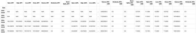
This code generates a list of stock symbols such as ‘SPY’, ‘AAPL’, ‘BTC-USD’, ‘ETH-USD’. It then calls a function called prepare_data to collect data for these symbols and merges them into a dataframe named df. Finally, it shows the initial rows of the dataframe using df.head().
Multiple ticker price plot
plot_data(df,tickers,figsize=(10,5),secondary_y=['Close_BTC-USD','Close_ETH-USD'])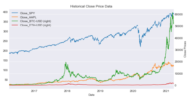
This code generates a plot using data from a DataFrame (df) for specified tickers. The plot’s dimensions will be 10x5 units. It also provides a secondary y-axis for the ‘Close_BTC-USD’ and ‘Close_ETH-USD’ columns, making it simpler to compare these columns with the primary y-axis data.
Summary statistics for tickers
df[['Close_'+ticker for ticker in tickers]].agg([min,max,'mean','median','std'])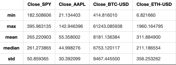
This code calculates different statistical values like minimum, maximum, mean, median, and standard deviation for the ‘Close’ prices of stocks. It analyzes each stock in the given list of tickers within a DataFrame.
Rolling statistics refer to a technique used in data analysis to calculate and visualize statistical measures like mean, median, standard deviation, etc. by moving a fixed-size window across a time series or sequence of data. This helps in understanding how these measures change over time and in identifying trends or patterns in the data.
SPY close with rolling mean and Bollinger Bands.
spy = prepare_data(['SPY'])
ax = plot_data(spy,['SPY'],figsize=(10,5),label='SPY Close')
spy['Close_SPY'].rolling(20).mean().plot(ax=ax,label='Rolling Mean'
                                         ,color='crimson')
(spy['Close_SPY'].rolling(20).mean()+2*spy['Close_SPY'].rolling(20).std())\
    .plot(linestyle='--',color='maroon',linewidth=1,ax=ax,label='Bollinger Bands')
(spy['Close_SPY'].rolling(20).mean()-2*spy['Close_SPY'].rolling(20).std())\
    .plot(linestyle='--',color='maroon',linewidth=1,ax=ax,label='')
ax.set_xlabel('Date')
ax.legend(loc='upper left');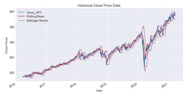
This code utilizes financial information for the stock identified by the ticker symbol ‘SPY’. It generates a plot illustrating the stock’s closing price alongside its 20-day rolling average. Additionally, it displays Bollinger Bands, which are volatility bands positioned both above and below the stock’s moving average. Bollinger Bands are used to determine whether a stock is overbought or oversold based on its current price level. The code processes data for the stock ‘SPY’, plots the closing price, and includes a 20-day rolling average. It further computes upper and lower Bollinger Bands by adding and subtracting two standard deviations from the rolling mean respectively, which are shown as dashed lines on the graph. This code shows the stock price of ‘SPY’ along with its moving average and Bollinger Bands. It helps to understand the stock’s volatility and find possible trading chances.
When looking at the rolling mean of a series, it is commonly considered to represent the true base price of the asset. When the actual price of the asset crosses this rolling average, it may indicate a potential opportunity to either buy or sell. To make informed decisions on whether to buy or sell, it’s advised to analyze the rolling standard deviation in addition to the rolling mean. The Bollinger Bands represent a range around the rolling average of a data set. The upper band is calculated as the rolling mean plus 2 standard deviations, while the lower band is calculated as the rolling mean minus 2 standard deviations.
“Daily Returns” refer to the percentage change in the value of an investment over a single day. It is a common way to measure the performance of stocks, mutual funds, or other financial assets on a daily basis. Daily returns are a vital metric in financial analysis that tracks the price variation on a daily basis. To calculate daily returns for a stock on a given day (denoted as t), you compare the return on that day to the return on the previous day (t-1). You divide the return on day t by the return on day t-1, then subtract 1 from the result.
SPY close with mean line
ax = spy['Close_SPY'].pct_change().plot(color='gray',figsize=(10,5))
mean= spy['Close_SPY'].pct_change().mean()
ax.axhline(mean,color='maroon')
ax.text('2017-01',0.050,'$\mu$ = {}'.format(round(mean,3)),fontsize=15)Text(2017-01, 0.05, '$\\mu$ = 0.001')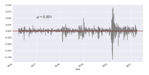
This code takes the closing prices of the SPY stock (S&P 500 ETF) and calculates the percentage change over time. It then creates a graph showing this percentage change in gray color. The code also finds the mean of the percentage change and adds a horizontal line representing this average in maroon color on the graph. Additionally, it includes text on the plot to show the mean value, with a specified format, font size, and position on the x-axis (date).
Daily returns for SPY
(spy['Close_SPY']/spy['Close_SPY'].shift(1)-1).plot()<AxesSubplot:xlabel='Date'>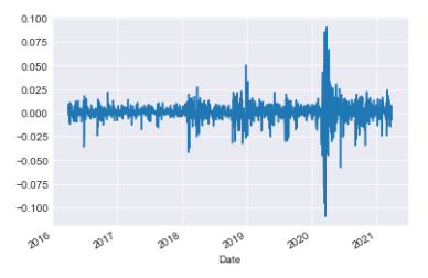
This code calculates the daily percentage change in the SPY stock’s ‘Close’ price and displays it on a graph. It subtracts yesterday’s price from today’s price, divides the result by yesterday’s price, and then subtracts 1 to get the percentage change. The graph helps to see how the stock price fluctuates daily.
Cumulative returns represent the total amount an investment has gained or lost over a specific period of time. It accounts for both capital gains or losses and any income generated by the investment during that time period. Cumulative returns are important as they help you compare returns in relation to a reference point.Cumulative returns for SPY
(spy['Close_SPY']/spy['Close_SPY'].iloc[0]*100-100).plot()<AxesSubplot:xlabel='Date'>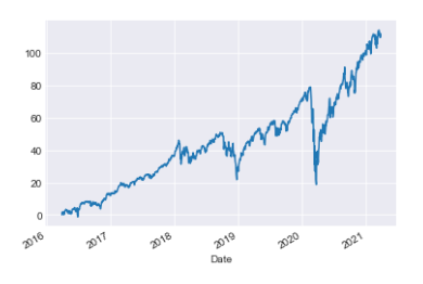
This code compares the initial price of a stock with its current ‘Close_SPY’ price to calculate the percentage change, then displays this information on a graph. This visualization helps to track how the stock price has fluctuated over time relative to its starting value.
Financial data analysis: rolling statistics and returns
def rolling_statistics(df,column='Close',ticker='SPY',function=mean,
                      window=20,plot=True,bollinger=False,
                       rolling_color='crimson',roll_linewidth=1.5,**kwargs):
    series = df[column+'_'+ticker].rolling(window).mean()
    if plot:
        ax = df[column+'_'+ticker].plot(label=column+' '+ticker,**kwargs)
        series.plot(ax=ax,color=rolling_color,linewidth=roll_linewidth)
        if bollinger:
            (series+(2*df[column+'_'+ticker]).rolling(window).std()).plot(linestyle='--',
                                                                      color='darkgreen',
                                                                       linewidth=1,
                                                                       ax=ax,
                                                                       label=
                                                                       'Bollinger')
            (series-(2*df[column+'_'+ticker]).rolling(window).std()).plot(linestyle='--',
                                                                      color='darkgreen',
                                                                       linewidth=1,
                                                                       ax=ax,
                                                                       label='')
        ax.legend();
    return series
def find_returns(df,columns,tickers,return_window=1,plot=False,**kwargs):
if isinstance(columns,list) and isinstance(tickers,list):
col_names = [column+'_'+ticker for ticker in tickers for column in columns]
elif isinstance(columns,list):
col_names = [column+'_'+tickers for column in columns]
elif isinstance(tickers,list):
col_names = [columns+'_'+ticker for ticker in tickers]
else:
col_names = columns+'_'+tickers
returns = df[col_names].pct_change(return_window)
if plot:
returns.plot(**kwargs)
return returns
class FinancialData(object):
and prepares it in a dataframe
INPUTS:
tickers (list): a list of all the tickers that you want to analize
period (string): a string with the period of the data you want to
analize
OUTPUTS:
df (pandas Data Frame): Data frame with the data required
assuming that the index of the dataframe is the x axis of the plot
INPUTS:
df (pandas dataframe): dataframe with the information to be plotted
tickers (list): list of the tickers to be plotted
column (string): the kind of data to be plotted
OUTPUTS:
None
can plot the rolling window with the data, adding the Bollinger bands.
INPUTS:
df (pandas Data Frame): data frame with the financial data, that contains
both the column and ticker specified in the function
column (string): the column that you want to get the rolling function of
ticker (str): the ticker from which you want to know the information
function: function that will be rolled through the time series
window (int): the window of the rolling data
OUTPUTS:
rolled (pandas series): a series with the rolling statistics specified INPUTS:
df (pandas Data Frame): dataframe containing the time series information
columns (list or string): columns to find the returns
tickers (list or string): tickers to be analyzed
return_window (int): the window from which to get the returns, default
daily OUTPUTS:
returns (pandas series or data frame): pandas data structure with the
returns
INPUTS:
ticker (string): name of the ticker added
OUTPUTS:
df (pandas DataFrame): dataframe with the information for all tickersThis code includes three functions organized within a class to analyze financial data. The rolling_statistics function in Python computes rolling statistics, such as the mean, for a specified column in a DataFrame. Additionally, it can create visualizations of the rolling statistics, including the option to include Bollinger bands in the plot. The function find_returns evaluates the percentage change in a dataset over a set window, such as daily returns. It can also display this data graphically if chosen. The FinancialData class is a tool used for managing financial data. It comes with functions for organizing financial information, creating charts with Bollinger bands, gathering statistics over time, and calculating returns for specified columns and tickers. These functions and methods help with analyzing financial data, showing trends visually, and calculating returns. They make it easier to understand and interpret financial information.
Incomplete data refers to information or datasets that are missing certain elements, values, or details that are needed to fully understand or analyze a situation. This lack of complete information can hinder accurate interpretation or decision-making. It is important to acknowledge and address any gaps in data to ensure reliable and meaningful results.
Financial data is often a compilation of information from different sources, rather than being perfectly recorded minute by minute with no gaps or missing points, as some might believe. It’s important to note that not all financial products are traded daily. Some products may be newly created during the time being analyzed, may have sporadic trading days, or may not trade at all when others do. Additionally, missing data could be due to errors or lack of market liquidity. Filling missing data involves replacing empty or null values in a dataset with appropriate information. When handling missing data in a time series, it is advisable not to interpolate the missing values. Interpolation uses future data to estimate past data, which can lead to distortions in the accuracy of our models. One way to manage missing data is by using the fill-forward method, which means keeping the last known value until a new value is available. In cases where historical data is missing and needs to be filled in, the fill-backward method is recommended, as it takes the closest known data point. “Filling forward means to copy a value from the previous cell and automatically continue it in the following cells in a row or column.” Filling backward means completing a task or activity that was missed or left incomplete in the past. Python is a popular programming language known for its readability and versatility. It is widely used in various fields such as web development, data analysis, artificial intelligence, and more. Python’s simplicity and straightforward syntax make it a great choice for beginners and experienced programmers alike. “Fill forward” is a term used in data management to describe a method where missing values in a dataset are replaced with the most recent non-missing value that occurred before it. This technique helps to ensure that each data point has a value by carrying the previous value forward. This code fills missing values in a DataFrame by using forward-fill, which copies the previous non-missing value to fill in the missing ones. The fill backward method is a function in programming that fills missing values in a dataset by using the value in the next available row and copying it backward. This can be useful for ensuring that all data points in a series are complete and do not have gaps. To fill missing values in a DataFrame, the code above uses the “bfill” method, which fills NaN values with the next valid value in the column.
Histograms and scatter plots are visual tools commonly used in statistics. Histograms display the distribution of a single numerical variable, showing the frequency or proportion of data within different intervals or bins. Scatter plots, on the other hand, help to visualize the relationship between two numerical variables by displaying individual data points on a graph. These tools are helpful in analyzing data patterns and relationships in statistics. To better understand individual daily returns, it’s helpful to compare them across various stocks. One method to achieve this is by creating histograms that show how the returns of different stocks are distributed.
Short data analysis: rolling statistics and returns
tickers = ['SPY','BTC-USD','DX-Y.NYB','MCFT']
financial_data = FinancialData(tickers,period='5y')
financial_df = financial_data.prepare_data()
returns_df = financial_data.find_returns('Close',tickers,plot=True,kind='hist',alpha=0.5,bins=30)[*********************100%***********************] 4 of 4 completed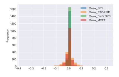
This code performs the following tasks: A list is made with tickers such as ‘SPY’, ‘BTC-USD’, ‘DX-Y.NYB’, and ‘MCFT’. You can obtain historical financial data for specific stocks over a 5-year period by using the FinancialData class. Financial data is organized and prepared into a DataFrame. This function computes returns using the closing prices of selected tickers. It then generates a histogram plot of these returns, allowing customization of parameters like transparency, number of bins, and plot style.
Histogram of Close price returns for the selected tickers
returns_df.hist(bins=50,figsize=(15,15))
plt.suptitle('Return Distribution Close price',fontsize=20)Text(0.5, 0.98, 'Return Distribution Close price')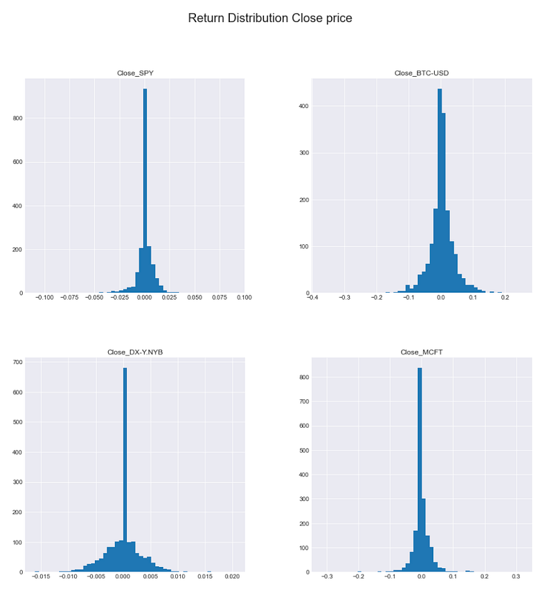
This code creates a histogram for a DataFrame called returns_df, showing how the data values are distributed. It uses bins of size 50 and the resulting histogram will be displayed in a plot that is 15x15 in size. The plot will have a title “Return Distribution Close price” with a font size of 20 at the top, providing a visual representation of how returns are distributed in the DataFrame.
After creating histograms showing the distribution of returns, we can analyze key statistics from them. These include the mean, standard deviation (representing the average deviation from the mean), and kurtosis. Kurtosis indicates how different the distributions are from a normal distribution, which helps identify the presence of fat tails indicating more frequent extreme values compared to a normal distribution. Negative kurtosis would suggest a lack of extreme values in the tails compared to a normal distribution.
Calculating return distribution statistics.
returns_df.agg(['mean','std','kurtosis'])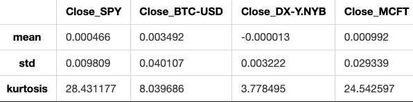
This code analyzes the data in a DataFrame called returns_df by calculating three statistics for each column: mean (average value), standard deviation (amount of variation), and kurtosis (peakness or flatness of the distribution).
Analyzing return distribution.
statistics = returns_df['Close_SPY'].agg(['mean','std','kurtosis'])
ax = returns_df['Close_SPY'].hist(bins=30,color='maroon',figsize=(10,5))
ax.axvline(statistics['mean'],color='slategray',
           linewidth=2,label='Mean')
ax.axvline(statistics['std'],color='black',linewidth=1,linestyle='dashed',
          label='Stand. Dev.')
ax.axvline(-statistics['std'],color='black',linewidth=1,linestyle='dashed',
          label='')
ax.axvline(1.95*statistics['std'],color='darkgreen',linewidth=1,linestyle='dashed',
          label='1.95*Std')
ax.axvline(-1.95*statistics['std'],color='darkgreen',linewidth=1,linestyle='dashed',
          label='')
ax.text(-0.1,1000,'$\mu$ = {} \nStd = {} \nKurt = {}'.format(round(statistics['mean'],4),
                                                            round(statistics['std'],4),
                                                            round(statistics['kurtosis'],4)))
plt.legend()
plt.title('Statistical Analysis of Return Distribution for SQY');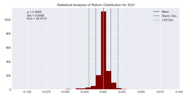
This code examines how returns are distributed for a stock denoted by the variable ‘Close_SPY’. The ‘agg’ function is used to calculate the average, variance, and shape of the returns in a data set. It generates a graph showing the distribution of returns using 30 bins and colored in maroon. Vertical lines are added to the histogram to show key values such as mean, standard deviation, 1.95 times the standard deviation, and their negative counterparts. This visual representation helps illustrate the distribution of returns. Afterward, text is included in the plot to display the mean, standard deviation, and kurtosis that have been calculated. The plot visually shows how the statistical analysis was done on the returns distribution of the stock represented by ‘Close_SPY’.
To explore the relationship between two stocks’ returns, we can create a scatter plot by plotting one stock’s returns on one axis and the other stock’s returns on the other axis. This visual representation helps us understand how the returns of the two stocks are related to each other.
Scatter plot: SPY vs BTC-USD
plt.scatter(returns_df['Close_SPY'],returns_df['Close_BTC-USD'])<matplotlib.collections.PathCollection at 0x1c1d1c60310>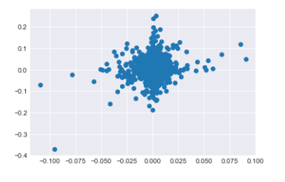
This code generates a scatter plot displaying the relationship between the closing prices of the S&P 500 index (‘Close_SPY’) and the Bitcoin price (‘Close_BTC-USD’). Each point on the plot corresponds to the closing prices of both assets on a specific day. By examining the scatter plot, we can visually identify any potential correlations or trends between the prices of these two assets.
Scatter matrix plot of return distributions for all assets
from pandas.plotting import scatter_matrix
scatter_matrix(returns_df,figsize=(15,15),diagonal='hist',color='teal',hist_kwds={'bins':30,'color':'teal'},alpha=0.2);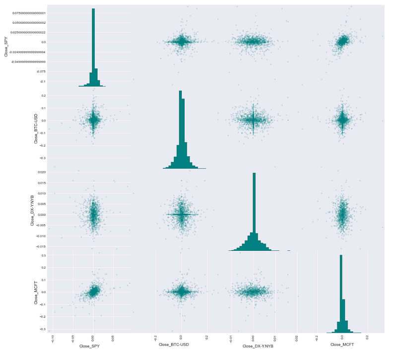
This code creates a scatter matrix plot with the help of the pandas library. The scatter matrix plot illustrates the connections between each pair of numerical columns in a DataFrame. The scatter matrix plot is being created for the DataFrame called returns_df. The command “figsize=(15,15)” adjusts the size of the plot to be 15 by 15 units. When diagonal=’hist’ is specified, each column in the plot will display a histogram in the diagonal. When using the color attribute with the value ‘teal’, you can adjust the color of markers in scatter plots and histograms to teal. When using hist_kwds={‘bins’:30,’color’:’teal’}, you can customize histograms by specifying the number of bins and the color of the bars. When alpha is set to 0.2 in a scatter plot, it adjusts the transparency level of the markers. When you run the code, a scatter matrix plot will appear. This plot will illustrate the connections between various columns within the returns_df DataFrame.
Scatter plots with regression lines
returns_df.dropna(how='all',inplace=True)
stocks = [col for col in returns_df.columns.values if col!='Close_SPY']
fig = plt.figure(figsize=(30,5))
axs = {'ax'+str(i+1):fig.add_subplot(1,len(stocks),i+1) for i in range(len(stocks))}
for i,col in enumerate(stocks):
    beta,alpha = np.polyfit(returns_df['Close_SPY'],returns_df[col],1)
    returns_df.plot(kind='scatter',ax=axs['ax'+str(i+1)],x='Close_SPY',
                   y=col,color='teal',figsize=(30,10))
    axs['ax'+str(i+1)].plot(returns_df['Close_SPY'],returns_df['Close_SPY']*beta+alpha)
    axs['ax'+str(i+1)].text(returns_df['Close_SPY'].min(),
                            returns_df[col].max(),r'$\beta$ = {}  $\alpha$ = {}'.format(round(beta,4),round(alpha,4)),
                           fontsize=15,color='midnightblue')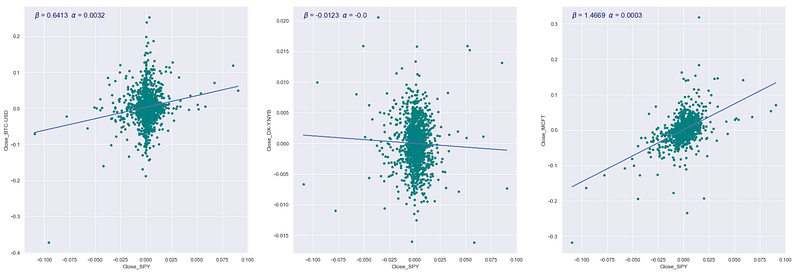
This code examines how the closing price of a stock market index (specifically, the S&P 500 denoted as ‘Close_SPY’) is related to the closing prices of other stocks. To begin with, any rows in a DataFrame (returns_df) that contain only missing values are eliminated. The code identifies the list of stocks in the DataFrame, except for ‘Close_SPY’. A figure object is created for plotting, with separate subplots made for each stock in the list. The code computes the beta and alpha values for each stock by performing a linear regression analysis between the closing prices of the stock and the ‘Close_SPY’ using NumPy’s polyfit function. It creates a scatter plot that displays how the closing prices of a stock relate to the ‘Close_SPY’ variable, each on their own subplot. It shows the regression line on the scatter plot. Last, it includes text in each subplot displaying the beta and alpha values of the linear regression model. This code shows and calculates how the closing prices of different stocks relate to the closing prices of the S&P 500 index in a straight line.
Correlation matrix using Spearman’s correlation coefficient
returns_df.corr('spearman')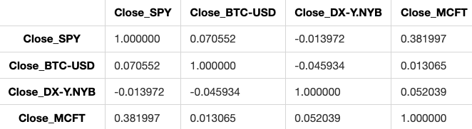
This code computes the Spearman correlation for the columns in a DataFrame named returns_df. Spearman correlation evaluates how closely two variables are related based on a monotonic function. This method is useful as it can account for both linear and non-linear connections between the variables.
Kurtosis is used to check if returns follow a normal distribution, especially in finance. This is crucial because assuming normality when it’s not true could underestimate risk, since extreme values occur more often in distributions with very positive kurtosis.
The Sharpe Ratio is a measure used to evaluate the risk-adjusted return of an investment or a portfolio. It compares the excess return of the investment to its volatility, providing insights into how well the investment compensates investors for the risk taken.
Other portfolio statistics that are commonly used include measures such as standard deviation, which indicates the volatility of returns, and beta, which measures the sensitivity of an investment’s returns to changes in the overall market.
Overall, these statistics help investors assess the performance and risk profile of their portfolios, allowing them to make more informed decisions about their investments. I see you haven’t entered any text. If you have any questions or need help with anything, feel free to ask! When analyzing portfolios, we look at overall statistics rather than just individual stocks. A portfolio is a distribution of funds across a group of stocks, with the assumption that the combined weights of the assets in the portfolio equal one.
This section displays the daily values of your investment portfolio. To find the daily portfolio value, follow these steps: To normalize prices with respect to a time window means to standardize or adjust the prices based on a specific period of time. This process helps to remove fluctuations or changes in prices over time, allowing for easier comparison and analysis. To apply the weights to the time series, simply multiply the values in the time series by the corresponding weights. Calculate the total value for each observation point.
Imports for financial analysis.
from financial_data import *
import yfinance as yf
import numpy as np
import pandas as pd
import matplotlib as mlp
import matplotlib.pyplot as plt
mlp.style.use('seaborn-darkgrid')
This code initializes the required libraries and configures the style for displaying financial data graphs. This line imports functions from a module named financial_data, which probably includes tools for managing and assessing financial information. The line “import yfinance as yf” is used to bring in the yfinance library, enabling the retrieval of stock market information from Yahoo Finance. When we write “import numpy as np” in Python, we are bringing in the numpy library. Numpy is used for handling arrays and matrices, especially when dealing with a lot of data or complex mathematical operations. The line “import pandas as pd” is used to import the pandas library, a tool commonly used for data analysis and manipulation. The line “import matplotlib as mlp” imports the matplotlib library, which is used for creating plots in Python. This line imports the pyplot module from matplotlib, allowing us to create plots using a MATLAB-like interface. This line of code sets the style of the plots to seaborn-darkgrid, a visually attractive style commonly used for displaying financial data.
FinancialData object and data preparation
fd = FinancialData(['SPY','XOM','GOOG','GLD'],period='5y')
prices = fd.prepare_data(fillna=False)[*********************100%***********************] 4 of 4 completedThis code gathers historical financial data for the stock symbols SPY, XOM, GOOG, and GLD spanning 5 years. The data is then processed without filling in any missing values.
Normalization of prices and calculation of portfolio values.
def normalize_prices(prices,start_date,end_date,tickers=[],column='Close'):
    columns = [column+'_'+ticker for ticker in tickers]
    norm_prices = prices.loc[start_date:end_date,columns]/prices.loc[start_date,columns]
    return norm_prices
def get_portfolio_values(prices,start_date,end_date,weights,tickers=[],column='Close'):
norm_prices = normalize_prices(prices,start_date,end_date,tickers,column)
portfolio_values = norm_prices*weights
portfolio_values['Total'] = portfolio_values.sum(axis=1)
return portfolio_valuesThis code contains two functions that are used to calculate the normalized prices of individual stocks and the total value of a portfolio based on the weights assigned to each stock. The normalize_prices function receives a dataframe containing stock prices, start and end dates, a list of stock tickers, and a column name. This function normalizes the stock prices for the specified tickers within the chosen start and end dates. It achieves this by dividing each day’s stock price by the price of the first day within the specified date range. The get_portfolio_values function calculates the total value of a portfolio based on input parameters like stock prices, dates, stock weights, tickers, and column name. It first normalizes the stock prices and then computes the portfolio values by multiplying normalized prices with stock weights. It then sums these values to determine the total portfolio value for each day. These functions assist in evaluating and monitoring how a group of stocks in a portfolio are performing, using predetermined weights and price information.
Returns the tickers used in the FinancialData object
fd.get_tickers()['SPY', 'XOM', 'GOOG', 'GLD']The code fd.get_tickers() is probably using a function or method called get_tickers() from an object or module named fd.
This code helps get a list of ticker symbols, which are short abbreviations that represent financial assets such as stocks, bonds, or options.
Weighted sum of normalized prices
weights = [0.2,0.2,0.4,0.2]
(normalize_prices(prices,'2016-03-28','2021-01-02',fd.get_tickers())*weights).sum()
Close_SPY 337.427505
Close_XOM 226.445565
Close_GOOG 726.180874
Close_GLD 272.989197
dtype: float64This code calculates the weighted sum of stock prices that have been adjusted for differences in scale across the chosen date range. The normalize_prices function adjusts the stock prices to a standard scale within a specified date range. The dataset called “prices” holds historical stock prices. To get the tickers of stocks, you can use the command fd.get_tickers(). Weights are used to calculate the weighted average of prices for different stocks. This involves multiplying the normalized prices by the specific weight assigned to each stock. The function “.sum()” computes the weighted sum of the normalized prices.Plotting portfolio values alongside normalized prices
ax = get_portfolio_values(prices,'2016-03-28','2021-01-02',weights,fd.get_tickers())['Total'].plot()
normalize_prices(prices,'2016-03-28','2021-01-02',fd.get_tickers()).plot(ax=ax)<AxesSubplot:xlabel='Date'>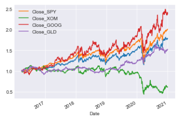
This code is carrying out two main functions: This tool calculates the total value of a portfolio by using stock prices, date range, weight of each stock, and stock tickers. It then shows this value over time through a graph for the specified date range. It adjusts stock prices to a chosen date range for specific stock tickers and displays the adjusted prices in a graph. These plots are commonly used to show and compare how a portfolio performs in terms of total value and the adjusted stock prices throughout a period of time.Portfolio object: tickers, period, weights
tickers = ['SPY','XOM','GOOG','GLD']
weights = [0.4,0.1,0.4,0.1]
portfolio = Portfolio(tickers,'5y',weights)[*********************100%***********************] 4 of 4 completedThe following code initializes a portfolio object by providing specific details such as ticker symbols, historical data duration (in this example, spanning 5 years), and the respective weights assigned to each ticker. Each ticker denotes an individual asset within the portfolio, like stocks or commodities, while the weights determine the percentage allocation of each asset within the portfolio. Essentially, this code establishes a structured portfolio based on the specified parameters for potential analysis or additional modifications.
Optimizers are used to fine-tune a parameterized model to improve its performance. Optimizers are tools that find the maximum or minimum of a function. They typically use techniques like gradient descent. In scipy, there is a module that provides optimizers. You can input a function and an initial guess of where the optimum might be located.
Data visualization setup
import pandas as pd
import numpy as np
import matplotlib.pyplot as plt
import matplotlib as mlp
import scipy.optimize as spo
mlp.style.use('seaborn-darkgrid')
This code imports key libraries for handling data and creating visualizations in Python. It includes Pandas for data manipulation, NumPy for numerical operations, Matplotlib for plotting data, and SciPy for optimization tasks. It also configures the plot style of Matplotlib to ‘seaborn-darkgrid’.
Function definition
def f(X):This code creates a function called “f” that accepts an input “X”.
The “methods” attribute simply indicates a particular optimizer algorithm being referenced.
Function test_run() is undefined
test_run()X = [2.], Y = [0.75]
X = [2.00000001], Y = [0.75000001]
X = [0.99999999], Y = [0.75000001]
X = [1.5], Y = [0.5]
X = [1.50000001], Y = [0.5]
Optimization terminated successfully (Exit mode 0)
Current function value: [0.5]
Iterations: 2
Function evaluations: 5
Gradient evaluations: 2
Minima found at:
X = [1.5], Y = [0.5]
X = [0.5 0.6 0.7 0.8 0.9 1. 1.1 1.2 1.3 1.4 1.5 1.6 1.7 1.8 1.9 2. 2.1 2.2
2.3 2.4 2.5], Y = [1.5 1.31 1.14 0.99 0.86 0.75 0.66 0.59 0.54 0.51 0.5 0.51 0.54 0.59
0.66 0.75 0.86 0.99 1.14 1.31 1.5 ]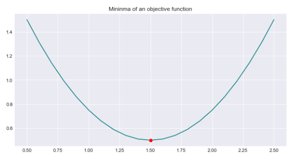
The function test_run() is probably a function that runs a test. Since it’s not defined in the code provided, we don’t know its exact function. It might be part of a testing framework or a custom function made for running a specific test case. In general, when test_run() is called, it should execute a test scenario and show the outcome, indicating if the test passed or failed.
One common problem faced by optimizers is solving convex problems. A function is considered convex if, when you draw a straight line between any two points on its graph, the line always lies above the graph.
When dealing with a parametrized model like linear regression, we need to determine a function that we want to minimize.
Calculates the error of a linear regression line fit to data points
def error(line, data):

    e = np.sum(np.power(data[:,1]-(line[0]*data[:,0]+line[1]),2))
    return e
This code establishes a function named “error” that accepts two parameters: “line” and “data”. The function calculates the error by summing the squared differences between the actual data points and the predicted values based on a linear equation. The function ultimately provides the error value, ‘e’, as its result.
Fits a line to noisy data points using the method of least squares
def fit_line(data, erroc_func):
    l = np.float32([0,np.mean(data[:,1])]) # guess of slope = 0 and intercept = mean(data)

    x_ends = np.float32([-5,5])
    plt.plot(x_ends,l[0]*x_ends+l[1],'m--',linewidth=2.0, label = "Initial Guess")

    result = spo.minimize(erroc_func,l,args=(data,),method='SLSQP',options={'disp':True})
    return result.x
    def test_run():
    l_orig = np.float32([4,2])
    print("Original line: C0 = {}, C1 = {}".format(l_orig[0],l_orig[1]))
    Xorig = np.linspace(0,10,21)
    Yorig = l_orig[0]*Xorig+l_orig[1]
    plt.plot(Xorig,Yorig,'--',linewidth=2,label='Original line',color='midnightblue')

    noise_sigma = 3
    noise = np.random.normal(0,noise_sigma,Yorig.shape)
    data = np.array([Xorig,Yorig+noise]).T
    plt.plot(data[:,0],data[:,1],'o',color='teal',label='Data Points')

    l_fit = fit_line(data,error)
    print("Fitted line: C0 = {}, C1 = {}".format(l_fit[0],l_fit[1]))
    plt.plot(data[:,0],l_fit[0]*data[:,0]+l_fit[1],color='maroon',linewidth=2,
             label='Fitted Line')
    plt.legend()
test_run()
Original line: C0 = 4.0, C1 = 2.0
Optimization terminated successfully (Exit mode 0)
Current function value: 181.11742181698918
Iterations: 5
Function evaluations: 19
Gradient evaluations: 5
Fitted line: C0 = 4.225120681198813, C1 = 1.7600230278926403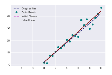
This code creates a function called fit_line that uses the least squares optimization method to fit a straight line to a set of data points. It requires two inputs: data (x and y coordinates of data points) and error_func (a function to calculate the error between the fitted line and data points). The fit_line function starts by guessing the slope and intercept of a line, then plots this initial guess on a graph. It proceeds by using the minimize function from the SciPy library to calculate the best slope and intercept values that minimize the given error function. The test_run function creates a random line with a specific slope and intercept. It introduces noise to the generated data points and then utilizes the fit_line function to determine the best-fitting line for the noisy data. This function plots the original line, the noisy data points, and the fitted line on a graph for visualization. The code is showing how to best fit a straight line to data that has some noise by using a method called least squares optimization.
Optimizes portfolio weights to maximize the Sharpe ratio
def get_sharpe_ratio(weights,portfolio_returns,rfr=0):
    p_returns = (portfolio_returns*weights).sum(axis=1)
    std = p_returns.std()
    sharpe_ratio = (p_returns-rfr).mean()/std
    return -sharpe_ratio
def optimize_portfolio(guess_weights=None,portfolio_returns=None,rfr=0):
if guess_weights==None:
guess_weigths = np.array([1/portfolio_returns.shape[1] for i in range(portfolio_returns.shape[1])])
else:
guess_weights = np.array(guess_weights)
bounds = [(0,1) for i in range(len(guess_weights))]
weights_sum_to_1 = {'type':'eq','fun': lambda weights:np.sum(weights)-1}
weights = spo.minimize(get_sharpe_ratio,guess_weights,args=(portfolio_returns,rfr,),
method='SLSQP',options={'disp':True},bounds=bounds,
constraints=(weights_sum_to_1))
return weights.xThis code helps optimize a portfolio by focusing on the Sharpe ratio. The get_sharpe_ratio function computes the Sharpe ratio of a portfolio by subtracting the risk-free rate from the mean portfolio returns and then dividing this difference by the standard deviation of portfolio returns. This ratio is useful for assessing a portfolio’s performance relative to the risk it carries. The optimize_portfolio function is used to find the best weights for assets in a portfolio. It requires initial weights, returns of assets, and the risk-free rate as inputs. If no initial weights are given, it assumes equal weights for assets. The function uses scipy.optimize.minimize to calculate the optimal weights that maximize the Sharpe ratio. The sum of weights must be 1 and each weight should be between 0 and 1. This code aims to determine the best weights for different assets in a portfolio in order to increase the Sharpe ratio. The Sharpe ratio helps to evaluate the return of an investment while considering the level of risk taken.
Portfolio Sharpe ratio calculation
weights = [1/returns.iloc[:,:-1].shape[1] for i in range(returns.iloc[:,:-1].shape[1])]
get_sharpe_ratio(weights,returns.iloc[:,:-1])-0.060616140758315604This code determines the weight for each column in the returns data, excluding the last column. The weight for each column is calculated as 1 divided by the total number of columns except the last one. Subsequently, it uses these weights along with the returns data (excluding the last column) as inputs for a function called get_sharpe_ratio. This function presumably calculates the Sharpe ratio, a metric that assesses the risk-adjusted return of an investment.
Returns all columns in the DataFrame except the last one
returns.loc[:,returns.columns.values[:-1]]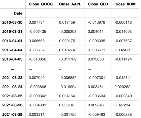
1259 rows × 4 columns
This code creates a new DataFrame by selecting all columns from an existing DataFrame called ‘returns’, except for the last one. It achieves this by using the .loc method along with slicing operation.
Portfolio optimization for maximum Sharpe ratio
w_opti = optimize_portfolio(weights,portfolio_returns = returns.loc[:,returns.columns.values[:-1]],rfr=0)Optimization terminated successfully (Exit mode 0)
Current function value: -0.08146435334637109
Iterations: 12
Function evaluations: 60
Gradient evaluations: 12The code optimizes a portfolio’s weight distribution to maximize its returns using historical returns of different assets. The function ‘optimize_portfolio’ requires current asset weights, historical asset returns, and a risk-free rate as inputs to find the most profitable allocation of assets for the portfolio.Imports financial data module
from financial_data import *This code imports data from the financial_data file to be utilized within the current program. By doing this, we can use functions, variables, or other elements that are defined in the financial_data module in our current script.
Portfolio with equal weights: GOOG, AAPL, GLD, XOM, 5y.
weights = [0.25,0.25,0.25,0.25]
portfolio = Portfolio(['GOOG','AAPL','GLD','XOM'],period='5y',weights=weights)[*********************100%***********************] 4 of 4 completedThis code sets up a portfolio containing four assets: GOOG (Google), AAPL (Apple), GLD (Gold), and XOM (Exxon Mobil). Each asset is given an equal weight of 0.25 within the portfolio, meaning the total investment is evenly divided among the four assets. The portfolio is designed for a five-year time frame.
Optimizes portfolio weights
portfolio.optimize_portfolio()4
array([0.09719233, 0.44019727, 0.46261039, 0. ])This code is designed to optimize an investment portfolio using a mathematical algorithm. The algorithm helps find the most advantageous mix of assets that offers the highest expected return while keeping risk to a minimum. By setting specific criteria or constraints, the code can adjust the allocation of assets in the portfolio to match the investor’s objectives and constraints effectively.
Plot portfolio values and normalized prices
portfolio.get_portfolio_values()['Portfolio'].plot()
portfolio.normalize_prices().plot()<AxesSubplot:xlabel='Date'>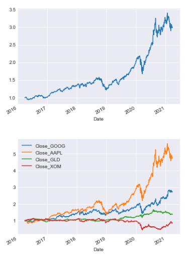
This code displays two plots of a portfolio’s data. The first plot shows how the total value of the portfolio shifts over time. The second plot illustrates how the prices of individual assets in the portfolio change in relation to each other, showing normalized prices over time.
Calculates the Sharpe ratio for the portfolio
portfolio.get_sharpe_ratio()0.08139281626897596The code is using the function get_sharpe_ratio() on the portfolio object to calculate the Sharpe ratio. The Sharpe ratio assesses the return on an investment considering its level of risk, providing insight into performance relative to risk.


