
Enhancing Accessibility: Developing Translated Views in Multilingual Power BI Reports
A Step-by-Step Approach to Offer Power BI Reports in Users’ Preferred Language

When creating a dashboard, it often becomes necessary to cater to a diverse audience that communicates in different languages. However, Power BI lacks a native feature for automatic translation of developed reports. Fortunately, with the introduction of field parameters functionality in May 2022 and a little DAX wizardry, you can now effortlessly provide your audience with the ability to switch between languages within your reports.
In this article, I will guide you through the process of building a bilingual English and French dashboard using Statistics Canada data. It’s important to note that the same approach can be applied to accommodate three or more languages.
Step 1: Load and Prepare the Initial Data
For the purpose of this example, a data table on the Canadian Labour Force in a CSV format has been retrieved from Statistics Canada here.
It has been loaded in Power BI and minor data transformations have been applied.
Here is the starting point in Power Query:

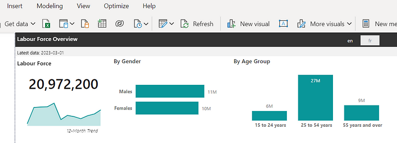
Step 2: Build the initial Power BI view in one language
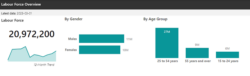
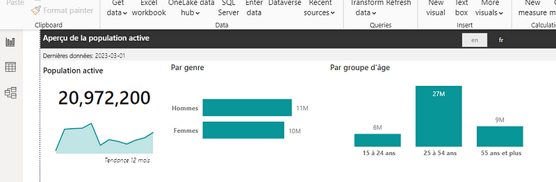
Here is a simplified report page with a few basic visuals developed in Power BI. As you can see, all the text presented in this view is currently only in English.
Step 3: Identify the Columns Within the Data Tables That Require Translation
Looking at the graphs and visuals axes, we can see that the bar chart axis require English and French translations (circled in red).

To address this, a dimension table can be created in a separate Excel parameters file that provides the proper the English and French version of each axes term. Here are the examples for Gender and Age Group. These tables were created in seperate tabs of the Excel file.
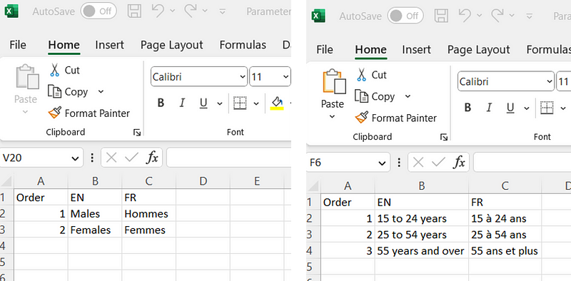
The “Order” column has been added to these tables. This is to help sort the chart axis in a specific order.
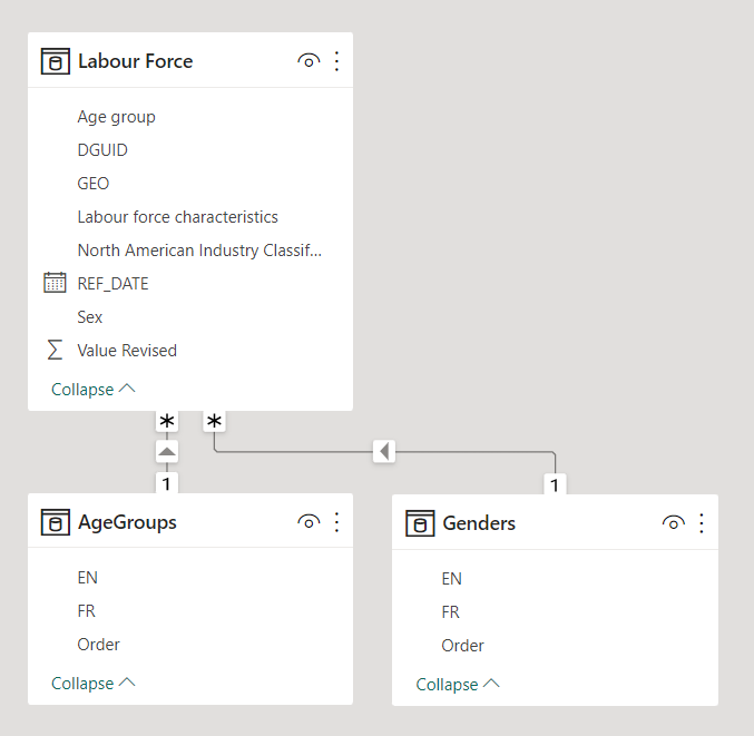
Once these dimension tables are ready, they can be loaded to the Power BI and connected to their respective columns in the initial “Labour Force” table.
Step 4: Identify the Titles, Text Boxes and Other Visual Components that Require Translation
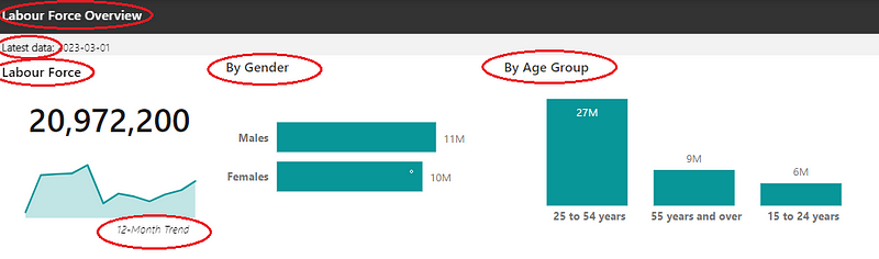
Below are the titles and text boxes that require translation.
The translations of these terms can also be prepared in a seperate tab of the parameters file under a different sheet, following the structure below:
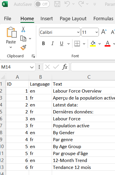
The table can then also be loaded to Power BI. No connection to the data model is required afterwards.
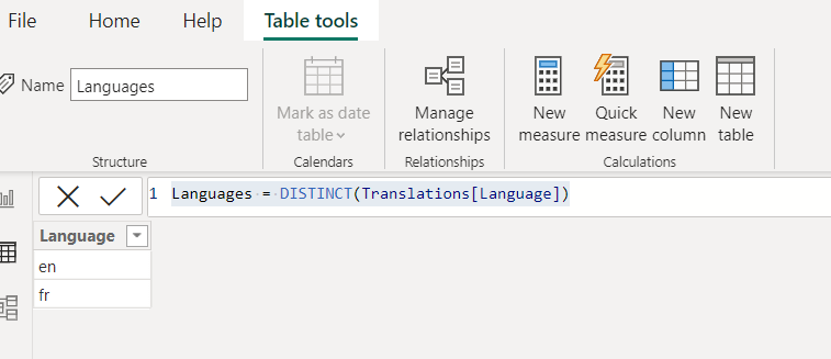
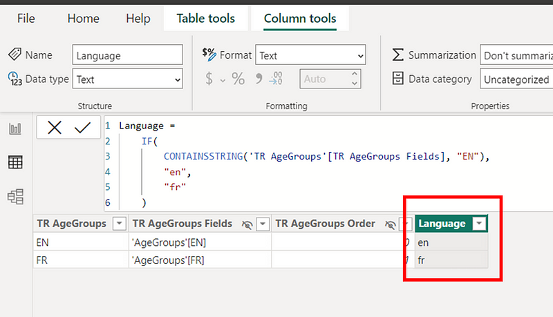
Step 5: Set Up the DAX Language Table and Translation Measures
A new dimension table can be created to manage languages leveraging the “Translations” table loaded in the previous step.
A measure then needs to be created to identify the selected language to read in the report using the following DAX code:
Selected language =
VAR selected_language = SELECTEDVALUE(Languages[Language])
VAR value_to_return =
    IF(
        selected_language = "",
        "en",
        selected_language
    )
RETURN value_to_return
For the text identified in step 4, a distinct measure for each ID from the translation table needs to be created to offer the translation of the required terms. Here is an example to translate the title “By Gender” (“ID” 4 from “Translations”):
TR By Gender =
VAR translation_id = 4
VAR translated_text =
    CALCULATE(
        FIRSTNONBLANK(Translations[Text],1),
        FILTER(
            Translations,
            Translations[ID] = translation_id &&
            Translations[Language] = [Selected language]
        )
    )
RETURN translated_text
For Power BI visuals, these measures can be assigned to the title using the formula function.

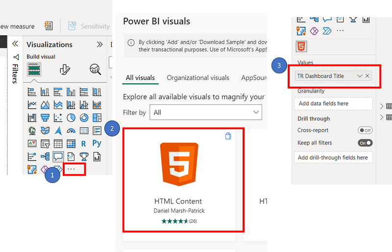
For text boxes, a value can be assigned to call the required DAX measure. However, the custom HTML Content Power BI visual can also be used, as it performs better on heavier reports and also allows HTML code integration that can be helpful to present images and icons.
As an example, the following DAX measure was created for the dashboard title:
TR Dashboard Title =
VAR translation_id = 1
VAR translated_text =
    CALCULATE(
        FIRSTNONBLANK(Translations[Text],1),
        FILTER(
            Translations,
            Translations[ID] = translation_id &&
            Translations[Language] = [Selected language]
        )
    )
RETURN translated_text
And then that measure was assigned to the HTML Visual (after loading it from the “Get more visuals”).
Step 6: Add the Field Parameter Column
To translated the By Gender and By Age Group graph axes, the field parameter functionality then can be used as follows. Below is an example for the By Age Group visual.
First, both EN and FR columns of the “AgeGroups” table need to be set of as field parameters.
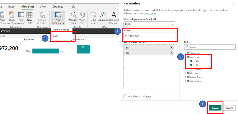
Then the X-axis field of By Age Group visual needs to be replaced by the new TR AgeGroups field parameter.
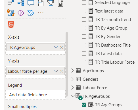
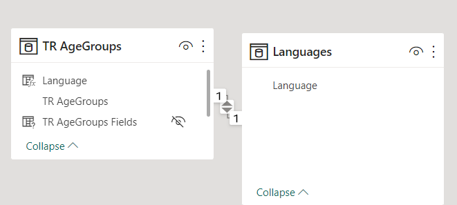
After, a language column needs to be added to the field parameter table.
Finally, that column needs to be connected to the “Language” column from the “Languages” table.
These steps should be repeated for each axis that requires translation.
Additionnally, if you wish to sort columns in a specific order (in our case, by the Order column of the initial AgeGroups table, below are the steps to follow:

Step 7: Insert the Language Slicer and Test the View
Finally, a slicer needs to be inserted with the “Language” column of the “Languages” table to act as the user’s button to toggle between languages.

The views can now be tested using the slicer to ensure that everything is working correctly for both languages and all required text has been translated.
Conclusion
In conclusion, the process of providing translated views in Power BI reports is straightforward. However, it can become slightly tedious when dealing with numerous titles or text boxes that need translation. Nonetheless, adopting the practice of using a parameters file to load initial data values not present in data tables is highly recommended. This approach simplifies dashboard updates by allowing for refreshing data sources instead of republishing the entire report.
I hope this article has been helpful to you! If you have any questions or comments, please don’t hesitate to reach out.


