
UI-Design: Laws of Nature –Lighting 💡
UI design encompasses more than just color, forms, and typography. While professionals in this field may be aware of that, there is one aspect that often goes unnoticed: lighting. Yes, light, the same element found in photography and cinematography. It may not immediately come to mind when thinking about UI design, but it is deeply rooted in the laws of nature, and after all, humans exist within nature… well, most of them, Elons excluded.
At first, the concept of lighting in UI design may seem strange. However, if you embrace the notion that design extends beyond a flat 2D space (which is essential for any UI designer), you’ll realize that lighting plays a vital role in creating a sense of depth and dimension. Those familiar with 3D software like Blender understand the significance of lighting in shaping the visual outcome. Although web UI design may not emphasize it as heavily, lighting still holds immense potential to transform the user experience. Allow me to elucidate why.
By incorporating thoughtful lighting techniques, UI designers can elevate their creations from mere flat designs to immersive and engaging experiences. Lighting serves as a guiding force, highlighting key elements, establishing hierarchy, and providing visual cues. It adds depth, dimension, and a touch of realism to the digital realm, enabling users to connect with the interface in a more intuitive and satisfying manner.
The Basics
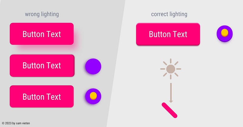
Lighting serves as a powerful tool in design, offering direction, focal points, and an element of style. When your design incorporates multiple assets with lighting from different angles, something may feel off, even if users can’t explicitly pinpoint the issue. It’s more of a subconscious feeling, like “I’m not quite liking this site.” This is where consistency, a vital aspect of UI design, comes into play. You don’t always have to use the same lighting angle; you can purposefully introduce variation.
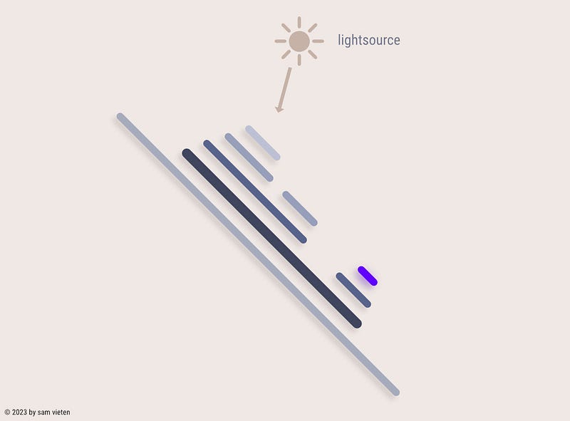
Now that we have covered the basics, let’s delve deeper. In natural settings, light sources typically come from around a 45° angle or above us. When you hold your phone, for instance, it’s at a 45° angle, suggesting that the light generally originates from above, not from the side or below. This understanding leads to a few fundamental rules:
- Layers in the foreground receive more light, so elements positioned in front must be more illuminated than those in the background.
- Shadows consistently point downward, adhering to the natural behavior of light.
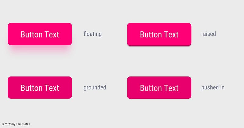
- Elements that appear “pressed down” should logically be darker, creating a visual cue of depth and interaction.
By mastering these principles, you can harness the full potential of lighting in your design, creating visually cohesive and engaging experiences for your users.
Perception of Depth
Lighting plays a crucial role in creating a sense of depth, which greatly impacts our perception of the digital world, including websites and apps. Without careful consideration, these digital spaces can feel hollow and devoid of depth. That’s why companies like Apple have implemented features like the haptic engine. A simple click, which would typically feel hollow on a glass surface, now carries a sense of weight and substance, engaging not only your device’s vibration but also your tactile senses. For example, when a switch is turned off, you can feel two distinct vibrations: a long, soft one followed by a short, strong one, mimicking the experience of flipping a mechanical switch.
Similarly, in the perception of depth, when a user interacts with an element by pressing it down, it should appear slightly lower than before, just like a key on a keyboard or a power switch that remains in a depressed position. An element situated below the base layer or lower than its previous state will receive less lighting. By leveraging this understanding, you can create designs that feel more natural and perceptible to users.
To further enhance depth perception, consider incorporating active lighting effects. These effects can emit around the element, even when it’s active, adding an extra layer of visual engagement.
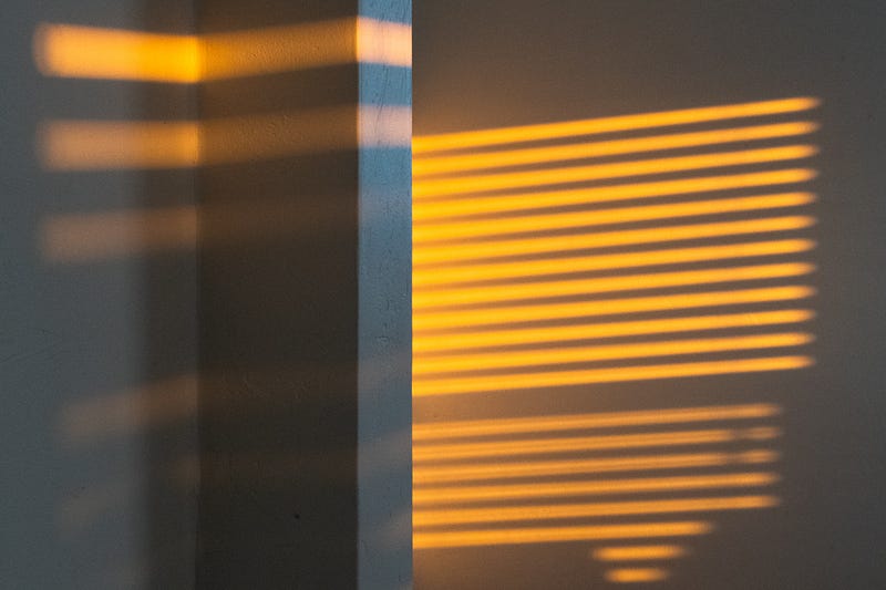
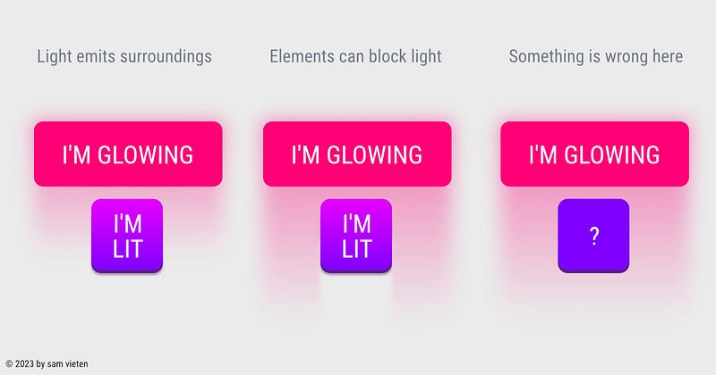
Spacing
Light behaves uniquely based on spacing and is affected by obstacles. When all UI elements in a design don’t break the ray of a light source, the entire UI appears weightless, conveying concepts such as lightness and ease. This can be a deliberate design choice, especially when marketing products that emphasize thinness and lightness, like a pillow, MacBook Air, or Nike Air shoes. However, it can also evoke notions of uncertainty, weakness, or indecisiveness. It’s a decision that intertwines marketing and artistic direction.
If you decide for an UI Design that is fixed on the background and not floating you need to consider the lightsources that break when colliding with other element.
The intentional breaking of light sources serves as a stylistic element. However, it must adhere to the laws of physics to feel visually cohesive and avoid appearing disjointed or out of place.
Closing Thoughts
Lighting often goes unnoticed in today’s flat UI design, yet it holds tremendous potential as a stylistic tool for distinguishing a design. While the era of skeuomorphism may be behind us, I anticipate its resurgence in a new form. Apple’s recent designs, featuring creamy 3D haptic-looking icons and the impressive Apple Vision Pro UI, provide a glimpse into this trend.
With the growing accessibility of 3D tools like Spline, we can expect 3D to play a larger role in web and app UIs. As a result, lighting will gain even more significance in UI design, amplifying its impact on the overall user experience.
If you have any feedback, ideas, or if you spot any mistakes, please let me know.
disclaimer
*For this article, I used the assistance of ChatGPT to help me with some phrasings as English is not my native language.
Did you enjoy reading what I wrote? I’m not asking for funding, just a small gesture of support, like buying me a coffee. I would genuinely appreciate it. If you’d like to read more content similar to the article you just read, consider following me on Twitter: @s4m_ur4i.


