
The Power of White Space in UI Design: Less is More
In the ever-evolving world of user interface (UI) design, it’s tempting to fill every pixel with information. However, the secret to creating clean, intuitive, and visually appealing designs lies in the judicious use of white space. In this article, we delve deep into the significance of white space in UI design, examining its impact on user experience, aesthetics, and functionality.
Introduction:
The world of UI design is dynamic, ever-evolving, and perpetually driven by innovation. Amidst all the trends and technologies, one design principle remains timeless: the strategic utilization of white space. Often misunderstood as “empty” or “wasted” space, white space is anything but. It’s the breathing room that allows other design elements to shine and communicates more than words ever could. It’s the unsung hero of user interfaces.
Why White Space Matters
Clarity and Readability
White space is the unsung hero of user interface (UI) design. It might seem like “empty” space, but in reality, it’s anything but. Adequate white space around text and content makes it more legible. It allows users to digest information without feeling overwhelmed. When text and elements are too close, it creates visual noise, making it harder for users to understand the content.

Visual Hierarchy
White space is a key tool for establishing visual hierarchy within a design. Through strategic spacing, important elements can be given more prominence, guiding users’ attention to what matters most.

Enhancing Interactivity
When you’re navigating a website or app, accidental taps or clicks can be frustrating. White space can be used to buffer interactive elements like buttons and links. This not only reduces the chance of unintended actions but also enhances the overall user-friendliness of the interface.

Aesthetics and Balance
While white space is a functional element, it also greatly impacts aesthetics. It provides a sense of balance and elegance, making the UI visually appealing. A cluttered interface can be overwhelming, while a well-spaced design exudes a sense of simplicity and sophistication.
Examples of Effective White Space Usage
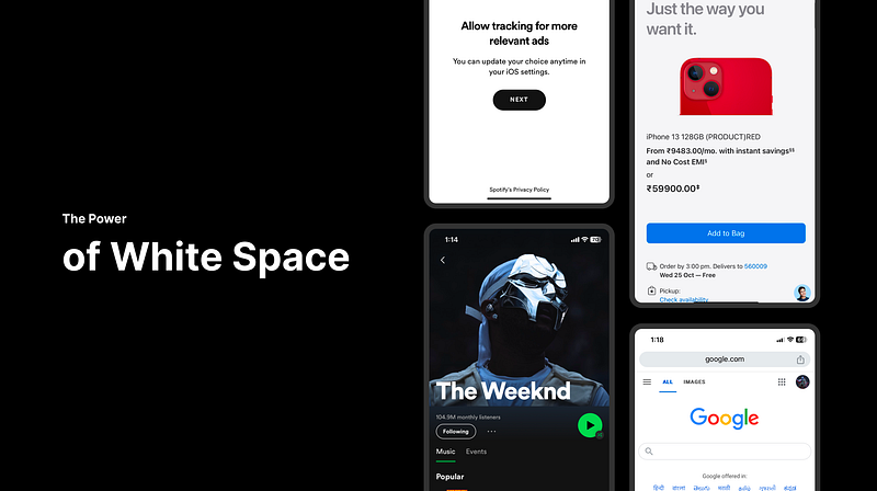
Apple:
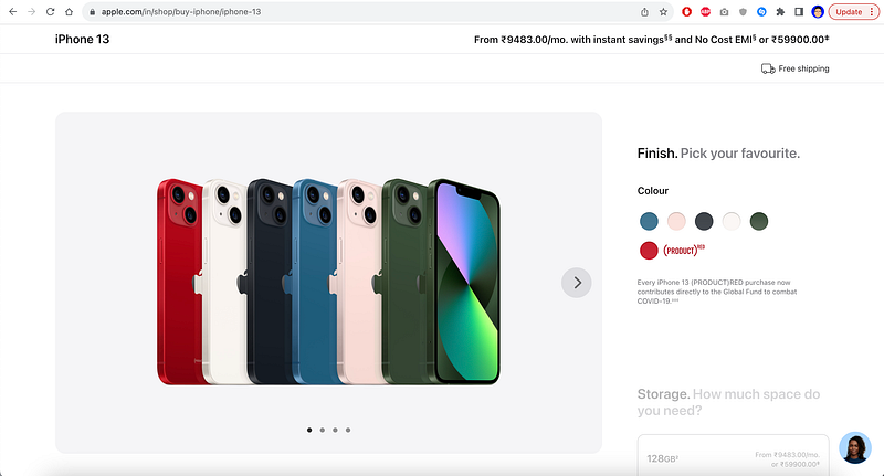
Apple’s website and product design are excellent examples of using white space to convey a sense of elegance and simplicity. Their use of ample white space allows users to focus on key product features.Google:
Google:
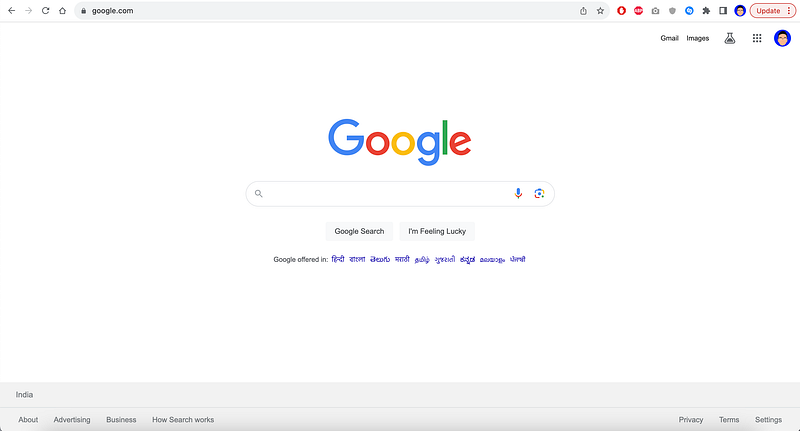
Google’s search engine exemplifies the power of minimalism and white space. The uncluttered interface puts the search bar at the center, making it the focal point for users.
Spotify:

The Spotify app employs white space around album covers and track listings, making it easy for users to navigate and explore music.
— — — — — — — — — — — — — — — — — — — — — — — — — — — — — — — — — — — — —
In conclusion, the power of white space in UI design is undeniable. It serves as the cornerstone of clean, intuitive, and visually appealing interfaces. By enhancing clarity, establishing visual hierarchy, improving interactivity, and contributing to aesthetics, white space is a versatile and indispensable tool for designers.
Furthermore, it’s essential for designers to advocate for the importance of white space, especially when pressured to reduce spacing for the sake of showcasing more products or offerings. While the intention may be to provide more information, overcrowding the interface can lead to a negative user experience and potential drop-offs. Balancing content with white space ensures that users can seamlessly navigate and engage with the interface, resulting in a more satisfying and effective user experience.


