

Introduction to Box Plots and how to interpret them
An implementation with Python
Box Plots are very useful graphs used in descriptive statistics. Box plots visually show many features of numerical data through displaying their statistics, like means, averages, and so forth.
Visually speaking, a Box Plot looks like the following:

Let’s examine all the information displayed:
- Box: the box embraces the portion of data included between the 25 and 75 percentiles (also known as first and third quartiles). In statistics, percentiles indicate values in data below which fall a given percentage of all values. Namely, the 25 percentile (or first quartile) of a given sample of numerical data indicates the value below which 25% of all sample data are located. The range between these two quartiles is called Interquartile Range (IQR).
- Median: within the box, we can also see the value of median. Note that the median is nothing but the 50 percentile of the underlying numerical data.
- Whisker: they account for all the values that fall outside the central 50% of data (the portion contained into the IQR).
- Min and Max: these two values identify the extreme values of our numerical data. Note that box plots can also be displayed in a slightly different manner, so that the termination of whiskers do not represent the extreme values (min/max), but rather a quantity computed as Q1–1.5 * IQR for the lower whisker, Q3 + 1.5 * IQR for the upper whisker (where Q1 and Q3 stand for, respectively, first and third quartiles). This different visualization is very useful if we want to identify outliers, as we will see below.
Looking at a box plot, there is relevant information we can retrieve.
Skewness of Distribution
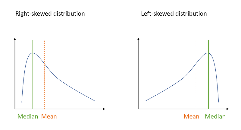
First, we can retrieve the shape of the distribution, which means, understanding whether it is symmetric or not.
To do so, in statistics the skewness is the quantity to refer to, since it tells us the tendency of our distribution to be asymmetric. More specifically, a positive skewness indicates a right-skewed distribution, where the median is lower than the mean. On the other side, a negative skewness indicates a left-skewed distribution where the median is greater than the mean.
So how can we use our box plot to retrieve this information? For this purpose, let’s generate positive-skewed data in Python and inspect the corresponding box plot:
import numpy as np
import seaborn as sns
from scipy.stats import skewnorm
import matplotlib.pyplot as plt
a = 20 #value for skewness
r = skewnorm.rvs(a, size=1000)mean= np.mean(r)
median = np.median(r)sns.distplot(r)
plt.axvline(x=median, color = 'blue')
plt.axvline(x=mean, color = "red", linestyle='--')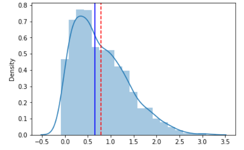
As you can see, the median is lower than the mean and the distribution shows a positive skewness. Now let’s generate the box plot:
sns.boxplot(r, orient='h')
plt.axvline(x=median, color = 'blue')
plt.axvline(x=mean, color = "red", linestyle='--')
Basically, whenever the median is closer to the lower bound of the box, and the upper whisker is longer than the lower one, it indicates that the distribution is right-skewed (the skewness is positive).
On the other hand, whenever the median is closer to the upper bound of the box, and the lower whisker is longer than the upper one, it indicates a left-skewed distribution (the skewness is negative). Let’s have a look at it:
f, (ax_box, ax_hist) = plt.subplots(2, sharex=True, gridspec_kw= {"height_ratios": (0.2, 1)})a = -20 #value for skewness
r = skewnorm.rvs(a, size=1000)mean= np.mean(r)
median = np.median(r)sns.boxplot(r, ax=ax_box)
ax_box.axvline(mean, color='r', linestyle='--')
ax_box.axvline(median, color='b')sns.distplot(r, ax=ax_hist)
ax_hist.axvline(mean, color='r', linestyle='--')
ax_hist.axvline(median, color='b')ax_box.set(xlabel='')
plt.show()
Finally, for the sake of completeness, let’s also see how a symmetric distribution looks like:
f, (ax_box, ax_hist) = plt.subplots(2, sharex=True, gridspec_kw= {"height_ratios": (0.2, 1)})a = 0 #value for skewness
r = skewnorm.rvs(a, size=1000)mean= np.mean(r)
median = np.median(r)sns.boxplot(r, ax=ax_box)
ax_box.axvline(mean, color='r', linestyle='--')
ax_box.axvline(median, color='b')sns.distplot(r, ax=ax_hist)
ax_hist.axvline(mean, color='r', linestyle='--')
ax_hist.axvline(median, color='b')ax_box.set(xlabel='')
plt.show()
As you can see, when a distribution is symmetric, the mean is equal to the median, and the skewness is equal to 0.
Outliers
Another important information we can retrieve, as mentioned in the previous paragraph, is the presence of outliers. In statistics, we define outliers as those values which are far apart from the majority of other values. How can we quantify this distance? As a general rule, we can say that a given observation is an outlier whenever it is greater than Q3 + 1.5 * IQR or lower than Q1 -1.5 * IQR.
So for this purpose, let’s retrieve the boxplot of the symmetric distribution above:
sns.boxplot(r, orient='h')
plt.axvline(x=median, color = 'blue')
plt.axvline(x=mean, color = "red", linestyle='--')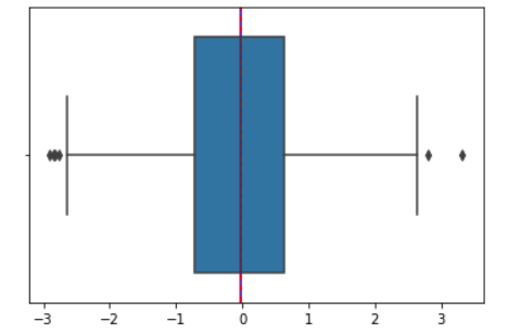
As you can see, there are some observations that fall outside the whiskers: those are labeled as outliers.
Finally, let’s have a look at how to boost data visualization with the Plotly graphic library, which power and extend Python visualization tools, making them more creative and interactive.
For this purpose, I’m going to use an existing dataset available within the library:
import plotly.express as px
df = px.data.tips()
df.head()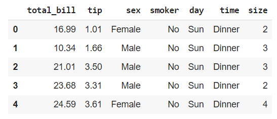
We will inspect the “total_bill” numerical variable.
fig = px.box(df, y="total_bill")
fig.show()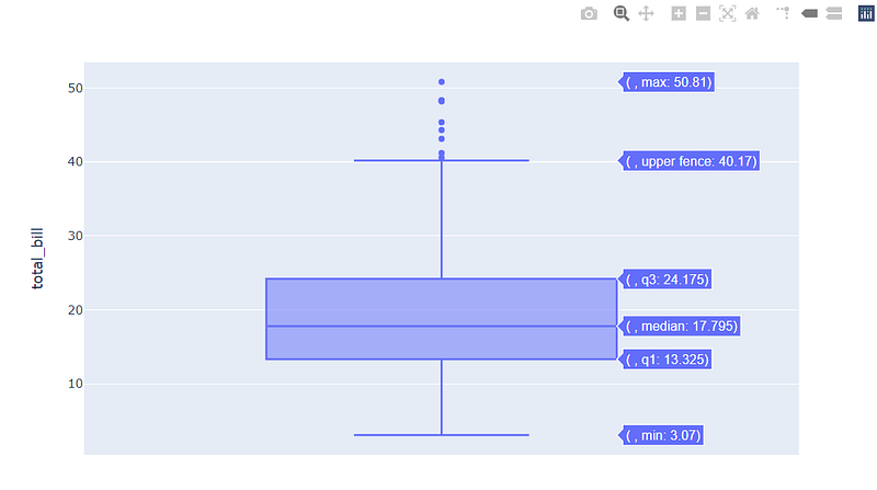
From this insight, we can derive that the distribution is probably right-skewed and that it exhibits outliers in the right tail. Let’s check it:
sns.distplot(x)
plt.axvline(x=median, color = 'blue')
plt.axvline(x=mean, color = "red", linestyle='--')
Great! This confirms the positive skewness of the distribution.
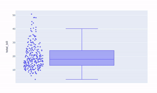
With Plotly, it is easier to interact with your graph and have meaningful insights. Let’s see what it looks like to display all data points alongside our boxplot:
In general, data representation is a pivotal step in getting relevant information. Plus, doing so before getting into the deeper analysis can also help you in driving future decisions about which direction your analysis should take.
I hope you’ll find this article useful! See you at the next one!


