
The bottom line on measuring hard and soft grids, Part I
I was recently conducting a peer review for some design explorations of a component for O’Reilly’s design system. During the review, I noticed that some of the vertical spacing seemed “off”. After further discussion with the designer, we came to the sneaking suspicion that we might be measuring designs in different ways.
Even though we were both utilizing the same 8px baseline grid, we were getting very different results.
In the midst of that conversation, my colleague said; “So we’re actually using a 4px baseline grid, not 8.” That really got me thinking. Had we set up our grid templates for failure? Would changing everything to a 4px baseline correct the issues we were seeing? I really wasn’t sure so I started doing some research to find out.
The first place I referenced was an article I had bookmarked some time ago. This post by Spec gives a comprehensive overview of the 8pt grid system which highlights a crucial and often overlooked part of designing with the baseline grid: using “hard” or “soft” grids. Reading that post was a bit of an aha! moment. On the surface, it appeared that declaring “hard” or “soft” would address the major issue we were facing and that it was less about the setup of the baseline grid settings. To validate that I would need to put both methods to the test to see how they work in the real world and compare them with our current designs.
To start, let’s look at the arguments for each:
“Hard Grid”
You can use oddly sized elements within a design and just reduce/increase the size of the surrounding block element to fill the space within the grid structure.
“Soft Grid”
This mirrors the development environment more closely because programming languages don’t adhere to a hard grid structure.
“Don’t get hung up on the word “Grid” too much, when talking about a Soft Grid. It’s really more about a fixed sizing/spacing increment (8px in this case) of the elements relative to each other.” ~Anthony Collurafici
I embarked on a mission to analyze these methods with the hope of finding a solution that would get the O’Reilly design team closer to reaching our primary goal: To find a consistent method of measurement for both design and development.
To break that down even further, that means that the proposed solution would ideally:
- Enable any designer to pick up where someone else left off and produce the same spacing results
- Enable any front-end developer to reference a design and ingest the same outputs as their counterparts
Hard
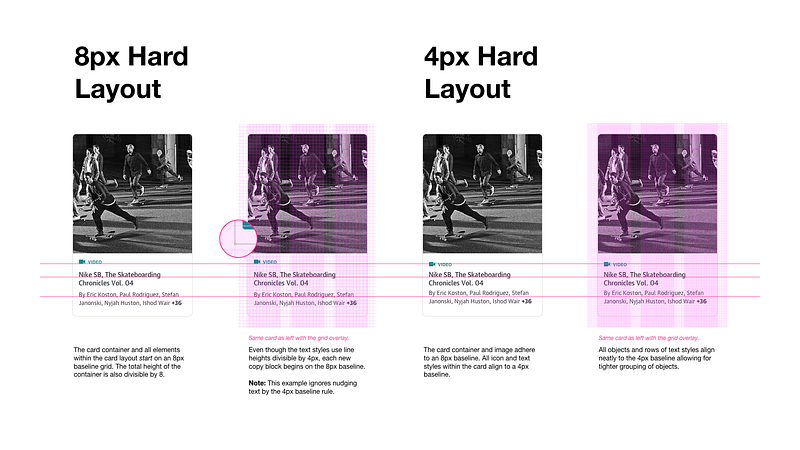
The first exercise I performed was laying out a sample card component using the Hard method with both an 8pt and 4pt baseline grid.
Observations
- The top-left icon/text element has an object height of 20px because we’re following Material Design which allows icons to be sized in increments of 4px. I decided to align only the text portion of the group (“video”) to the baseline even though I had a bounding box area that was off-grid (see bubble callout in the second column).
- While the 4px baseline grid settings were noisier to look at while designing, it allowed for better flexibility in visual alignment of text without the need to nudge. Even with a pre-set nudge setting, you can sometimes get lost in more complex layouts which requires you to reset your text on the baseline and nudge again. I’m a bit OCD, so I liked seeing everything fit cleanly on the lines.
- You still have to do some math to make sure objects besides icons and text are divisible by 8.
Next, I used a few common methods to extract measurements from each layout.
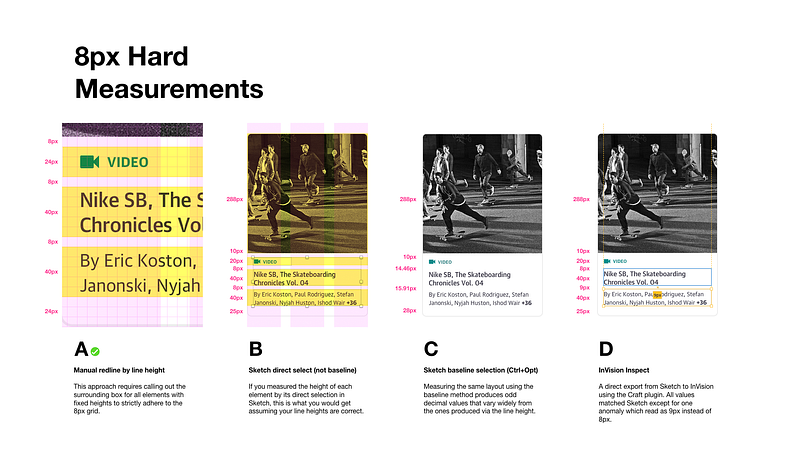
Observations
- Manually highlighting rows to declare the height and distance between objects provides accuracy but could be a burden to scale.
- Measurements in Sketch (using direct selection) and InVision Inspect are only as good as your text field height settings. Even if your text line-height is 20px, inspectors read the text container height when selecting objects which could be set to a different value (e.g. 44px), throwing off the output. This forces you to check your line-height settings and confirm the math based on the number of rows of text (example: line-height of 20px *2 rows of text = bounding box height of 40px).
- 4px baseline conforming elements such as a 20px icon threw off measurements, producing values such as 10px instead of 8px.
- Baseline measurements are pointless when following the hard grid method.
Soft
I’m generally a fan of soft grid layouts and respecting the code as a source of truth. I will use spacing elements in my files to help layout a baseline grid but I generally just measure element to element. I use the 8pt grid as a relative spacial system, not a strict grid. ~Elliot Dahl
So how do you measure between a variety of elements using a soft grid?Elliot Dahl talked about this in 8-Point Grid: Vertical Rhythm
A big takeaway from Elliot’s post was the need to choose between measuring from the baseline or from the line-height. This was my second aha! moment.
Using the same example design, I recreated the layouts following the soft grid method with both an 8pt and 4pt baseline grid.
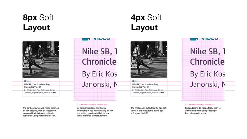
Typography can be placed outside of the 4dp grid when it’s centered within a component, such as a button or list item. ~Google Material Design
Observations
- I turned off my grid overlay when laying out the icons and text within the component and just relied on the direct selection of elements and space between to produce the final output.
- A 4px baseline grid did not provide any extra value in this specific use case because all of my icons/text were within a component. I thought card components might be considered a special case and adhere more strictly to the baseline, but I couldn’t find anything specific on the subject. “Cards have no singular layout, typographic, or image size. All cards should be designed to meet the needs of the content they present.” ~Google Material Design
- The same precautions about bounding box height and line heights still apply to this (see previous observations).
I applied the same methods of measurement I had previously used for the 8px hard layout to the “soft” layouts.
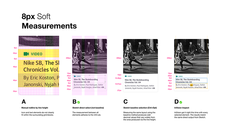
Observations
- Trying to manually redline specs when using soft increments of 4px created odd spacing when using the 8px baseline grid overlay settings.
- Sketch and InVision Inspect produced clean, matching specs. Yay!
- Baseline measurements don’t make sense here because the icon and text elements were not being measured from the baseline in Sketch (Ctrl+Opt).
“…Getting a web browser to measure from the baseline will be tricky. You’ll have to design based on the baseline and then use highly specific spacings to get your content to line up. This will become difficult to maintain and I would not recommend it for large design systems with a lot of surface area.” ~Elliot Dahl
Conclusions
- I’m somewhat conflicted about whether or not to start using a 4px baseline grid setting for layouts in Sketch. It didn’t provide much value in this exercise with a component, but setting type or complex data sets within a page might be useful.
- It’s critical to ensure your text object (bounding box) heights match your text line-height calculations to ensure proper output.
- Relying on the 8px baseline for laying out images and containers works well.
- Relying on the object/line-height of objects and ignoring the 8px baseline grid overlay when laying out icons/text within a component resulted in cleaner measurements when inspecting.
- Providing measurements by the baseline in Sketch produces decimal values and would require a lot more work to get right across a team.
- I’m leaning towards promoting the 8/4px Soft approach based on the output of this test, but I want to do some further comparisons with the 8/4px Hard method, specifically in regards to developer preference and truth in implementation.
Keep in mind there is more to consider when choosing between hard and soft grids:
- Which baseline grid settings are you using (e.g. 4, 8, none, etc.)?
- Is your design team working from an established design system or style guide with pre-defined type styles that have line-heights matching the baseline grid units (e.g. 16/24px)?
- Do all designers on your team use the same digital production tool (e.g. Sketch, Studio, XD, etc.)?
- Is everyone on your team using the same method/tool for referencing measurements in designs? (Source file, InVision Inspect, Sketch Measure, etc.)
- How are your front-end teams translating measurements in CSS?
Up Next, Part II
I’m working on the second half of this post which will cover communicating and translating these results into a front-end development environment. Stay tuned.
As always, I’d love to hear your feedback and understand how other teams are approaching this issue.
Resources
Baseline Grid
Intro to The 8-Point Grid System
Learn how it can take your design to the next level
builttoadapt.io
Typesetting
Sketch
Note: I attempted to use Zeplin as a point of comparison for this post because several members of our team use it, however, I was shocked to find that it did not provide any measurements between text objects which just seems crazy to me. If you use this tool please contribute to this open feature request thread.

O’Reilly’s hiring
We’re currently looking for smart product designers and front-end developers to help build the future of our online learning platform. Send me a tweet or DM me touhey if you’re interested in joining our growing design team.


