The UX Reflex theory: lessons from Apple’s search bar experiment
The significant role conditioned reflexes play in UX design.
In 2021, iOS 15 defaulted Safari’s search bar to the bottom of the screen. It was a drastic departure from the industry standard because all other web browsers kept their search bar at the top of the screen.

The move was likely made to make reaching the search bar easier for users with larger iPhones. However, it faced a huge backlash, and consequently, numerous articles surfaced guiding users on how to revert its position.
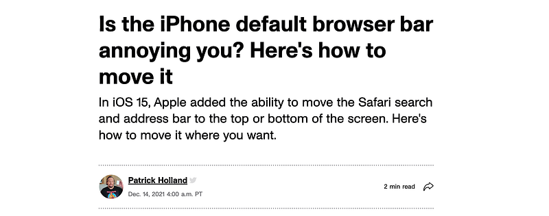
The users were willing to make an extra effort to learn the tips and tricks to restore the experience they were accustomed to. Apple’s attempt to differentiate its user experience from other mobile browsers met resistance from users unwilling and struggling to adapt to the change.
Similarly, in June 2023, Amazon experimented with placing its search bar at the bottom of the screen. The test was exclusive to a select group of users, referred to as beta participants. Unlike Apple, Amazon did not include a “restore to the top” option, making the bottom placement of the search bar permanent. As a result, the internet was flooded with disappointed remarks.


After ~3 weeks of sitting with this change, Amazon reverted the search bar to its original position, abandoning the experimental bottom placement.
The tests done by Apple and Amazon proved that users don’t like sudden changes. They dislike changes that force them to learn new ways of doing things because they are accustomed to their usual methods.
In theory, placing the search bar at the bottom of the screen makes sense. Phones are bigger now, so having the search bar at the top requires more physical movement of the hands. Users need to hold the phone with one hand and tap the search bar with the other hand. When using only one hand, they have to extend their thumb even higher. This movement is repeated many times when searching.

Placing the search bar at the bottom reduces vertical hand movement because the thumb is already close to the bottom of the screen.

Reflex theory
“Users spend most of their time on other websites, so they expect your site to work like all the other sites they already know.” — Jakob’s Law of UX.
I pondered, “Why do users prefer the experiences on any platform to be similar to others they already know?”. As I researched and read numerous articles on human psychology, I came up with the term UX reflex theory.
Reflex in psychology is about instinct and unconscious actions. It is an involuntary response that happens without conscious thought or effort. Blinking, raising an arm to protect the face, a reduction of pupil size in response to light are all examples of reflexes.
Let’s link reflex theory to the above experiments by Apple and Amazon. The search bar placement was a one-off instance in their app while the user experience for many other apps remained the same. This made the change feel strange, abrupt, and inconsistent. Users were accustomed to the traditional search bar placement at the top but suddenly needed to overcome their ingrained muscle reflex of reaching the top of the screen.
The UX Reflex Theory can be defined as conditioned reflex, where a set of repeated actions eventually becomes an ingrained muscle memory.
Users prefer your app to work like other apps because their reflexes have been conditioned into ingrained muscle memory. For instance, when learning to play the guitar, the finger shapes of chords take some time to get used to. With consistent practice, these finger formations become ingrained in muscle memory. Similarly, with search bars, the action of tapping or clicking the search bar at the top has been repeated so many times that the brain subconsciously moves the eyes and thumb to the top of the screen. Search bars are just one of the many examples of design components for which the users have developed conditioned muscle reflexes.
Conditioned reflex is devoid of stimuli and reinforcements unlike classical and operant conditioning; read more about those in this article.
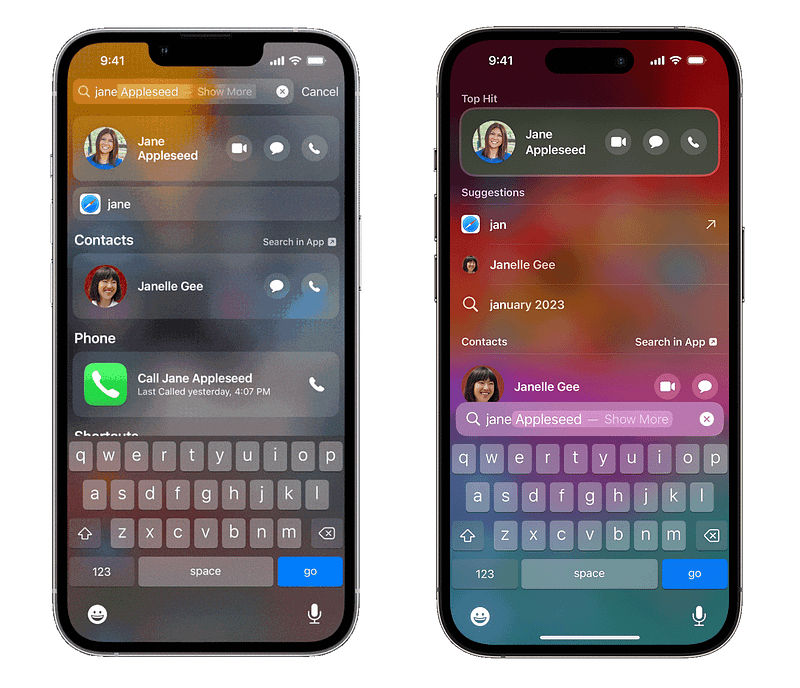
In February 2024, Apple successfully placed its spotlight search at the bottom of the screen without much backlash. Previously, it was located at the top of the first screen. Users didn’t show much hesitancy toward this change maybe because it is not as widely used as the search bar in Safari and Amazon app.
Does this mean we need to design components the traditional way forever? The answer is no; conditioned reflexes are adaptable, and with enough repetition, old muscle reflexes can be overridden with new ones. However, there will be reluctance until users become accustomed to the new patterns that eventually develop into reflexes. This approach can be experimented with more in new designs like AI platforms, games, new hardware devices, or headsets, where users already expect different user experiences than the norm.
References used in this article: Is the iPhone default browser bar annoying you? Here’s how to move it Amazon forum “I hate the search bar being in the bottom” Jakob’s Law of UX Reflex in psychology Is the Conditioned Reflex the Unit of Habit? 3 techniques to influence user behavior Use Spotlight Search on your iPhone, iPad, or iPod touch


