
Hard and soft grids are just tools, not rules
Thoughts on using vertical grids for text in UI design
Grids have always been one of the core design tools. In some cases, such as columns in newspapers or magazines, the grid is taken for granted. But in the case of vertical grids in UI (especially when it comes to text), it’s not so simple.
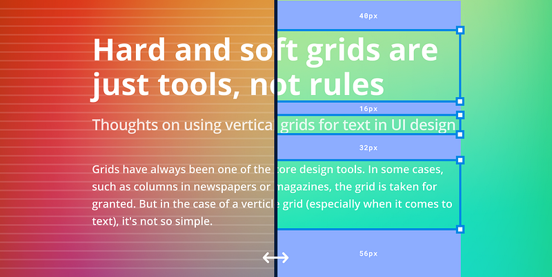
The most common vertical layout systems are hard grids (also called base grids) or soft grids. Hard grids align content to a fixed vertical grid, while soft grids define the space between elements on the page. Both approaches have their supporters and opponents.
Advantages
Hard grid
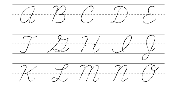
The hard grid is probably logically the easiest thing to understand. Why? Probably because most of us in childhood learned to write on the grid. And when you start to draw interfaces sometimes you want to put the texts in the usual way — along the lines.
Soft grid
The soft grid operates with spacings between elements, setting the rhythm of the design composition. These spacings are especially handy to use when it comes to the implementation of the design in the code because developers do not have any hard vertical grid to which they could stick the design elements (except pixel coordinates, but these are already extremes).

The spacing values can be synchronized between design and development.
A soft grid also works well with Dynamic Type and other user-side text size manipulations.
Hard grid — nuances, and solutions
Any grid is first of all a tool. No more than that. And it may not always be necessary. When we learn how to write (or continue to write by hand on paper) a grid helps us to write evenly horizontally (or vertically for some languages). When typing on a computer, however, there is little need for ruling — the text will be correctly aligned by default.
Some designers argue that:
Adhering to a baseline grid allows us to be more efficient by removing decision making while maintaining a consistent rhythm between components and typography.
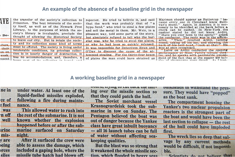
For newspapers and magazines, the grid is definitely important, because, in addition to aligning the text to the columns, you also need to align it vertically to a grid, because this makes it easier to read the text in a multi-column layout (and makes it neater).
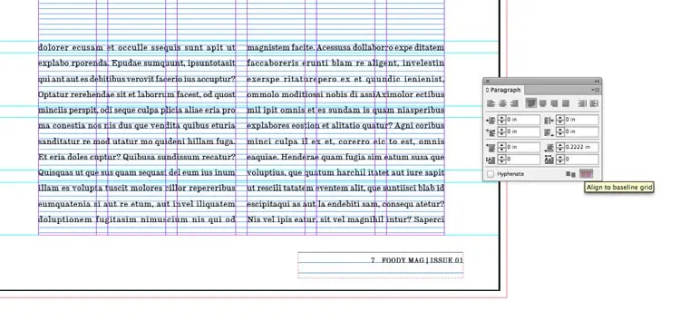
In some modern desktop publishing apps, snapping to the grid is automated. For example, in InDesign, all text on a page can be snapped to the grid with a single button.
However, in UI design tools such as Figma or Sketch, there is no such thing and the text has to be aligned to the grid manually. Besides we have to combine the text not only with pictures (as in print design) but also with buttons, input fields, and other components, which sometimes complicates the task of alignment. And sometimes this is confusing, especially for beginner designers who start thinking of the grid as a panacea, forgetting about everything else.
The thing is that in UI design apps text alignment is based primarily on text frames. And it not only behaves differently in different programs:
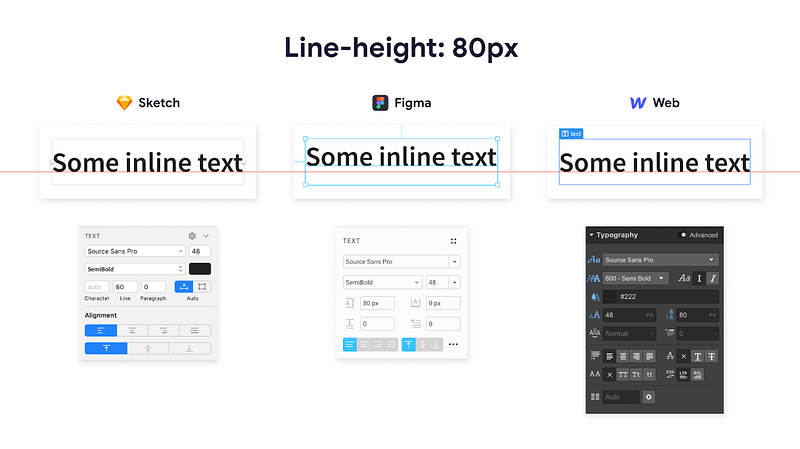
But it also depends a lot on the particular font:
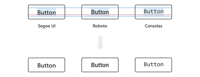
If you add to this the fact that on the end-device we have to deal with custom font size settings, then tying text to a vertical grid becomes a real challenge.
There are several solutions to achieve fine grid alignment, but they are not universal and are very platform-specific. In addition, such solutions would require additional support from the developers.
CSS Baseline by MUI
MUI started back in 2014, to unify React and Material Design. It is now a powerful React UI library. Among other things, MUI offers a vertical grid solution.
Aligned
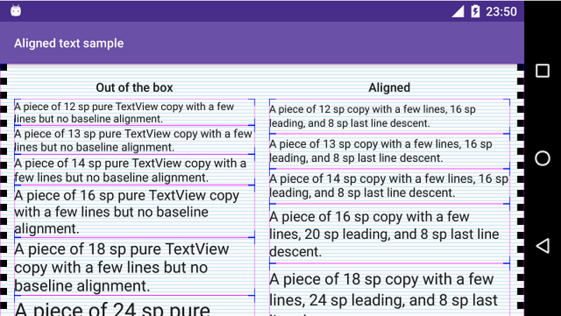
Aligned is a tiny library for Android that makes putting text on baseline infinitely easier. At the moment it does only one thing — provides a TextView implementation that allows setting arbitrary leading and some other metrics on the text, helping you to place it nicely on the Material 8dp grid.
BonMot
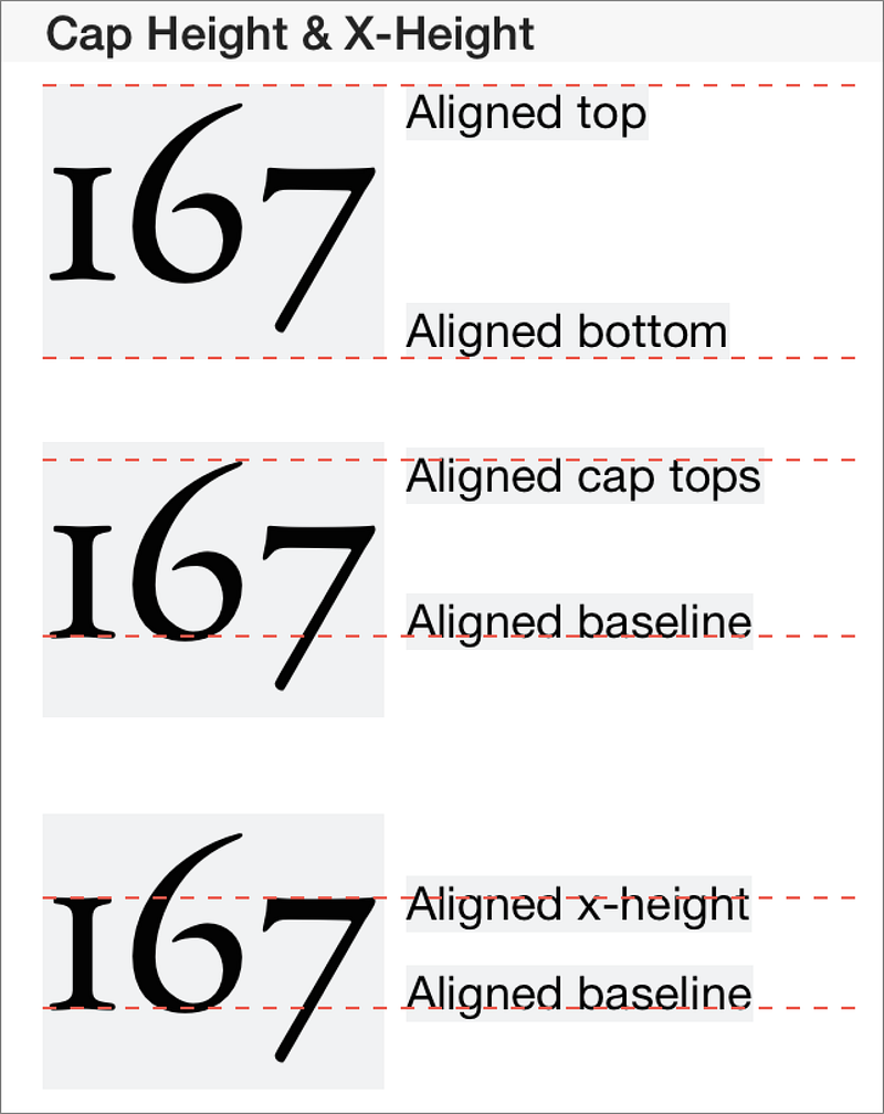
A Swift library attributed string library. It allows to align text by top, bottom, or baseline. For iOS, macOS, tvOS, and watchOS.
CSS Inline Layout Module Level 3
Finally, the most interesting thing (and the one that will probably solve the whole problem in the future) is the initiative to change the CSS standard to natively support the baseline of the text. So far it’s just a draft (and we don’t know when it will come to life), but the idea itself looks great.
If you’re not interested in the technical details of the standard, I suggest you read Ethan Wang’s article Leading-Trim: The Future of Digital Typesetting:
Soft grid — nuances, and solutions
The soft grid is the easiest to implement and use in UI design. As mentioned above, at present developers do not have any vertical grid, to which they could bind the text, so all the alignment is usually done by positioning the text frame. The main disadvantage of this approach is that the position of the text within the text frame is highly dependent on the specific font. That in some cases the difference is very noticeable.
However, if you do not have to change the font in the layout regularly, the issue can be solved by setting up good typography. Zac Halbert wrote an excellent article/guide on this and I really recommend it. The author describes the process of typography set up in a simple and clear detailed way. Although the article describes everything using Sketch as an example, it also applies to Figma (and probably to any other similar app).
Combined with a good typography setup a soft grid works great and, in most cases, really removes decision making. And it makes life easier for designers and developers alike. Especially if you use a good spacing system.
A soft grid, like a hard grid, allows you to set the right consistent rhythm between the components and the text, so the result, in most cases, will not differ too much than if you were using a hard grid. Christopher Deane illustrates this well with a few examples in this video.
So what is the bottom line?
Any grid is first and foremost a tool. No more than that. Matthew Butterick puts it well in his Practical typography:
Grids are not helpful when they create a false sense of security — I aligned everything to my grid, therefore my layout is solid. For instance, a few years ago, web designers were fixated on the 960 grid system. If it got people curious about grids, OK. But it also proved that if you take ugly shit and align it to a grid — it’s still ugly shit.
In my opinion, the use of a hard vertical grid is justified primarily in typography (especially in newspaper/magazine design). However, in UI design, the absence of native support in the editors and the code only creates unnecessary complexity. So the soft grid is the best tool to set consistent rhythm interface layouts.
Let’s stay in touch! Connect with me on LinkedIn and follow me on Dribbble and here on Medium for more design-related content.


