

‘Eyeballing’ or Optical Alignment in Design
There is such a thing as an optical illusion. This is when our brain perceives information a little differently than it actually is in the real world. Likewise, this is characteristic in design. But in the design of websites and interfaces, it works in the opposite direction. You need to break the laws of physics and mathematics and slightly change how the elements look in order to create an optical illusion.
When we are using graphic editor tools such as Adobe Photoshop or Sketch or something else, all layers by default are rectangular containers. When we align one layer in the center relative to another, the centers of rectangular containers are used for alignment. Such an approach is extremely inconvenient when working with icons, since the shapes to be leveled may differ greatly from their rectangular containers. And the more an asymmetric shape differs in area and coordinate points from the rectangle in which it is placed, the more noticeable the difference between the centers of the shape and its container. This brings an imbalance to the composition in the icons and in the interface as a whole.
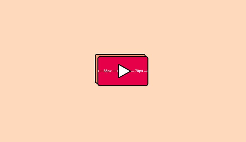
Let’s look at real-world examples so that you understand what optical illusions mean in design and what role they play. Let’s take, for example, the common ‘play’ button. It is quite primitive and is often a typical example of optical illusion.
At first glance, it may seem that this triangle is located exactly in the center in the shape:

However, this is not quite so. In looking at the exact dimensions, we see that we have 86 px on the left and 70 px on the right:
This is an optical illusion. You need to break the geometry laws a little and mathematics in order to achieve the best result. Let’s see what this icon would look like if we did everything exactly according to mathematics where the left and right indentation would be equal in pixel length:
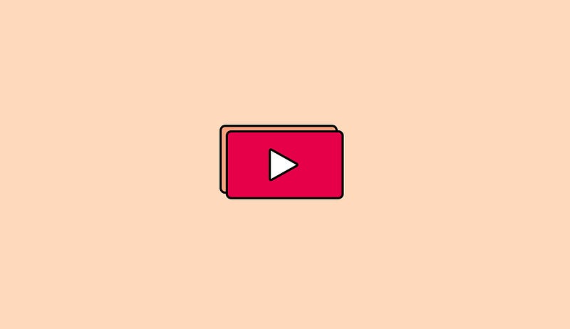
As you can see, our triangle has strongly shifted from the center and now it looks unbalanced.
Why is that so? The answer to this question is in the shape of a triangle. If you look, its left side has more optical weight than its right, and this is the very essence of optical alignment.
It becomes noticeable at the stage of the layout of user interface elements. In order to identify the problem in advance, when accepting the design and evaluating the quality of the layouts, it is necessary to pay attention to how visually the figures in the icons are aligned. If inside the icons, they do not look balanced (as in our example), they will need optical compensation.
Optical compensation is the distance to move the shape to achieve visual balance relative to other layers. To do this, we change the coordinates of the center of the container so that they match the coordinates of the center of the shape, and then aligning the shape relative to the new center.
If a project has no documentation for User Interfaces, Design Systems are not applied which means the alignment becomes the responsibility of designers. For designers and developers, it is important to discuss such issues. If you have not yet applied such optical alignment solutions in your work, it makes sense to look at the user interfaces being developed: you will most likely need to correct the alignment of some of their elements. Also, there are plug-ins and solutions for graphics editors, for example, Optically for Sketch.
There are different methods of optical alignment:
- Element Size
- Element Color
- Positioning
Let’s go through each of them.
The Size
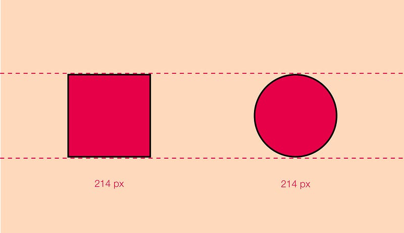
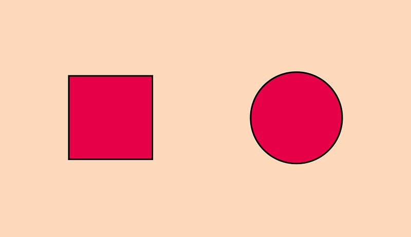
Let’s take the common example of a square and a circle. Are the shapes the same size?
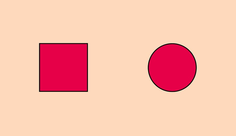
Based on this example, we visually feel that the circle is smaller than a square. But in fact, if you measure the real size of these shapes, we will see that they have the same size/diameter:
If we slightly increase our circle, the shapes will look visually closer to each other (have the same size/weight), although in this case, the diameter of the circle will be larger than the diameter of the square:
All of this can be called a visual compensation of space. In fact, geometry is behind this. In this article, I will not go into these details, as there is a very good and detailed description in this post.
The same technique works with other shapes, such as a rhombus and a triangle. This exact same principle works when you design icons:
The Color
Optical compensation in colors is less noticeable. But in this case, it is all about the optical weight of the object.
If you use the same shade of red for both the icon and the text, the text will look a little dimmer:
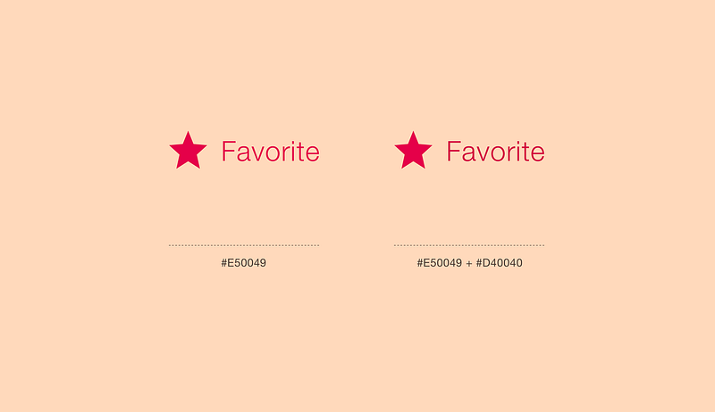
The icon and the text on the left side is the same HEX code, while the icon and the text on the right are different.
To avoid different optical weights, you can either make the icon a little brighter or the text-darker.
Positioning
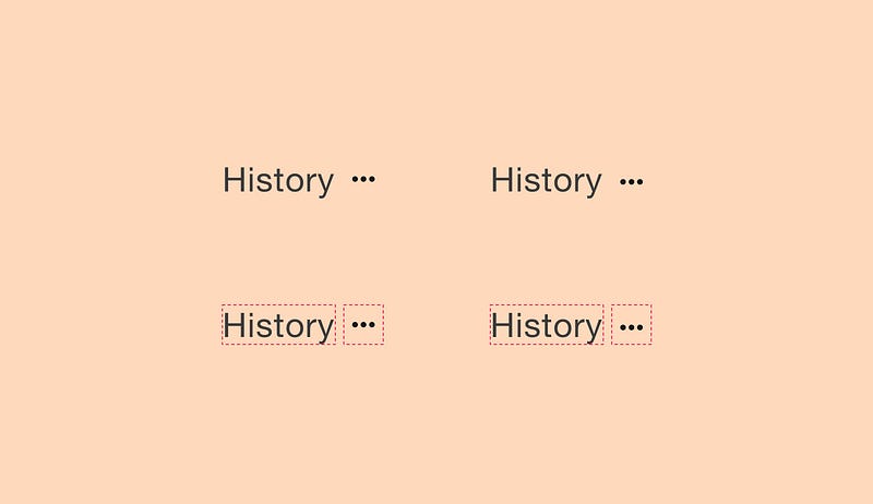
Positioning is also a very important part of optical alignment. Let’s take a simple example of text and an icon next to it.
In the left example, you see that two objects are centered relative to each other. But due to the fact that they have different weights (in our case, you still need to take into account the baseline of the text), this gives a visually not-pleasant feeling that the icon is raised up. In this case, we need to apply optical alignment and lower the icon inside the bounding box as shown in the example on the right.
This rule applies to the composition of your design as a whole.
A good user interface is the result of the work of each specialist and team. It is created in the process of building the visual harmony of the elements on the user’s screen. Such harmony can be achieved by applying interdisciplinary knowledge and skills. For example, mastering and applying geometric principles in design and development.
In our case, this approach is optical alignment. When working on a full-fledged project, even small changes will affect the overall perception of the picture. This attention to detail distinguishes the good from the great design.


