
Email Psychology Breakdown: Jones Road Beauty Welcome Email
Steal the secrets of this masterclass in marketing psychology…
🧠 This welcome email from Jones Road Beauty has a lot to love (and some things I’d change). Here’s the psychology behind what works & what doesn’t 👇
You can watch the video breakdown below, or keep reading for a summary.
1. Subject Line
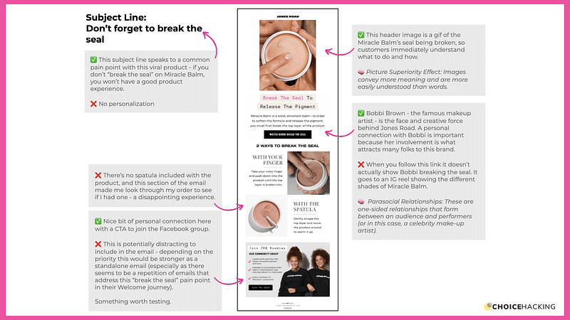
“Don’t forget to break the seal”
✅ This subject line speaks to a common pain point with this viral product — if you don’t “break the seal” on the Jones Road Miracle Balm, you won’t have a good product experience (something unique to this product).
❌ No personalization in the subject line: Some low-hanging fruit worth testing.
🧠 Cocktail Party Effect: We pay more attention to personal and personalized information, like our names.
2. Header Image / Gif
✅ This header image is a gif of the Miracle Balm’s seal being broken, so customers immediately understand what to do and how. The use of the product is a big pain point for customers because it’s unique to this product — and if you don’t break the seal, your product experience will be a poor one.
🧠 Picture Superiority Effect: Images convey more meaning and are more easily understood than words.
3. CTA (“Watch Bobbi Break the Seal”)
✅ Bobbi Brown — the famous makeup artist — is the face and creative force behind Jones Road.
A personal connection with Bobbi is important because her involvement is what attracts many folks to this brand.
❌ When you follow this link it doesn’t actually show Bobbi breaking the seal. It goes to an IG reel showing the different shades of Miracle Balm.
🧠 Parasocial Relationships: These are one-sided relationships that form between an audience and performers (or in this case, a celebrity make-up artist).
4. Body Copy
❌ There’s no spatula included with the product, and this section of the email made me look through my order to see if I had missed it — a disappointing experience that could be avoided with a bit of personalization.
4. Bottom Section
✅ Nice bit of personal connection here with a CTA to join the Facebook group.
❌ This is potentially distracting to include in the email — depending on the priority this would be stronger as a standalone email (especially as there seems to be a repetition of emails that address this “break the seal” pain point in their Welcome journey). Something worth testing.
Choice Hacking 3S Framework Score
Is this email Simple, Salient, and Soulful? Let’s find out:
🎯 Simple: Is this email easy to navigate — is it clear what I need to do next?⭐ 4/5 This email is about product education, not a hard CTA.
The design is a bit crowded and the CTA itself (“Watch Bobbi break the seal”) isn’t actually paid off. But it’s now clear how I’m supposed to use the product.
🧠 Salient: Is this email easy to pay attention to and remember?⭐ 4/5 The headline gif image is salient and eye-catching.
The header gif does so much heavy lifting that the rest of the email isn’t really necessary.
❤️ Soulful: Is this email easy to love and emotionally engaging? ⭐ 3/5 The personal connection isn’t here for me in this email.
Legendary makeup artist Bobbi Brown is the face of the brand, so I would’ve liked to see more of her face/name/presence in this welcome email.
Getting traffic but not enough sales, leads, or clients? 👇
What if you could quickly understand a customer’s impressions of your digital experience, get rapid expert feedback, and immediately understand how to improve your experience with marketing psychology and behavioral science?
My popular Choice Hacking CX Audit can help you.
✅ 43-point CX Audit
✅ Drive sales and retention
✅ Build your brand for the long-term
// What is a Customer Experience Audit?
Part expert review, part user research, and part behavioral diagnostic, I record a video teardown of your website or marketing experience and share my initial recommendations in an actionable 43-point CRO report.
Each audit will help you:
✅ Instantly understand flaws in your messaging, visuals, design & information architecture
✅ Quickly identify areas where behavioral science and persuasive design can help your business accomplish its goals
✅ Predictive AI Salience analysis to understand what users are noticing, and what they’re missing.
To see an example audit or schedule yours, visit: https://www.choicehacking.com/customer-experience-audit
This article was originally posted on my blog Choice Hacking.


