
Elegance in Simplicity: Subtlety with Neutrals in Design
Unveiling the Power of Neutral Tones in Crafting Timeless and Sophisticated Design Projects
The classic appeal of neutrals is proof of the enduring power of subtlety in the ever-evolving world of design, where trends come and go. With its palette of whites, grays, beiges, and muted tones, neutrals provide designers with a flexible canvas on which to create sophisticated yet ageless places and images. This thorough book explores the art of subtlety, showing how well-chosen neutrals can elevate design projects, arouse feelings, and withstand the test of constantly changing aesthetics.
Accepting Neutrals: A Symphony of Complexity
Neutrals are sometimes referred to as the unsung heroes of design because of their special capacity to foster harmony and serenity. The emphasis on shape, texture, and composition is made possible by the lack of strong color. Neutral colors are always in style among homeowners, according to a poll conducted by Houzz, a well-known website for home remodeling and design. This suggests that people generally value the subtle elegance that neutral colors provide to places.
The deceptive simplicity of neutral colors provides for a timeless appearance that transcends fads and inspires viewers to examine the intricacies of design aspects.
Building Graphic Hierarchies: The Influence of Mild Contrast
The skill of building a visual hierarchy is crucial in the fields of graphic and online design. In this process, neutrals are essential because they create a background that highlights important components. The contrast between neutral backgrounds and emphasis points ensures that critical information or imagery stand out.
Neutral website backgrounds, for example, can improve readability and highlight eye-catching graphics or call-to-action buttons. The intelligent application of neutrals to establish visual hierarchy results in a smooth and simple user interface.
Mood and Ambience: The Neutral Emotional Palette
Emotions are evoked by colors, and neutrals are no different. Although bold hues could draw attention, neutrals can gently alter the tone. While chilly grays and whites can convey a sense of tranquility and serenity, warm neutrals like taupe and beige can create a friendly and inviting ambiance.
For interior designers, a room can become a peaceful haven by utilizing neutral furniture, wall colors, and décor. Recognizing the subtle emotional undertones of neutral colors enables designers to create spaces that evoke the right mood.
Classic Elegance: Neutrals in Style and Other Aspects
The timeless appeal of neutral colors has long been acknowledged by the fashion industry. The use of black, white, and gray in their iconic designs has been championed by designers like as Coco Chanel and Calvin Klein. Neutral colors are now widely used in branding, packaging, and accessories in addition to apparel.
Businesses like Apple and Nike have embraced neutral, minimalistic branding, which adds to the perception of sophistication and timelessness. Neutrals’ transcendent quality attests to their adaptability to a wide range of design fields.
Texture and Substance: Neutrals Exceeding Level Surfaces
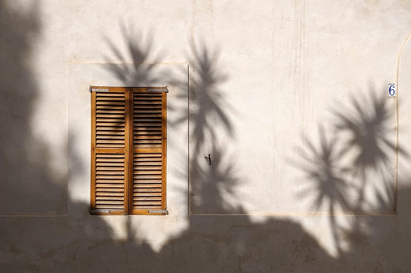
There is a world outside just flat, monochromatic colors for neutrals. On neutral surfaces, the play of light and shadow can draw attention to texture and deepen designs. This is most noticeable in interior design, where neutral flooring, finishes, and textiles create a rich, visceral space.
Subtle gradients and textures in muted hues can improve the user experience in digital design by giving it a more realistic and realistic feeling. Neutrals are a useful element in a designer’s palette because of their adaptability in expressing texture.
Design Scheme Flexibility: Neutrals as Chameleons
Neutrals’ ability to blend in with a variety of design schemes is one of their main advantages. Neutrals go well with various colors, whether they’re the basis of a minimalist style or mixed with colorful accents for a more varied appearance. This flexibility is very useful in both home and business settings.
Neutrally colored office interiors create a polished, businesslike feel in the corporate sector. Neutrals are a flexible backdrop in domestic design that lets homeowners experiment with different decor styles without having to match the existing color scheme.
The use of neutrals in design is a classic and effective example of the art of subtlety. Neutrals are an essential part of any designer’s toolkit since they may be used to create visual hierarchy, evoke strong feelings, and promote ageless elegance and versatility. When creating calm spaces, modern logos, or intuitive user interfaces, the subtle elegance of neutral colors guarantees a lasting impression. Accept the subtlety, become an expert with neutrals, and take your creative endeavors to a new level of timeless sophistication and beauty.
If you enjoyed my article, I would greatly appreciate your support in my creative work. The easiest way to do so is by simply buying me a coffee. Thank you very much for your support.


