avatarMarcin Wichary

Summary

Medium's design philosophy emphasizes the importance of punctuation and typography in enhancing the reading experience, with custom bullet points, hyphenation, underlines, and pilcrows.

Abstract

The article discusses Medium's meticulous approach to punctuation and typography in their content. It highlights the platform's use of custom bullet points that are aesthetically pleasing and appropriately sized, falling between mid dots and larger bullet points. Medium also employs hyphenation for text on Safari, particularly on smaller devices, to improve the readability of the right-hand text edge, while ensuring that hyphenation adheres to the correct language rules. The platform has designed underlines that balance the indication of clickable links with minimal distraction to the reader. Additionally, Medium uses pilcrows to separate inline paragraphs, drawing on the symbol's rich typographic history to maintain clarity and readability.

Opinions

  • The article suggests that most bullet points are unattractive, implying a common design flaw that Medium aims to avoid.
  • Medium's approach to hyphenation indicates a belief that proper hyphenation is crucial for readability on smaller screens, and that incorrect hyphenation is detrimental.
  • The custom underlines are seen as a thoughtful balance between functionality and aesthetics, emphasizing Medium's commitment to a distraction-free reading experience.
  • The use of pilcrows in streamlined/inline paragraphs reflects an opinion that clear paragraph separation is important for maintaining the visual structure of text and enhancing readability.

Death to typewriters

Part III. Punctuation binds the words together

A great typeface doesn’t matter much when joined together by bad punctuation. We make sure that punctuation in Medium stories is on par with the words surrounding it:

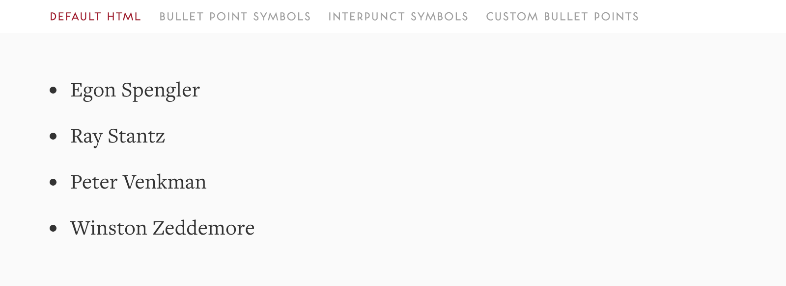
Bullet points. Most bullet points are ugly. Seriously. We hope ours is not — we put together custom bullet points that are sized somewhere in between mid dots (interpuncts) and actual fat bullet points.

Hyphenation in text.

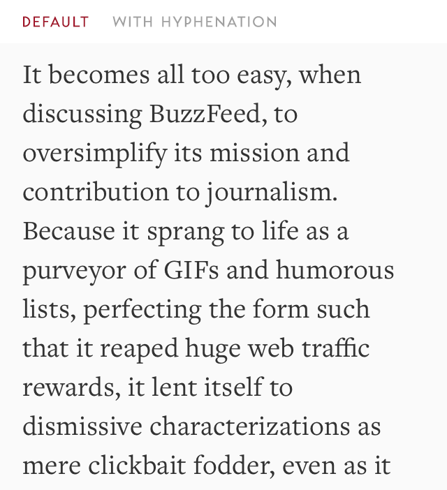
We enable hyphenation on Safari, on smaller devices only. The latter point is important because the ragged right edge is much more prominent on small screens. Safari is one the few browsers so far offering the right knobs to fine-tune hyphenation (tip of the hat to Internet Explorer as well); fortunately it also happens to be the most popular small-screen browser.

We make sure to be explicit about what’s the language of the story — hyphenating according to rules of a wrong language is worse than not hyphenating at all.

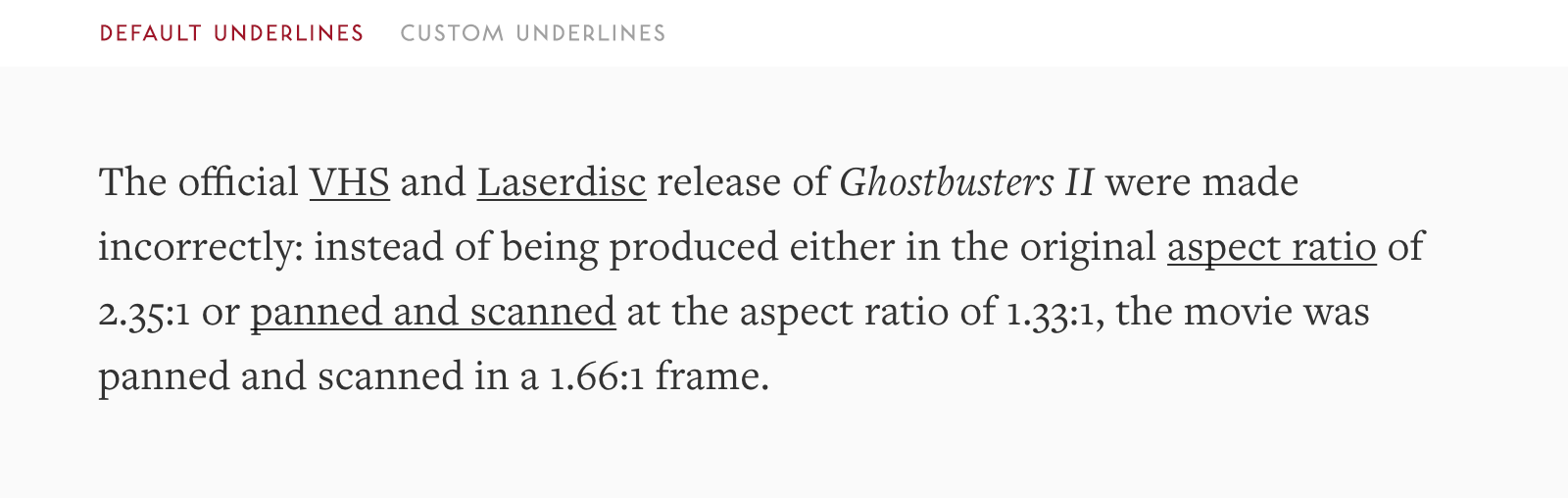
Underlines. We designed custom underlines that strike the right balance between communicating something clickable, and being a possible distraction from reading.

Pilcrows. When we streamline/inline paragraphs, we use pilcrows (paragraph marks with interesting history) to separate them, instead of just allow them to blend together like a one long paragraph from hell.

« Part II · Part IV »

Typography
Medium
Recommended from ReadMedium