
Education App UI - Flutter Tutorial #6 | Intro Screen
Welcome to Tutorial #6 of our Education App UI Flutter series! In this installment, we focus on creating the Intro Screen, a crucial component of any educational app’s onboarding process. Join us as we dive into the design and implementation of an engaging and informative Intro Screen using Flutter.
🚀 Key Tutorial Highlights:
- Designing an attractive and user-friendly Intro Screen layout.
- Incorporating interactive elements to guide users through the app’s features.
- Implementing Flutter widgets and animations to enhance the user experience.
Whether you’re a Flutter enthusiast or a developer looking to enhance your UI skills, this tutorial will provide practical insights into creating compelling Intro Screens for Education Apps.
📂 Project Files:
Access the project files and code snippets used in this tutorial on our GitHub repository to get the Assets and Basic Code. Dive into the code, experiment, and adapt these techniques to create Course Screens tailored to your app’s unique requirements.
🔗 Final Source Code (40++ screens): https://codingyourlife.gumroad.com/l/english-course-app
🔗 Get the Assets and Basic Code: https://github.com/faisalramdan17/flutter_english_course
🔗 Palylist of Flutter UI Tutorial — E-Learning App: https://www.youtube.com/playlist?list=PLfoSLwBzaK26h0b-XZ-ypaqahOFcc4XkS
🔗 Try the App on Play Store: https://play.google.com/store/apps/details?id=id.codingyourlife.enlive
The Instructions
Firstly, open the folders : modules > screens, then create a folder `welcome` and a file `intro_view.dart`.
Create `IntroView` widget by using `StatelessWidget`. we add the `routeName` static const String variable like this:
static const String routeName = '/intro';And we replace the `Container` of the screen with `Scaffold` and `Text` widget like this:
 return const Scaffold(
        body: Center(
        child: Text('This is Intro Screen'),
        ),
    );
Open the file `app_router.dart`. In the `AppRouter` class, we add the `loginRedirect` static FutureOr function that return nullable String.
We can use it later in the case that we like to make a redirection decision for a specific route (or sub-route).
static FutureOr<String?> loginRedirect(_, state) async {
  return null;

  // final db = StorageDB();
  // final token = await db.getToken();

  // // NOTE: if the user is not logged in, they need to login
  // final bool loggedIn = token != null;

  // if (!loggedIn) {
  // return LoginScreen.routeName;
  // }

  // final bool loggingIn = state.matchedLocation == LoginScreen.routeName;

  // // NOTE:if the user is logged in but still on the login page, send them to
  // // the home page
  // if (loggingIn) {
  // return HomePage.routeName;
  // }

  // // NOTE: no need to redirect at all
  // return null;
}
Open the file app_routes.dart. In the `AppRoutes` class, we add the `introRoutes` static final variable.
It is a list of the `RouteBase` abstract class. Here, we set growable to false to make the list fixed-length.
static final introRoutes = <RouteBase>[].toList(growable: false);Add an item to the list with a `GoRoute` object that has parameters associated with the `IntroView` class.
GoRoute(
  name: IntroView.routeName,
  path: IntroView.routeName,
  builder: (_, __) => const IntroView(),
  redirect: AppRouter.loginRedirect,
),
Open the file app_router.dart again. In the `AppRouter` parameters, we change `initialLocation` parameter value with `IntroView.routeName`.
Then add this item to the routes list parameter value. We try to restart first.
/// Starter routes
…AppRoutes.introRoutes,
Open the file intro_view.dart again. Replace `Scaffold` with `Material` and `body` parameter with `child` then add `color` parameter with this value:
context.theme.colorScheme.background
Wrap `Center Text` with `SafeArea`, vertical `Padding` of 16 pixels, `Column`, and `Expanded` widgets.
padding: const EdgeInsets.symmetric(vertical: 16),Add the `Next` and `Login` action buttons below the `Center Text` widgets by using `Column` widget.
Remove ‘const’ before `SafeArea` and rename the `Center Text` to `This is Intro Slide Pages`.
Column(
  children: [
    AppRoundedButton(
      onPressed: () {},
      label: 'Next',
    ),
    Row(
      mainAxisAlignment: MainAxisAlignment.center,
      children: [
        const Text(
          'Do you have an account?',
          style: TextStyle(fontSize: 17),
        ),
        const SizedBox(width: 4),
        TextButton(
          onPressed: () {},
          child: const Text(
            'Login',
            style: TextStyle(fontSize: 17),
          ),
        ),
      ],
    ),
  ],
),
Add the `imagesPath` static final String list variable to store path of assets.
static final imagesPath = <String>[
  Assets.imagesSVG.teaching,
  Assets.imagesSVG.studying,
  Assets.imagesSVG.onlineLearning,
];
Add the `_introText` static const String map variable to store all texts of the title and subtitle for each slide page item.
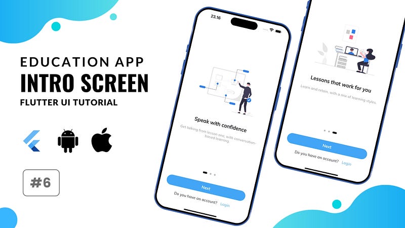
static const Map<String, String> _introText = {
  'intro_page_title_1': 'Speak with confidence',
  'intro_page_subtitle_1': 'Get talking from lesson one, with conversation-based learning.',
  'intro_page_title_2': 'Learn atyou pace',
  'intro_page_subtitle_2': 'Build a learning habit and make it part of your day.',
  'intro_page_title_3': 'Lessons that work for you',
  'intro_page_subtitle_3': 'Learn and retain, with a mix of learning styles.',
};
Open the folders : components > common, then create a file `intro_slider.dart`.
Create IntroSlider global component widget by adding IntroModel class and IntroSlider Stateful Widget.
part of component;

class IntroModel {
    String imagePath, title, subtitle;

    IntroModel({
        required this.imagePath,
        required this.title,
        required this.subtitle,
    });
}

class IntroSlider extends StatefulWidget {
    const IntroSlider({
        Key? key,
        required this.items,
    }) : super(key: key);

    final List<IntroModel> items;

    @override
    State<IntroSlider> createState() => _IntroSliderState();
    }

    class _IntroSliderState extends State<IntroSlider> {
    final selectedImageNotifier = ValueNotifier<int>(0);

    @override
    void dispose() {
        selectedImageNotifier.dispose();
        super.dispose();
    }

    @override
    Widget build(BuildContext context) {
        return Padding(
        padding: const EdgeInsets.all(20.0),
        child: ValueListenableBuilder(
            valueListenable: selectedImageNotifier,
            builder: (context, currentImage, child) => Column(
            mainAxisAlignment: MainAxisAlignment.center,
            children: [
                Expanded(
                child: buildImagesPage(),
                ),
                widget.items.length > 1
                    ? SizedBox(
                        height: 30,
                        child: Row(
                        mainAxisAlignment: MainAxisAlignment.center,
                        children: widget.items
                            .map((image) => _buildIndicator(widget.items.indexOf(image) == currentImage))
                            .toList(),
                        ),
                    )
                    : Container(),
            ],
            ),
        ),
        );
    }

    Widget buildImagesPage() {
        return PageView(
        physics: const BouncingScrollPhysics(),
        onPageChanged: (value) => selectedImageNotifier.value = value,
        children: widget.items.map((item) {
            String ext = item.imagePath.split(".").last;
            double height = 200;
            return Padding(
            padding: const EdgeInsets.symmetric(horizontal: 4),
            child: Column(
                mainAxisAlignment: MainAxisAlignment.center,
                children: [
                Container(
                    padding: const EdgeInsets.symmetric(horizontal: 16),
                    child: ext != "svg"
                        ? Image.asset(
                            item.imagePath,
                            fit: BoxFit.scaleDown,
                            height: height,
                            // height: ,
                        )
                        : SvgPicture.asset(
                            item.imagePath,
                            fit: BoxFit.scaleDown,
                            height: height,
                        ),
                ),
                const SizedBox(height: 55),
                Text(
                    item.title,
                    style: p23.bold,
                    textAlign: TextAlign.center,
                ),
                const SizedBox(height: 23),
                Text(
                    item.subtitle,
                    textAlign: TextAlign.center,
                    style: p16.grey,
                ),
                ],
            ),
            );
        }).toList(),
        );
    }

    Widget _buildIndicator(bool isActive) {
        return AnimatedContainer(
        duration: const Duration(milliseconds: 150),
        margin: const EdgeInsets.symmetric(horizontal: 6),
        height: 8,
        width: isActive ? 20 : 8,
        decoration: BoxDecoration(
            color: isActive ? Colors.black : Colors.grey[400], borderRadius: const BorderRadius.all(Radius.circular(12))),
        );
    }
}
Open the file intro_view.dart again. Replace the `Center Text` with this:
 IntroSlider(
    items: imagesPath.map((item) {
    return IntroModel(
        imagePath: item,
        title: _introText['intro_page_title_${(imagesPath.indexOf(item) + 1)}']!,
        subtitle: _introText['intro_page_subtitle_${(imagesPath.indexOf(item) + 1)}']!,
    );
    }).toList(),
),
Yap, already done. you can see the page slider is working fine now. But now I want to explain parts of component in `IntroSlider` widget.
Here, we have `ValueNotifier` for selected image state and don’t forget `dispose` it in `StatefulWidget` life cecyle.
We use `ValueListenableBuilder` to listen current state changes for re-building the widget.
We use column as well then in children we wrap the pages with Expanded and put the indicator animation below.
We use PageView widget with this parameters. In children of PageView we set mapping of items with Padding and Column.
And in children of Column, we put image container, texts of title and subtitle.
The last part is using AnimatedContainer for indicator animation.
We just adjust several parameters within BoxDecoration like `color` and `borderRadius`
Subscribe to our channel for future tutorials, tips, and tricks on Flutter UI development. If you find this tutorial valuable, give it a thumbs up, share it with your developer community, and share your thoughts in the comments below!
Flutter Course for FREE → https://bit.ly/flutter-free-course
→ Source Code — Rental Car App : https://codingyourlife.gumroad.com/l/flutter-cental-car-app
→ Source Code — Workout App : https://codingyourlife.gumroad.com/l/flutter-aqua-workout-app 🔔
SUPPORT ME :
— Wise → https://wise.com/pay/me/faisalm269
— PayPal → https://www.paypal.com/paypalme/faisalramdan17
— Download My Apps → https://codingyourlife.gumroad.com
— Buy Me a Coffee → https://www.buymeacoffee.com/faisalramdan17
— My Portfolio → https://codecanyon.net/user/codingyourlife/portfolio
CONTACT ME :
— Email → [email protected]
— Instagram → https://www.instagram.com/faisalramdan17
— Github →https://github.com/faisalramdan17
— LinkedIn → https://www.linkedin.com/in/faisalramdan17


