
Art | Roleplaying Games
Dungeons & Dragons is Artless and Boring
These 10 games look and play WAY better
This is what D&D looks like.
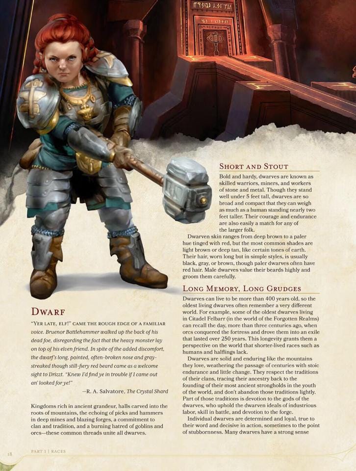
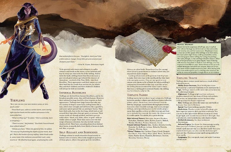
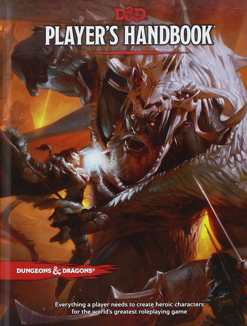
D&D’s art is over-refined, uninspired, and dull. It’s not bad. The art is typical fantasy stuff done well and the text exists. But it’s boring. The characters and landscapes are identifiable but not at all memorable. It’s refined but lacks any discernible style. For “the world’s greatest roleplaying game”, fine is crap.
D&D books are mostly walls of text broken up with the sort of artwork we’ve all seen a million times. You can never find the rules you’re looking for because none of D&D’s art is memorable enough to act as landmarks.
There are exceptions, but Hasbro-sized art budgets make having a few genuinely good pieces inevitable. Sometimes D&D looks like this…
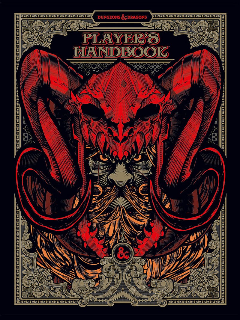
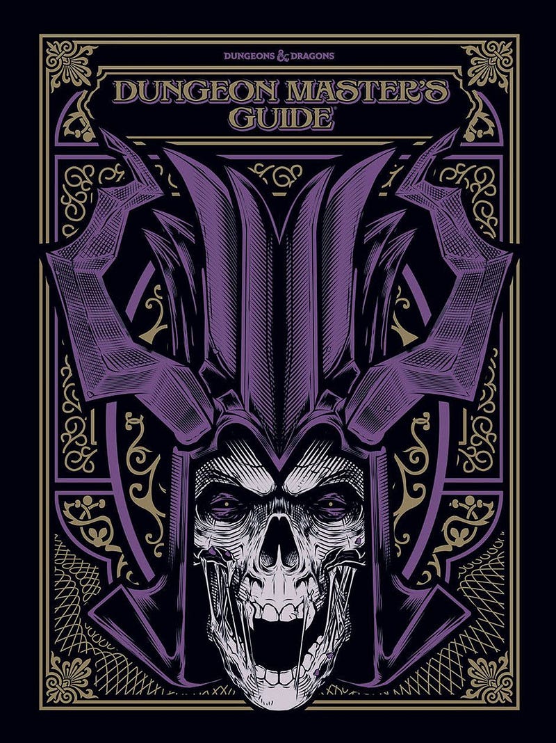
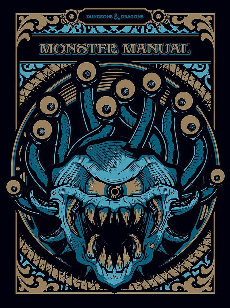
… but only if you pay more, and the interior is still the same bland crap as before. If this was the norm and the interior matched, D&D would look far more interesting. But it doesn’t, so here we are.
Games can be art. For example…
ARC: Doom Roleplaying
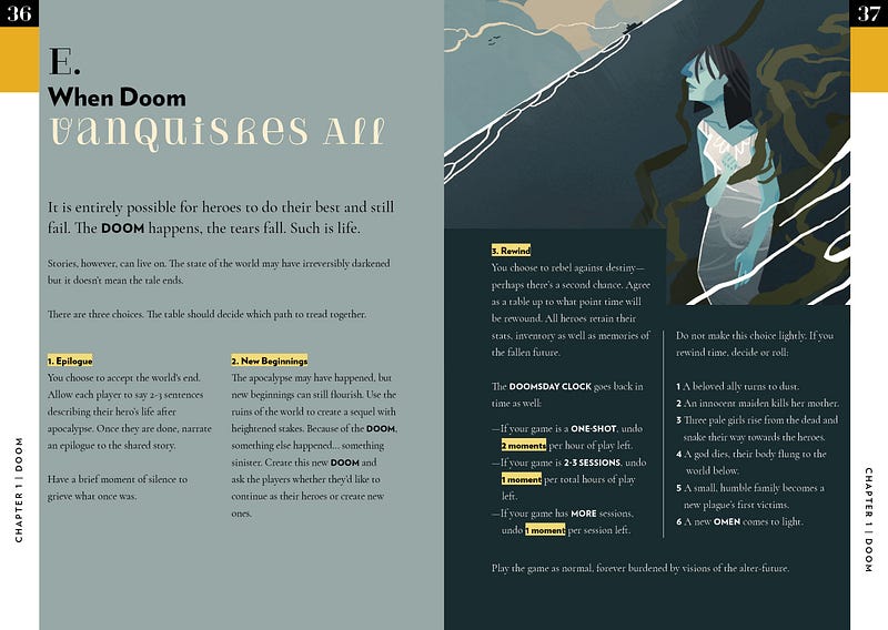
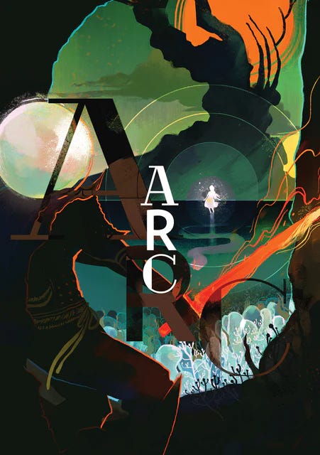
Race against a world-ending apocalypse. Layout focuses on two-page spreads for key concepts. Art and story seeds are fairy tale-like but with an edge. Color and shading is dramatic and fittingly foreboding for a game about doom. Surprisingly easy to reference.
Atma
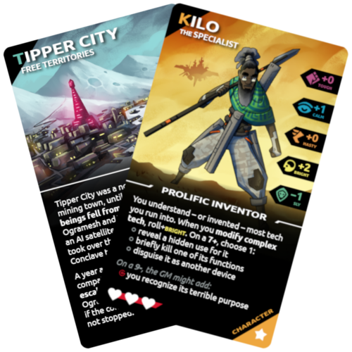
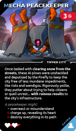
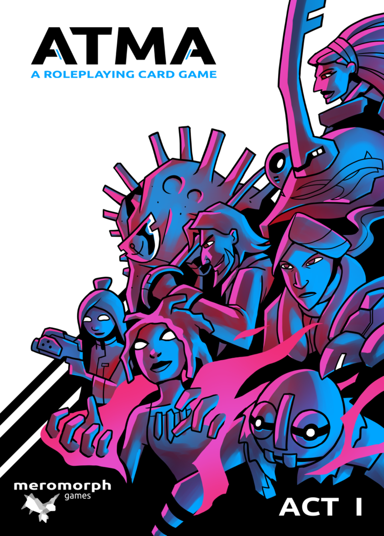
Post-apocalypse science fantasy adventure. Art looks a bit amateurish but also bold and memorable. Character, NPC, location, and plot twist cards are distinct and identifiable at a glance. Iconography is easy to grok. The juxtaposition of primitive weapons and sci-fi robots glues players’ attention to the table and the game.
Cy_Borg
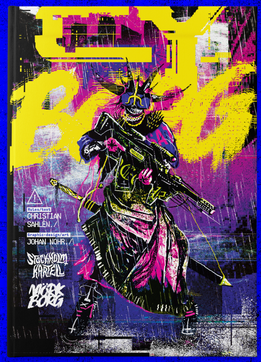
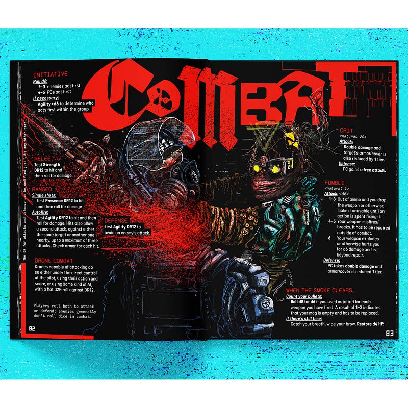
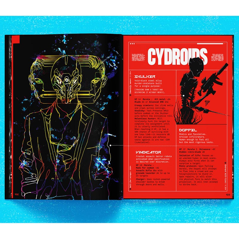
Artpunk doom-and-gloom cyberpunk. Fonts and art styles change from page to page. Nothing in this book is boring to look at. The whole world “feels” wet and dirty and hard. Not easy to reference during play, but that’s negated by the two-page reference in the back.
iHunt: The RPG
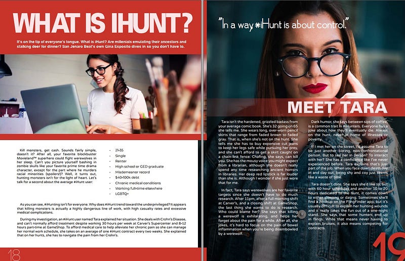
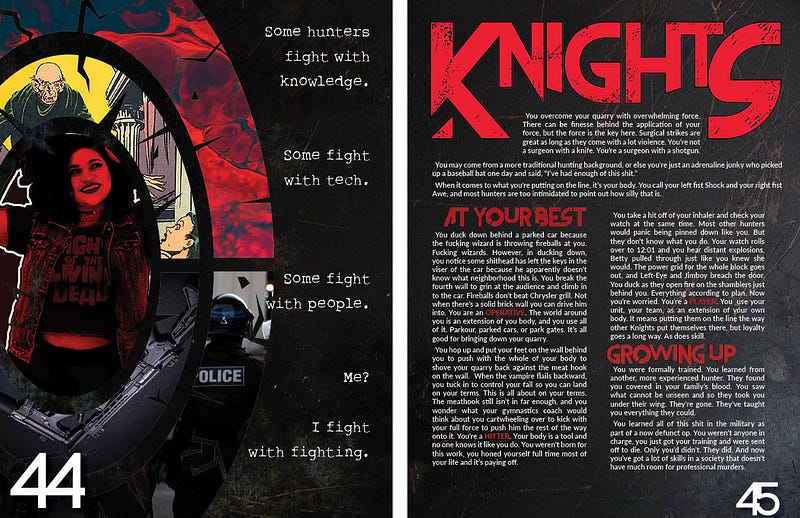
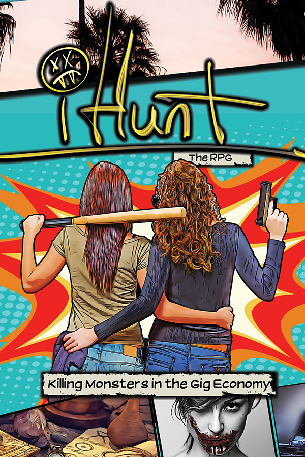
Ironically tragic anti-capitalist monster hunting. Most of the art is remixed public domain or stock photos. Style alternates between traditional magazine, underground zine, and screen grabs. Visually imbalanced, which fits the economic imbalance of the setting perfectly.
Into the Odd
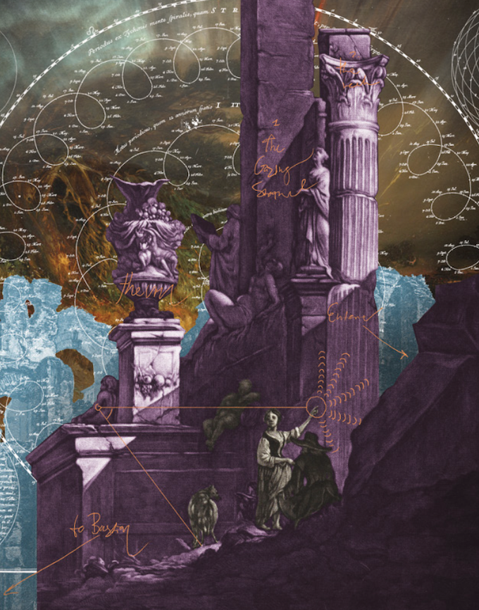
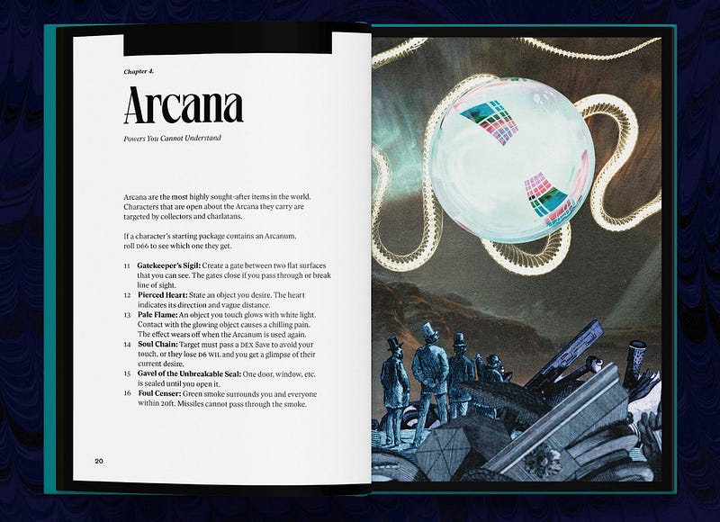
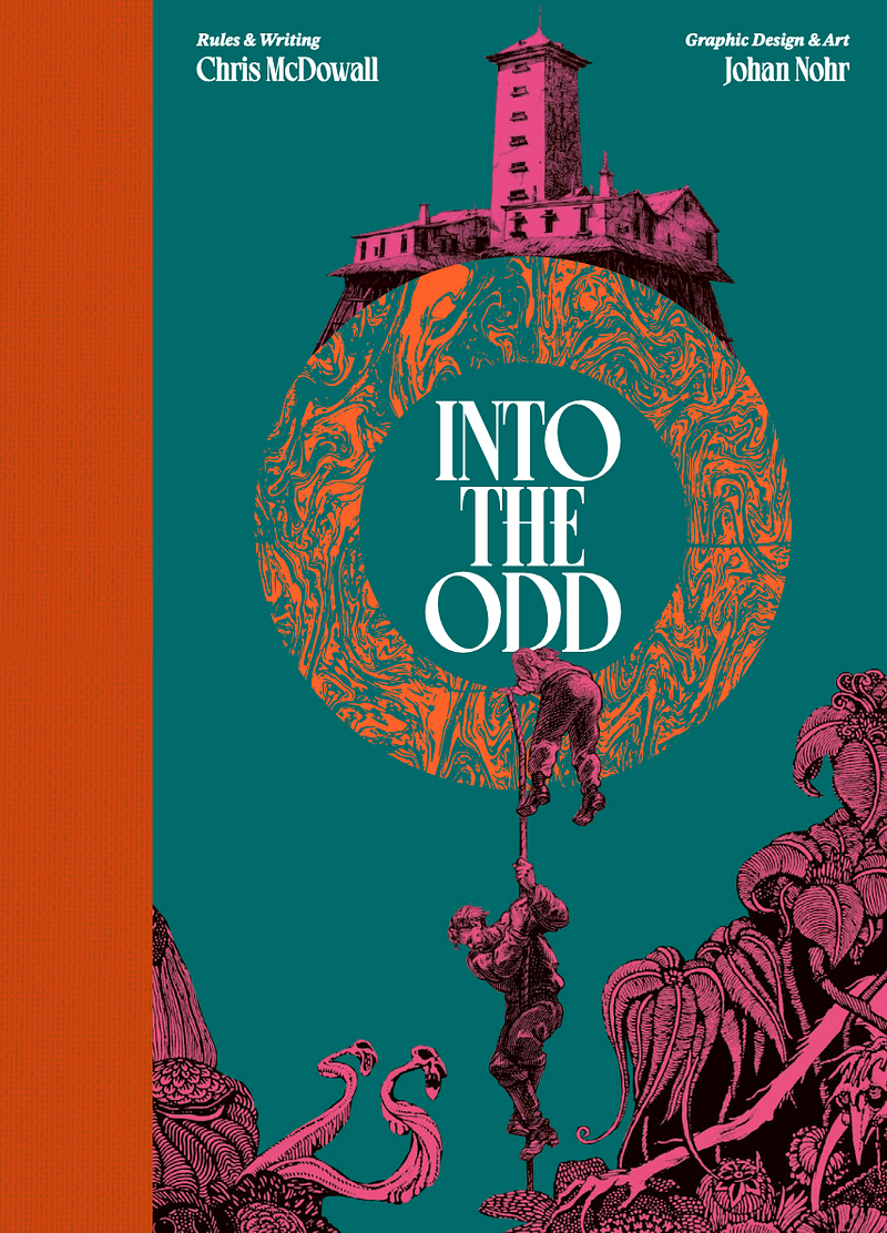
Strange fantasy adventure. Very clean layout alternates with surreal remixed historical and public domain images. Easy to reference during play, because the layout person was completely unafraid of white space.
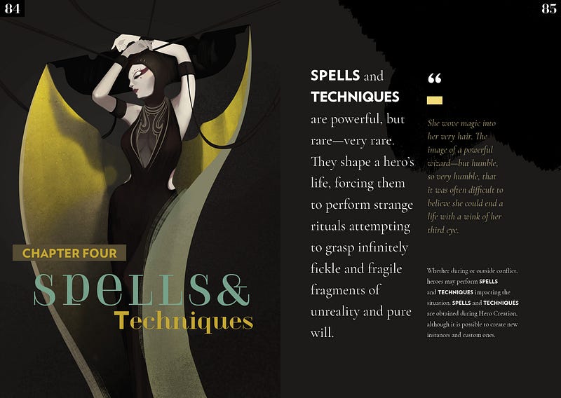
Moonpunk
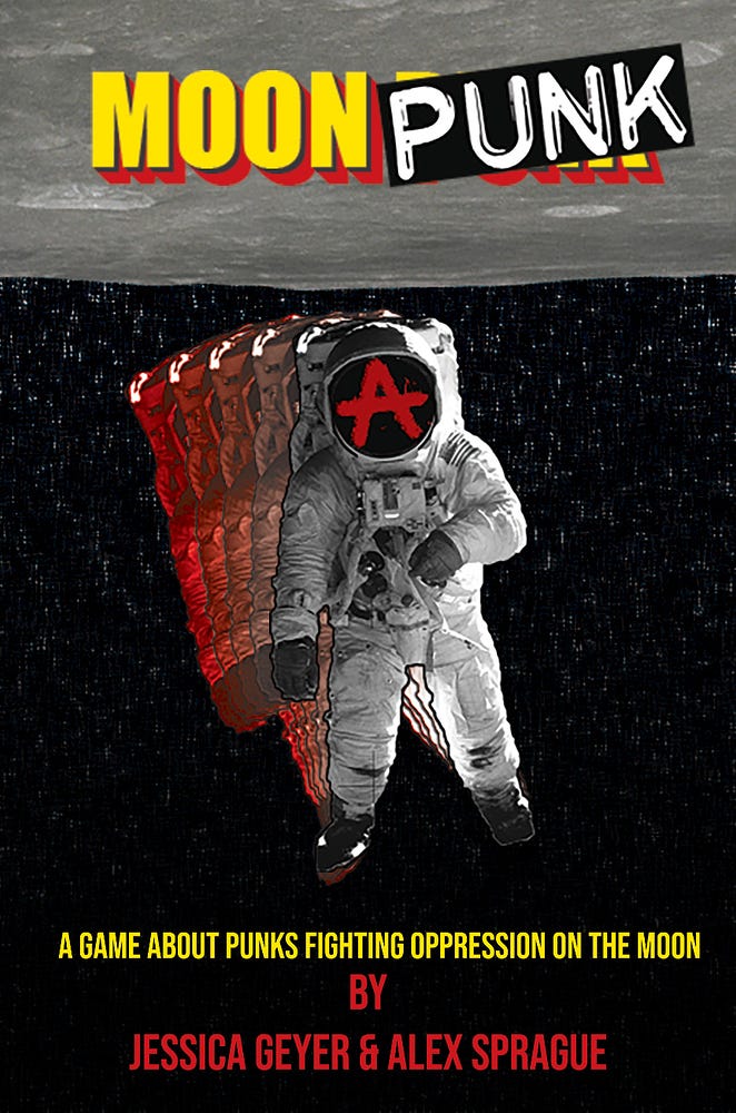
Fight oppression on the moon! Exceedingly zine-like. Embraces the anarchist aesthetic. Beautifully inconsistent style. Mostly monochrome with just enough color where it matters. A subversive joy to read and look at. Makes you want to eat the rich.
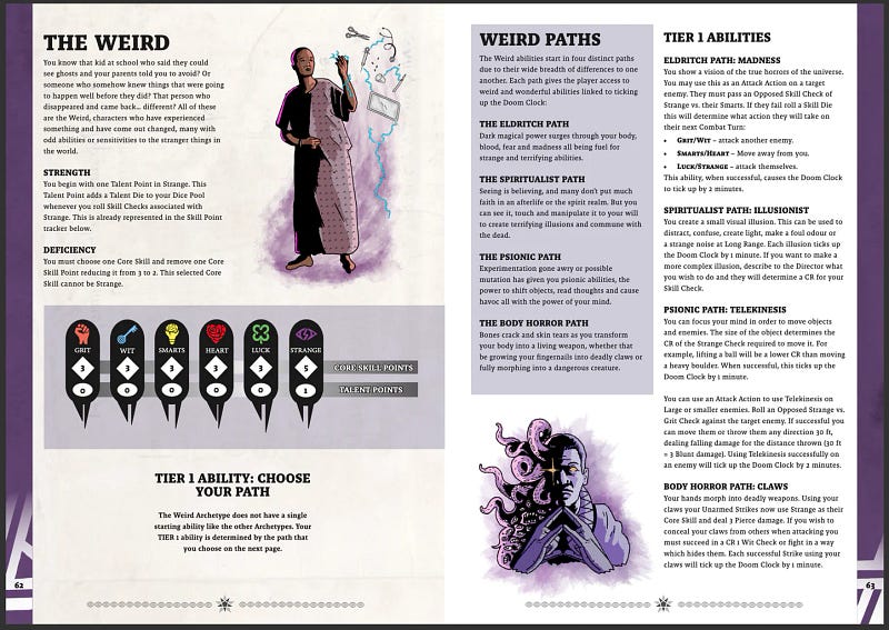
Slayers
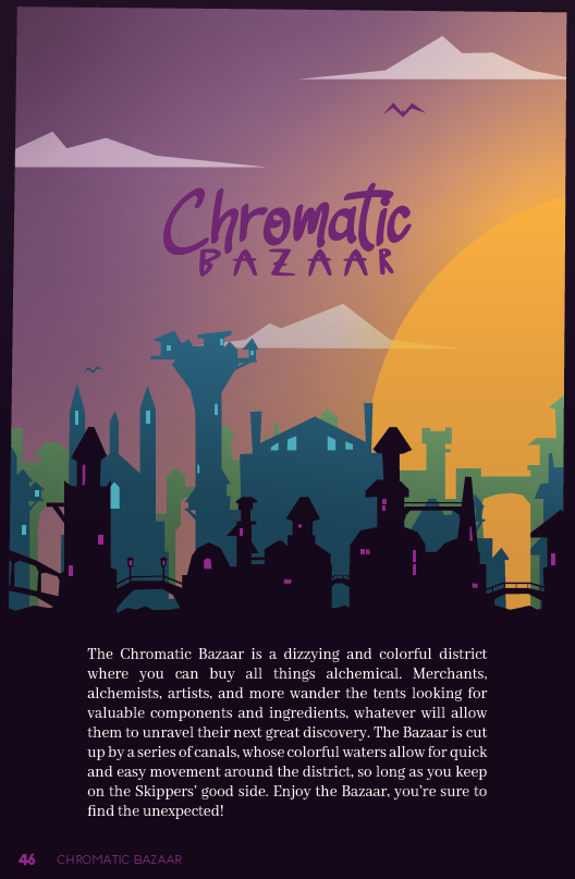
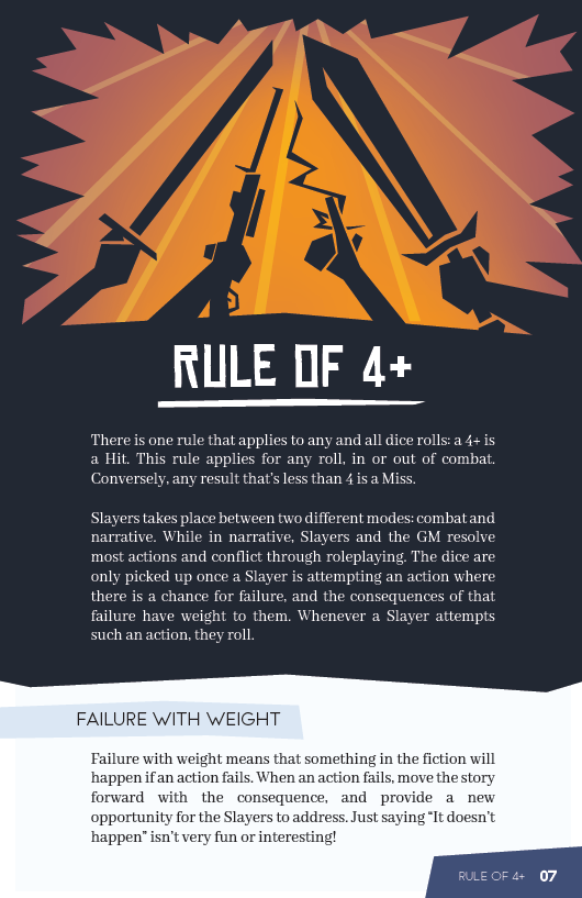
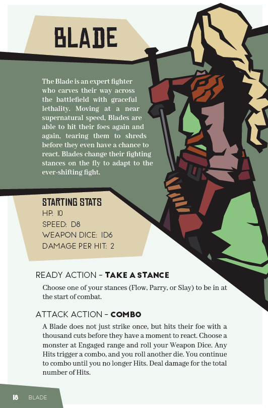
Blocky, high-contrast art. Clean layout. Heroes and monsters are framed with thick, hard lines. Key rules are presented memorably. City districts are visually distinct. The inconsistent shape and thickness of the frames hammers home the strangeness of the setting.
Shiver
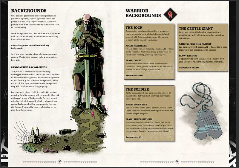
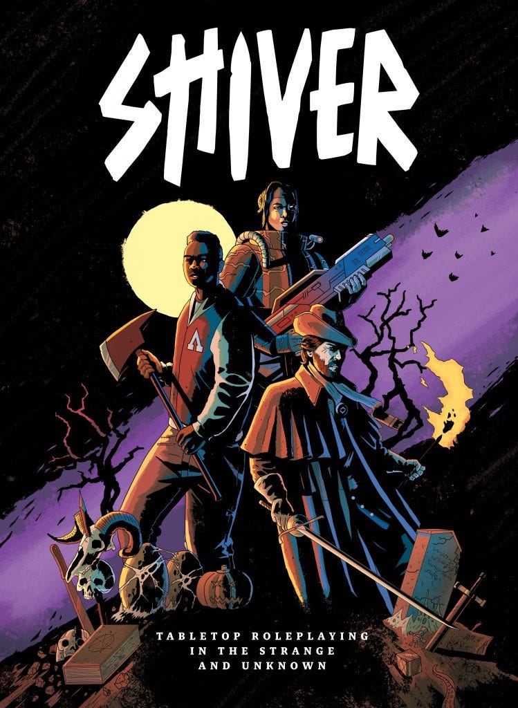
Settingless horror RPG. Bizarre illustrations, many of which hint at untold disturbing stories. Crazy yummy colors. Amazing iconography. Deep shadows. All these elements help get players into the proper distrusting and paranoid headspace.
Unbound
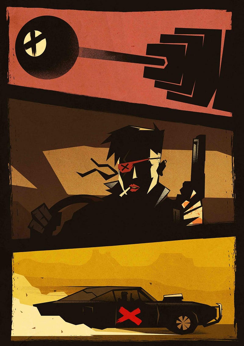
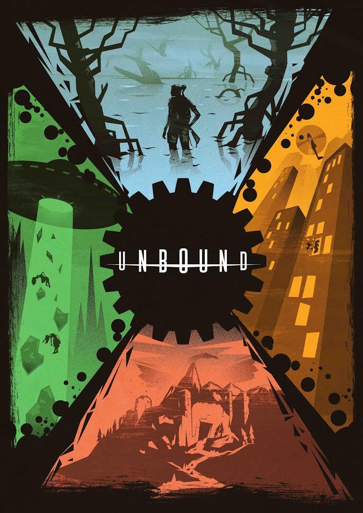
Universal build-your-own-setting game. Striking, high-contrast pulpy action artwork. Simple shapes prime players to expect simple in-your-face stories. The text is a bit text-plode-y, but framed with delicious artwork and “smeared” borders.
Viking Death Squad
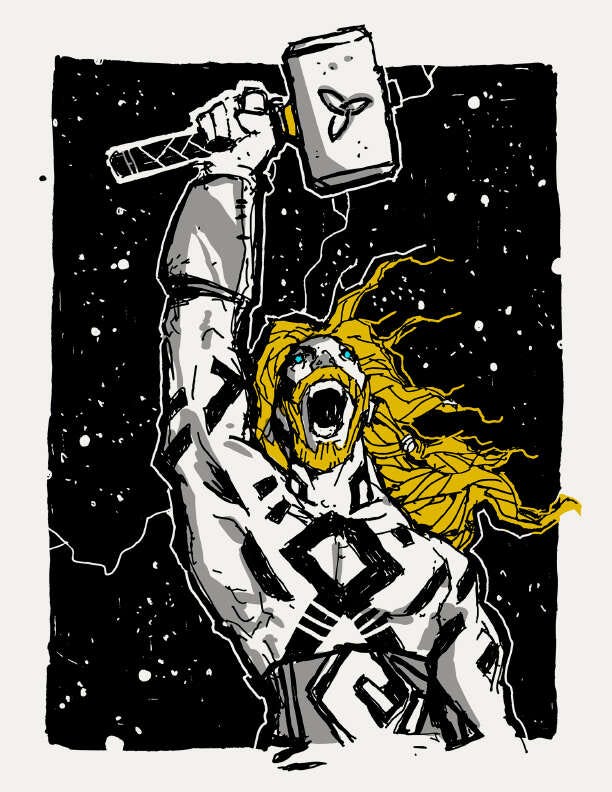
Over-the-top grim-hope science fantasy action. High contrast with just enough color to emphasize. Obviously inspired by metal album art, Warhammer, and Norse mythology. The mostly white on black art clearly imparts humanity’s dire situation.