
Draggable Notion Style Text Editor Blocks with TipTap/Prosemirror
Learn how to use a custom schema in TipTap/Prosemirror to recreate a notion-style user experience with draggable blocks.

The main goal of rich-text editors is to let users create rich text. However, this goal is already interfering with creating draggable blocks. Text blocks are not draggable by default because it would interfere with the ability to select text. In this article, you will learn how to create a root block that wraps around other blocks which makes it possible to add custom functionality to each individual block without interfering with the default functionalities.
Implementing a draggable root block involves the following:
- Define the Schema: This involves defining the structure of the custom block. For example, your block may allow inline content inside it (text, images, etc.), or it may be a more rigid structure.
- Handle User Interactions: Define how the block should behave when certain actions are performed.
- Custom Rendering with NodeViews: Since you want a custom appearance and behavior (like drag handles), you’ll use NodeViews. This lets you use React components to define how the node is rendered and behaves.
- Extend the Behavior with Commands and Plugins: For custom actions, like splitting the block when a button is clicked or pressing enter, you’ll need to define custom commands and handle these interactions. Plugins can help maintain state or extend behavior.
Table of Contents
- Resources
- Getting Started
- TipTap vs. ProseMirror
- Basic TipTap Setup
- Custom Root Block Extension
- Final App
- Summary
1. Resources
In this article, we are focusing on how to add the ability to drag individual blocks. If you are interested in a Full Stack Next.js Notion Clone — Clerk, Prisma, Planetscale, TipTap, Shadcn/UI check out the link below:
We are going to use the following technologies:
- Next.js 13.4 as the framework
- TipTap as our Editor
- Tailwind CSS for styling
- TypeScript as the programming language
Before starting with the implementation, make sure that you have Node.js installed. I will also be using VSCode as the editor, however, you can use any editor you like.
2. Getting Started
Let’s get started by creating a new next app. Open a terminal in the directory where you want to start your project and use the following command to create a new app:
npx create-next-app@latest
Let’s open our new app in VSCode and continue with our project. Feel free to use any editor you like.
Let’s also install the packages for TipTap:
npm install @tiptap/react @tiptap/pm @tiptap/starter-kit @tailwindcss/typography @radix-ui/react-icons
3. TipTap vs. ProseMirror
ProseMirror is a toolkit for building rich-text editors on the web. It’s not an out-of-the-box editor, but a toolkit that provides the building blocks to create custom editors.
Important Prosemirror Components:
- Schema: Defines the structure of your documents and the marks and nodes it contains.
- Nodes: Represent block and inline content, such as paragraphs, headings, or text.
- Marks: Represent inline styling, like bold or italics.
- State: Represents the editor’s current state, which includes the document, selection, and any plugin-specific state.
- View: Manages the DOM representation of the editor, reflecting the current state.
- Plugins: Allow for extending and customizing the editor’s behavior.
- Transactions: Actions that transition between two states, like inserting text or changing the document structure.
TipTap on the other hand is a higher-level wrapper around ProseMirror. It provides a more user-friendly way to work with ProseMirror, especially for those familiar with Vue or React.
Important TipTap Components:
- Extensions: These are the heart of TipTap and are essentially wrappers around ProseMirror plugins. They define nodes, marks, and plugins in a more straightforward and organized manner.
- Commands: Methods provided by TipTap (and its extensions) to perform certain actions, like setting text to bold or creating a heading.
- Custom NodeViews: TipTap offers the ability to define how nodes are rendered using frameworks like Vue or React. This is particularly powerful when you want to mix interactive web components within the editor.
4. Basic TipTap Setup
The basic setup is relatively easy. The essential things are:
- Initializing the editor with
useEditor() - Defining extensions
- Defining props
- Defining the default content
For better readability, we are creating a new directory in our project /src/editor and add the following files index.tsx , extenstions.ts and props.ts .
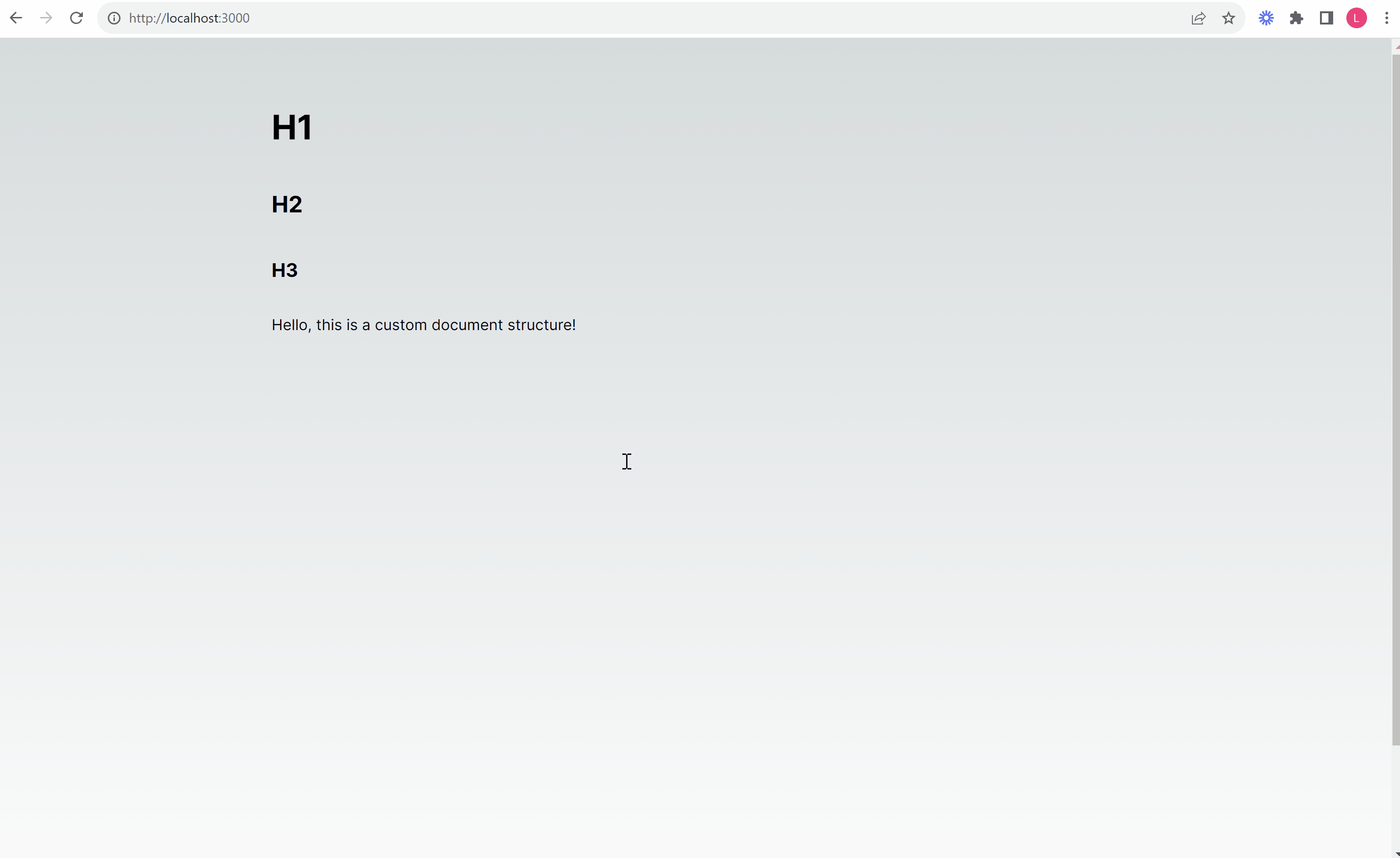
In the following index.tsx file, the editor is initialized with the extensions that we define in extensions.ts , the editorProps defined in props.ts , and the default content of ’<p>Hello World!</p>’ .
index.tsx :
"use client";

import React from "react";
import { EditorContent, useEditor } from "@tiptap/react";
import Extensions from "./extensions";
import Props from "./props";

const Editor: React.FC = () => {
  const editor = useEditor({
    extensions: Extensions,
    editorProps: Props,
    content: `
    <div data-type="rootblock">
      <h1>H1</h1>
    </div>
    <div data-type="rootblock">
      <h2>H2</h2>
    </div>
    <div data-type="rootblock">
      <h3>H3</h3>
    </div>
    <div data-type="rootblock">
      <p>Hello, this is a custom document structure!</p>
    </div>
  `,
  });

  return (
    <div className="min-h-screen w-full">
      <EditorContent editor={editor!} />
    </div>
  );
};

export default Editor;
extensions.tsx :
import StarterKit from "@tiptap/starter-kit";

const Extensions = [StarterKit];

export default Extensions;
The StarterKit extension combines other extensions which bring functionalities that you might want to have in a basic editor such as the definition of the Document, Paragraph, and Text, as well as extensions for formatting such as Bold, Italic, and more. If you are interested in what it contains and what the StarterKit looks like you can check out this link to the GitHub repository of TipTap.
props.tsx :
import { EditorProps } from "@tiptap/pm/view";

const Props: EditorProps = {
  attributes: {
    class:
      "prose-base prose-gray prose-headings:font-bold focus:outline-none prose-h1:mt-[10px] prose-h2:mt-[14px] prose-h3:mt-[14px] prose-p:mt-4",
  },
};

export default Props;
In the props.tsx we are adding basic styling. To make this work, we also have to update the tailwind.config.ts file to include the directory as well as the typography package:
import type { Config } from "tailwindcss";

const config: Config = {
  content: ["./src/**/*.{ts,tsx}"],
  theme: {
    extend: {
      backgroundImage: {
        "gradient-radial": "radial-gradient(var(--tw-gradient-stops))",
        "gradient-conic":
          "conic-gradient(from 180deg at 50% 50%, var(--tw-gradient-stops))",
      },
    },
  },
  plugins: [require("@tailwindcss/typography")],
};
export default config;
Let’s also override the default page.tsx file and add the Editor component:
import Editor from "@/editor";

export default function Home() {
  return (
    <main className="min-h-screen w-full py-16">
      <div className="mx-auto flex max-w-4xl cursor-text flex-col gap-2">
        <Editor />
      </div>
    </main>
  );
}
This is how the app should look at this point:
5. Custom Root Block Extension
The complexity of implementing a custom RootBlock comes from blending the document model (how the content is structured) with the view (how it’s rendered and interacted with). Understanding the distinction and how TipTap/ProseMirror bridges the two is key to building a custom editor experience.
Given this understanding, the implementation involves:
- Creating a TipTap extension for the
RootBlock. - Defining a custom schema.
- Creating a React
NodeViewfor custom rendering and behavior. - Adding commands for custom actions.
- Integrating this block into the editor.
Goal
We want to create an editor that supports a top-level Document node that contains rootblock nodes. Each rootblock can contain block-type content and is associated with a React component for rendering. The behavior of the Enter key has to be customized to manage the insertion of new rootblock nodes based on the cursor’s position.
Default Schema
To make this a little bit easier to understand, let’s have a look at the current schema. The StarterKit gives us a basic schema that looks like this:
// the Tiptap schema API
import { Node } from '@tiptap/core'

const Document = Node.create({
  name: 'doc',
  topNode: true,
  content: 'block+',
})

const Paragraph = Node.create({
  name: 'paragraph',
  group: 'block',
  content: 'inline*',
  parseHTML() {
    return [
      { tag: 'p' },
    ]
  },
  renderHTML({ HTMLAttributes }) {
    return ['p', HTMLAttributes, 0]
  },
})

const Text = Node.create({
  name: 'text',
  group: 'inline',
})
We are looking at the Tiptap schema API. Under the hood, the whole schema will be merged together into a ProseMirror representation of the schema. The schema above contains the following:
Document (doc):
- The topmost node in the document.
- Represents the root or container of the entire content.
- Contains one or more block elements. This means you can’t have a document with no content at all; at least one block node (e.g., a paragraph) must exist.
Paragraph (paragraph):
- A block-level node, meaning it operates at the level of structural elements like paragraphs, headings, lists, etc.
- Contains zero or more inline elements. This means you can have an empty paragraph without any text or other inline nodes, but you can also have a paragraph filled with inline content like text, links, or emphasized text.
- Has associated rules for parsing and rendering to/from HTML:
- Parsing: When Tiptap encounters a
<p>tag in an HTML source, it will transform that tag into a paragraph node in its internal document model. - Rendering: When Tiptap needs to display a paragraph node, it will render it as a
<p>HTML tag. Any additional attributes (like class, id, style, etc.) will be added to this tag.
Text (text):
- An inline-level node, meaning it operates at the level of individual text runs, links, or other elements that exist inline within block nodes.
- Represents plain text within other nodes (like a paragraph).
- Doesn’t have specified rules for parsing or rendering to/from HTML because plain text doesn’t need special handling. The text content is inherent.
Relationships:
- The
Documentnode (doc) can contain multipleblocknodes. In this schema, the onlyblocknode specified is theParagraph(paragraph), but in more complex schemas, there could be others like headings, lists, blockquotes, etc. - The
Paragraphnode (paragraph) can contain multipleinlinenodes. In this schema, the primaryinlinenode isText(text).
Overall, this schema provides a basic structure for an editor where the content is a series of paragraphs, and each paragraph can contain text. Other nodes (like headings, lists, or media elements) would need to be added to make this a more comprehensive rich-text editor schema.
Custom Schema
To ensure that our Document only contains rootblocks which in turn contains all other kinds of block-type content as outlined in the goal section above, we need to create a custom schema. However, we can still make use of the StarterKit and configure the existing extension. We are going to update the extension.ts file and create a root-block.ts file as well as a root-block-component.tsx file and a keymap.ts file inside /editor directory.
In the extension.ts file we need to exclude the default Document provided by the StarterKit and add our own Document. We are also adding the RootBlock and Keymap extension that we are going to create later on.
extension.ts :
import StarterKit from "@tiptap/starter-kit";
import { Node } from "@tiptap/core";
import RootBlock from "./root-block";
import Keymap from "./keymap";

const Document = Node.create({
  name: "doc",
  topNode: true,
  content: "rootblock+",
});

const Extensions = [
  Document,
  RootBlock,
  Keymap,
  StarterKit.configure({
    document: false,
  }),
];

export default Extensions;
Before we create the RootBlock extension, we are creating the RootBlockComponent that contains a side menu that becomes visible on hover. It is a custom node view using React. This component displays the content of a rootblock node alongside a button to insert a new rootblock after the current one and a handle to drag and reorder nodes.
root-block-component.tsx :
import { DragHandleDots2Icon, PlusIcon } from "@radix-ui/react-icons";
import { NodeViewContent, NodeViewProps, NodeViewWrapper } from "@tiptap/react";

// Define the RootBlockComponent, which will serve as a custom Node View in the Tiptap editor
const RootBlockComponent: React.FC<NodeViewProps> = ({
  node,
  getPos,
  editor,
}) => {
  // Function to create a new node immediately after the current node
  const createNodeAfter = () => {
    // Calculate the position right after the current node
    const pos = getPos() + node.nodeSize;

    // Use the editor's command to insert a new "rootblock" node at the calculated position
    editor
      .chain()
      .insertContentAt(pos, {
        type: "rootblock",
        content: [
          {
            type: "paragraph",
          },
        ],
      })
      .focus(pos + 3) // Focus on the new block (you might need to adjust the position based on your exact requirements)
      .run();
  };

  // Render the custom node view
  return (
    <NodeViewWrapper
      as="div"
      className="group relative mx-auto flex w-full gap-2"
    >
      <div className="relative mx-auto w-full max-w-4xl">
        {/* Container for buttons that appear on hover */}
        <div
          className="absolute -left-12 top-5 flex w-12 gap-1 opacity-0 transition-opacity duration-300 ease-in-out group-hover:opacity-100"
          aria-label="left-menu"
        >
          {/* Button to add a new node after the current node */}
          <button type="button" onClick={createNodeAfter} className="">
            <PlusIcon className="h-5 w-5" />
          </button>
          {/* Draggable handle button to allow rearranging nodes */}
          <button draggable data-drag-handle className="cursor-grab">
            <DragHandleDots2Icon className="h-5 w-5" />
          </button>
        </div>
        {/* Area where the node's actual content will be rendered */}
        <NodeViewContent className="w-full" />
      </div>
    </NodeViewWrapper>
  );
};

export default RootBlockComponent;
Finally, we can create the RootBlock extension. It can contain a single block element and provides special commands for inserting itself within the editor. The visual representation of the node is handled by RootBlockComponent. Additionally, we defined a keyboard shortcut (Mod-Alt-0) just to show how this can be done. Parsing and rendering rules ensure the node correctly translates between its HTML representation and the editor's internal model.
root-block.ts :
import { mergeAttributes, Node } from "@tiptap/core";
import { ReactNodeViewRenderer } from "@tiptap/react";

import RootBlockComponent from "./root-block-component";

// Extend the Commands interface to include RootBlockCommands
declare module "@tiptap/core" {
  interface Commands<ReturnType> {
    RootBlockCommands: {
      setRootBlock: (position?: number) => ReturnType;
    };
  }
}

// Create and export the RootBlock node
export const RootBlock = Node.create({
  name: "rootblock",
  group: "rootblock",
  content: "block", // Ensure only one block element inside the rootblock
  draggable: true, // Make the node draggable
  selectable: false, // Node isn't selectable
  inline: false, // Node is a block-level element
  priority: 1000, // Priority for node resolution

  // Default options for the node
  addOptions() {
    return {
      HTMLAttributes: {},
    };
  },

  // Define commands specific to the RootBlock node
  addCommands() {
    return {
      setRootBlock:
        (position) =>
        ({ state, chain }) => {
          const {
            selection: { from },
          } = state;

          // Determine the insertion position
          const pos = position ?? from;

          // Insert a new rootblock node and focus on it
          return chain()
            .insertContentAt(pos, {
              type: "rootblock",
              content: [
                {
                  type: "paragraph",
                },
              ],
            })
            .focus(pos + 4)
            .run();
        },
    };
  },

  // Define keyboard shortcuts for the RootBlock node
  addKeyboardShortcuts() {
    return {
      "Mod-Alt-0": () => this.editor.commands.setRootBlock(),
    };
  },

  // Rules to parse the node from HTML
  parseHTML() {
    return [
      {
        tag: 'div[data-type="rootblock"]',
      },
    ];
  },

  // Rules to render the node to HTML
  renderHTML({ HTMLAttributes }) {
    return [
      "div",
      mergeAttributes(HTMLAttributes, { "data-type": "rootblock" }),
      0,
    ];
  },

  // Use ReactNodeViewRenderer to render the node view with the RootBlockComponent
  addNodeView() {
    return ReactNodeViewRenderer(RootBlockComponent);
  },
});

export default RootBlock;
As we are managing the max width in the RootBlockComponent we also want to remove it from the page so that the component spans across the full width:
import Editor from "@/editor";

export default function Home() {
  return (
    <main className="min-h-screen w-full py-16">
      <div className="mx-auto flex cursor-text flex-col gap-2">
        <Editor />
      </div>
    </main>
  );
}
When we test our app at this point, everything should look fine. However, when we try to use “Enter” to create a new line, it does not work. Due to the fact that we altered the default schema, we also have to adjust the default behavior for the “Enter” key.
Custom Keymap
In order to adjust the default behavior of the “Enter” key, we are going to create another extension for better readability. We could also include this inside the RootBlock, however, this will affect all extensions where we want to use the “Enter” key.
When “Enter” is pressed inside a block that is inside a rootblock, when the cursor is at its end, a new rootblock with a paragraph is created and when the cursor is inside the middle of the content, it rearranges content based on the cursor position.
keymap.ts
import { Extension } from "@tiptap/core";

// Extend the Commands interface to include the handleEnterKey command for Keymap
declare module "@tiptap/core" {
  interface Commands<ReturnType> {
    Keymap: {
      handleEnterKey: () => ReturnType;
    };
  }
}

// Define and create the Keymap extension
const Keymap = Extension.create({
  name: "Keymap",

  // Define custom commands for the extension
  addCommands() {
    return {
      handleEnterKey: () => ({ state, chain }) => {
        const { selection, doc } = state;
        const { $from, $to } = selection;

        // Check if the cursor is within a rootblock, no selection is made, and if it's at the end of a block.
        if (
          $from.node(-1).type.name === "rootblock" &&
          $from.parent.type.isBlock &&
          $to.pos === $from.pos
        ) {
          if ($to.pos === $from.end()) {
            // Create and focus on a new root block with a paragraph inside at the cursor position
            return chain()
              .insertContentAt($from.pos, {
                type: "rootblock",
                content: [
                  {
                    type: "paragraph",
                  },
                ],
              })
              .focus($from.pos + 4)
              .run();
          } else {
            console.log("Cursor is not at the end of the block");

            let currentActiveNodeTo = -1;

            // Iterate over document nodes to find the active node's end position.
            doc.descendants((node, pos) => {
              if (currentActiveNodeTo !== -1) return false;
              if (node.type.name === "rootblock") return;

              const [nodeFrom, nodeTo] = [pos, pos + node.nodeSize];
              if (nodeFrom <= $from.pos && $to.pos <= nodeTo)
                currentActiveNodeTo = nodeTo;

              return false;
            });

            const content = doc
              .slice($from.pos, currentActiveNodeTo)
              ?.toJSON().content;

            // Replace content from cursor to the end of the block with new content.
            return chain()
              .insertContentAt(
                { from: $from.pos, to: currentActiveNodeTo },
                {
                  type: "rootblock",
                  content,
                }
              )
              .focus($from.pos + 4)
              .run();
          }
        }

        // If conditions aren't met, use the default Enter behavior
        return false;
      },
    };
  },

  // Define keyboard shortcuts for the extension
  addKeyboardShortcuts() {
    return {
      Enter: ({ editor }) => editor.commands.handleEnterKey(), // Call handleEnterKey command on Enter key press
    };
  },
});

export default Keymap;
Final App
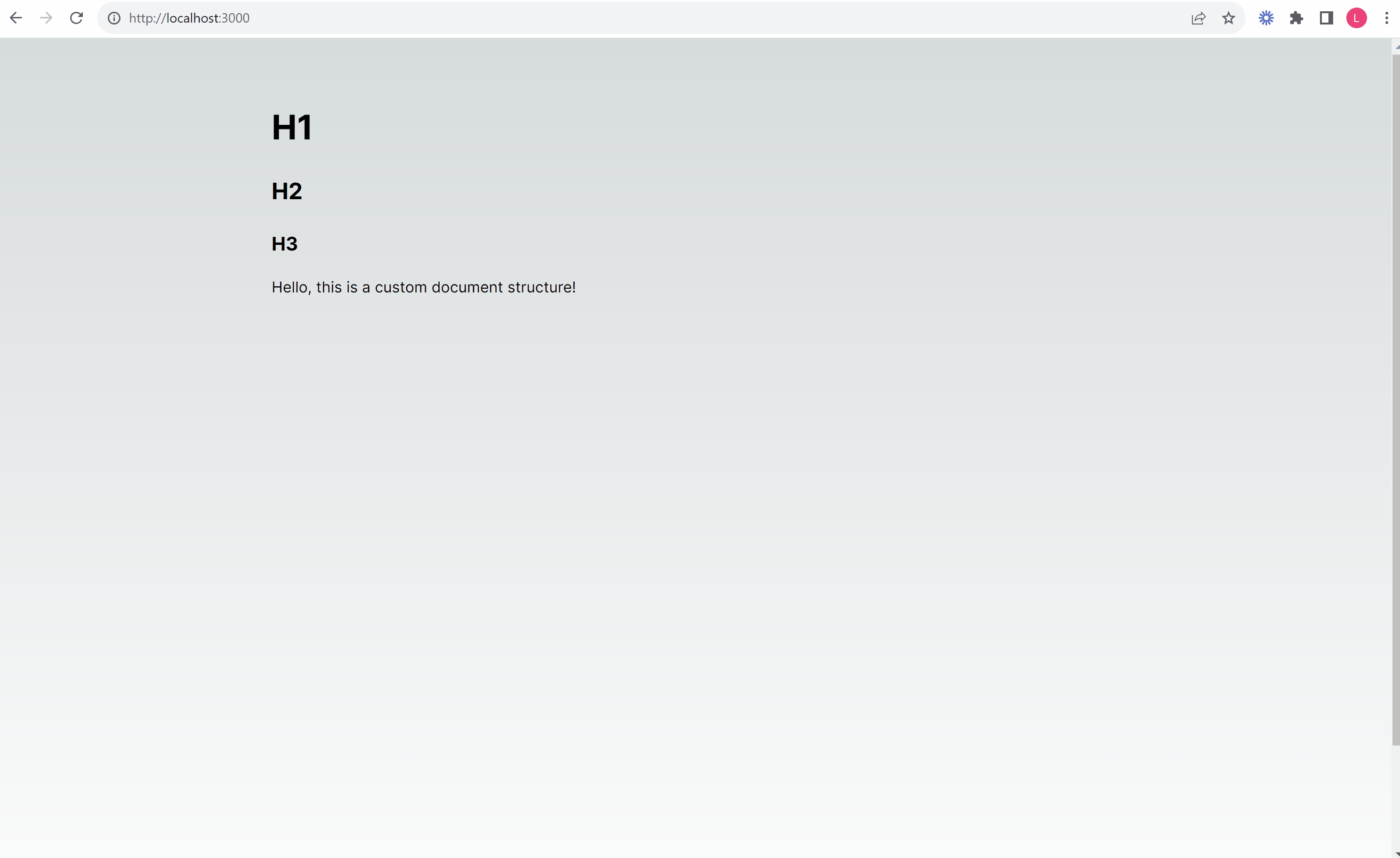
By implementing a custom schema, we managed to create a custom extension that wraps other block-type content in order to make them draggable. The final app looks like the following.
Things to consider
When making changes to the default schema in TipTap/ProseMirror, it’s crucial to evaluate and modify the existing behavior as needed. Introducing new block types or custom blocks can lead to unexpected consequences. It’s essential to ensure that such adjustments fit seamlessly into your editor’s existing framework. However, with careful consideration, you can build almost anything.
It’s worth noting that this is an example, and there’s a lot of room for improvement. Nonetheless, this should provide a glimpse into how to leverage the customization options of TipTap and ProseMirror.
Summary
With TipTap and ProseMirror, you can essentially construct any kind of editor you can imagine. We’ve showcased the implementation of a custom schema, including an extension that wraps block-type content with custom functionalities.
I hope this article shed light on the extensibility that ProseMirror and TipTap offer. With this knowledge, you can now not only imagine a custom editor but also build one.


