

Don’t use rem/em for paddings, margins and more
Sooner or later everyone of us has read an article which praises the superiority of rem/em units in modern web design.
The arguments are always obvious and reasonable. Furthermore the articles tell you something about “accessibility” and this seems to be the ultimate magic word to end every discussion.
But in my projects I quite often see the paradigm “always use rem/em units” escalating. Some developers start to use rem/em unity for everything like paddings, margins, borders, responsive breakpoints and many more I sometimes couldn’t even think of. Many articles will be mixed and you get a weird bunch of functions and properties and the web page in the end is anything but accessible.
By now I’m absolutely tired of repeating myself in countless projects, so I want to end the myth of rem/em and hope you will follow me on this journey :).
Brief introduction to rem/em
What are rem/em units? They are relative units based on the value you set as font size. Thereby em is relative to the parent container; whereby rem is relative to the root element aka the -tag.
As a small preamble to everything what follows from now on: It’s always a good idea to set your font sizes relative to one another; either with rem or em. But just your font sizes!
Setting the <html>-tag to 10px
The first myth starts with setting the <html> to font-size: 10px. This approach seems to be too tempting for many developers. When you set the base font-size to 10px it’s very easy to calculate any other size.
You want the body text to be 16px? No problem: font-size: 1.6rem . You want 20px padding? Easy: padding: 2rem . To multiply with 10 is easy and everyone can calculate this without a calculator.
When you set the root font-size to 10px, you can already stop here. It’s absolutely nonsense. Technically you have already ruined the idea of accessibility.
When you really want to be accessible you have to set the <html> to font-size: 100% (or any other percentage value). 100% here means 16px in most browsers. There is no discussion about it. If you set it to 10px, the browser will not increase or decrease the font-size, no matter what the user configures in the settings.
Look mom, everything grows and shrinks proportionally!
Ok, so now we have set the base font-size to 100% and we start to use rem/em accordingly.
In many articles and even more talks I have seen about this topic comes now a part where the audience will be amazed.
The author builds a simple component like a widget, a card, a header or something else. He will add some text in different font-sizes, some padding, some margin, maybe an image. He then adds a simple range slider which controls the font-size of the tag.
He then increases the font-size to maybe 125% and everything grows proportionally. The font-sizes, the gaps. It’s like you zoomed right into the component. WOW! What a cool party trick.
The stunned crowd will hear something like: “And when it becomes necessary to increase the font-size of your project by 25%, you can do this really easy and everything will still look fine. You don’t have to fix broken layouts!”.
Hmm let’s think about this for a minute. I don’t know how about you, but in 10+ years of web development I never had a project or even heard about a project where this could be helpful… I’ve never witnessed a client who has approved a design, approved a prototype and then, after all work is done, says: “Looks really good, but could you increase everything by 25%?”.
Maybe sometimes you have to increase the running text from initially 14px to 16px or from 16px to 18px. But mostly this means just the running text and not everything else.
And now the problems begin to rise. Imagine a case, where you want to do exactly this. To change just the font-size of running text. You can’t do this anymore. Still a cool trick?
Let’s take a look on accessibility
When it comes to accessibility the user has three options:
- The user can zoom into the page temporarily.
- The user can zoom into every page by default.
- The user can increase the default font-size in the settings of the browser.
What happens if you change the page zoom?
You guessed it, you zoom into the page :). Everything becomes larger or smaller. Does this reminds you of something? Yes, it’s exactly like the party trick from earlier!
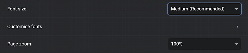
Now it becomes exciting: What happens if you change the “font size” option from medium to large?
Under normal pages just the texts are getting bigger under one requirement: You have set the <html> font size to 100% and all other texts like paragraphs, headers and so on with rem/em values.
And what happens if you have set everything like paddings and margins with rem/em values and then change the “font size” option?
Everything gets bigger and the page looks like zoomed in.
So the user has two options to configure the browser for his individual preferences. But you decide that this tremendous amount of options are too many and you steal him one option by letting it look exactly like the other option.
I think this is a horrible idea. If someone says I just want to have the texts bigger, but just the text and not everything else, he has a reason for this and you should respect this.
But wait! It’s getting worse…
The false prophets of rem/em also preaching to use em values for media queries. But what does this do?
If the user changes the default font size also the breakpoints are changing. So the user maybe has a reading disability and wants to increase the font size, but then the breakpoint switches and the user suddenly sees the tablet version of the page. Or he uses a small tablet in portrait mode and suddenly sees the smartphone version. Maybe text is hidden in accordions, the navbar is now a hamburger menu, carousels / sliders are disabled.
And I know many projects where some font sizes like headers are getting smaller when it comes to mobile versions. So the user wants to increase the font size, the breakpoint switches and everything gets smaller. He is where he started, but now in mobile mode. Cool :)
Conclusion
Don’t use rem/em for padding, margin, border, etc. Set your <html> to font-size: 100% and just use rem/em for every font-size you want to set. So you have the maximum of accessibility in conjunction with maximum of
configurability.

📝 Read this story later in Journal.
👩💻 Wake up every Sunday morning to the week’s most noteworthy stories in Tech waiting in your inbox. Read the Noteworthy in Tech newsletter.


