
Do You Also Save Your Apple Packaging for Way Too Long, or Is It Just Me?
Never underestimate the power of a good box.
It came to my attention while packing up my bedroom closet for an upcoming move.
My wife and I are still in the early stages of preparation so we still have the luxury of time for sorting possessions onto the two opposing conveyor belts of stuff to transport and stuff to jettison. (In every move I’ve ever done, I always eventually run out of time and have to start shoveling the rest of my junk into the back of the moving truck.)
That’s when I remembered that I’ve kept every box for my and my wife’s current round of Apple products.
I don’t do this for any of the other thousands of products in my house. So why with Apple?
I can think of two main reasons.
Reason 1: Practicality
The thinking here is to keep the original packaging for reselling the product when I’m done with it.
It’s a nice idea, but it breaks down because Apple products never break down.
In the 20 years that I’ve been an Apple customer, I’ve never voluntarily upgraded my equipment.
Apple is really expensive, but you get what you pay for, in a good way.
I always wait until my Apple products are living fossils until I replace them, and by that point they’re so old that no one expects to see the original packaging.
For me, holding onto packaging for practical reasons isn’t worth the space it takes up. It starts to veer into that gateway-hoarding idea of overabundant possibility, as in “I might need this one day” and one day never comes.
Reason 2: Aesthetics
I think this is the more compelling reason for me.
Apple packaging is a masterclass in industrial design just as much as the products themselves.
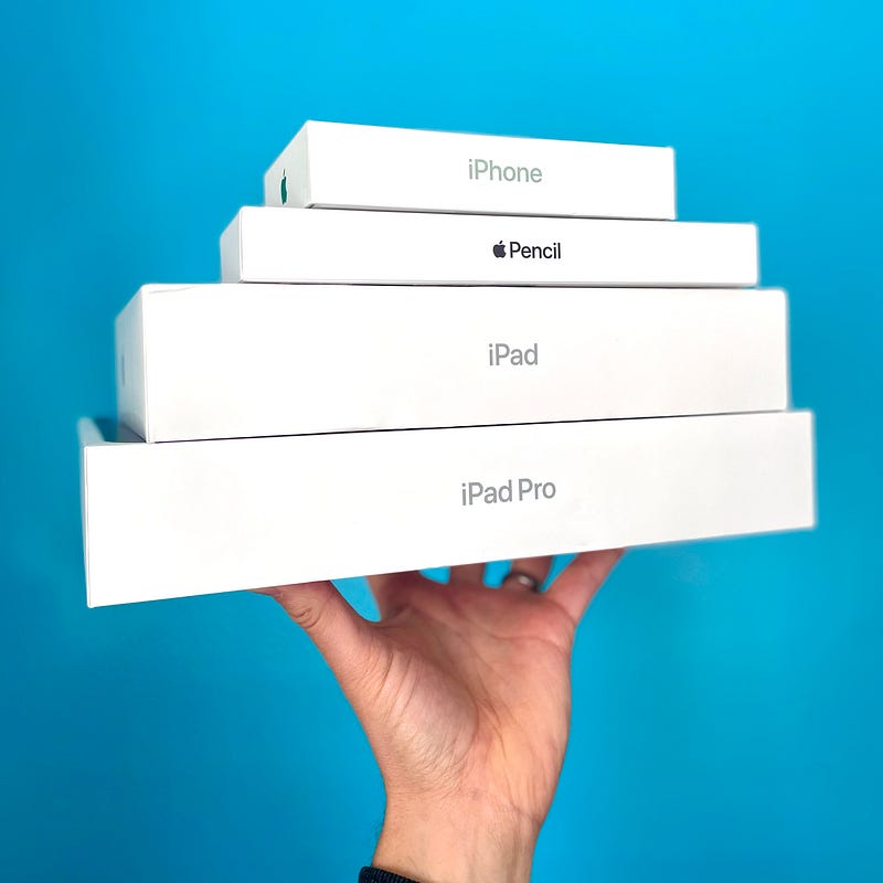
Nothing about Apple boxes is arbitrary:
- Box size and weight — There’s something pleasing about exterior box dimensions. It might be that they’re smaller than you’d expect for expensive electronics, so the ratio of size to weight is akin to comforting objects like a nice hardback book.
- Exterior finish — Since the boxes are all white, the texture on the box facade doesn’t need any gloss to reflect plenty of light. Instead, Apple opts for a soft satin finish that feels pleasant to the touch.
- Exterior graphic design — The visual language of Apple’s branding comes straight from the modernist design of the Swiss Style, with its focus on geometric simplicity. Apple’s proprietary humanist sans serif typeface San Francisco is like a softer Helvetica.
- The whole kit has a zen vibe. It’s just a dang nice box, people.
But what am I going to do? Display it on a shelf or give it a spot in a curio cabinet?
Nope. Despite the hagiography above, I’m not THAT into packaging design.
A package is ultimately meant for disposal by design because its value is housing the product in the liminal space between the company and the consumer. Once it’s served that function it doesn’t hold its primary value anymore.
But darn it, Apple packaging is so nice that it draws out my emotional response of admiration.
I don’t want to chuck it immediately. I can’t chuck it immediately.
I also don’t want it all up in my grill, either, so it’s going in the closet or under the bed.
Is it irrational? Absolutely! But that’s the thing, emotions aren’t rational.
Design is a logical practice of guiding the viewer’s emotions to the desired destination. To that end, Apple packaging is a very successful design solution (maybe even a little too successful).
If you know anything about Jony Ive’s design work at Apple, you’ll know the packaging design principles come from the core of Apple’s brand philosophy: permanently weaving together utility and aesthetics, making products that are both functional and beautiful.
Maybe holding onto it for a little longer than normal isn’t so abnormal after all.


