
Discover who you are through design
How designing my logo helped me understand who I am

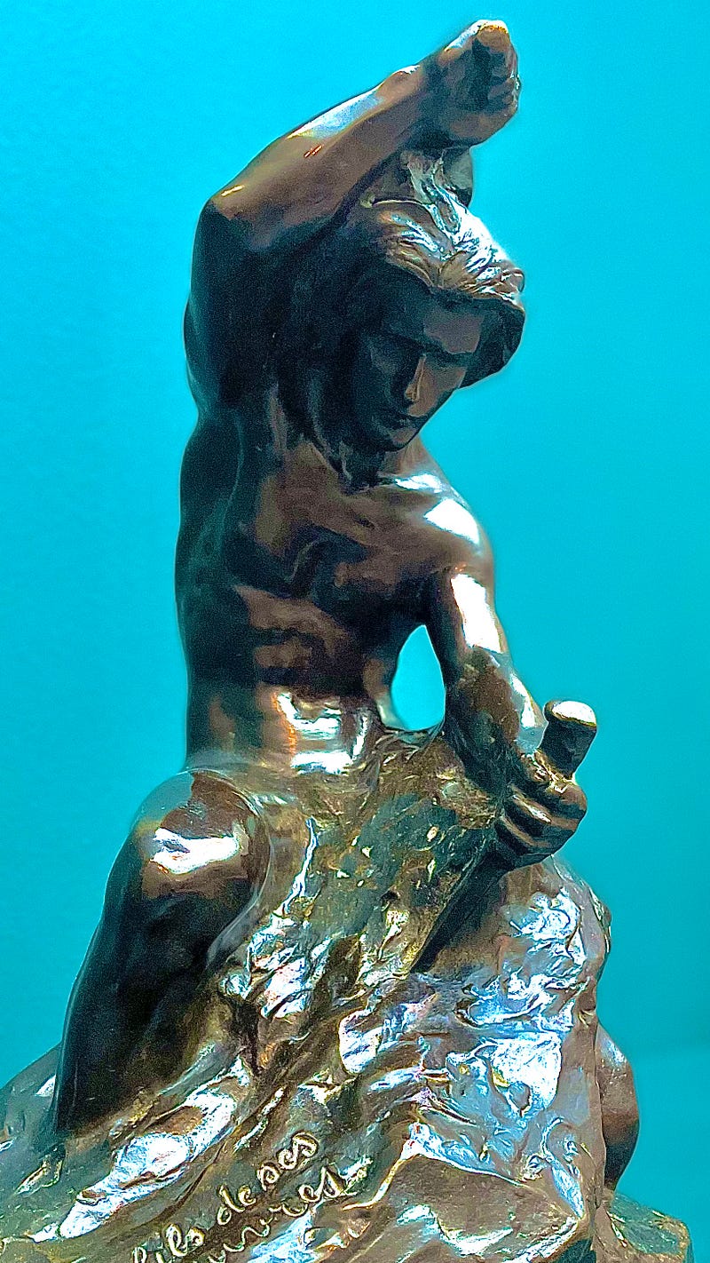
“Every block of stone has a statue inside it, and it is the task of the sculptor to discover it.” ~ Michelangelo
Who are you? What is your essence? What is the statue you carry within you?
What if I asked you to answer these questions not in a 5-minute speech, not in 1 sentence, not even in 3 words, but in 1 picture? As the saying goes:
“A picture is worth a thousand words”
So this idea seems to be a really powerful tool for you to discover and express who you really are. This is a beautiful artistic journey that I have been on myself. And in the following lines and pictures, I will tell the story.
Design Base
Here is the first step I took:
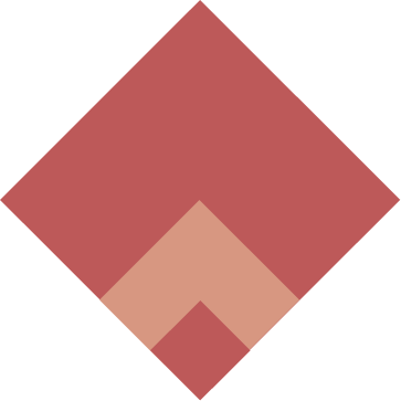
As you can see, it’s a very simple design. This simplicity comes from a really small variety of shapes, sizes, and colors.
- Shape — I used only 1 shape: a rectangle with equal side lengths (i.e. a square), tilted at 45°.
- Size — I used a simple formula to define the sizes: consecutive powers of 2. Here the sizes in pixels are 2⁸, 2⁹, 2¹⁰ (i.e. 256, 512, 1024 pixels).
- Colors — I used only 2 colors: #BD5959 and #D79781
I liked this first design as a base but I needed to keep going. Something was missing. My main concern was the white space at the top of the largest square. There was too much of it. So in the next step, I brainstormed a few ways to add some elements at the top of the square.
Brainstorm
I came up with 4 new designs, all trying to solve my main concern: too much white space at the top. As you can see below, I simply added some elements to make it look less empty.
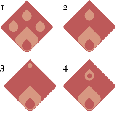
None of these really felt right. The elements I added in the white space reminded me of real things that didn’t belong here.
- Design 1 reminds me of a dog’s paw
- Design 2 reminds me of a drop of water
- Design 3 reminds me of the tip of a water pen
- Design 4 reminds me of a drop of fire or an avocado
So I had to find something else, something I had not tried yet. As Steve Jobs said:
“If you haven’t found it yet, keep looking. And don’t settle. As with all matters of the heart, you’ll know when you find it.”
Note: You may have noticed that I also tried to round the corners of the squares, but that’s not the most important point here.
Getting Closer
Here is the design I came up with:
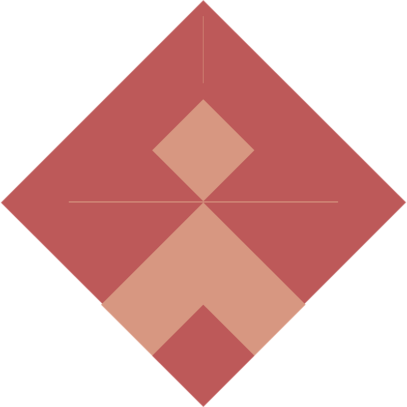
On this one, I simply added a square and two lines.
This one felt satisfying. I thought it was almost perfect. The most important thing to fix then was the colors. They don’t resonate with me. I only started with them because they were colors for another project of mine.
Final Design
I searched for a while and tested a few different color palettes until I found this one:
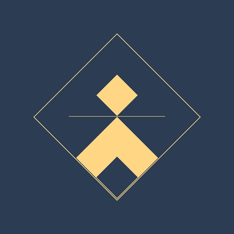
The high contrast makes the combination really powerful. Note that I also removed the line at the top, which felt superficial.
If we recap, here is what we have on this design:
- Shape — I used only 2 shapes: a rectangle of equal side length (i.e a square), tilted at 45°; and 1 line
- Size — Consecutive powers of 2: 2⁸, 2⁹, 2¹⁰ (i.e., respectively, 256, 512, 1024 pixels).
- Colors — I used only 2 colors: #2C3C53 (blue representing the night) and #FFD684 (gold representing the divine)
I stopped there because it seemed perfect. I could find the essence of myself in this image. You may not agree and that’s okay. These images are very personal, and I’ll give you some tips on how to create your own.