
Detecting and Visualizing Candlestick Patterns (Python Tutorial)

This post is a tutorial on how to detect and visualize candlestick patterns in Python.
This story is solely for general information purposes, and should not be relied upon for trading recommendations or financial advice. Source code and information is provided for educational purposes only, and should not be relied upon to make an investment decision. Please review my full cautionary guidance before continuing.
What are Candlestick Patterns?
Candlestick patterns are graphical formations that traders use to identify potential trading opportunities. Each candlestick pattern has a specific meaning, which may be used to predict the future price action of a security.
Candlestick patterns are formed by the movement of the candlesticks on a chart. Candlesticks are graphical representations of the opening, high, low, and closing prices of a security over a given time period. The body of the candlestick is the area between the open and close prices, and the wick is the line above and below the body.
Candlestick patterns are a valuable tool for stock market investors. By learning to recognize the different patterns, investors can gain a better understanding of the market and be better prepared to make investment decisions.
StocksDads.com is a thriving trading community with AI trading stock/crypto alerts, expert advice and a ton of educational material. Get a 30% forever discount with code ‘BOTRADING’.
What are the common Candlestick Patterns?
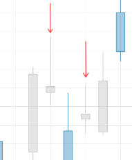
There are many different candlestick patterns, but some of the most common include the bullish and bearish engulfing patterns, the hammer and hanging man, three white soldiers or three black crows.
The Hammer
The hammer is a bullish reversal pattern that forms when a black candlestick is followed by a white candlestick the shape of a hammer. The body of the candle is short with a long lower wick.
This pattern is a a sign of the bears driving the prices lower during the bar period but the bulls fighting back and pushing the price back up.
The Doji
The Doji is a candlestick with a body that is either extremely small or nonexistent. It is formed when the open and close prices are the same, or very close to each other. The Doji pattern may be considered a sign of trend reversal or indecision with the open price being very close or the same as the closing price of the session.
The Hanging Man
The hanging man is a bearish reversal pattern. It is formed when the security opens higher than the previous close, but sells off to close lower than the open. The hanging man indicates that the security has found resistance and is likely to move lower.
The hanging man candle can be dark or light. It looks similar to the hammer but there is a distinction in how they appear in the trend. A hanging man pattern emerges in a rising trend and indicates a bearish reversal, whereas a hammer emerges in a falling tend and indicates a bullish reversal.

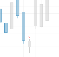
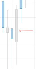
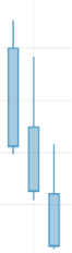
The Bullish/Bearish Engulfing Pattern
The engulfing pattern is a bullish or bearish pattern that indicates a change in trend. It is formed when the body of one candlestick completely engulfs the body of the previous candlestick.
Here a sample of a bullish engulfing pattern:
Three White Soldiers
The three white soldiers is a bullish reversal pattern. The pattern consists of three consecutive bullish candles, each one closing higher than the prior candle.
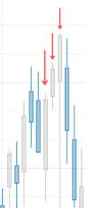
Three Black Crows The three black crows is a bearish reversal pattern. It is formed when the there are three bearish candles, each one closing lower than the prior candle.
Which Patterns are most reliable?
Unfortunately, there is no candlestick pattern that is a 100% accurate indicator of the price direction in the future. However, there is a lot of information available regarding the statistical accuracy of candlestick patterns and related pattern rankings.
The ‘PatternSite.com’, is a website created by Tom Bulowski, the author of the Encyclopedia of Chart Patterns, and it provides pattern rankings of past decades as well as rankings for the last three months.
Next, let’s see how we can implement candlestick charts and patterns in Python.
Implementation
You can download the complete Python script from my ‘B/O Trading Blog’ on Substack.
Here the most important functions:
This function is used to plot our candlestick chart with candlestick patterns.
import plotly.graph_objects as go
import pandas as pd
from plotly.subplots import make_subplots
import talib as ta
from talib import abstract
import os

def plot_chart(symbol, df, pattern_list):
    light_palette = {}
    light_palette["bg_color"] = "#ffffff"
    light_palette["plot_bg_color"] = "#ffffff"
    light_palette["grid_color"] = "#e6e6e6"
    light_palette["text_color"] = "#2e2e2e"
    light_palette["dark_candle"] = "#4d98c4"
    light_palette["light_candle"] = "#cccccc"
    light_palette["volume_color"] = "#f5f5f5"
    light_palette["border_color"] = "#2e2e2e"
    light_palette["color_1"] = "#5c285b"
    light_palette["color_2"] = "#802c62"
    light_palette["color_3"] = "#a33262"
    light_palette["color_4"] = "#c43d5c"
    light_palette["color_5"] = "#de4f51"
    light_palette["color_6"] = "#f26841"
    light_palette["color_7"] = "#fd862b"
    light_palette["color_8"] = "#ffa600"
    light_palette["color_9"] = "#3366d6"

palette = light_palette
    #  Create sub plots
    fig = make_subplots(rows=1, cols=1, subplot_titles=[f"{symbol} Chart" ], \
                        specs=[[{ "secondary_y": True}]], \
                        vertical_spacing=0.04, shared_xaxes=True)
    #  Plot close price
    fig.add_trace(go.Candlestick(x=df.index,
                                 open=df['Open'],
                                 close=df['Close'],
                                 low=df['Low'],
                                 high=df['High'],
                                 increasing_line_color=palette['light_candle'], decreasing_line_color=palette['dark_candle'], name='Price'), row=1, col=1)
    #  Add candlestick pattern annotations
    periods_with_candles = []
    for pattern_name in pattern_list:
        for i, value in enumerate(df[pattern_name]):
            #  Skip this period in case it already has a pattern annotation
            if i in periods_with_candles:
                continue
            #  Skip periods where pattern is not identified
            if value == 0:
                continue
            x = i
            y = df['High'].iloc[i] + 8
            text_color = '#5c285b'
            if value > 0:
                text_color = 'LightSeaGreen'
            fig.add_annotation(x=x, y=y, textangle=-90, text=pattern_name, showarrow=False,
                               font=dict(size=9, color=text_color))
            periods_with_candles.append(i)
    fig.update_layout(
            title={'text': '', 'x': 0.5},
            font=dict(family="Verdana", size=12, color=palette["text_color"]),
            autosize=True,
            width=1280, height=720,
            xaxis={"rangeslider": {"visible": False}},
            plot_bgcolor=palette["plot_bg_color"],
            paper_bgcolor=palette["bg_color"])
    fig.update_yaxes(visible=False, secondary_y=True)
    #  Change grid color
    fig.update_xaxes(showline=True, linewidth=1, linecolor=palette["grid_color"],gridcolor=palette["grid_color"])
    fig.update_yaxes(showline=True, linewidth=1, linecolor=palette["grid_color"],gridcolor=palette["grid_color"])
    #  Create output file
    file_name = f"{symbol}_candle_pattern_chart.png"
    fig.write_image(os.path.join(RESULTS_PATH, file_name), format="png")
    return fi
This function is used to detect the candlestick patterns. We add a column to the dataframe for each pattern. In case the pattern is detected, the column will have a value, otherwise it will be nan (Not a number).
def detect_candlestick_patterns(df, pattern_list):
    #  Get the individual price columns
    open_prices = df['Open']
    high_prices = df['High']
    low_prices = df['Low']
    close_prices = df['Close']

    #  Add a column for each candle pattern
    for candle_name in pattern_list:
        df[candle_name] = getattr(ta, candle_name)(open_prices, high_prices, low_prices, close_prices)
    #  Drop all columns with all zero values (which means: no pattern detected)
    df = df.loc[:, (df != 0).any(axis=0)]
    return df
Here main function in which we are taking the following steps:
- Download OHLC price data
- Shorten the price data so the plot doesn’t get overcrowded
- Get a list of candlestick patterns from TA-Lib
- Detect the patterns and add columns to the price dataframe
- Create a list of detected patterns
- Plot the chart with candlestick patterns
if __name__ == '__main__':
    symbol = "AAPL"
    # Download OHLC data, e.g. from Yahoo Finance
    df = load_data(symbol)
    #  Limit periods to avoid a crowded chart
    df = df.head(90)
    #  Get the list of candlestick patterns
    pattern_list = [method for method in dir(abstract) if method.startswith('CDL')]
    print(pattern_list)
    #  Detect candlestick patterns
    df = detect_candlestick_patterns(df, pattern_list)
    #  Create list of patterns detected during the period
    detected_pattern_list = []
    for column_name in df:
        if column_name.startswith('CDL'):
            detected_pattern_list.append(column_name)
    #  Create plot
    fig = plot_chart(symbol, df, detected_pattern_list)
Results
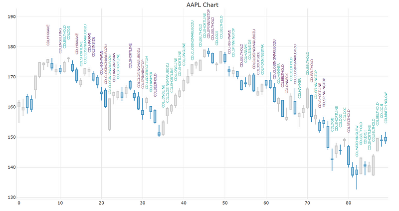
Below is a chart that displays Apple (AAPL) daily data for the last 90 periods. In our script we added all of the 61 candlestick patterns for detection, which makes the chart very busy. I suggest reducing the number of patterns to the ones that are most reliable or the ones you are interested in.
Many times a particular formation may signify multiple candlestick patterns, which is why in the code I added a check to only display one pattern annotation per candle.
In this chart, the pattern names in green are bullish candlestick patterns and the ones in purple are bearish ones.
As you can see, candlestick patterns don’t always indicate accuracy in determining trend direction due to their simplistic nature.
However, sometimes they can be a good indicator of a trend reversal, entry- or exit signal or confirmation. Take for example the inverted hammer candle at the end of the downward trend around period 35. After a downward price move, the inverted hammer is a signal for a bullish reversal, which is then confirmed by three white solders. The upward trend lasts for 8 more periods, each closing price higher than the next. The trend ends with a spinning top pattern, which is a sign of indecision. The spinning top bar ends with a lower closing price and the trend is reversed in the following periods.
Summary
In this post we discussed what candlestick patterns are and which are the most common patterns. Then we went over the implementation in Python and finished up by looking at some of the results of the script.
I hope you found this post worth your time. Thanks for reading.
You can support my writing for free using this link. Don’t miss another story — subscribe to my stories by email. For more premium content, check out my ‘B/O Trading Blog’ on Substack.
This post contains affiliate marketing links.
Have a great day!


