
Designing with sharp gradients in CSS
How to use the CSS linear- and radial-gradient properties with ease
Sometimes, we encounter a paradox in design, such as a sharp gradient.
Smooth
Gradients are supposed to be smooth. A smooth gradient blends two or more colors together harmoniously, as in this example:
Example 1:

Sharp
A sharp gradient, on the other hand, is a gradient that does not have a smooth transition, but sharp changes of colors at a specified point. In example 2, we see 4 sharp gradients (first 3 colors, +1 at the right end) and one smooth gradient:
Example 2:
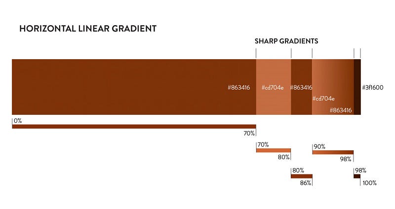
A sharp gradient is defined as a precise percentage value in the gradients flow that ends one color, and starts the next color.
In example 2, the first color #863416 ends at 70%, and the second color #cd704e starts at exactly the same value of 70%. Thus, we have created a sharp color transition.
In CSS, this linear gradient reads as follows:
.div-item {
 background-image: linear-gradient(90deg, #863416 70%,
 #cd704e 70%, #cd704e 80%, #863416 80%, #863416 86%, #cd704e 86%,
 #863416 98%, #3f1600 98%);
}
To note: A gradient is applied as the background-image property in CSS.
Why is a sharp gradient interesting in CSS?
Defining an irregular color pattern in a
<div class="div-item"></div> .div-item {
background-image: linear-gradient(90deg, #863416 70%, #cd704e 70%, #cd704e 80%, #863416 80%, #863416 86%, #cd704e 86%, #863416 98%, #3f1600 98%);
height: XXXpx;
width: XXXpx;
}The sharp CSS gradient applied to an object
Here’s how the gradient can enhance an object, one
, as attractively colored chopsticks.Example 3:

View the full HTML/CSS in Codepen[1].
All the sushi board gradients
Every sushi roll on this board has a CSS sharp gradient to define their looks. The rolls on the left and right have sharp radial gradients, whereas the salmon roll in the center shows off a beautifully designed sharp linear gradient on the slice of salmon.
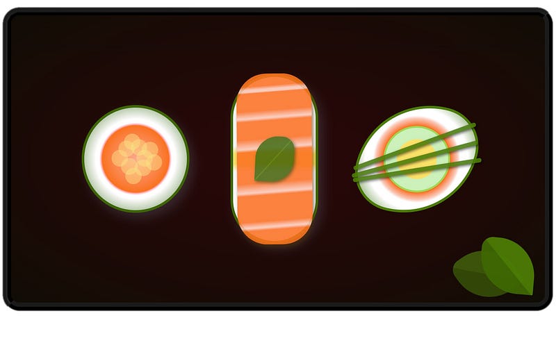
This sushi board has many CSS sharp gradients! Let’s look at a few:
The round sushi with salmon roe on top
Example 4:
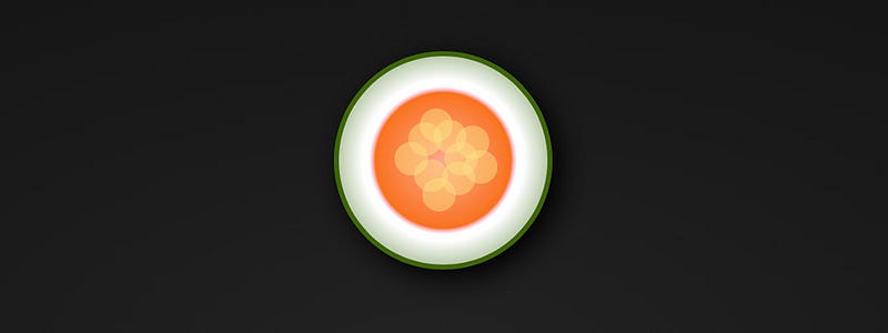
This round sushi roll consists of only one
(except for the roe on the top), and one line of CSS code for its background-image color gradient. The gradient used here is a sharp radial gradient, with a slightly blurry transition between the salmon and white colors..sushi {
background-image: radial-gradient(var(--salmon-light), var(--salmon) 46%, pink 48%, white 50%, white 55%, var(--seaweed));border: 4px solid var(--seaweed);
border-radius: 100%;
box-shadow: #4b4c5876 6px 8px 16px;
height: 150px;
width: 150px;
}View the full HTML/CSS code in CodePen.[2]
The delightful sushi roll with a slice of salmon
Example 5:
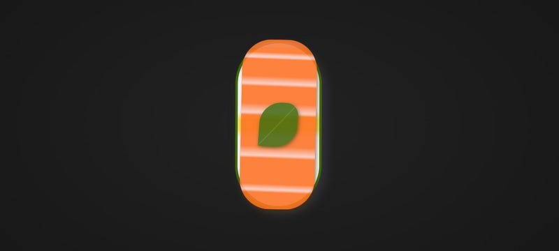
In example 5, it is the salmon that gets the sharp linear gradient. The sharp gradient renders the salmon striations vividly. While the background-image linear-gradient looks complicated, it’s actually based on the method of applying only 1.5% — 2% of value to the light striations, thus creating the effect of light lines in the salmon pattern.
.sushi-salmon {
    align-items: center;
    background-image: linear-gradient(1deg, var(--salmon)10%, var(--salmon-light2) 11.5%, var(--salmon-light2) 12%,
var(--salmon) 15%, var(--salmon) 30%, var(--salmon-light2) 31.5%, var(--salmon-light2) 32%, var(--salmon) 37%, var(--salmon) 55%, var(--salmon-light2) 56.5%, var(--salmon-light2) 57%,
var(--salmon) 62%, var(--salmon) 72%, var(--salmon-light2) 73.5%, var(--salmon-light2) 74%, var(--salmon) 78%, var(--salmon) 88%, var(--salmon-light2) 89%, var(--salmon-light2) 90%,
var(--salmon) 92% );
    border-radius: 44px;
    box-shadow: #4b2f07b7 2px 4px 6px;
    display: flex;
    justify-content: center;
    height: 250px;
    width: 110px;
    opacity: 0.90;
    position: absolute;
    bottom: -5px;
    left: 5px;
    transform: rotate(1deg);
}
See full HTML/CSS in CodePen.[3]
And lastly, the two leaves
The color of these leaves have one line of CSS code, as a linear sharp gradient in the background-image property. The gradient is angled (46deg) to line up the degree of the leaf.
Example 6:

.leaf {
    background-image: linear-gradient(46deg, var(--seaweed) 49%, var(--seaweed)49%, var(--seaweed-light) 50%, var(--seaweed-light) 52%);
...
}See full HTML/CSS in CodePen.[4]
Enjoy!
Hopefully, you’ve enjoyed this journey into CSS sharp gradients, and how they can be applied to individual
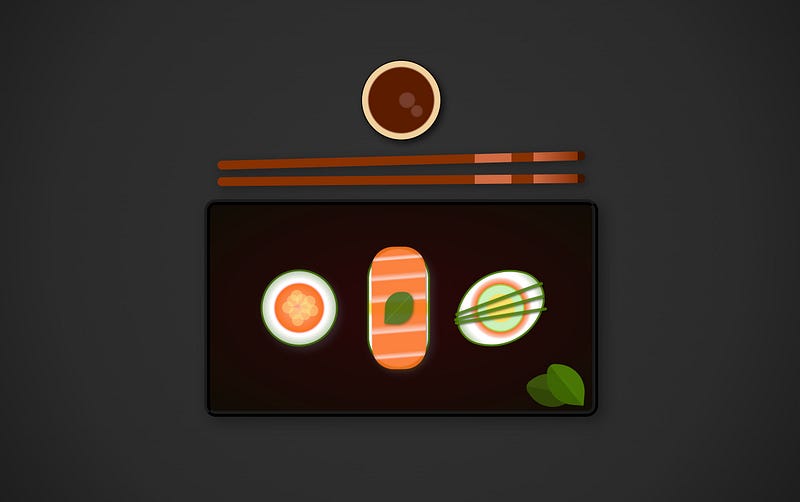
objects to render full coloration with one line of CSS code.And here it is: The full sushi board! There are a few more CSS sharp gradients to explore, so best to dive into the full HTML/CSS in CodePen.[5]
There are so many more sushi rolls to design. Try CSS sharp gradients in your next project!
Interested in learning more about design, trends, tools, tech insights and techniques? Join Medium with this link, and support me on my future writing endeavors on coding design.
Thank you! ✍️🧡
References:
[1] Chopsticks: https://codepen.io/evaschicker/pen/wvmxMOr
[2] Sushi roll: https://codepen.io/evaschicker/pen/gOeNKNj
[3] Salmon in salmon sushi roll: https://codepen.io/evaschicker/pen/abYgjbp
[4] Leaves: https://codepen.io/evaschicker/pen/jOzjpqN
[5] Full sushi board: https://codepen.io/evaschicker/pen/bGvyOar
All CSS illustrations ©Eva SChicker 2022.


