
LEARN UX DESIGN
UX Case Study: Designing a Bike Share App in 5 Days
How to tackle a design challenge on a short timeline.
When I was in high school, I was the king of procrastination. I left assignments, studying, and homework right up until the last minute. I did well in school though, graduating with a 3.8 GPA and never missing a day of school K-12. Somehow, I just made it work and I may have even perfected the art of procrastination back then.
While I survived that way growing up, I’ve recognized that putting things off as an adult just causes too many problems. This has especially rung true as a UX designer with deadlines, deliverables, and companies that won’t play around with lazy follow-thru.
As part of my recent interview process at a company, I was asked by their UX team to design an app for a bike-share service they wanted to launch. The catch? They gave five days to complete the design challenge and present it to their team. So much for procrastination!
In this case study, I’ll show how one might approach an app of this type and demonstrate how I think through problems. I’ll break away from my typical “case study” presentation and give this to you in a day-to-day format.
Lots to do in five days… so let’s get started!
Oh, and a quick disclaimer:
For the sake of preserving their identity, I won’t mention the company name here. Some of the design mockups have been changed slightly to remove their branding on the app; otherwise, everything is exactly how it was presented to the company during my interview.
My UX Process
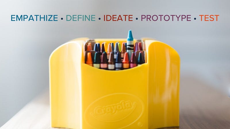
Even though I’m breaking away from my standard “case study” format, the principles and application of UX were ever-present during the five days. Empathize, define, ideate, prototype, and test. My opinion is that if you miss one of these core fundamentals of UX, you might overlook your user’s true goals.
Day 1: Client Meeting, Business Goals, Assumptions & Surveys
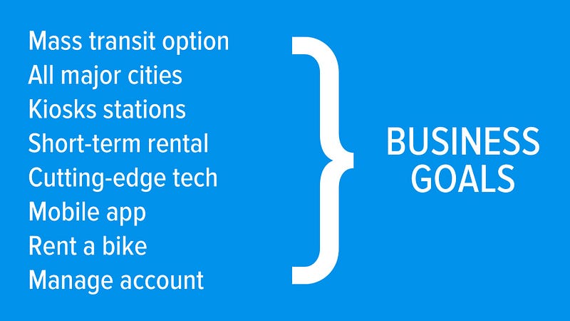
Meeting with the company helped me learn some key goals they had for the app. It was to be a mobile app, use cutting edge technology, have kiosk stations where riders picked up bikes and rented them short term, and allowed users to manage a rider account through the app.
Another key aspect in their goals was for the service to be an alternative to mass transportation, cutting down on pollution, and being an environmentally friendly option for people. Lastly, the intention for the app was for this bike share to be in all major cities.
Whether I’m right or wrong about it, that seemed like an ambitious first step.
Should this service immediately start out in all major cities or should it start small? I’ll explore this further in the user story mapping exercise, but it goes to show that we need to fully understand the business and their goals and make sure we know WHY they want this app/service.
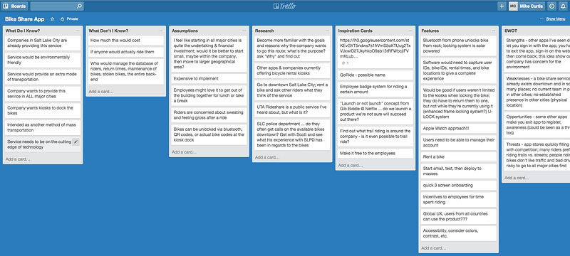
Taking note of these goals, I went to my trusty Trello board and began an intense brainstorming session of assumptions, knowns, and unknowns. I performed a brief SWOT analysis (strengths, weaknesses, opportunities, threats) and jotted down every idea as it came to me; Trello works beautifully for this step.
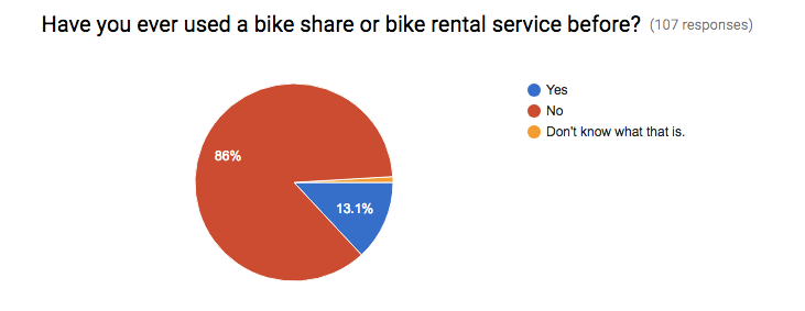
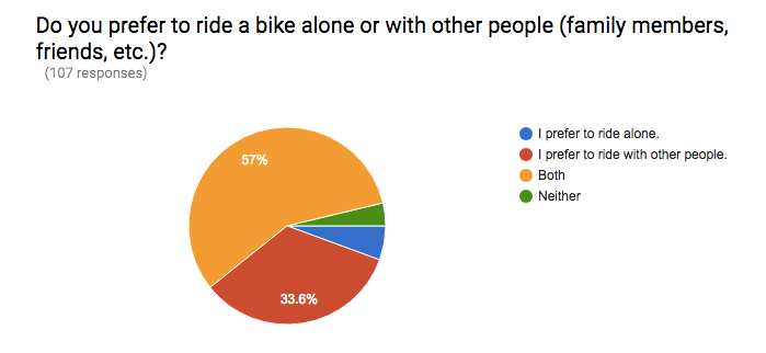
While updating my Trello board with ideas, I took to social media and Google Forms to solicit qualitative and quantitative data from potential users of the app and bike share service. I created a survey and disseminated it amongst a platform of users most likely to use the service. Over 100 responses were received. Here’s a few questions respondents were asked:
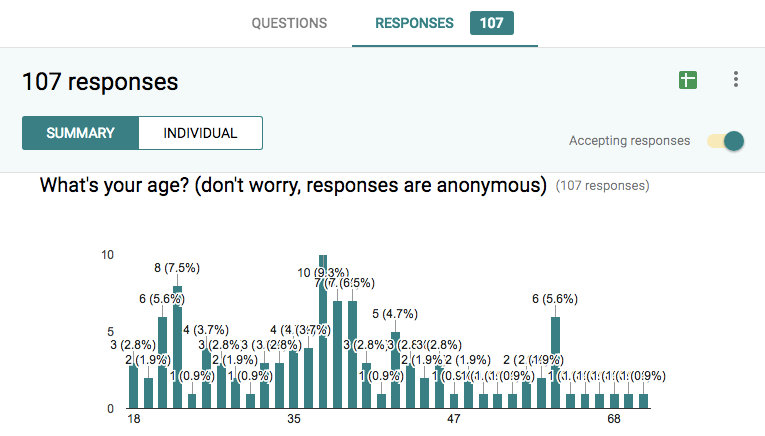
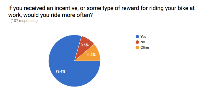
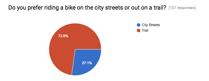
There were also questions in the survey that helped me see preferences people have from a qualitative standpoint. An interesting piece of information I received at this stage was hearing people say they wouldn’t use a bike share service because they work night shifts; I never would have thought of that!
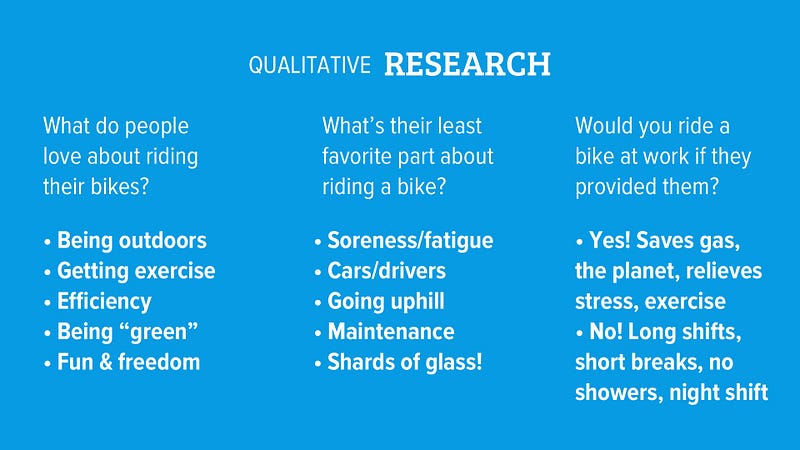
Answers came in showing me that people love being outdoors and getting exercise, but dislike the soreness associated with a bike ride and dealing with vehicles that have less-than-friendly drivers behind the wheel. I even had a respondent say he loves riding except when he falls off his bike and his face meets a pile of glass shards! Ouch!
All good information though… and Day 1 was complete!
Day 2: Get Out and Ride!
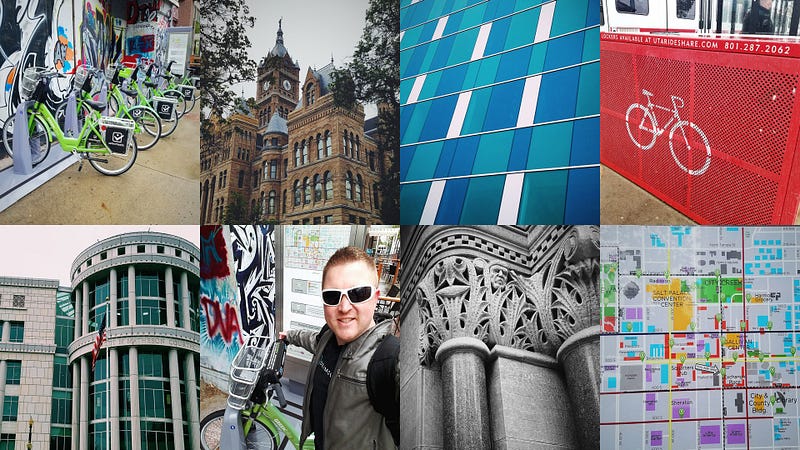
I live in Utah, and Salt Lake City already has a well-established, non-profit bike share service called Green Bike. It was a snowy Friday (Yes, snow in April… only in Utah!), but I braved it anyway. I wanted to experience the service, rent a bike, see what it was like personally, and talk with other bike riders using the service.
The snow put a slight damper on things, and cut down on the number of people using the bike share, but it was so much fun! I met with half a dozen folks riding, took pictures of downtown Salt Lake City architecture, and visited three different bike share locations with kiosks.
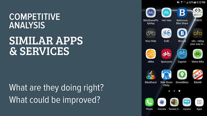
The second half of day two was spent loading up my phone with similar bike share apps, such as the one used here in Salt Lake City, called BCycle. I downloaded them, tested out the service, and began forming a good idea of how they tackle their user’s goals. This competitive analysis revealed strengths and weaknesses in design and overall execution of renting a bike.
Day 3: Personas, User Story Mapping, and Sketching
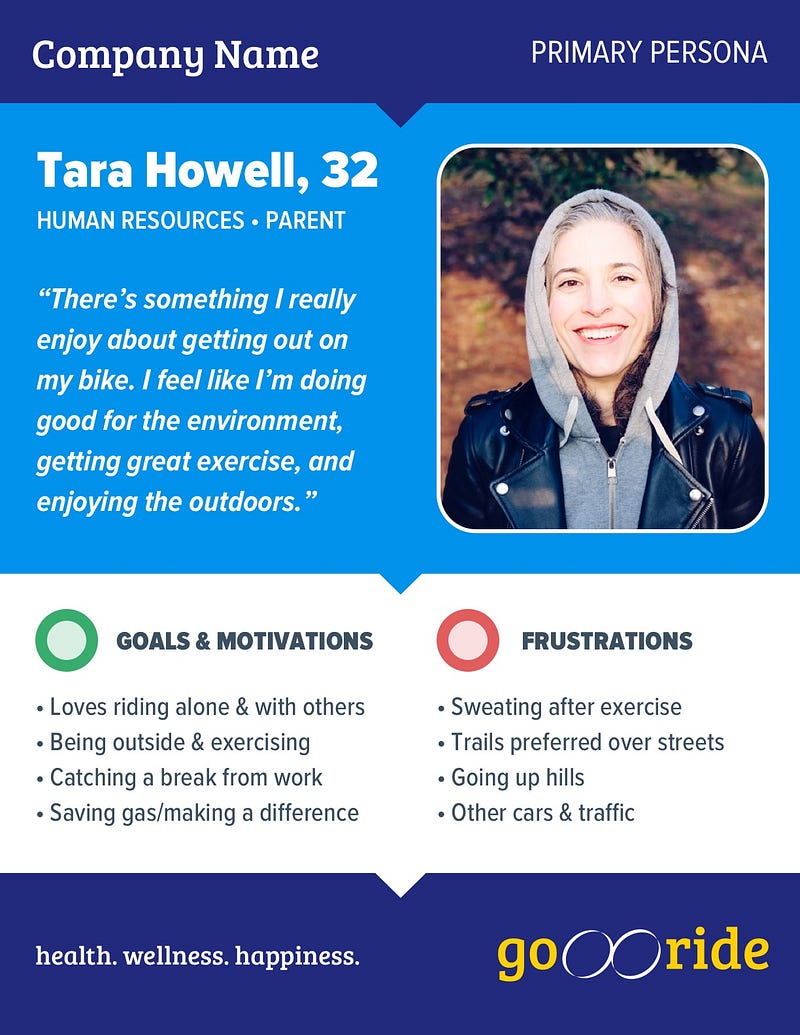
Things were looking good up to this point. With the data I retrieved through contextual inquiries, surveys, and the company business goals, I was ready to craft a persona for the app and see what my user looked like.
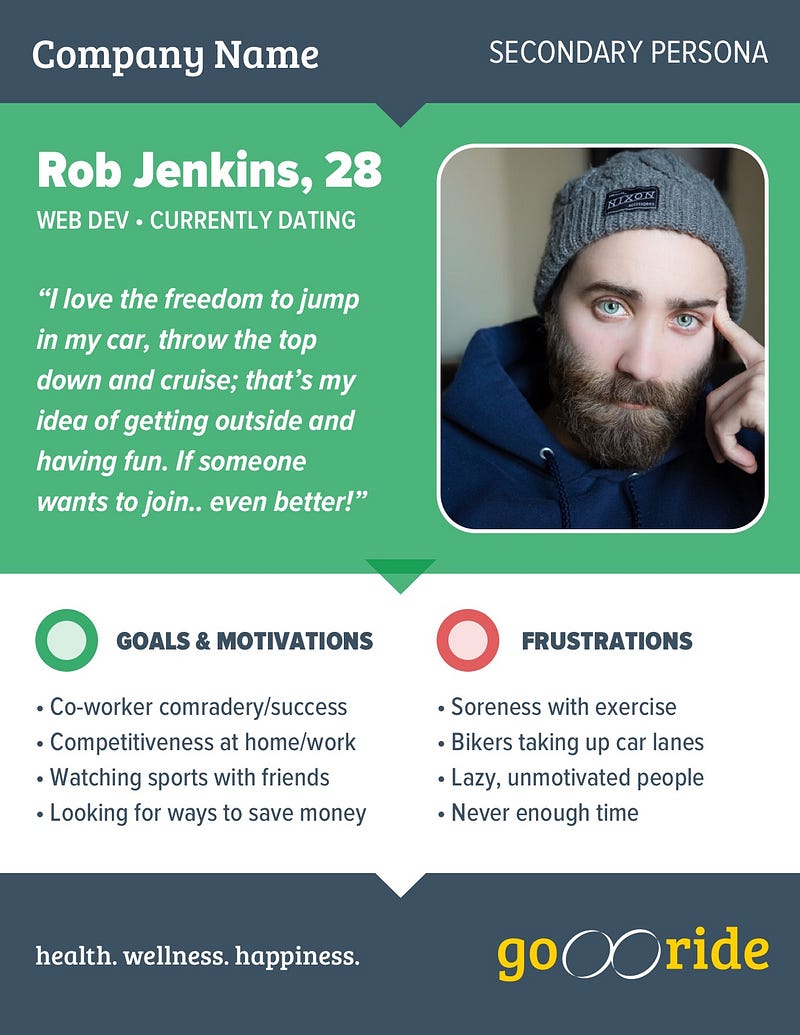
Along with my primary persona, I couldn’t help but consider another candidate for the app, so a secondary persona was created. Even though this user wasn’t much for exercise, he enjoyed camaraderie amongst his co-workers, competitiveness, and was conscious about spending and saving money. Not only could I design for him, I felt it was a must.
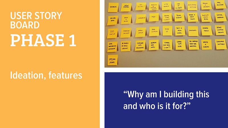
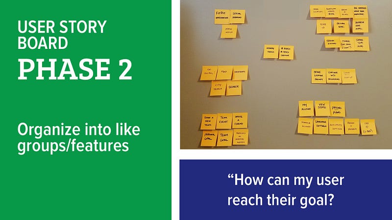
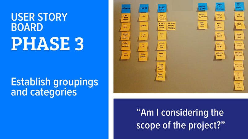
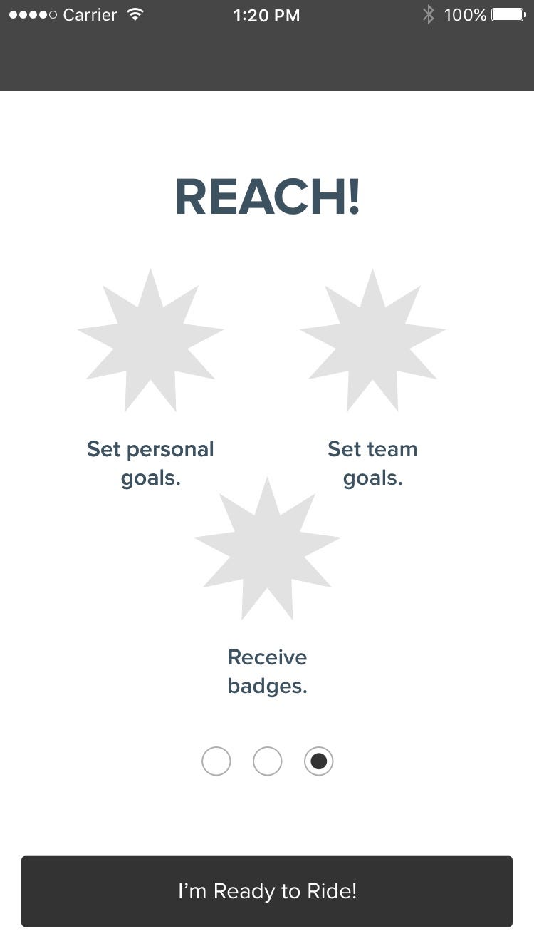
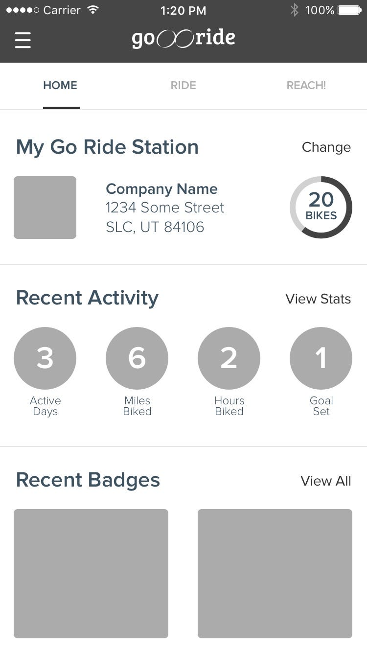
Once my personas were created, printed out, and slapped on the wall, I began creating a user story map. You’ll see the process broken into four phases, all of which funneled down to an MVP (minimum viable product).
It was at this point that the wheels in my head started to turn. As I drew that MVP line in Phase 4, I recognized that launching this app/service in all major cities would be an undertaking not yet suited for the initial release.
What was possible, however, was for the company to launch the app/service as a perk to their employees. The company installs the bike share kiosks and incentivizes their employees to ride! Employees head out on a lunch break for a 30-minute ride, come back, and share their experiences on social media. That seemed doable, viable, and within reach to the company.
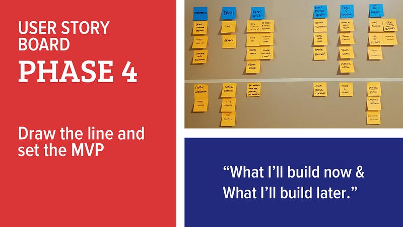
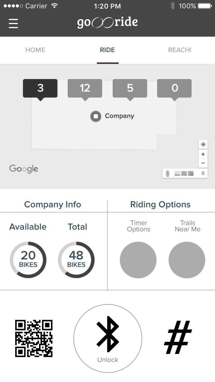
Features above the MVP line got me excited about the possibilities of the app! It would allow the users to:
- Unlock the bike at the kiosk via Bluetooth
- Unlock the bike with a QR code
- Unlock by simply punching in the # of the bike on your phone and having the system spit back an unlock code for the bike
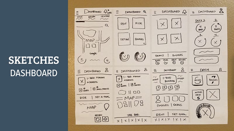
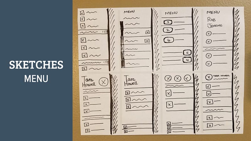
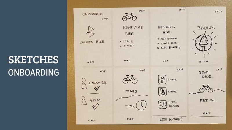
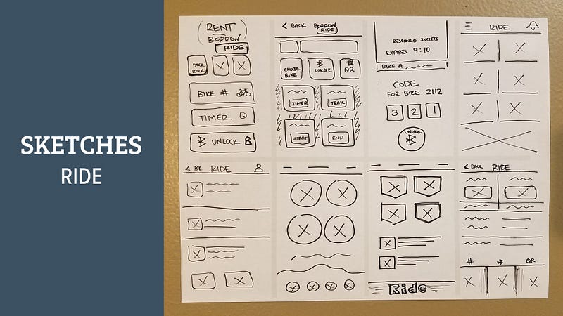
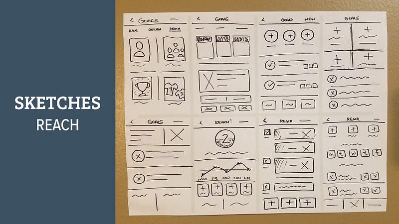
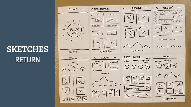
Final part of Day 3 was finding a marker, some scratch paper, and getting my ideas out through sketching. I prefer the 10x10 method, which says to do 10 drawings of one specific screen, and only spend 1 minute on each of the 10 ideas for that screen. It’s a great approach so you don’t get too hung up on one particular design.
Day 4: Wireframes, Hi-Fi Mockups, Prototype, Test
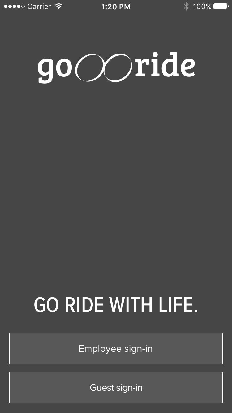
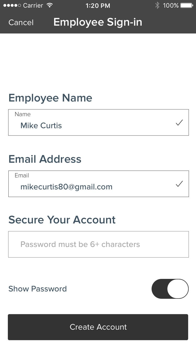
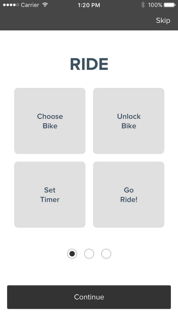
I could see it… I could see the light at the end of the five-day tunnel! With three days behind me and lots of information gathered, I was ready for some low-fidelity wireframes in Sketch. The first half of the day was sticking to grayscale and simply trying to accomplish the goals of the user from the story map and not get too sucked into the design/color aspect of the app. Here’s just a few screens from the process:
Now for some color and pizzaz. I used vibrant colors and smooth gradients to give the interface a clean look with ample white space and easy-to-navigate sections.
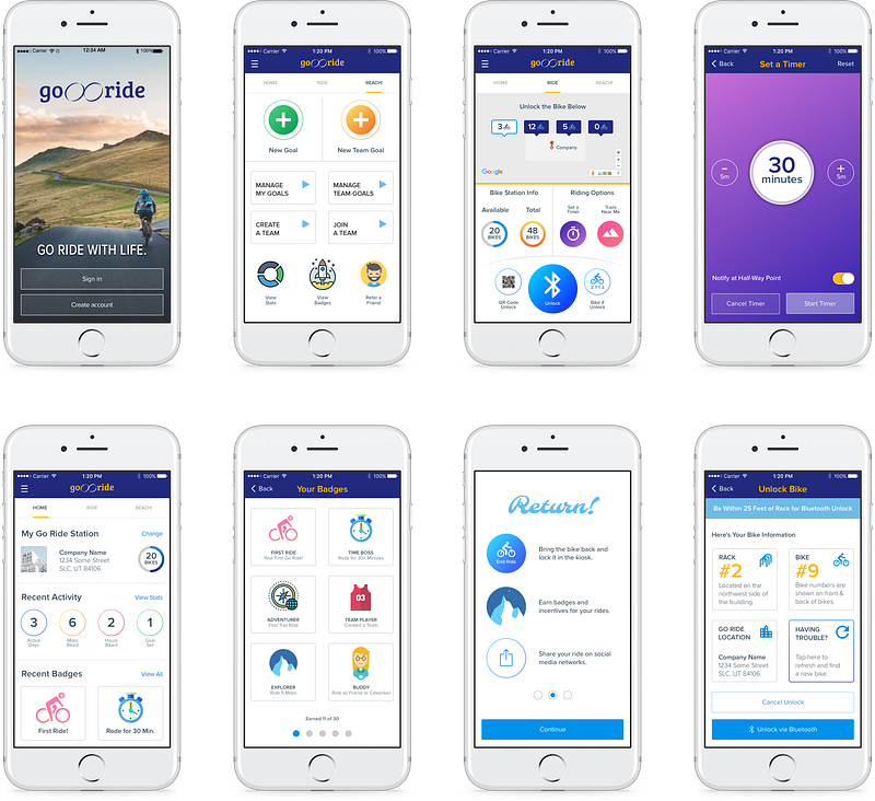
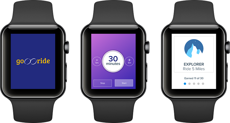
Going back to the goals of the business, they wanted the app to use cutting edge technology. While the Apple Watch wasn’t my primary focus, I did mock up a few screens to show them the potential to use these devices in addition to mobile phones.
I prototyped the screens with InVision and enlisted a group of individuals to test the app.
InVision prototype will be added here soon.
A few flaws were discovered in navigation and design changes were made at the end of the day to account for what my user testing found. Day four was brutal and long… it was time to get some rest for the final day.
Day 5: Finishing Touches & Presentation
I woke up early to put on the finishing touches and polished up the designs a bit. In this short amount of time, I was happy with where the app had come.
- I had designed an app that was more focused on the company installing and launching this service to their employees
- I had designed an app that encouraged employees to get out and ride during lunch breaks; there even happens to be a number of trails they can ride close to this particular company, so that was a huge selling point for employees to get out during lunch, take a break, and get some fresh air whilst avoiding city streets and vehicles
- I had designed an app that used cutting edge tech, like Bluetooth, QR codes, Apple Watches, etc. and felt it was ready to show to the company
I presented to a group that consisted of UX, product managers, and others. It was received well and I walked them through each of the steps you have seen here in the case study.
Conclusion
Wow! Five days, zero procrastination, and an end product I’m proud of. That was a lot of UXing in a short amount of time, but well worth the challenge. I’ve learned a couple of things:
- First, when presenting your designs, people want to see how you think, not necessarily just design work. It may be pretty and draw out the “ooohs” and “aaahs” from your audience, but does it solve the goals and needs of your users?
- Second, if you lose sight of your users, you’ve missed the point — that’s why I went out and rode the bikes with them and talked with them. That’s why I surveyed people and based my hypothesis for the project on the goals of the business AND the users
That’s it — the UX process for designing a bike-share app in five days. Hopefully, you found something useful here!
If you enjoy reading stories like these and want to support me as a writer, consider signing up to become a Medium member. It’s $5 a month, giving you unlimited access to stories on Medium. If you sign up using my link, I’ll earn a small commission.
Uncle Mikey helps amplify people and products through human-centered design. With 20+ years experience in design, marketing, e-commerce, and UX, his passion is helping people & businesses apply their skills to the way they’re experienced by others. You can connect with him on LinkedIn, Instagram, Twitter, or follow his writing here on Medium.


