Design systems 101: placeholder components in Figma

Wouldn’t it be nice if you could make universal components with only a few variants? Components with a structure that can be easily altered on an instance level? Components so flexible that you could reuse them with no limitations? You can do all of the above with placeholders :)
The placeholder component reserves space for content that can appear in your layout. It can be easily hooked up to the component properties and swapped with another instance based on context.
1. Base component
Base components have an auxiliary function in building design system libraries. They allow you to create complex objects through overrides. You can quickly spot them on your canvas because, usually, their names start with a “.” or an “_”. This naming convention excludes them from publishing in the library.
A base component is designed with all possible elements in place. Then, it is nested in the main component variants with the appropriate layers hidden. The layer visibility can be toggled with boolean properties in the design panel. In general, it shouldn’t be used to convey any interactive state (e.g. hover, active).
Base components are often made for buttons or inputs to speed up editing. Yet, they can cause a lot of headaches with phantom instances which are possible to create this way but are used nowhere in any of your sketches. They also significantly worsen your library performance. So if this is the design pattern you use in your files you should definitely check out this article:
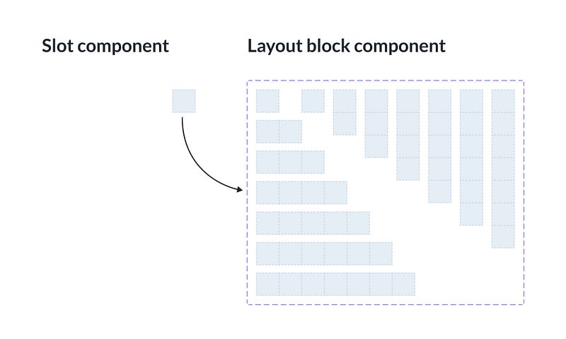
2. Slot component
This component type is made to be swapped. It is simply an empty auto-layout frame component that holds place for a wide variety of content. The slot instance can be changed to whatever you have available in your assets. You can also use it with its parent’s instance swap property in the design panel.
3. Layout block component
In general, it’s not possible to change the structure of an instance. You can’t freely change its layers’ position, z-index, or constraints, nor can you paste additional elements into your instances. You can read more about these restrictions here:
Yet, there is a neat trick to work around these limitations. You can use the combination of slot components to prepare a layout block.
The layout block is an auto-layout frame component with slot instances nested inside. Usually, it has two properties: the number of slots and the layout direction. The number of slots controls your instance structure. The slots themselves let you handle the content.
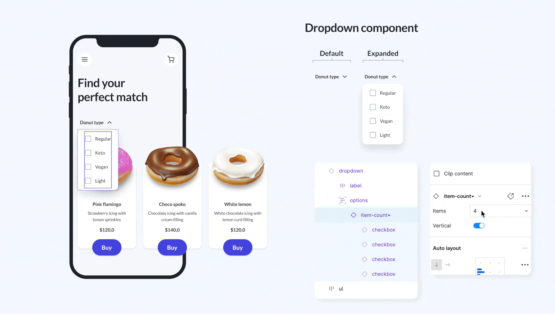
Let’s say you want to make a dropdown list. You might use separate variants differing in the number of options or use boolean props to hide unnecessary list items.
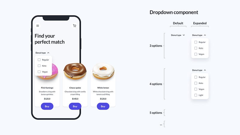
However, if you use the layout block you can add as many options as you like on your instance level by changing the number of slots in the design panel. No hidden layers nor multiple variants are needed.
4. Fixed ratio image component
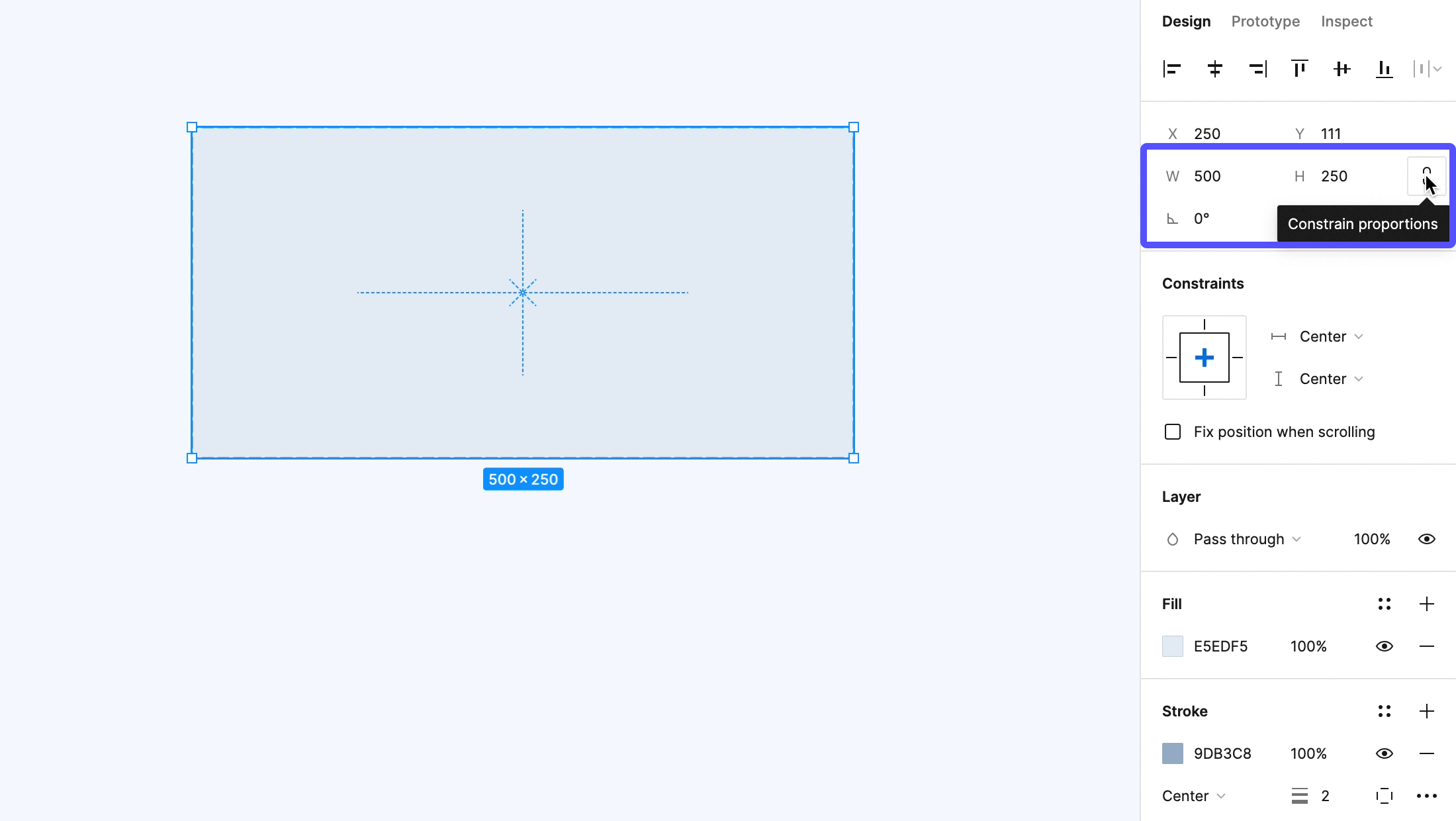
Currently, there are two default ways to keep your image ratio in Figma unchanged. You can either toggle the constrain proportions button in the design panel or use the scaling tool from the main menu. Unfortunately, none of these work with auto-layout frames. The first one can be used only when you type in the width or height of your element. The second one can be applied only while resizing objects by hand on the canvas when the scale factor is stored.
Unlike in the other 2D graphics apps out there, the scale transform in Figma has unit axes and size is controlled by width, height, constraints and resizing properties. Also, the translation components of the transform matrix are ignored on auto-layout frames’ children but they do keep the rotation parts. So it is possible to set proportions within these frames by using rotated objects.
The first step is to draw a simple line and place it inside of an auto-layout frame. The line should have a horizontal resizing set to fill and a vertical one set to fixed. The parent frame should be fixed horizontally and hug its contents vertically. The magic happens when you rotate the line inside.
Since you have already fixed the height and rotation based on yur resizing setup, you just need to find the correct angle to keep the proportions you want. The cyclometric functions will help you find the valid rotation. For example, to make an image with a ratio of 2:1 you can search for the arcsine of 1/2. As it turns out it is 30°, a pretty nice round number. Rotating your line by exactly this amount will make its parent frame always twice as wide as its height when scaling horizontally. For 3:2 proportions you would need to use a 41,81° rotation and so on.
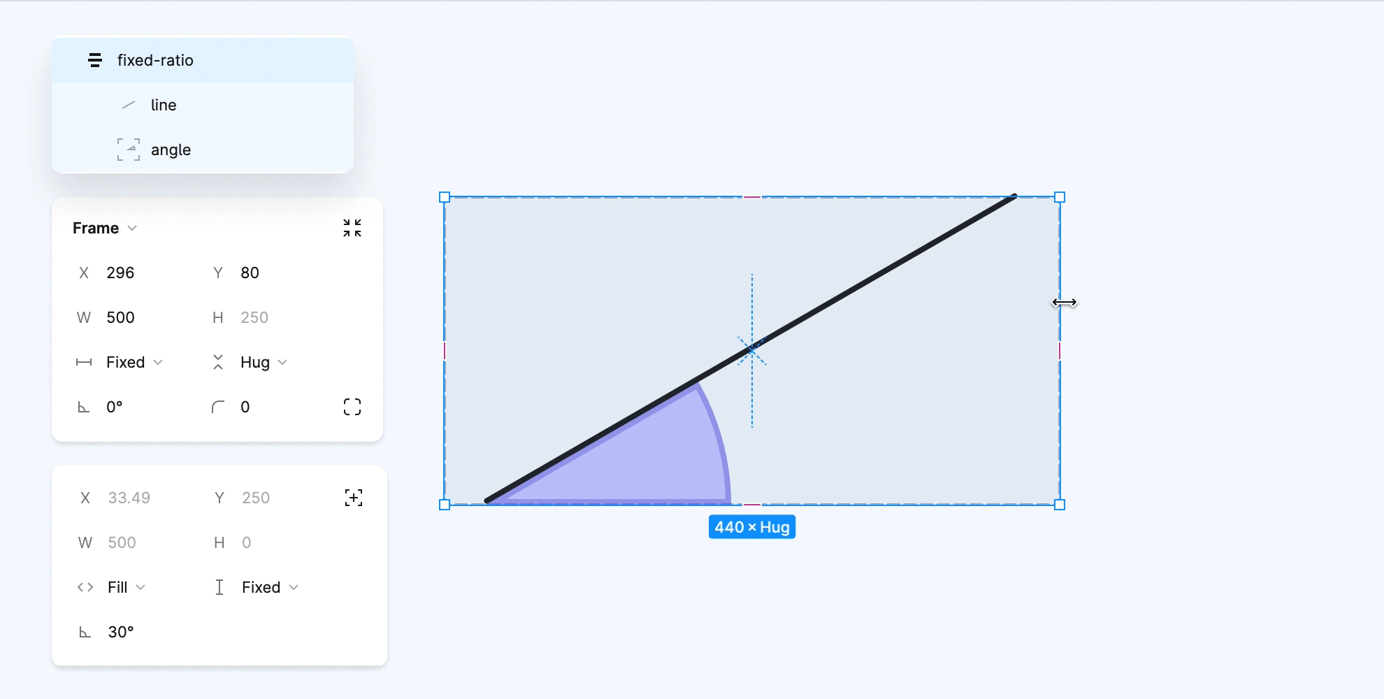
Preparing different aspect ratios is now just a matter of checking the angles or, if you want to be super precise and don’t bother with the rounding issues, combining square blocks. Then, you can remove the stroke and fill from the helper objects (lines and frames). And finally, the raster image you want to use in your interface can be placed on the top-most parent as a simple fill.

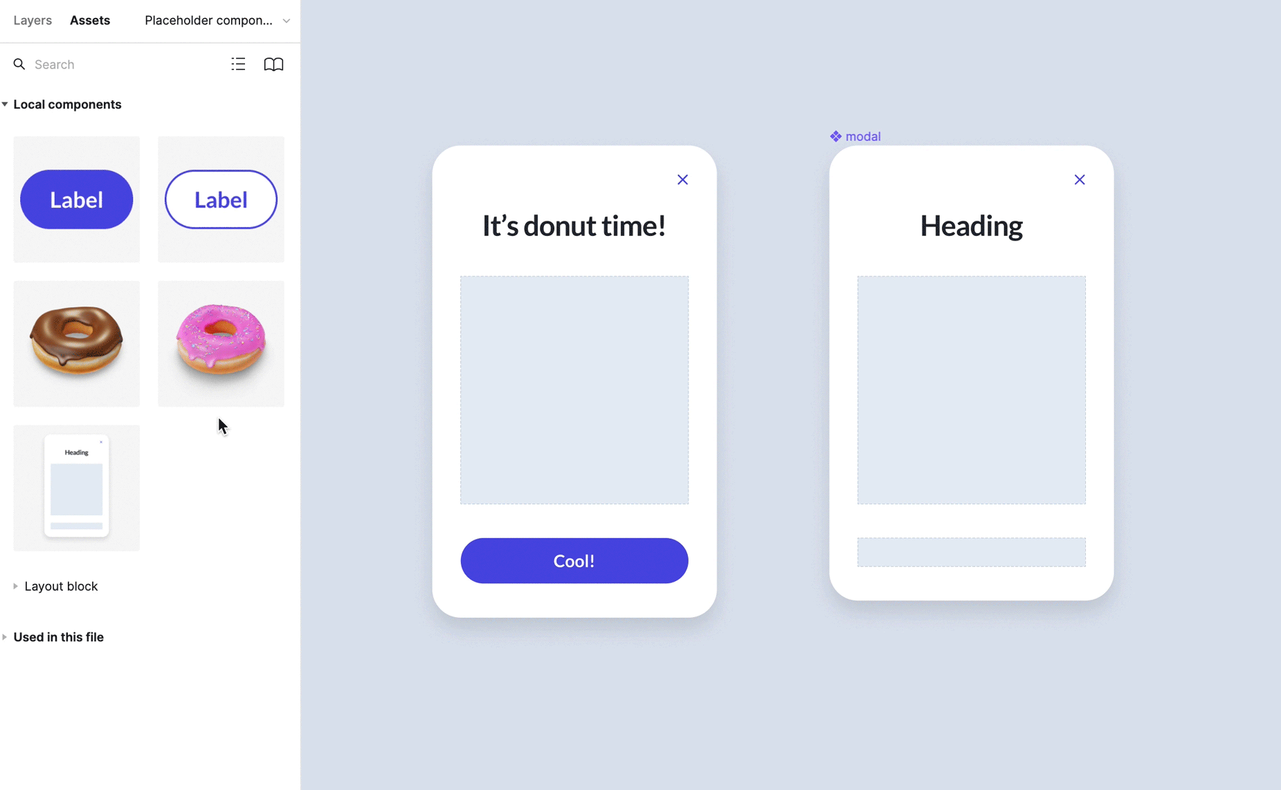
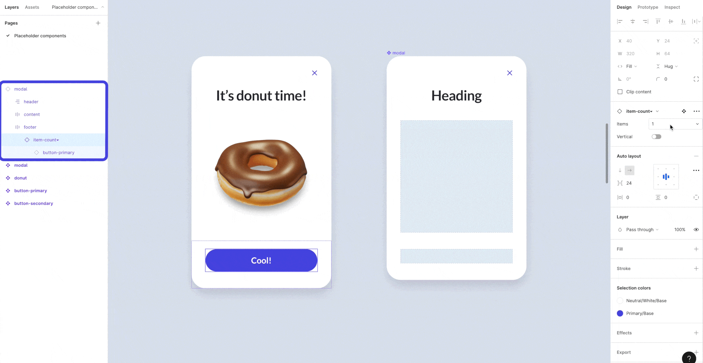
5. Template shell component
This is the most complex placeholder component type of them all. Templates use the atomic design principles with nested placeholders. They work like the Lego bricks, you just mix and match the most basic elements to build more complex structures. The cool thing about them is that you don’t have to create every possible variant inside your component and you won’t end up with millions of hidden layers. At the same time, your design system remains consistent and your developers have all the necessary information available.
Conclusion
The placeholder components give you the flexibility to prepare templates that can be reused in different contexts. They can simplify your system libraries and let you organize your files neatly. What is more, they ensure predictability and adherence to the guidelines set for your designs. It’s definitely worth giving them a try.
Let’s stay in touch! Connect with me on LinkedIn or follow me on Dribbble for more design-related content :)