
Design Home Top Hits and Hints
My hall of shame/fame and suggestions for 5-star interior designs

For those of you not aware of the game, “Design Home” offers you an ongoing series of interior design challenges. There are mandatory types of pieces that must be included, such as a sofa, end table, or sideboard. Then there are optional pieces that you can include if you wish, such as rugs, lamps, flowers, and artwork.
Your finished designs are judged against a series of other designs in a this-or-that format to achieve a final rating. A perfect score is 5.0, meaning everyone who voted on your design chose it over the design it was paired with.
From my experience, as you get better, and your average design rating rises, you’re paired against better designers. You can also enter the more difficult competitions. So, the game remains challenging.
The higher you score, the more prizes you win. Prizes can be decor items or “diamonds”, the in-game currency that allows you to buy decor items of your choice. Each piece of decor can only be used a limited number of times before it disappears from your inventory.
Inspired by Frances A. Chiu’s article on her favorite Design Home designs, I promised an article showing my favorites. The images are from a Toastmasters speech I gave, highlighting things I did both wrong and right in the game.
Hopefully, this will let you learn from my efforts, so you start winning design competitions quickly. Or gives you ideas for effective real-world designs.
Don’t make these mistakes
First, here are some of the things I did wrong.
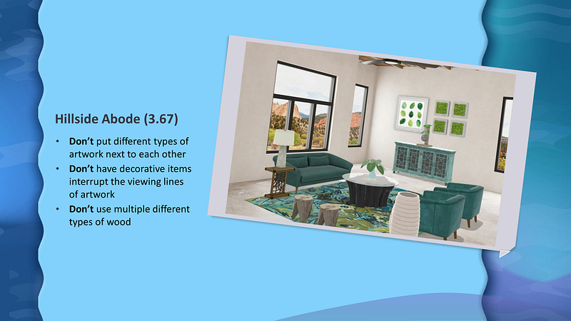
One of my early designs, I hadn’t yet figured out that “less is more”. It’s okay to leave the optional spaces empty. Especially if your optional pieces only “sort of” match the rest of the decor.
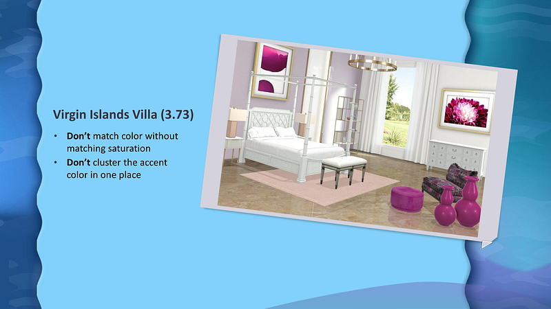
Here, I tried matching pale pink and mauve with vibrant magenta. Don’t do that. I’d have been better off not including the magenta tuft and vases, or finding something else in a pale shade.
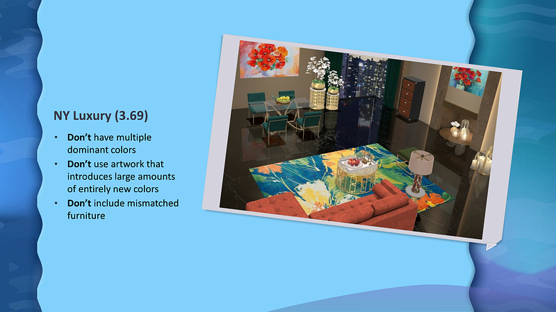
Here I tried using different colors to define the living room area and the dining room area. But since you can see both areas at the same time, it just looked sloppy. It was not a success.
Take this advice
Now let’s take a look at some of the things that worked well.
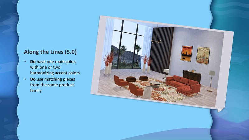
I loved how the orange, ivory, and antique gold echoed in both the carpet and artwork. Because of the shadows, the red branches in the standing vases actually look orange as well.
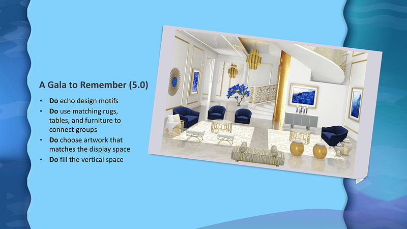
Key to making this design work was placing the vertical and horizontal artwork in the right places. And the blue tree was a playful way of incorporating the stairwell area, keeping it from looking sterile and echoing.
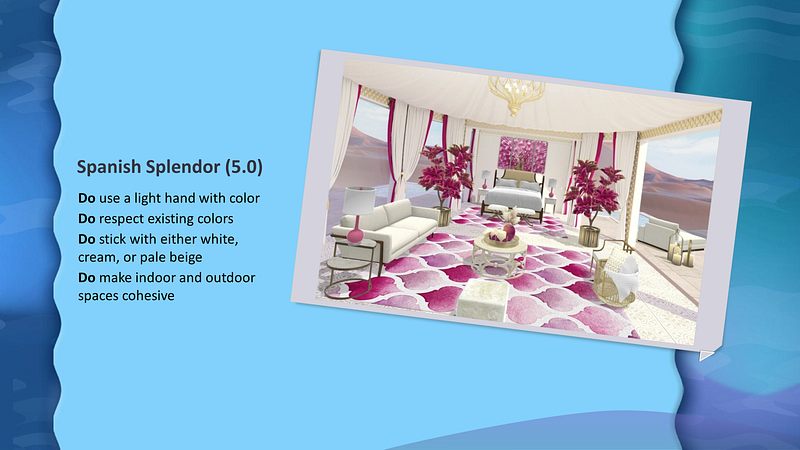
The drapes with their pink edging were included in the background for the design. It was important to pick up both the pink and also the ivory in the rest of the design. There are so many variations of white and off-white. Mixing them can look sloppy. Most of the designs that fared poorly against this one featured furniture in too many different shades and colors.
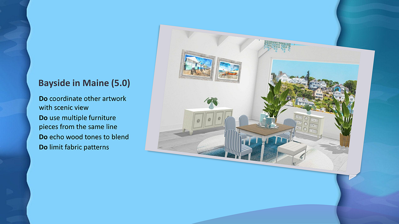
I loved this design. I’d vacation there in a heartbeat. The grey wood picture frames match the grey wood flooring. Adding the planter in the same wood as the tabletop makes that a conscious design choice rather than an accident.
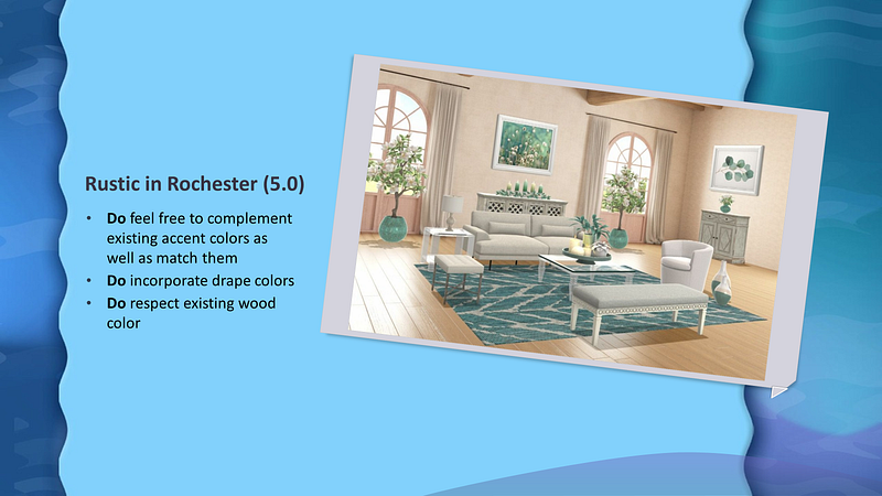
This design started with pink window trim and wainscotting. Ugh. I found a shade of aqua that worked very well with it, and based the design around that, making the pink an accent.
Wrap up
If you’d like to play Design Home and test your interior design skills, it’s available as a free app with in-game purchases. You get freebies every day, as well as when you win a design competition. So, it’s possible to play without ever buying anything.
I tended to save my diamonds, then load up on purchases when design packs in my favorite colors came out. There are often limited-edition purchases for special themed challenges. If you save them, rather than use them for the immediate challenge, you can include striking accents that no one else is using in future challenges.