
Design better buttons
Everything you need to know to have this important interface element go next level.
A button is an interactive element that results in an action described on it. You can bet that if it says “save” on a button, clicking it will most likely “save” something. It’s also one of the most important interactive element of any digital product.
It can lead to a purchase, downloading, sending and many other important actions. Digital buttons are also descendants from real world buttons like in the tv remote, record player or game controller.
Most important thing to know.
A BUTTON SHOULD LOOK LIKE A BUTTON
The most important rule while designing a button is for it to stand out enough so it won’t be confused with anything else.

Familiar = good
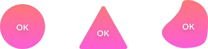
We are used to certain shapes and forms that are normally associated with action. The more our button looks similar to what we associate with buttons — the better. This is why a rectangle (or a rounded rectangle) are always the safest choice for a button.

Other shapes and forms (triangle, circle, organic) are not as recognizable to the user. Proceed with caution and use them only when the general style of your product requires deviating from the norms.
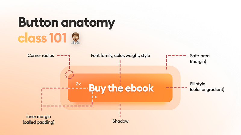
Button dissection
While designing buttons remember about every one of these elements and choose them wisely. Using the brand book as a baseline, think about what kind of buttons will match the brand and fit well within the interface.
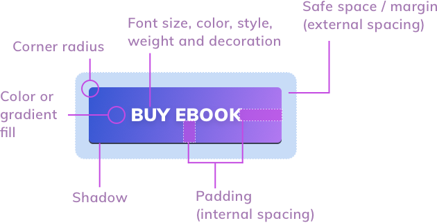
You should set the padding and safe space using your grid base numbers. In the above example the left inner spacing is twice as big, as the vertical spacing which is a safe choice for increased readability.
Spacing and alignment
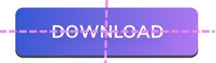
Unevenly spaced buttons are one of the most common problems of all interfaces. Double check if your button labels is centered both horizontally and vertically. Create guides if you need to be sure.
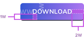
Aside from grid based methods, a safe way of choosing button spacing can also be done with the uppercase W. If at least 1 W fits on each side of the button label you’re safe. On the sides it’s even better to use 2 x W for increased readability.
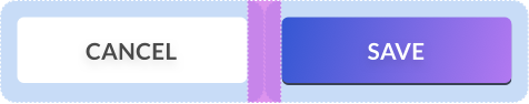
Don’t forget about the safe space of your buttons. If you have a group of them, the safe space should be individual for each one — don’t overlap it!
The right size
Both web and mobile buttons should also have the right minimum size. If your buttons are too small it will be difficult to tap or click on them. That results in frustration and can lead to users uninstalling your app. Best way is to start with 44 by 44 points for all interactive elements on mobile devices.
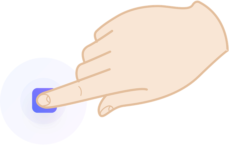
The sweet spot is somewhere around 50 for mobile buttons. In the case of cursor based devices 32 by 32 should also work. Remember that even on desktops the larger the button the easier it is to use
Good practices.
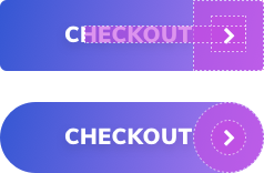
Important buttons also work well with icons. A checkout is quickly identified by a basket or a cart icon, but only as long as the word checkout also appears.

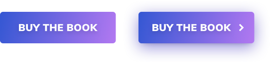
A right arrow or chevron placed after the button label makes the resulting message stronger. The user is more compelled to click and “proceed”. This works well if you’d like to strengthen your CTA.

Buttons with shadows are also more “clickable” and noticed much faster, than flat ones. Add a subtle drop shadow in the button to make it stand out from the background more. Best practices on button shadows will be discussed later in the chapter.
Rounded corners
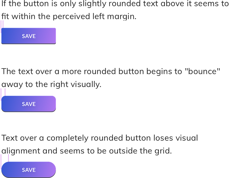
Rounded buttons are considered more friendly and positive than sharp edges. At the same time however they make it a lot harder to design content around them. If you have left aligned text just above the button, the more rounded the corner the less that text will visually fit. It makes you feel as if the left margin is in two places at the same time.
Aligning icons
Good icon alignment on buttons is on of the hardest things to do. In many cases the relation of font weight and icon weight are directly related and specific to them. There is however a simple and useful rule that works in most cases.
Depending on our corner radius we create a circle or a square the size of the height of our button. Inside it we create another shape to house the icon. It should have a padding inside the larger shape, that’s the same size as our text height. Then we place our icon inside the smaller shape.
In case of a chevron it’s best for it to be the same height as text-height and you can also check the line-width against the font width. The more closely matched the better the end result.
Edge balancing
If you’re using rounded buttons keep in mind to have the right rounded corner ratios towards other on screen elements. Using the same one for everything will create inbalances in the margins.
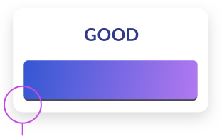
The diagonal spacing is the same here as the one on the left side and the bottom. That results in a much nicer, faster to process outer edge.
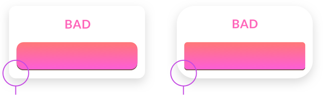
The diagonal spacing is larger (left) and smaller (right) than the side spacing. That makes the edge stand out too much and take the attention away from the button itself.
Summary
When you start building out your primary, secondary and tertiary buttons try to remember to check them against a couple of factors every time. Even small inconsistencies or bad alignments can lead to lower conversion. And with buttons conversion and clicks are all that matter.
Keep in mind to:
- Make your button look like a button
- Have the label centered both vertically and horizontally
- Have enough space (padding) inside the button
- If you’re using an icon choose the right size and alignment
- Set your border radius depending on where the button will be used
- And then check if that radius matches your other on-screen elements
- Make it the right size! The bigger the button the easier it is to use. That includes desktops!
Good luck!
____________
What’s next? 👋
This has been an excerpt from the free chapter of the Designing UI Book. Download the free chapters PDF here.
Get THE FULL UI DESIGN BOOK 📘 or subscribe on YOUTUBE 📺
You can also follow my Medium profile for a weekly dose of design-related stories. We’re Instagram with free tutorials too.


