The webpage provides an in-depth guide on designing a Pinterest-like Masonry layout, emphasizing responsive design, image aspect ratio preservation, and performance optimizations for frontend development.
Abstract
The article discusses the design of a Pinterest-style Masonry layout, which involves arranging images in a grid based on available vertical space. It outlines the requirements for such a layout, including fixed-width columns, aspect-ratio preservation, responsiveness to different screen sizes, and the consideration of lower-resolution images for smaller screens. The basic solution involves maintaining an array of column heights to place images optimally and using absolute positioning to minimize reflow. The article also covers API requests and responses, with a focus on metadata for image fetching and pagination. It addresses the challenge of preserving image height to prevent layout shifts and suggests using the object-fit: cover property to maintain aspect ratios. Performance optimizations are crucial, with recommendations for lazy loading, prioritizing image loading based on visibility and importance, using the WebP format, and leveraging subdomains to increase concurrent image downloads. Additionally, the article touches on implementing infinite scroll with cursor-based pagination and managing edge cases such as network issues or failed image loads.
Opinions
The author advocates for the use of absolute positioning to avoid layout reflows, which can improve performance.
Preserving the aspect ratio of images is considered important for maintaining a consistent and visually appealing layout.
The use of cursor-based pagination for infinite scroll is presented as efficient for handling large datasets and real-time data.
Lazy loading and prioritizing image loading are seen as key strategies for reducing bandwidth usage and improving load times.
The article suggests that handling edge cases, such as network issues or image loading failures, is an essential part of creating a robust user experience.
The author emphasizes the importance of optimizing multimedia content, as it significantly impacts web performance and user engagement.
Design a Pinterest | Frontend Component Design
Some people may call Pinterest layout Masonry layout. It is essentially a grid layout and works by placing elements in optimal position based on the available vertical space.
If you prefer watching a video, you can see it here:
Requirements
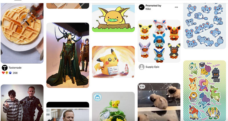
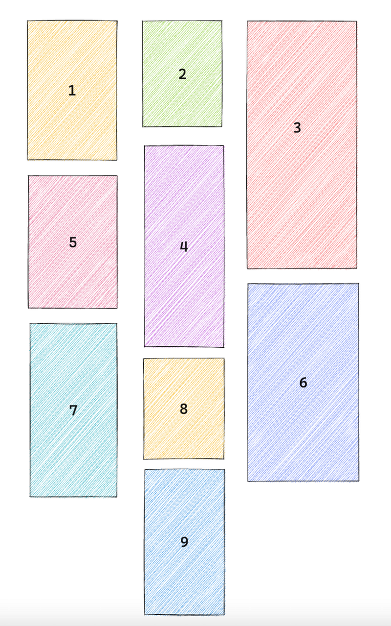
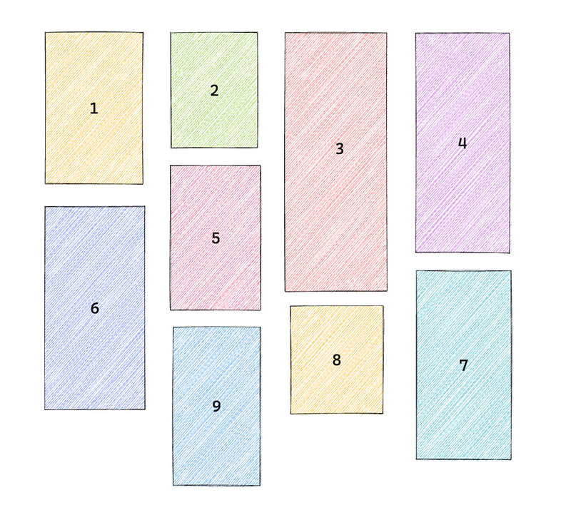
Pinterest layout usually uses fixed width columns. Let’s say there are 3 columns on a 900 px screen. Each column has a fixed width. And let’s suppose we are placing 9 pictures with various heights in this order.
If you look at column №4 closely, it is placed at the 2nd column that has the shortest height.
There are some other requirements including:
1. Images should be rendered into fixed width columns
2. We want to preserve the aspect-ratio of the image. And we want to provide image of different size for different viewport. (We will show how to do this in the api overview)
3. We should consider adding infinite scroll, which fits well for entertainment type content.
4. Other things we should consider to include in our design is images should be responsive across different screen size
5. We should consider loading lower-resolution images for smaller screen
We went over the requirements, next I’d like to come up with a basic design, discuss the API request & response and talk about some optimizations that we should be aware of.
Basic solution
First of all, let’s see how we can position the images on the screen.
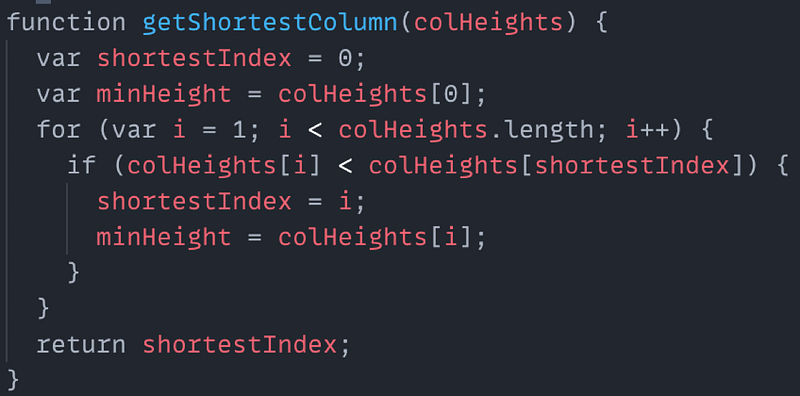
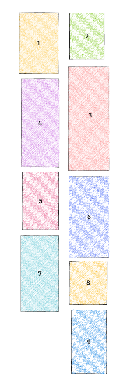
What we can do is to maintain an array of column’s heights. The array would have n elements, where n is the number of columns.
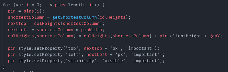
And then we could figure out the shortest column, then insert a new entry to the columnHeights array, then update the style of the pin,
credit: from https://www.pinterest.com
The image is absolute positioned, this is to help avoid triggering the reflow.
And What should happen when the screen resizes, so when screen resizes, we will have to recompute, layout and render again. See below when screen resizes, pictures layout:
When screen is largerWhen screen is smaller
Basically we can have a couple of breakpoints in our css and once the screen size goes over the breakpoints, we would trigger the callback to compute and layout the images on the screen.
API request
So, let’s look at the API request and response. The request is pretty straightforward,
we have a get request with an optional parameter taking the previous cursor, The cursor remembers the place where we left off.
This string is usually converted to base 64, here I just show the raw string for demo purpose.
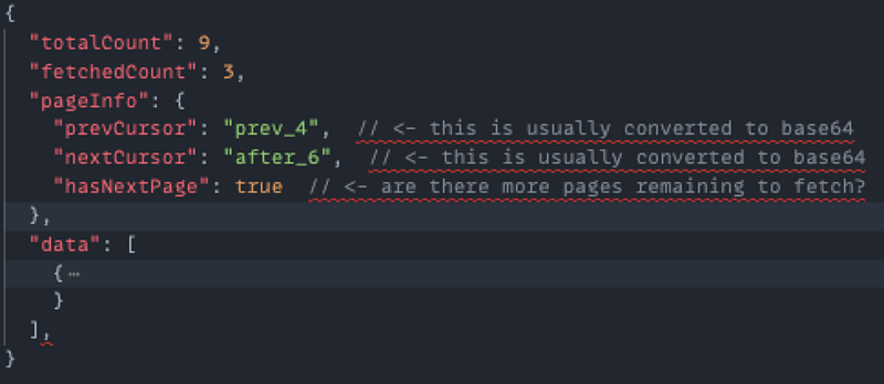
API response
Inside the response, we would have some metadata indicating how many images there are in total, how many we have fetched, the pageInfo object includes the information about where to start fetching for the next request and how many images to fetch.
sample response
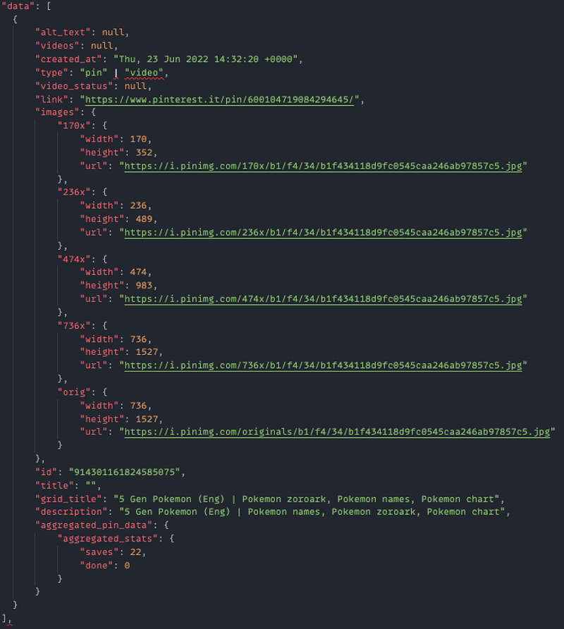
The data array consists of the images/video information we needed to display on the screen.
You can take a close look at it, but here I want to call out the images property, for each pin, it contains an images property, this would be shown for a specific viewport width. then we could use these along with the current viewport width to give priority hints to browsers to determine which images should be loaded first and which could be lazy loaded.
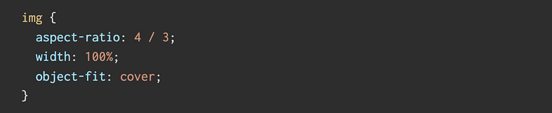
Preserve image height
The other problem with the tag is that it takes up zero space until the browser loads enough of the image to know the dimension
if we don’t do anything about it, you would see the layout shift constantly as images finishes loading. And the images on top keeps pushing the images below furthur down the screen.
One way to resolve this is to give the tag a width and height, and define the aspect ratio of the image. Looks something like this.
object-fit: cover makes sure that The image is sized to maintain its aspect ratio while filling the element’s entire content box.
Optimizations
According to MDN, For the average website, 51% of its bandwidth comes from imagery, followed by video at 25%, so it’s safe to say it’s important to address and optimize your multi-media content.
Next we can talk about some optimizations, first of all, how are we going to download all the images,
We should consider first loading images above the fold. Above the fold for a website refers to the content a viewer sees before they scroll down.
When the pin is an image carousel, we could give the priotity hint to the image tag and decide which one to load first by adding an importance attribute, for exmaple, for image carousel pin, we will load the first image and lazy load the rest.
We should consider Upgrading the and element with media and /or size attributes,
The next optimizations are that we lazy load images that are below the fold or are for different viewport sizes.
We can specify the loading attribute on the image tag if we are working in the browsers that support the attribute, and we can use a JS library lazysizes to help facilitate development,
We can use the WebP format to enable better compression of the images and sometimes we can use progressive JPEG to make the loading transition smoother.
7. Browsers can have limited concurrent connections per domain. If your page exceeds the number of images that can be concurrently downloaded from a given domain, you will see delays in the rendering of those images. One work-around for this issue is to create more subdomains, thereby increasing the number of connections. Still, this approach requires a connection to download the images.
8. How about eliminating the connection altogether? You can do so by embedding the image in the HTML using Base64 encoding, which is supported by most modern browsers.
Next I’d like to quickly mention some key points about infinite scroll. Here I’m just going to touch upon some important aspect.
Infintie scroll is a good match with the cursor based pagination. And the implementation usually includes using an intersectionObserver that monitors the top node and bottom node. So you have these two nodes at the top of the page and at the bottom of the page, once these nodes move past certain part of the screen, it triggers the callback you specified in the intersectionObserver.
Some benefits of using cursor based optimizations, you can find in this medium article, but mostly,
Supports real-time data capabilities
It doesn’t skip data
It doesn’t contain duplicated data
Handling big data sets efficiently
The disadvantages usually includes only supporting limited sort feature to keep up the performance and sometimes it is not as intuitive when it comes to the implementation.
Edge cases
Lastly, I’d like to talk about some edge cases, let’s say there are some network issues or the image loading doesn’t succeed int he first time.
We could try implementing some smart retry logic or we could silently ignore the images that fail to load after certain times with a sensible default.
I hope you enjoyed it and I hope the content is useful. You can use it as a starting point to explore more from here. Consider giving me a like and comment about what you think or anything that I might have missed.