
Learn Android Development
Demystify Jetpack Compose Layout Constraint and Size Setting
Mastering one of the most confusing Jetpack Compose APIs I encountered

I shared about how one can support negative padding in Jetpack Compose. The best solution used is to use Jetpack Compose Custom Layout Modifier.
However, although the code seems clear, the logic behind how that happened is most confusing for me.
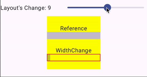
Take for example the below divider, where we change the layout width
    @Composable
    private fun DividerLayoutWidthChanged(layoutWidth: Int) {
        Divider(modifier = Modifier
            .height(20.dp)
            .layout { measurable, constraints ->
                val placeable = measurable.measure(constraints)
                layout(
                    width = layoutWidth.dp.roundToPx(),
                    height = placeable.height
                ) { placeable.place(0, 0) }
            }
        )
    }
As we modify the width, we thought the divider’s length would change. But it didn’t. Instead, confusingly 😕
- It just got moved around, like placement functionality.
- And sometimes, no visual different change as we change the width size.
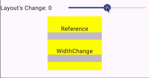
This is not a bug. They are legitimate. Just confusing if we don’t have the right context of what it’s doing.
Here, I attempt to demystify it.
Custom Layout Basic
In order to know this well, let’s get back to the basic of Custom Layout (where we can create our own Jetpack Compose component).
As shown below, in any Custom Layout, we have to
- Measure — using the Constraint of the parents, to determine the sizes of each item wrapped by the component
- Layout — setting the width and height of the Layout, and deciding the placement for each item wrapped by the component

At the Composable Component level, it looks something like the one below.
@Composable
fun CustomLayout(modifier: Modifier = Modifier, content: @Composable () -> Unit) {
    Layout(
        modifier = modifier,
        content = content
    ) { measurables, constraints ->

        // Measure
        // ....

        // Layout
        // ...
    }
}
At the Modifier Level (where one can modify any Composable View), it looks something like the one below.
modifier = Modifier
    .layout { measurable, constraints ->
        // Measure
        // ....

        // Layout
        // ...
    }
Given the similarity, this article will focus on the Modifier Level’s layout, which is also the “mysterious width” of the divider example above used.
Measuring
As mentioned, at this stage, we’re measuring the wrap items, by applying the constraint of the parent.
Constraint
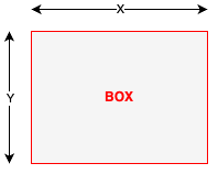
If we have the below Box
Box(modifier = Modifier
    .width(x)
    .height(y)
    .layout { measurable, constraints ->
        // Measure
        val placeable = measurable.measure(constraints)

        // Layout
        // ...
    }
Note, all the example in this measuring is assumign the Layout is based on the original constraints
// Layout
layout(constraints.maxWidth, constraints.maxHeight) {
    placeable.place(0, 0)
}
the placeable above is actually the Box itself. We are taking the constraints that was originally given ( x and y in our case above), and apply it to the placeable.
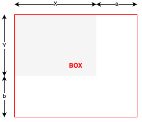
However, if we’re to add some offset to the constraint when applying on the placeable
Box(modifier = Modifier
    .width(x)
    .height(y)
    .layout { measurable, constraints ->
        // Measure
        val placeable = measurable.measure(constraints.offset(a, b))

        // Layout
        // ...
    }
We will then get a larger box. But the layout (in grey color below) still is the same.
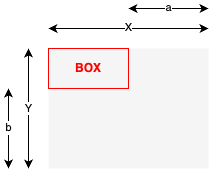
Of course, we can deduct the offset too.
Box(modifier = Modifier
    .width(x)
    .height(y)
    .layout { measurable, constraints ->
        // Measure
        val placeable = measurable.measure(constraints.offset(-a, -b))

        // Layout
        // ...
    }
Min and Max of Width and Height
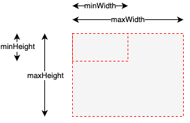
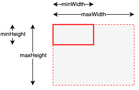
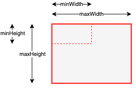
In the above, the dimension is just Width and Height. However, in reality, there are 4 main properties of constaint, which is
minWidthminHeightmaxWidthmaxHeight.
When we just set the Width and Height, we are making the
minWidth = maxWidthminHeight = maxHeight
But when we have different values for the min and max, this provides some level of flexibility in how the size of the placeable
When we have
Box(modifier = Modifier
.width(x)
.height(y)
.layout { measurable, constraints ->
// Measure
val looseConstraints = constraints.copy(
minWidth, maxWidth, minHeight, maxHeight
)
val placeable = measurable.measure(looseConstraints)
// Layout
// ...
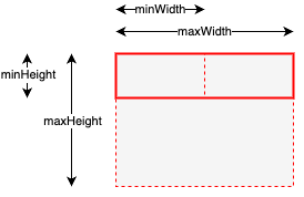
}If there is no content within the box
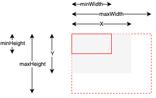
Or even if the content is smaller than the min size, then the min size of the box is retained.
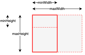
But when we have a component length longer than the min length, it will stretch the box.
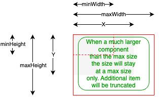
But if the component within the box goes beyond the max size, the max size is retained. E.g. when a text is longer, it will be moved to the next line expanding vertically instead of horizontally.
From here, we can clearly see how the min and max width control what the Box size is limited to.
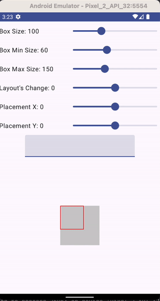
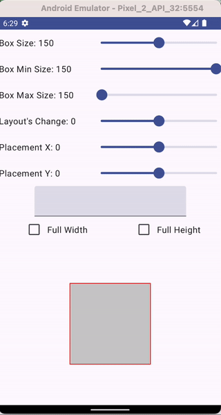
To illustrate this better, below is a sample App I created. You can see the box is small initially, and expanded to the max, before going to the next line. The vertical height also expanded as we have more text until finally, it reached the max height, then the new text get truncated.
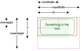
Fill Max Width/Height/Size Content
From the above, we know that when we have the flexible size of Box (i.e. min < max), then the actual size of the Box will be determined by the content.
If we have content that is using either fillMaxWidth(), fillMaxHeight(), or fillMaxSize(), it will always stretch out the max limit of the Box length accordingly.
Let’s look at each, starting with the default content without any modifier
Box(modifier = Modifier
    .width(x)
    .height(y)
    .layout { measurable, constraints ->
        // Measure
        val looseConstraints = constraints.copy(
            minWidth, maxWidth, minHeight, maxHeight
        )
        val placeable = measurable.measure(looseConstraints)

        // Layout
        // ...
    } {
        Box()
    }
Then it will go for min-width and min-height
If we have fillMaxWidth()
Box(modifier = Modifier
    .width(x)
    .height(y)
    .layout { measurable, constraints ->
        // Measure
        val looseConstraints = constraints.copy(
            minWidth, maxWidth, minHeight, maxHeight
        )
        val placeable = measurable.measure(looseConstraints)

        // Layout
        // ...
    } {
        Box(modifier = Modifier.fillMaxWidth())
    }
then it will take up the maximum width (the is the same behavior of Divider component)
If we have fillMaxHeight()
Box(modifier = Modifier
    .width(x)
    .height(y)
    .layout { measurable, constraints ->
        // Measure
        val looseConstraints = constraints.copy(
            minWidth, maxWidth, minHeight, maxHeight
        )
        val placeable = measurable.measure(looseConstraints)
        // Layout
        // ...
    } {
        Box(modifier = Modifier.fillMaxHeight())
    }
then it will take up the maximum height.
If we have fillMaxSize()
Box(modifier = Modifier
    .width(x)
    .height(y)
    .layout { measurable, constraints ->
        // Measure
        val looseConstraints = constraints.copy(
            minWidth, maxWidth, minHeight, maxHeight
        )
        val placeable = measurable.measure(looseConstraints)
        // Layout
        // ...
    } {
        Box(modifier = Modifier.fillMaxSize))
    }
then it will take up the maximum width and height
The below example App let me experiment where
- If we change Min Size, it will only change the non-full-length dimension
- If we change the Max Size, it will only change the full-length dimension
Layout And Placement
This is the second part of customizing our component, where we size and place the layout.
modifier = Modifier
    .layout { measurable, constraints ->
        // Measure
        // ....

        // Layout
        // 1. Size the Layout
        // 2. Place It
    }
The simplest way is to just size it to the constraint and place it at (0, 0).
// Layout
layout(constraints.maxWidth, constraints.maxHeight) {
    placeable.place(0, 0)
}
But what’s the impact if we size it differently?
Concept
Before we proceed, to learn about Layout, there are two important points.
- Each component is contained by an outer layer. I called the Container.
- For each component, there’s a Layout that will contain the content. E.g. for a BOX Component, there’s really a Layout that will contain the Placeable Box.
For simplicity, let me illustrate it in the diagram below.
- yellow — container
- grey — layout
- red-boundary — placeable
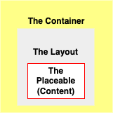
The inner layers are not necessarily sized smaller than the outer layer, to ensure we can see their relationship (which contains which).
Container {
    Box(modifier = Modifier
        .layout { measurable, constraints ->
            // Measure
            val placeable = measurable.measure(constraints)

            // Layout
            layout(constraints.maxWidth, constraints.maxHeight) {
                placeable.place(0, 0)
            }

    }) {
       Content()
    }
}
With the terminology in place, we are ready to learn further
Layout Sizing
The layout sizing rule goes as below
If there’s no size given, the box will take the container’s size.
Container(modifier = Modifier.size(containerSize) {
    Box()
}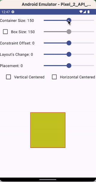
If there’s a box size, the layout size will then be determined by the box size from 0 up to the container size. The layout size cannot be greater than the container size, even if the box size exceeds the container size
Container(modifier = Modifier.size(containerSize) {
    Box(modifier = Modifier.size(boxSize))
}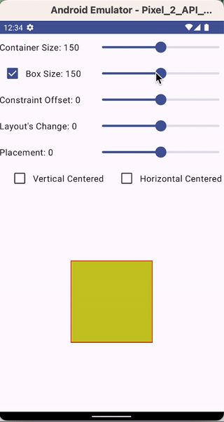
If we use a layout modifier, we can then modify the layout size ourselves.
Most of the time, the layout is dependent on the parent's constraints
// Layout
layout(constraints.maxWidth, constraints.maxHeight) {
    placeable.place(0, 0)
}
However, in our case here, we mimic the Negative Padding last example, where use the peaceable width and height instead and modified by a layout change value.
// Layout
layout(placeable.width + layoutchange, placeable.height + layoutchange) {
    placeable.place(0, 0)
}
If our layout size were dependent on a defined box size, then adjusting the layout size will either increase or decrease it evenly relative to the container’s size
If our layout size were dependent on a container’s size, then adjusting the layout size bigger will increase evenly relative to the container’s size, however, when reducing it, it will be aligned top-left to the container.
This is because, without setting any size to the box, the box constraint to 0 min, parent size max range.
This behavior can be altered if the parent container can have Vertical and Horizontal Center Alignmenet (e.g. the parent container is a Column)

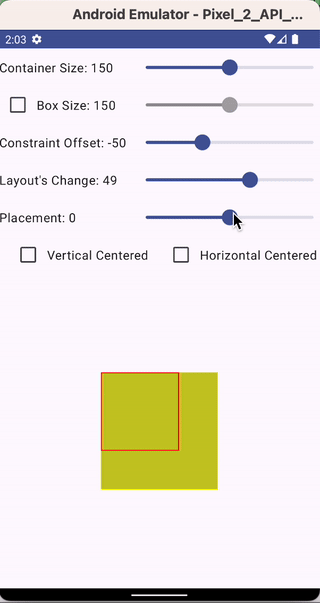
Placement
The default placement is always (0, 0) relative to the top-left of the Layout. However, if the Layout is negative (both height and width), then it will be relative to the bottom-right of the Layout.
The placement change will then be adjusted heading toward the right, bottom when increasing the placement value positively.
Explanation of the Tricky Weird Negative Padding
As promised in the article below, there’s a way to achieve negative padding correctly. But how that can be achieved is not easily understood. Here, I’m trying to make that understood easily
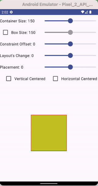
Here with I will show both Negative Padding and Positive Padding, but using a Box instead of a Divider example below
Negative Padding
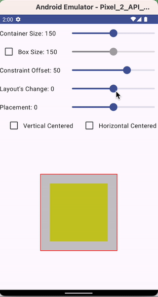
To enable negative padding, one will first adjust the enlarged Constraint Offset of the placeable. You’ll notice
- the peaceable (in the red border line) increase.
- The Layout also increases (as the Layout is dependent on the Placeable size).
- The increment is increased evenly relative to the parent container since its size is dependent on the parent container.

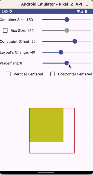
Upon the increase of the Placeablea Size and the Layout size (after the Constraint is increased), now decrease the Layout Size (to the size of the Constraint is increased)
This will
- Shrink the Layout size to its original size
- Realign the Layout to the Parent Container again since the size now matches with the parent container.
You’ll also notice since the Placeable size didn’t change, it gives an illusion that the Layout adjustment did change the size. In actual fact, it is changing the (invisible) Layout size without changing the (visible) Placeable size.
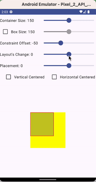
Finally, readjust the placement negatively of 50% of the value that changed (to the layout and constraints) to gain even negative padding on all sides.
Positive Padding
For Positive Padding, we first shrink the Constraints. You’ll notice
- the peaceable (in the red border line) shrink.
- The Layout also shrinks (as the Layout is dependent on the Placeable size).
- The increment is shrink-aligned left-top relative to the parent container since its size is dependent on the parent container.
Upon the shrink of the Placeablea Size and the Layout size (after the Constraint is reduced), now increase the Layout Size (to the size of the Constraint is increased)
This will
- Increase the Layout size to its original size (match the Parent Container size)
- There’s no realignment needed since it’s already aligned top-left always when the smaller layout grows slowly to match the parent container size
You’ll also notice since the Placeable size didn’t change, it gives an illusion that the Layout adjustment did change the size. In actual fact, it is changing the (invisible) Layout size without changing the (visible) Placeable size.
Finally, readjust the placement positively of 50% of the value that changed (to the layout and constraints) to gain even positive padding on all sides.
It’s tricky, but they are all legitimate
Now we have learned that if we’re to look at the original confusing change
And also the added information illustration, where the layout is made visible, is now explained well.
There’s quite a bit to absorb on what is shared above. Slowly digest it, and experiment with it using the sample design here (e.g. all samples above are created). After a while, hopefully, you can have a great grasp of how things work, and be able to customize your component confidently.


