

Decision Tree Regressor — A Visual Guide with Scikit Learn
Understanding Decision Trees without Math
In this article, we will implement the DecisionTreeRegressor from scikit-learn in python to visualize how this model works. We will not use any mathematical terms, but we will use visualization to demonstrate how a decision tree regressor works, and the impact of some hyperparameters.
For the context, a Decision Tree Regressor tries to predict a continuous target variable by cutting the feature variables into small zones, and each zone will have one prediction. We will begin with one continuous variable and then two continuous variables. We will not use categorical variables since for decision trees, continuous variables are ultimately treated like categorical data when the splits are made.
We will mainly study the impact of two hyperparameters that can be quite intuitive to understand: max depth and min_samples_leaf. Other hyperparameters are similar, the main idea is to limit the size of the rules.
One Non-Linear variable
Let’s use some simple data, with only feature variable x.
# Import the required libraries
from sklearn.tree import DecisionTreeRegressor
import numpy as np
# Define the dataset
X = np.array([[1], [3], [4], [7], [9], [10], [11], [13], [14], [16]])
y = np.array([3, 4, 3, 15, 17, 15, 18, 7, 3, 4])
And we can visualize the data in an (x,y) plot
import matplotlib.pyplot as plt

# Plot the dataset with the decision tree splits
plt.figure(figsize=(10,6))
plt.scatter(X, y, color='blue')
plt.show()
And in the following image, for the first cut, we can visually guess two possible splits as shown below:

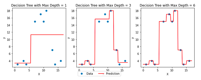
Now, the Decision Tree Regressor model determines exactly which split is better. Let’s specify the argument max_depth=1, to get only one split:
from sklearn.tree import DecisionTreeRegressor

# Fit the decision tree model
model = DecisionTreeRegressor(max_depth=1)
model.fit(X, y)

# Generate predictions for a sequence of x values
x_seq = np.arange(0, 17, 0.1).reshape(-1, 1)
y_pred = model.predict(x_seq)
If we decide to get 4 regions, we can try max_depth=2, and we get:

We can then visualize how the max_depth hyperparameter impacts the final model with the image below:
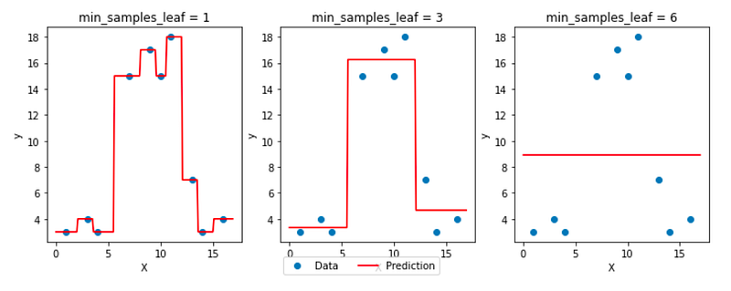
We can also plot the same with another hyperparameter min_samples_leaf, which is the minimum number of observations that should be in the final regions (that we call leaves because at the end of a tree’s ramification, we find leaves!)
One “Linear” Feature
Decision Tree Regressor is a non-linear regressor. We can see how it behaves/models the data from the previous examples. What happens to “linear” data?
Let’s take this simple example of perfectly linear data:
import numpy as np

X=np.arange(1,13,1).reshape(-1,1)
y=np.concatenate((np.arange(1,12,1),12), axis=None)

plt.scatter(X,y)
You can see that the relationship is very simple: y = x!
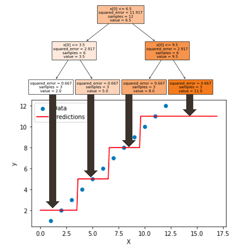
If we use the classic decision tree visualization, you may immediately see how the model behaves.

Now, we can create the same plot below. And sometimes people are surprised to SEE that a Decision Tree divides the perfect line into regions and gives a few values for the predictions, even for a linear dataset.
Then people would comment by saying that the model is not adapted at all for this dataset, and we should not use it.
Now, the truth is that you can not know the behavior of the dataset in advance. And that is what the No Free Lunch Theory is all about.
And in practice, you can apply several models such as linear regression and decision trees. If there is one model that is significant more performant than another, then you can conclude about the linear vs. non-linear behavior of the data.
Two continuous features
For two continuous variables, we have to create a 3D plot.
First, let’s generate some data.
import numpy as np
from sklearn.tree import DecisionTreeRegressor
import plotly.graph_objs as go
from plotly.subplots import make_subplots

# Define the data
X = np.array([[1, 2], [3, 4], [4, 5], [7, 2], [9, 5], [10, 4], [11, 3], [13, 5], [14, 3], [16, 1],
              [10, 10], [16, 10], [12, 10]])
y = np.array([3, 4, 3, 15, 17, 15, 18, 7, 3, 4,8,10,13])
Then can create the model:
# Fit the decision tree model
model = DecisionTreeRegressor(max_depth=3)
model.fit(X, y)
Finally, we can create the 3D plot with plotly
# Create an interactive 3D plot with Plotly
fig = make_subplots(rows=1, cols=1, specs=[[{'type': 'surface'}]])

fig.add_trace(go.Surface(x=x_seq, y=y_seq, z=z_seq, colorscale='Viridis', showscale=True,opacity = 0.5),
              row=1, col=1)

fig.add_trace(go.Scatter3d(x=X[:, 0], y=X[:, 1], z=y, mode='markers', marker=dict(size=5, color='red')),
              row=1, col=1)

fig.update_layout(title='Decision Tree with Max Depth = {}'.format(max_depth),
                  scene=dict(xaxis_title='x1', yaxis_title='x2', zaxis_title='Predicted Y'))

fig.show()
We can compare different values of depth as shown in the image below:
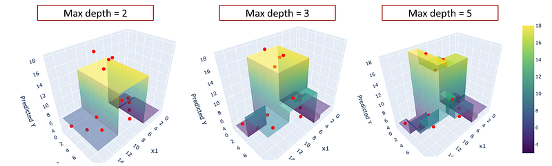
If you create a plot with python, you can manipulate it to see the visualization from different angles.
Conclusion
Visualizing the prediction of a model for simple datasets is an excellent way to understand how the models work.
In the case of decision trees, they already are quite intuitive to understand with the visualization of the rules in form of a tree. The classic visualization with x,y (and z) can be complementary.
We also can SEE that the model is highly non-linear. And the dataset does not need any scaling.
I write about machine learning and data science and I explain complex concepts in a clear way. Please follow me with the link below and get full access to my articles: https://medium.com/@angela.shi/membership


