
Debunking the Myth of “Average” Stock Returns
The road is a lot bumpier than it looks like in a spreadsheet

If you’re going to invest in the stock market, you need to accept an inescapable truth:
There is no such thing as an “Average year” in the stock market.
You’ve heard financial advisors and writers say that the historical long-term returns in the stock market have been around 10% per year. But there may never be a single year for the rest of your life where returns are exactly 10%.
In today’s post, we look at how bumpy the ride can be for long-term investors.
The TLDR
- On average, stocks have returned about 10% per year
- In the past century, the S&P has only returned between 8%-12% only six times
- The market has had years as great as +54% and as terrible as losing 43%
- Even years with positive can have massive intra-year drops
- Read to the end to learn why long-term investors are rewarded for stomaching this volatility
There’s no such thing as an average year in the stock market
The following chart from the research team at Dimensional Fund Advisors shows the annual return of the S&P 500 between 1926–2019
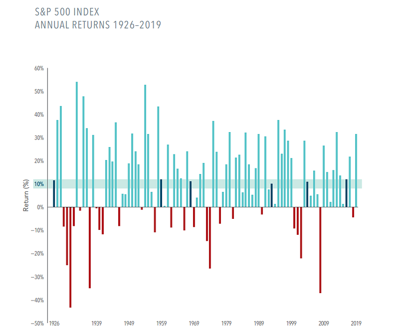
If you knew nothing about the stock market, would you look at this chart and guess that the average return of the S&P 600 has been about 10% over the past century?
No.
Only six times in the past 97 years has the U.S. stock market returned anything remotely close to the 10% average.
In good years, the stock market routinely returns 20% in a single year. But, in bad years, the drop can be equally as strong.
To this point, we have had more good years than bad — 69 positive years vs. 25 negative years — which is how we land on a historical 10% average return.
Even good years can feel painful
(Below is an excerpt from my book The Rational Investor.)
Volatility, and often extreme volatility, is the rule, not the exception, in the stock market. It’s incredibly rare for the stock market to go up and to the right for an entire year without major dips along the way.
There is always drama.
More research from Dimensional fund advisors highlights the reality that there are always significant drops in the market — even in good years.
The following chart shows the total return of the Russell 3,000 Index (approximation of the entire U.S. stock market) alongside the biggest dip within the same year from January 2002 to December 2021.
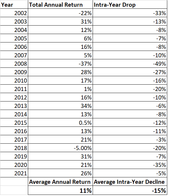
Data source: Dimensional fund advisors. Chart created by the author.
For example, in 2010, the market returned a very nice 17%. Looking back at it years later, it’s tempting to conclude that if the market returned 17%, it must have been pretty smooth sailing for the entire year.
Nope.
The market was down as much as 16% in that same year. 2010 was the year of the infamous “Flash Crash,” where the Dow Jones lost 9% of its value in 1-hour. Even more amazingly, it recovered 70% of that loss before the end of the day.
Looking at the returns from 2002 to 2021 — a period which included 9/11, the dot com crash, the great financial crisis, and COVID-19 — we see the market returned 11% per year. The market also had an average intra-year drop of 15% over that period.
Volatility is inescapable, and a scary narrative is usually attached to the volatility. Someone always gives you a reason to be fearful and sell — even if that’s not in your best interest.
Zoom out
Here’s the good news:
The further you zoom out, the quieter the day-to-day market noise gets.
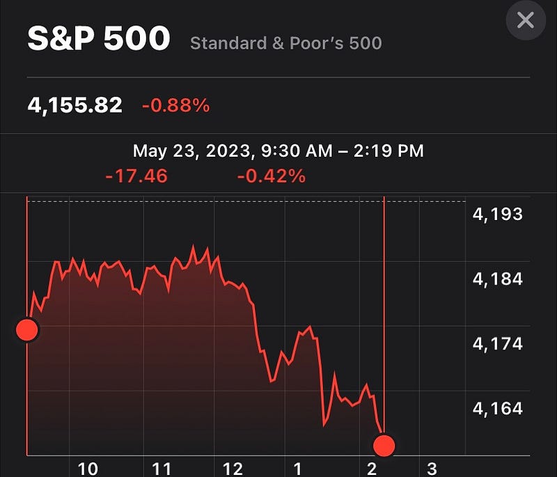
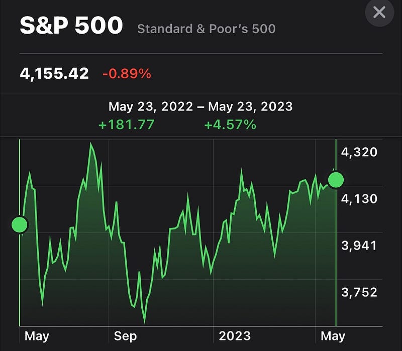
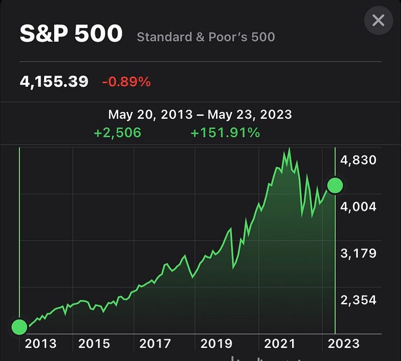
Here are a few screenshots I took off my phone that show the returns of the S&P 500 over various timeframes at the time I wrote these words.
One day:
One year:
10 years:
39 years:
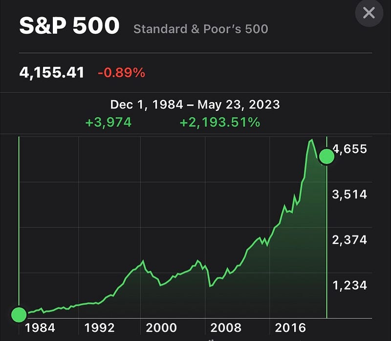
The challenge as a long-term investor is to stop thinking in days, months, or even years and focus on the long run.
Consider subscribing to my Substack for more articles like this.
This article is for informational purposes only. It should not be considered Financial or Legal Advice. Not all information will be accurate. Consult a financial professional before making any major financial decisions.