
Date Picker in Material 3 Jetpack Compose (with Examples)

In this article, we’ll learn how to implement the date picker in Material 3 Jetpack Compose.
First, What is a Date Picker?
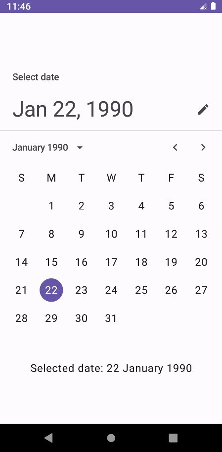
A date picker is a UI element that allows users to select a date from a calendar. It looks like this:

Let’s see how to implement it in the Android Studio.
First, create an empty Compose project and open the MainActivity.kt. Create a MyUI() composable and call it from the onCreate() method. We’ll write our code in it.
import android.os.Bundle
import androidx.activity.ComponentActivity
import androidx.activity.compose.setContent
import androidx.compose.foundation.layout.PaddingValues
import androidx.compose.foundation.layout.Arrangement
import androidx.compose.foundation.layout.Column
import androidx.compose.foundation.layout.fillMaxSize
import androidx.compose.foundation.layout.height
import androidx.compose.material3.Button
import androidx.compose.material3.DatePicker
import androidx.compose.material3.DisplayMode
import androidx.compose.material3.DatePickerDialog
import androidx.compose.material3.DateRangePicker
import androidx.compose.material3.ExperimentalMaterial3Api
import androidx.compose.material3.MaterialTheme
import androidx.compose.material3.SelectableDates
import androidx.compose.material3.Surface
import androidx.compose.material3.Text
import androidx.compose.material3.TextButton
import androidx.compose.material3.rememberDatePickerState
import androidx.compose.material3.rememberDateRangePickerState
import androidx.compose.runtime.Composable
import androidx.compose.runtime.getValue
import androidx.compose.runtime.mutableLongStateOf
import androidx.compose.runtime.mutableStateOf
import androidx.compose.runtime.remember
import androidx.compose.runtime.setValue
import androidx.compose.ui.Alignment
import androidx.compose.ui.Modifier
import androidx.compose.ui.unit.dp
import java.text.SimpleDateFormat
import java.util.Calendar
import java.util.Date
import java.util.Locale

class MainActivity : ComponentActivity() {
    override fun onCreate(savedInstanceState: Bundle?) {
        super.onCreate(savedInstanceState)
        setContent {
            YourProjectNameTheme {
                Surface(
                    modifier = Modifier.fillMaxSize(),
                    color = MaterialTheme.colorScheme.background
                ) {
                    Column(
                        modifier = Modifier
                            .fillMaxSize(),
                        verticalArrangement = Arrangement.Center,
                        horizontalAlignment = Alignment.CenterHorizontally
                    ) {
                        MyUI()
                    }
                }
            }
        }
    }
}

@Composable
fun MyUI() {

}
Material 3 Jetpack Compose provides DatePicker API. It was added in 1.2.0-alpha02.
@ExperimentalMaterial3Api
@Composable
fun DatePicker(
    state: DatePickerState,
    modifier: Modifier = Modifier,
    dateFormatter: DatePickerFormatter = remember { DatePickerDefaults.dateFormatter() },
    title: (@Composable () -> Unit)? = {
        DatePickerDefaults.DatePickerTitle(
            displayMode = state.displayMode,
            modifier = Modifier.padding(DatePickerTitlePadding)
        )
    },
    headline: (@Composable () -> Unit)? = {
        DatePickerDefaults.DatePickerHeadline(
            selectedDateMillis = state.selectedDateMillis,
            displayMode = state.displayMode,
            dateFormatter = dateFormatter,
            modifier = Modifier.padding(DatePickerHeadlinePadding)
        )
    },
    showModeToggle: Boolean = true,
    colors: DatePickerColors = DatePickerDefaults.colors()
)state— To manage the state of the date picker.modifier— The Modifier to be applied to this date picker.dateFormatter— The date format to be used while displaying the date.title— The title to be displayed in the date picker.headline— The headline to be displayed in the date picker.showModeToggle— This is to toggle between the picker and input mode.colors— Colors of the date picker at different states.
Simple Date Picker Example:
The state is a mandatory parameter. We can get the state from the rememberDatePickerState() method.
@Composable
@ExperimentalMaterial3Api
fun rememberDatePickerState(
    initialSelectedDateMillis: Long? = null,
    initialDisplayedMonthMillis: Long? = initialSelectedDateMillis,
    yearRange: IntRange = DatePickerDefaults.YearRange,
    initialDisplayMode: DisplayMode = DisplayMode.Picker,
    selectableDates: SelectableDates = object : SelectableDates {}
): DatePickerStateinitialSelectedDateMillis— It is the initial selection of a date. Provide a null to indicate no selection.initialDisplayedMonthMillis— Initial selection of a month to be displayed to the user. By default, in case an initialSelectedDateMillis is provided, the initial displayed month would be the month of the selected date. Otherwise, in case null is provided, the displayed month would be the current one.yearRange— The minimum and maximum years for the selection.initialDisplayMode— There are two modes — picker and input. We can set the default mode here.selectableDates— We can restrict the dates that are not allowed to be selected.
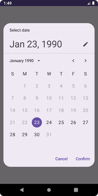
Example:
@OptIn(ExperimentalMaterial3Api::class)
@Composable
fun MyUI() {
    val calendar = Calendar.getInstance()
    calendar.set(1990, 0, 22) // add year, month (Jan), date

    // set the initial date
    val datePickerState = rememberDatePickerState(initialSelectedDateMillis = calendar.timeInMillis)

    DatePicker(
        state = datePickerState
    )

    val formatter = SimpleDateFormat("dd MMMM yyyy", Locale.US)
    Text(
        text = "Selected date: ${formatter.format(Date(datePickerState.selectedDateMillis!!))}"
    )
}
Output:
Let’s select 10 Feb 2000.
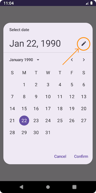
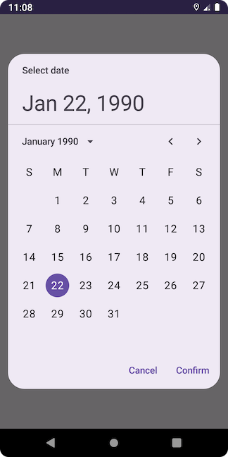
It is just a plain date picker. Let’s put it inside a dialog.
Date Picker Dialog:
Jetpack Compose provides DatePickerDialog API.
@ExperimentalMaterial3Api
@Composable
fun DatePickerDialog(
    onDismissRequest: () -> Unit,
    confirmButton: @Composable () -> Unit,
    modifier: Modifier = Modifier,
    dismissButton: @Composable (() -> Unit)? = null,
    shape: Shape = DatePickerDefaults.shape,
    tonalElevation: Dp = DatePickerDefaults.TonalElevation,
    colors: DatePickerColors = DatePickerDefaults.colors(),
    properties: DialogProperties = DialogProperties(usePlatformDefaultWidth = false),
    content: @Composable ColumnScope.() -> Unit
)onDismissRequest— It is a lambda and gets called when the user tries to dismiss the Dialog by clicking outside or pressing the back button. This is not called when the dismiss button is clicked.confirmButton— Confirm button of the dialog. The dialog does not set up any events for this button so they need to be set up by us.modifier— The Modifier to be applied to this dialog’s content.dismissButton— Dismiss button of the dialog. The dialog does not set up any events for this button so they need to be set up by us.shape— It defines the dialog’s shape as well as its shadow.tonalElevation— Elevation of the dialog.colors— The colors of the dialog.properties— It is used to customize the dialog.content— The content of the dialog (i.e. a DatePicker, for example)
Example:
@OptIn(ExperimentalMaterial3Api::class)
@Composable
fun MyUI() {
    val calendar = Calendar.getInstance()
    calendar.set(1990, 0, 22) // add year, month (Jan), date

    // set the initial date
    val datePickerState = rememberDatePickerState(initialSelectedDateMillis = calendar.timeInMillis)

    var showDatePicker by remember {
        mutableStateOf(false)
    }

    var selectedDate by remember {
        mutableLongStateOf(calendar.timeInMillis) // or use mutableStateOf(calendar.timeInMillis)
    }

    if (showDatePicker) {
        DatePickerDialog(
            onDismissRequest = {
                showDatePicker = false
            },
            confirmButton = {
                TextButton(onClick = {
                    showDatePicker = false
                    selectedDate = datePickerState.selectedDateMillis!!
                }) {
                    Text(text = "Confirm")
                }
            },
            dismissButton = {
                TextButton(onClick = {
                    showDatePicker = false
                }) {
                    Text(text = "Cancel")
                }
            }
        ) {
            DatePicker(
                state = datePickerState
            )
        }
    }

    Button(
        onClick = {
            showDatePicker = true
        }
    ) {
        Text(text = "Show Date Picker")
    }

    val formatter = SimpleDateFormat("dd MMMM yyyy", Locale.US)
    Text(
        text = "Selected date: ${formatter.format(Date(selectedDate))}"
    )
}
Output:

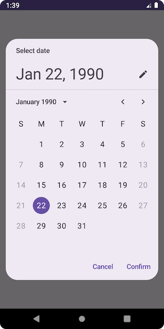
Date Picker Display Modes:
There are two display modes — Picker and Input.
Picker mode — It displays the calendar. Users can navigate to the year and month. This is what we have seen in the previous example.
Input mode — It displays the TextField. Users have to type the date using the keyboard.
By default, we can toggle between the modes using the icon button on the date picker.
Input mode looks like this:

Let’s set only one mode. We can do it by using the showModeToggle parameter of the DatePicker() method.
Picker Mode Only:
In the previous code, pass false to the showModeToggle.
DatePicker(
    state = datePickerState,
    showModeToggle = false
)
Output:
Input Mode Only:
val datePickerState = rememberDatePickerState(
    initialSelectedDateMillis = calendar.timeInMillis,
    initialDisplayMode = DisplayMode.Input
)

DatePicker(
    state = datePickerState,
    showModeToggle = false
)
Output:

Disable Specific Dates:
We can disable the specific dates using the selectableDates parameter of rememberDatePickerState() method. SelectableDates is an interface with two functions.
@ExperimentalMaterial3Api
@Stable
interface SelectableDates {
    fun isSelectableDate(utcTimeMillis: Long) = true
    fun isSelectableYear(year: Int) = true
}isSelectableDate()decides if the date representingutcTimeMillisshould be enabled or not.isSelectableYear()decides if the year should be enabled or not. When a year is defined as non-selectable, all the dates in that year will also be non-selectable.
We override these two methods to get the desired output. Let’s look at some examples.
Disable All Future Dates:
val datePickerState = rememberDatePickerState(
    initialSelectedDateMillis = calendar.timeInMillis,
    selectableDates = object : SelectableDates {
        override fun isSelectableDate(utcTimeMillis: Long): Boolean {
            return utcTimeMillis <= System.currentTimeMillis()
        }

        // users cannot select the years from 2024
        override fun isSelectableYear(year: Int): Boolean {
            return year <= 2023
        }
    }
)

DatePicker(
    state = datePickerState
)
Output:

Disable All Weekends:
val datePickerState = rememberDatePickerState(
    initialSelectedDateMillis = calendar.timeInMillis,
    selectableDates = object : SelectableDates {
        override fun isSelectableDate(utcTimeMillis: Long): Boolean {
            val calendar1 = Calendar.getInstance(TimeZone.getTimeZone("UTC"))
            calendar1.timeInMillis = utcTimeMillis
            return (calendar1[Calendar.DAY_OF_WEEK] != Calendar.SUNDAY) &&
                    (calendar1[Calendar.DAY_OF_WEEK] != Calendar.SATURDAY)
        }
    }
)

DatePicker(
    state = datePickerState
)
Output:
Set Start and End Dates:
Let’s limit the users to selecting dates between 23 Jan 1990 and 30 Jan 1990.
val calendar = Calendar.getInstance()
calendar.set(1990, 0, 22)
val startDate = calendar.timeInMillis

calendar.set(1990, 0, 30)
val endDate = calendar.timeInMillis

val datePickerState = rememberDatePickerState(
    initialSelectedDateMillis = (startDate + (24 * 60 * 60 * 1000)),
    selectableDates = object : SelectableDates {
        override fun isSelectableDate(utcTimeMillis: Long): Boolean {
            return (utcTimeMillis > startDate) && (utcTimeMillis < endDate)
        }

        override fun isSelectableYear(year: Int): Boolean {
            return (year == 1990)
        }
    }
)

DatePicker(
    state = datePickerState
)
Output:
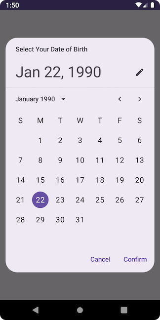
Title and Headline:
DatePicker() has two parameters — title and headline. The title shows the purpose of the date picker. By default, its value is “Select date.” The headline shows the currently selected date.
Let’s change the title.
DatePicker(
    state = datePickerState,
    title = {
        Text(
            text = "Select Your Date of Birth",
            modifier = Modifier.padding(
                PaddingValues(
                    start = 24.dp,
                    end = 12.dp,
                    top = 16.dp
                )
            )
        )
    }
)
Output:
Date Range Picker:
Jetpack Compose provides DateRangePicker() method. It lets users select a range of dates.
Example:
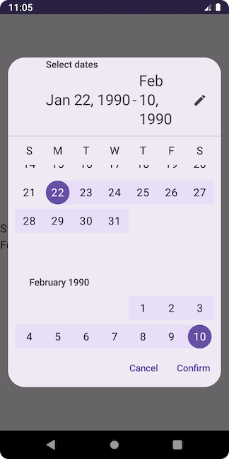
The API looks similar to the DatePicker():
@ExperimentalMaterial3Api
@Composable
fun DateRangePicker(
    state: DateRangePickerState,
    modifier: Modifier = Modifier,
    dateFormatter: DatePickerFormatter = remember { DatePickerDefaults.dateFormatter() },
    title: (@Composable () -> Unit)? = {
        DateRangePickerDefaults.DateRangePickerTitle(
            displayMode = state.displayMode,
            modifier = Modifier.padding(DateRangePickerTitlePadding)
        )
    },
    headline: (@Composable () -> Unit)? = {
        DateRangePickerDefaults.DateRangePickerHeadline(
            selectedStartDateMillis = state.selectedStartDateMillis,
            selectedEndDateMillis = state.selectedEndDateMillis,
            displayMode = state.displayMode,
            dateFormatter,
            modifier = Modifier.padding(DateRangePickerHeadlinePadding)
        )
    },
    showModeToggle: Boolean = true,
    colors: DatePickerColors = DatePickerDefaults.colors()
)
To manage its state, we need to use the rememberDateRangePickerState() method.
@Composable
@ExperimentalMaterial3Api
fun rememberDateRangePickerState(
    initialSelectedStartDateMillis: Long? = null,
    initialSelectedEndDateMillis: Long? = null,
    initialDisplayedMonthMillis: Long? =
        initialSelectedStartDateMillis,
    yearRange: IntRange = DatePickerDefaults.YearRange,
    initialDisplayMode: DisplayMode = DisplayMode.Picker,
    selectableDates: SelectableDates = object : SelectableDates {}
)
It is also similar to the rememberDatePickerState() method, but it takes two initial dates: initialSelectedStartDateMillis and initialSelectedEndDateMillis.
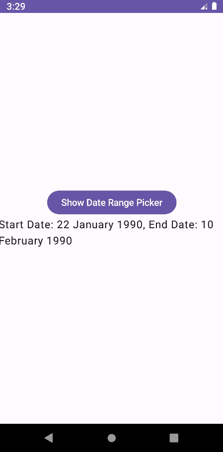
Example:
@OptIn(ExperimentalMaterial3Api::class)
@Composable
fun MyUI() {
    val calendar = Calendar.getInstance()
    calendar.set(1990, 0, 22) // year, month, date

    var startDate by remember {
        mutableLongStateOf(calendar.timeInMillis) // or use mutableStateOf(calendar.timeInMillis)
    }

    calendar.set(1990, 1, 10) // year, month, date

    var endDate by remember {
        mutableLongStateOf(calendar.timeInMillis) // or use mutableStateOf(calendar.timeInMillis)
    }

    // set the initial dates
    val dateRangePickerState = rememberDateRangePickerState(
        initialSelectedStartDateMillis = startDate,
        initialSelectedEndDateMillis = endDate
    )

    var showDateRangePicker by remember {
        mutableStateOf(false)
    }

    if (showDateRangePicker) {
        DatePickerDialog(
            onDismissRequest = {
                showDateRangePicker = false
            },
            confirmButton = {
                TextButton(onClick = {
                    showDateRangePicker = false
                    startDate = dateRangePickerState.selectedStartDateMillis!!
                    endDate = dateRangePickerState.selectedEndDateMillis!!
                }) {
                    Text(text = "Confirm")
                }
            },
            dismissButton = {
                TextButton(onClick = {
                    showDateRangePicker = false
                }) {
                    Text(text = "Cancel")
                }
            }
        ) {
            DateRangePicker(
                state = dateRangePickerState,
                modifier = Modifier.height(height = 500.dp) // if I don't set this, dialog's buttons are not appearing
            )
        }
    }

    Button(
        onClick = {
            showDateRangePicker = true
        }
    ) {
        Text(text = "Show Date Range Picker")
    }

    val formatter = SimpleDateFormat("dd MMMM yyyy", Locale.US)
    Text(
        text = "Start Date: ${formatter.format(Date(startDate))}, End Date: ${formatter.format(Date(endDate))}"
    )
}
Output:
This is all about date picker APIs in Material 3 Jetpack Compose. I hope you have learned something new. If you have any doubts or suggestions, leave a comment below. I will respond as soon as possible.
Happy Coding!


