
DataRobot Auto ML Tutorial for Beginners 2022
Use DataRobot to build a feature list, train machine learning models, evaluate model performance, and make predictions.

DataRobot is an auto machine learning platform. In this tutorial, I will talk about how to use DataRobot to build a feature list, train machine learning models, evaluate model performance, and make predictions.
Resources for this post:
- Video tutorial for this post on YouTube
- More video tutorials on Hyperparameter Tuning
- More blog posts on Hyperparameter Tuning
Let’s get started!
Step 0: Prepare Data (Optional)
The dataset used for this tutorial is the breast cancer dataset from sklearn. You can follow this notebook to export the train and test dataset as csv files. Alternatively, you can use your own dataset to follow through the tutorial. The breast cancer dataset is for binary classification models, so using a dataset with binary labels is suggested if you would like to follow the tutorial step-by-step.
Step 1: Login DataRobot
After logging into the DataRobot app, you will see the homepage screen below. DataRobot updates the user interface frequently, so you may see a slightly different screen that reflects a newer version.
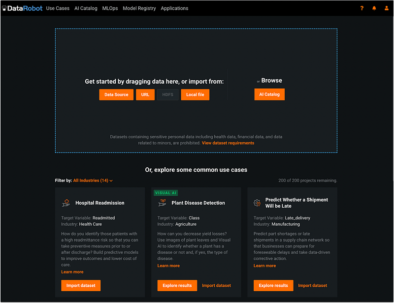
Step 2: Import Data into DataRobot
We can import data from different data sources. In this example, we will import the breast cancer training dataset from my computer (the dataset was downloaded in step 0) by clicking the orange button Local file. After the dataset is imported, we need to enter the target variable for the project.
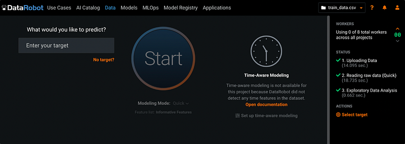
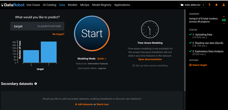
Step 3: Enter Target Variable
The breast cancer prediction dataset has a binary target variable called target. It is an indicator variable with 0 and 1 values. 0 means the patient does not have breast cancer, and 1 means the patient has breast cancer.
After entering the target variable, DataRobot automatically creates a bar chart for the variable.
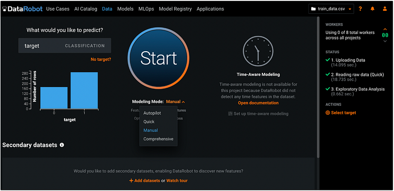
Step 4: Choose Modeling Mode
DataRobot provides four different modeling modes:
- Autopilot selects the best predictive models for the target.
- Quick runs selected models at max sample size.
- Manual runs user-selected models only.
- Comprehensive runs all the repository models, so it can take a long time to run.
The default mode is Quick. We will choose the model Manual to manually select the models.
Step 5: Go to Data Page
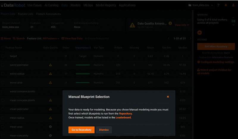
After clicking Start, DataRobot automatically assesses the quality of the dataset. The progress of the assessment shows on the right-hand side of the screen. After the assessment completes, a window pops up and asks us to choose between Go to Repository or Dismiss. Let’s choose Dismiss for now because we would like to examine the features before choosing models from the repository.
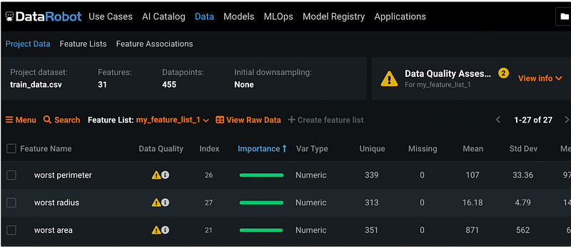
Step 6: Data Quality Assessment
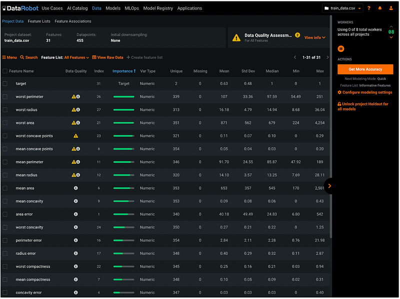
After clicking Dismiss, we will see the data summary page with information such as the dataset name, the number of features, the number of records, the number of missing values for each feature, etc.
- The first column is Feature Name. The features are sorted in descending order based on feature importance by default. But we can change the sorting value by clicking the header of the columns. The sorting results can be switched between ascending order and descending order by clicking the header.
- The second column is Data Quality. It shows warnings about potential data quality issues such as target leakage and outliers. For example, the first feature
worst perimeteris identified as a target leakage variable with outliers. If based on the domain knowledge, we know that it is not a target leakage variable, then we can ignore the target leakage warning. If we plan to use a model that’s not sensitive to outliers, the warning about outliers can be ignored as well. The Data Quality warnings do not prevent users from moving to the next steps. It just helps us to quickly check potential issues. - The third column is Index. It represents the order of the input dataset. For example, the variable
targethas the index of 31. That means it’s the 31st variable in the input dataset. - The fourth column is Importance. It shows as a green bar representing the strength of the relationship with the target.
- The fifth column is Var Type. We can see that all the variables are in numeric type for this dataset.
- Column six to column twelve has the summary statistics for each variable. They are the number of Unique values, the number of Missing values, Mean, standard deviation (Std Dev), Median, minimum value (Min), and maximum value (Max).
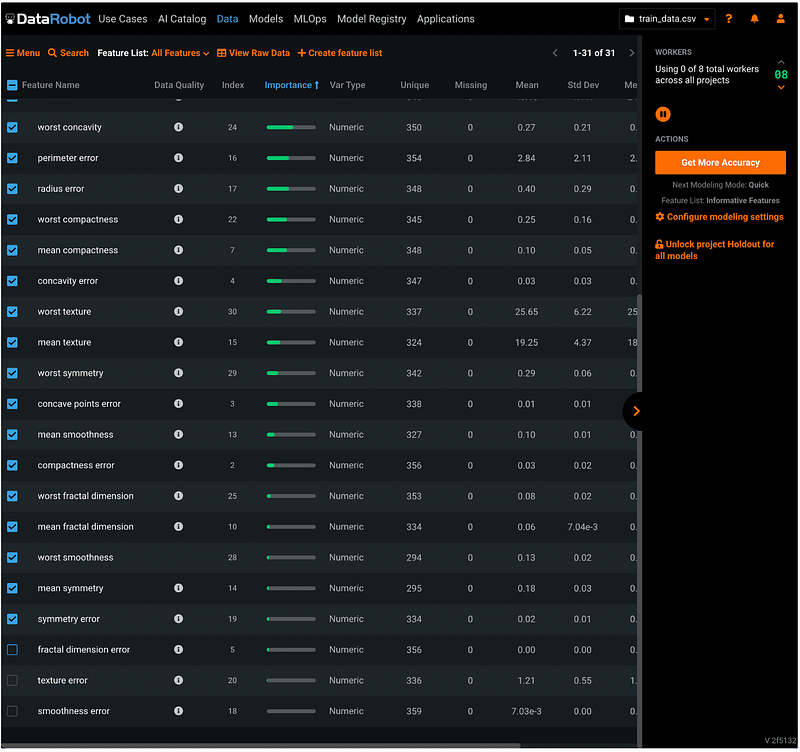
Step 7: Choose Features
To choose features for the models, click the check box next to Feature Name, then de-select the features we do not want to include in the model. I de-selected the last 3 features with the least importance.
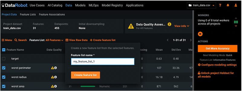
Step 8: Create Feature List
Click the orange +Create feature list, give it a name, and click Create feature list.
Step 9: Examine the Feature List Just Created
After clicking Create feature list in step 8, the default Feature List changed from All Features to the feature list name we just created. Make sure the list reflects the changes we made in step 8. In this example, my default Feature List changed to my_feature_list_1 and the last 3 features were eliminated from the list.
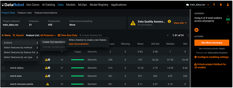
Step 10: Feature Engineering (Optional)
Feature engineering can be done by clicking the orange Menu button, then select Actions → Create f(x) transform.
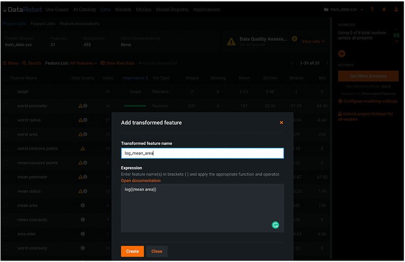
Let’s create a transformed feature called log_mean_area by entering the formula in the Expression box. We can click the orange Open documentation to check the syntax in the documentation in a new tab.
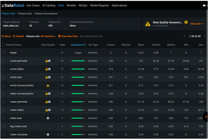
After clicking the orange Create button, we can see that the new feature log_mean_area is below the original feature mean_area , and the log version of the variable does not have any data quality warnings.
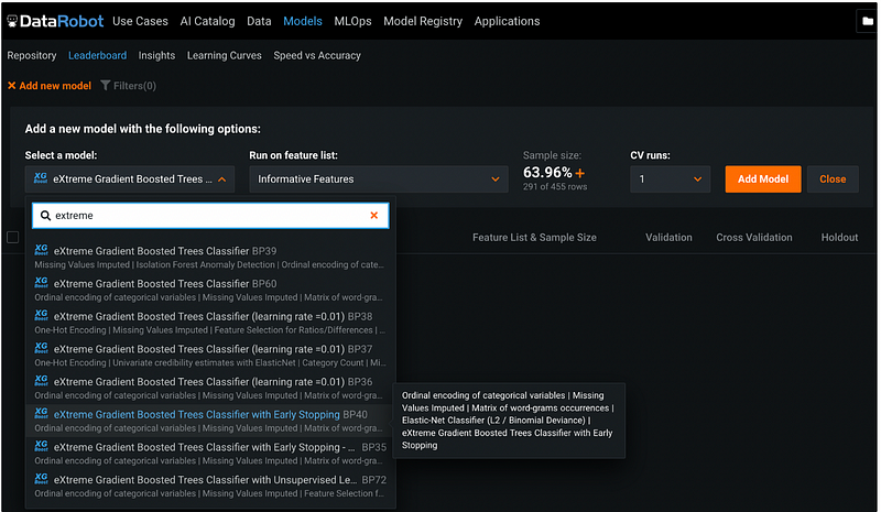
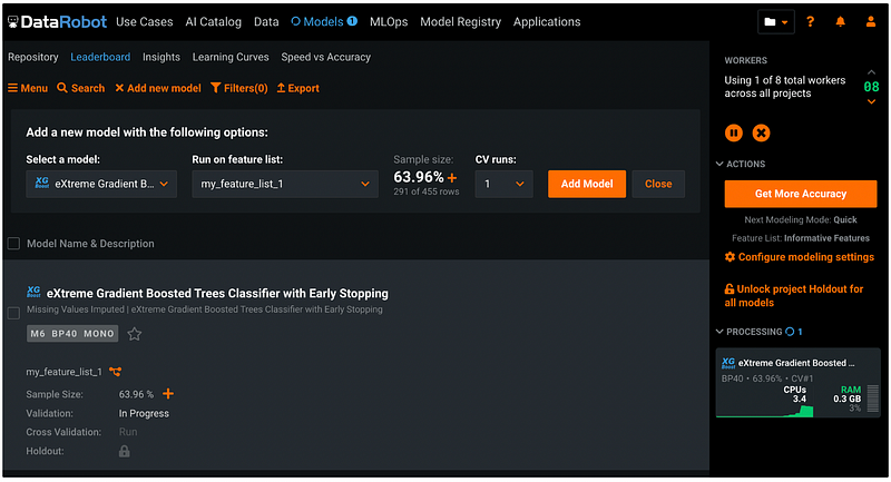
Step 11: Choose Models
Click Models from the top menu, then click +Add new model. Under Select a model, click the default model name, and search model name. We would like to choose an XGBoost model, and the search keyword extreme gives us different versions of XGBoost model. I chose the version BP40 with early stopping.
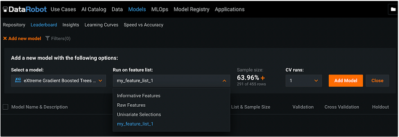
Step 12: Select Feature List
Under Run on feature list, let’s select the feature list we just created called my_feature_list_1. This is the list of predictors that we will use for the model.
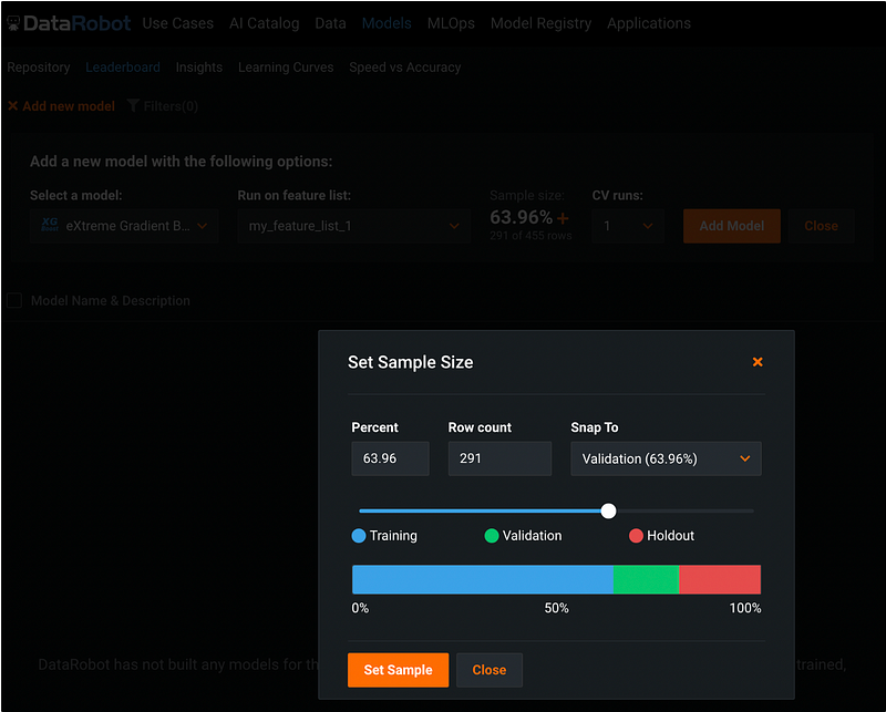
Step 13: Change Sample Size (Optional)
DataRobot set 20% of the data as holdout by default, and divide the rest 80% of the data into 5 folds for k-fold cross validation. The sample size can be changed by clicking the orange + sign under Sample size.
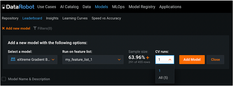
Step 14: Select Cross-Validation Runs (Optional)
Under CV runs, we can choose between running cross-validation for one fold or for all the five folds. The default is 1 fold.
Step 15: Add Model
After selecting all the model options, click the orange Add Model button, the model is added to the leaderboard. The model training process is displayed on the right pane.
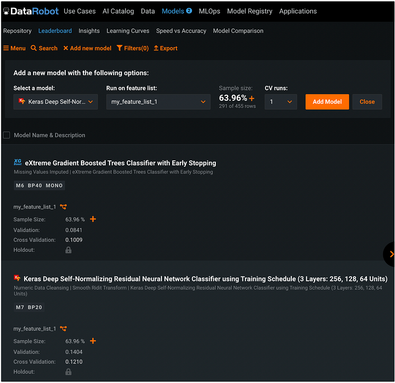
We can follow the same process to add new models by clicking the orang downward arrow under Select a model. I added a Keras neural network model to run on the same dataset and clicked Run next to Cross Validation to run the rest of the four folds.
In the output, the number next to Validation is the log loss for one fold, and the number next to Cross Validation is the average log loss for all the five folds.
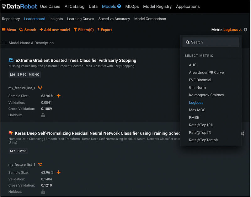
Step 16: Change Model Performance Metric (Optional)
To change the model performance metric, click the Close button next to the orange Add model button, you will see the Metric defaults to LogLoss. We can change it to other metrics such as AUC, and the model Validation and Cross-Validation results will be updated accordingly.
Step 17: Model Description
After model training is completed, click the model name, and the model pane will be expanded to show more information.
The blue Describe section has all the information about the model training process.
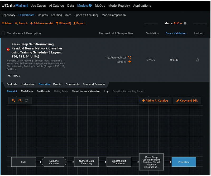
Step 17.1: Blueprint
The Blueprint shows the model training and prediction workflow.
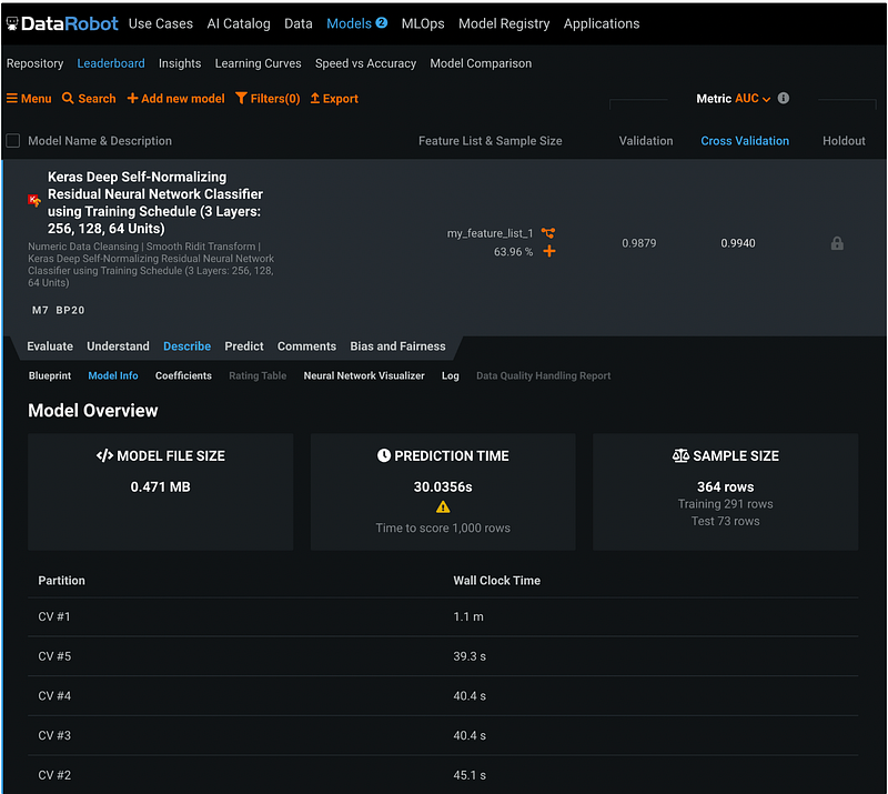
Step 17.2: Model Information
The Model Info has the model overview with file size, prediction time, and sample size information.
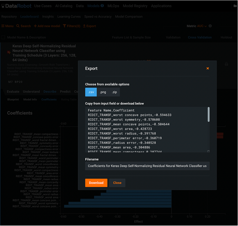
Step 17.3: Model Coefficients
Coefficients section has the model feature effect. We can sort the features by coefficients or by name.
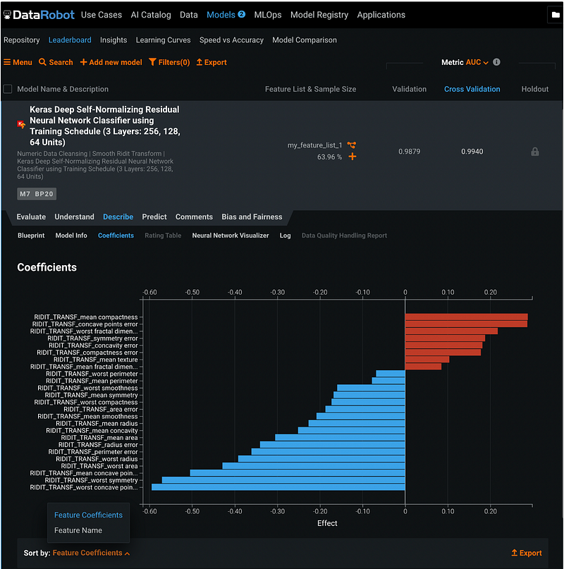
The coefficient results can be downloaded by clicking the orange Export button, choose a format, and click the orange Download button.
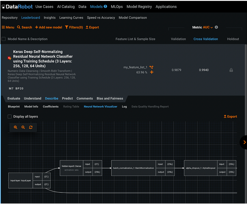
Step 17.4: Neural Net work Visualizer
Neural Net work Visualizer is specific for the neural network models. It displays the architecture of the neural network model.
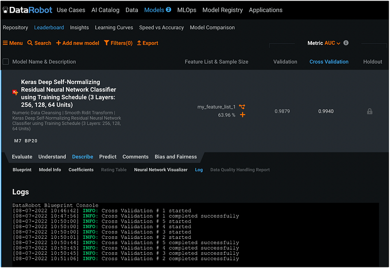
Step 17.5: Model Log
The Log tab has the logging information of the model.
Step 18: Model Evaluation
The model evaluation information is under the Evaluate tab.
Step 18.1: Lift Chart
The Lift Chart tab has the lift chart plotted for both the predicted and the actual values. Below the lift chart, there are options for Data Selection, Number of Bins, Sort Bins, and Enable Drill Down. We can hover over the markers to see the bin information.
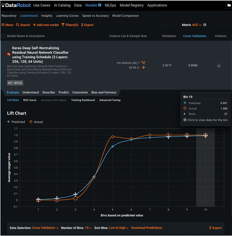
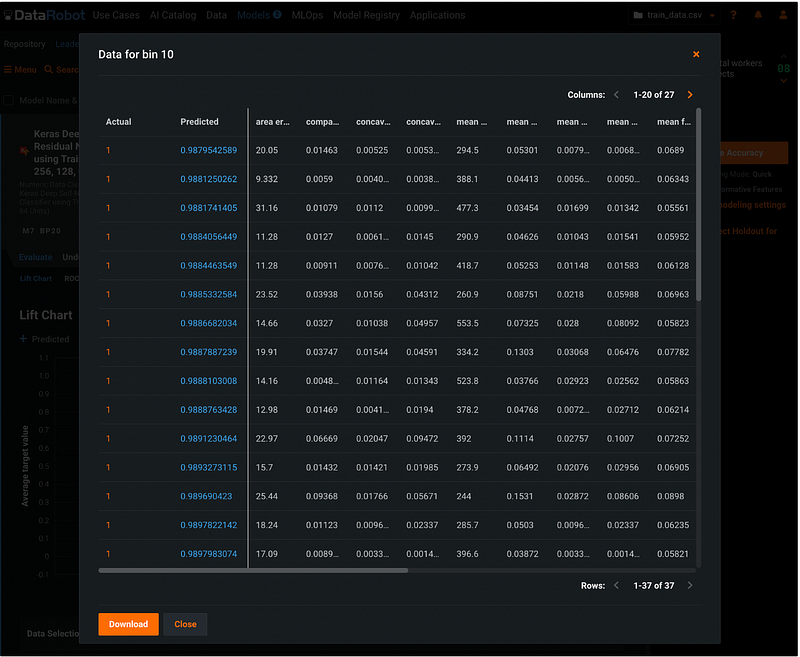
After enabling data drill down, we can click the plus sign on the marker to see the record level information.
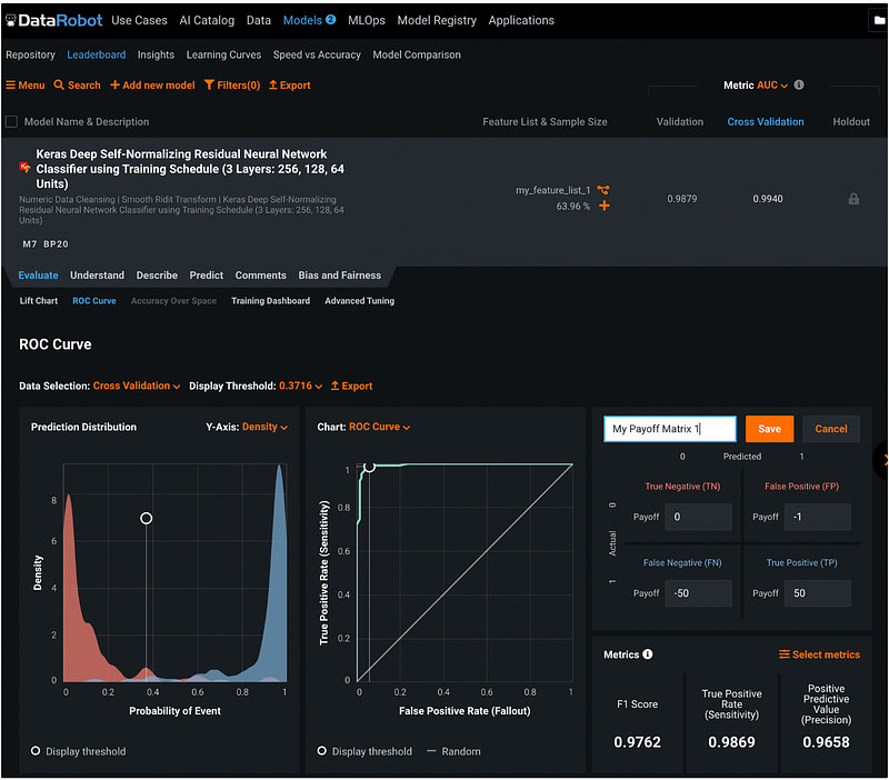
Step 18.2: ROC Curve
The ROC Curve tab has has the prediction distribution, the ROC curve, the confusion matrix, and the model performance metrics.
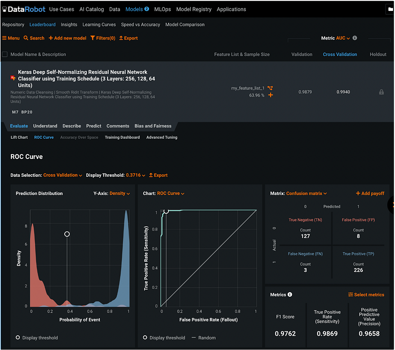
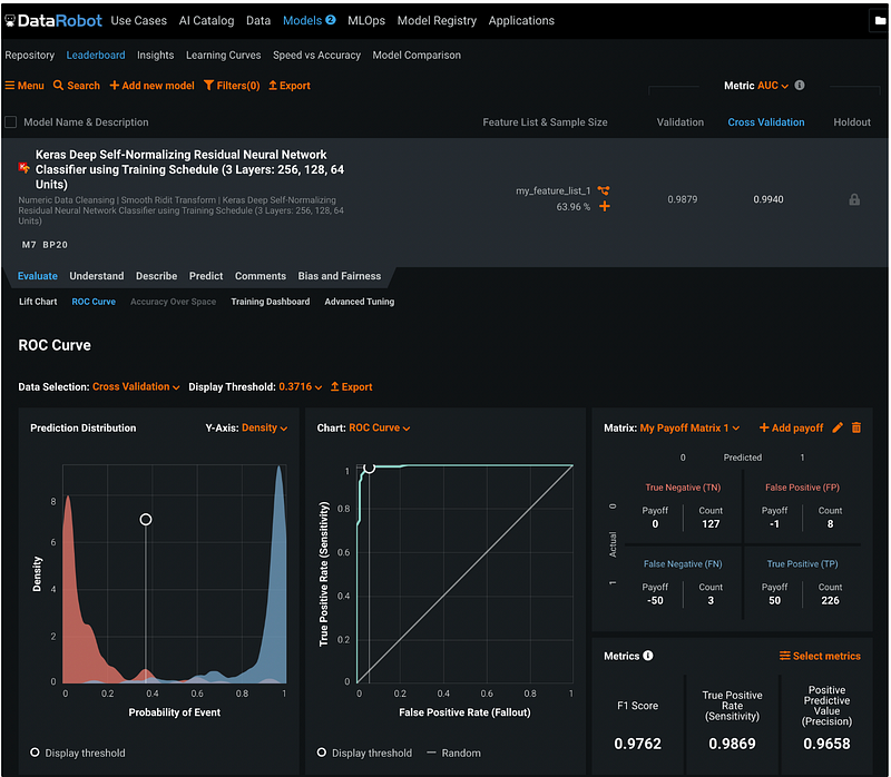
Step 18.3: Confusion Matrix and Payoff Matrix
We can click the orange + Add payoff in the Confusion Matrix pane to add the payoff to the confusion matrix and give it a name.
Clicking the orange Save button saves the payoff matrix. We can see the payoffs next to the counts in the confusion matrix after adding the payoff matrix.
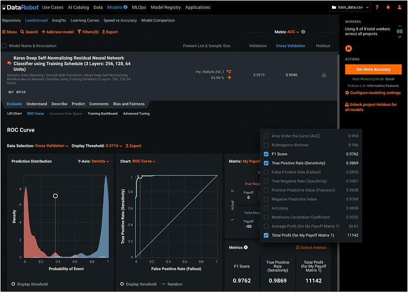
Step 18.4: Model Performance Metrics
DataRobot displays F1 Score, True Positive Rate (Sensitivity), and Positive Predictive Value (Precision) for the model by default, but we can click the orange Select metrics button to select the metrics to display. To learn more about the model performance metrics, please check out my previous tutorial How to evaluate the performance of a binary classification model.
In this example, I removed the Positive Predictive Value (Precision), and added the Total Profit. The metrics shows that the total profit based on my payoff matrix is 11 thousand dollars.
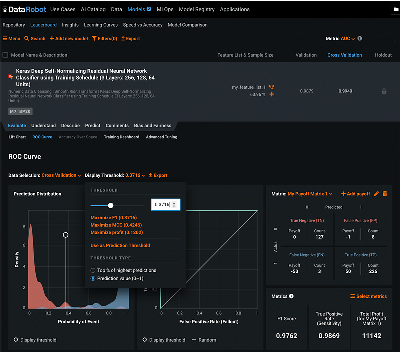
Step 18.5: Model Threshold
The model threshold can be adjusted by clicking the orange number next to Display Threshold. We can maximize F1 Score, maximize MCC, or maximize profit. Alternatively, we can select a customized threshold and apply it by clicking the orange Use as Prediction Threshold.
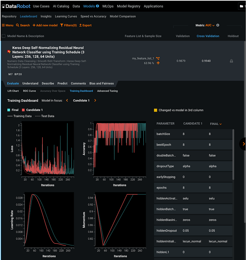
Step 18.6: Training Dashboard
The Training Dashboard tab tracks the Loss, Accuracy, Learning Rate, and Momentum over the iterations.
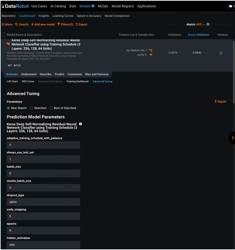
Step 19: Model Tuning
To tune the model hyperparameters, go to Evaluate, then Advanced Tuning. This section listed all the current hyperparameter values, and the user can change the values to tune the model.
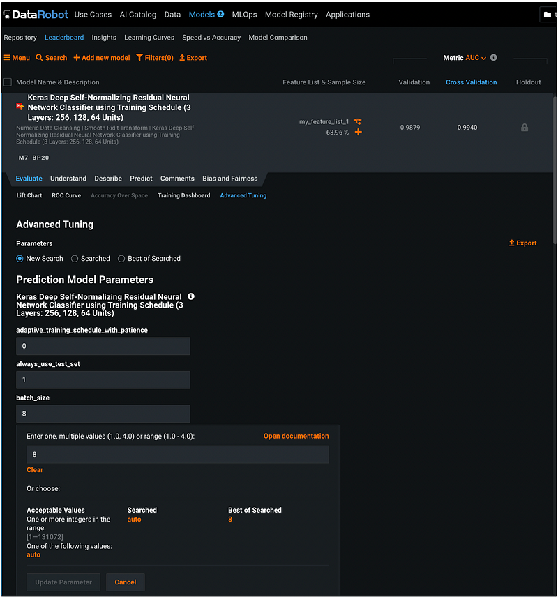
For example, if we would like to tune the parameter batch_size, we can click the input box for batch size and enter one value, multiple values, or a range of values.
Step 20: Unlock Holdout
After all the models are finalized, go back to Models, Leaderboard, and click the orange Unlock project Holdout for all models on the right pane.
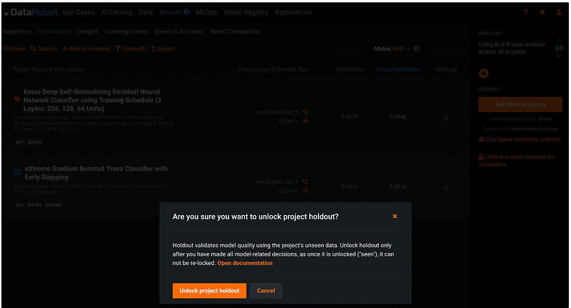
Then click the orange Unlock project holdout button in the pop-up window. We can see that the Holdout column changed from a grey lock to the metric values.
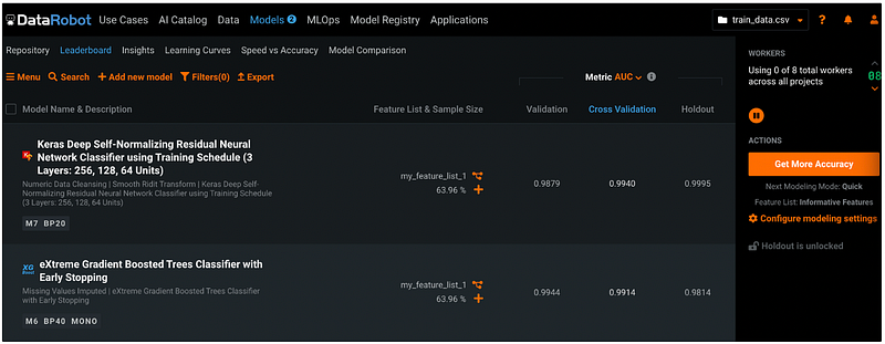
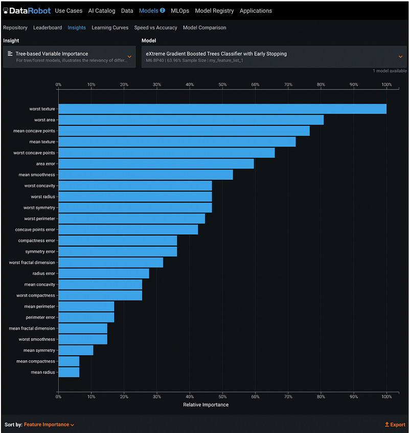
Step 21: Feature Importance
DataRobot plot feature importance in the Insights section under Models.
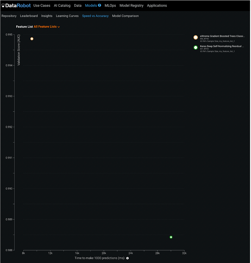
Step 22: Speed vs Accuracy
Under Models → Speed vs Accuracy, there is a scatter plot with x-axis being time to make 1000 predictions and y-axis being the validation score for the selected metric. For the two models in this tutorial, the EGBoost model is faster with a higher AUC score for the validation dataset.
Step 23: Model Comparison
We can see the model comparison summary by clicking Model Comparison in the sub-menu of Models.
DataRobot summarizes metrics in a table and highlights the best values across the models.
For the two models selected in this tutorial, we can see that the XGBoost model has better performance on the validation dataset, but the neural network model has better performance on the cross-validation and the holdout dataset. XGBooster is faster than the neural network model for prediction.
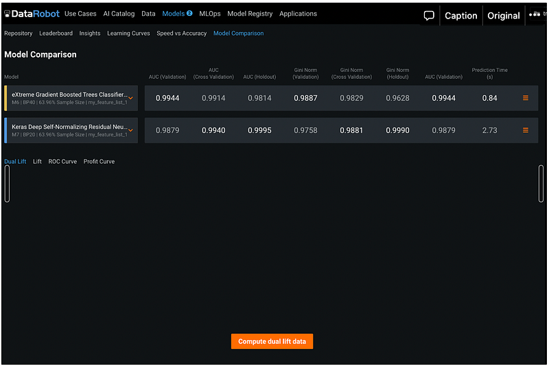
We can also compare the model performance side-by-side for Dual Lift, Lift chart, ROC Curve, and Profit Curve.
Step 24: Model Selection
After making the model comparison, we decide to move forward with the neural net work model because it has better performance on the cross validation and the holdout dataset. Our test dataset is small, so the longer prediction time is not a concern.
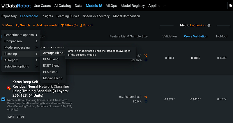
Alternatively, you can blend different models to create an ensemble model. Click Menu, then Blending, and Average Blend, we can create a model that blends the prediction average of the selected models.
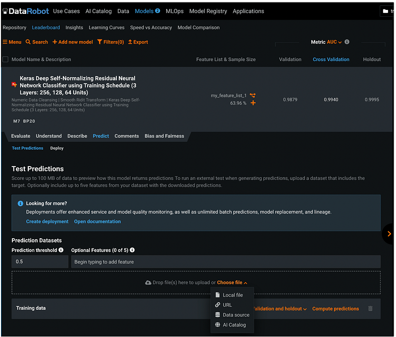
Step 25: Make Predictions
Click Models → Leaderboard, then click the name of the neural network model.
In the expanded section, click Predict. Under Test Predictions, we can customize the Prediction threshold.
Click the orange Choose file to upload the file. We can upload the file from a Local computer, from a URL, from a Data source, or from AI Catalog.
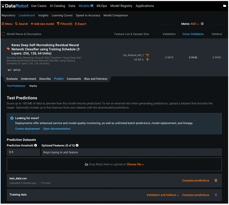
After uploading the test_data.csv file from my local drive, the file shows up in the Prediction Datasets section. Click the orange Compute predictions to make predictions.
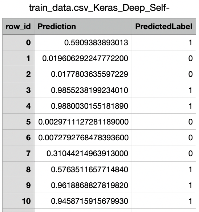
Step 26: Download Predictions
After the prediction is completed, click the orange Download predictions to download the prediction results.
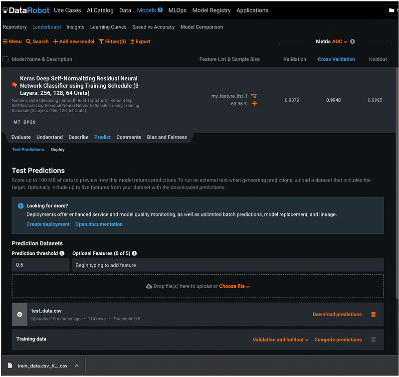
The prediction results contains the row ID, the predicted probability, and the predicted label.
DataRobot can deploy and monitor models as well, but the focus for this tutorial is auto ML, so we will not cover deployment and MLOps in this tutorial.
More tutorials are available on GrabNGoInfo YouTube Channel and GrabNGoInfo.com.
Recommended Tutorials
- GrabNGoInfo Machine Learning Tutorials Inventory
- One-Class SVM For Anomaly Detection
- Multivariate Time Series Forecasting with Seasonality and Holiday Effect Using Prophet in Python
- Hyperparameter Tuning For XGBoost
- Recommendation System: User-Based Collaborative Filtering
- Four Oversampling And Under-Sampling Methods For Imbalanced Classification Using Python
- How to detect outliers | Data Science Interview Questions and Answers
- Causal Inference One-to-one Matching on Confounders Using R for Python Users


