
Data Visualization with Pandas: A Comprehensive Guide
Creating Basic Plots with Pandas: Line, Scatter, Bar, Histograms and Box Plots

Introduction
Data visualization is the graphical representation of data and information. It is a powerful tool for understanding complex data and communicating insights to others. Data visualization can be used for a variety of purposes, such as identifying trends, patterns, and outliers, and exploring relationships between variables.
Pandas is a popular open-source data analysis library for Python. It provides powerful data structures and data analysis tools, including data visualization capabilities. Pandas visualization is built on top of the matplotlib library, which provides a wide range of customizable plots.
In this article, we will explore the basics of data visualization with pandas. We will start with simple plots and progress to more complex visualizations. We will also cover best practices for creating effective visualizations and customizing pandasplots.
Setting Up Pandas and Data
Before we can start visualizing data with pandas, we need to install pandas and load data into a pandas DataFrame.
Installing Pandas
If you haven’t installed pandas yet, you can do so using pip, the Python package manager. Open a terminal or command prompt and run the following command:
pip install pandas
Importing Libraries
Once you have installed pandas, you can import it and other necessary libraries in your Python script or notebook.
import pandas as pdLoading Data
To load data into a pandas DataFrame, we can use the pd.read_csv() function. This function reads a CSV file and creates a DataFrame object.
df = pd.read_csv('https://raw.githubusercontent.com/pycaret/pycaret/master/datasets/diamond.csv')
df.head()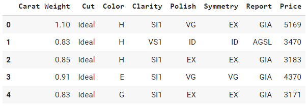
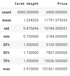
df.describe()
This will print statistics such as count, mean, and standard deviation for each column in the DataFrame. These functions are useful for getting a quick sense of our data before we start visualizing it.
Visualization using Pandas plot method
Pandas provides several basic visualization techniques that allow us to quickly visualize our data. In this section, we will cover some of the most commonly used plots in pandas.
Line Plots
A line plot is a graph that displays data as a series of points connected by lines. We can create a line plot in pandas using the plot() function with the kind parameter set to ‘line’:
# Import the pandas library
import pandas as pd

# Read in the migration.csv data from a URL using pandas
df = pd.read_csv('https://raw.githubusercontent.com/pycaret/pycaret/master/datasets/migration.csv')

# Transpose the DataFrame so that the countries are in the columns
df = df.transpose()

# Set the column names to the values in the first row of the DataFrame
df.columns = df.iloc[0]

# Drop the row with the column names, which is now redundant
df = df.drop(index = 'Country Name')

# Rename the index to 'Year'
df = df.rename_axis('Year')

# Plot the migration data for Canada
df['Canada'].plot()
Output:
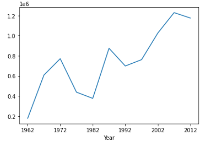
Here, we create a line plot of the Canada column against the Year column in our DataFrame.
Scatter Plots
A scatter plot is a graph that displays the relationship between two variables as a series of points. We can create a scatter plot in pandas using the plot() function with the kind parameter set to ‘scatter’:
# Import the pandas library
import pandas as pd

# Read in the diamond.csv data from a URL using pandas
df = pd.read_csv('https://raw.githubusercontent.com/pycaret/pycaret/master/datasets/diamond.csv')

# scatter plot of carat weight with price
df.plot(kind='scatter', x='Carat Weight', y='Price')
Output:

Here, we create a scatter plot of the column Price against the Carat Weight column in our DataFrame.
Bar Plots
A bar plot is a graph that displays categorical data with rectangular bars. We can create a bar plot in pandas using the plot function with the kind parameter set to bar:
# Import the pandas library
import pandas as pd

# Read in the diamond.csv data from a URL using pandas
df = pd.read_csv('https://raw.githubusercontent.com/pycaret/pycaret/master/datasets/diamond.csv')

# bar plot on counts of diamond by cut type
df['Cut'].value_counts().plot(kind = 'bar')
Output:
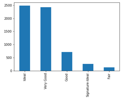
Here, we create a bar plot of the count of diamond by Cut type.
Histograms
A histogram is a graph that displays the distribution of a numerical variable. We can create a histogram in pandas using the plot function with the kind parameter set to hist:
# Import the pandas library
import pandas as pd

# Read in the diamond.csv data from a URL using pandas
df = pd.read_csv('https://raw.githubusercontent.com/pycaret/pycaret/master/datasets/diamond.csv')

# histogram of Price
df['Price'].plot(kind = 'hist')
Output:
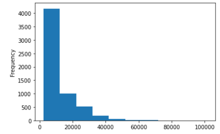
Here, we create a histogram of the Price column in our DataFrame.
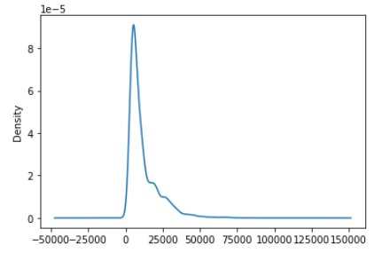
Kernel Density Estimation Plots
Kernel density estimation (KDE) is a non-parametric way to estimate the probability density function of a random variable. We can create a KDE plot in pandas using the plot function with the kind parameter set to density:
# Import the pandas library
import pandas as pd

# Read in the diamond.csv data from a URL using pandas
df = pd.read_csv('https://raw.githubusercontent.com/pycaret/pycaret/master/datasets/diamond.csv')

# histogram of Price
df['Price'].plot(kind = 'density')
Output:
Box Plots
A box plot is a graph that displays the distribution of a numerical variable. We can create a box plot in pandas using the plot function with the kind parameter set to box:
# Import the pandas library
import pandas as pd

# Read in the diamond.csv data from a URL using pandas
df = pd.read_csv('https://raw.githubusercontent.com/pycaret/pycaret/master/datasets/diamond.csv')

# histogram of Price
df['Price'].plot(kind = 'box')
Output:

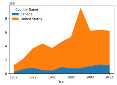
Area Plots
An area plot is a graph that displays the evolution of numerical values of different variables over time or any other dimension. We can create an area plot in pandas using the plot function with the kind parameter set to area:
# Import the pandas library
import pandas as pd

# Read in the migration.csv data from a URL using pandas
df = pd.read_csv('https://raw.githubusercontent.com/pycaret/pycaret/master/datasets/migration.csv')

# Transpose the DataFrame so that the countries are in the columns
df = df.transpose()

# Set the column names to the values in the first row of the DataFrame
df.columns = df.iloc[0]

# Drop the row with the column names, which is now redundant
df = df.drop(index = 'Country Name')

# Rename the index to 'Year'
df = df.rename_axis('Year')

# Plot the migration data for Canada and USA
df[['Canada', 'United States']].plot(kind = 'area')
Output:
Conclusion
In this article, we have learned how to use pandas to create various types of plots and visualizations to explore and analyze data. We have covered some basic visualization techniques such as line plots, scatter plots, histograms, heatmaps, area plots, kernel density estimation plots, and area plots.
Pandas provides a powerful and flexible way to create visualizations with just a few lines of code. With pandas, we can easily explore and analyze our data visually and gain insights into the underlying patterns and trends. We hope this article has provided a helpful introduction to data visualization with pandas.
Liked the blog? Connect with Moez Ali
Moez Ali is an innovator and technologist. A data scientist turned product manager dedicated to creating modern and cutting-edge data products and growing vibrant open-source communities around them.
Creator of PyCaret, 100+ publications with 500+ citations, keynote speaker and globally recognized for open-source contributions in Python.
Let’s be friends! connect with me:
👉 LinkedIn 👉 Twitter 👉 Medium 👉 YouTube
🔥 Check out my brand new personal website: https://www.moez.ai.
To learn more about my open-source work: PyCaret, you can check out this GitHub repo or you can follow PyCaret’s Official LinkedIn page.
Listen to my talk on Time Series Forecasting with PyCaret in DATA+AI SUMMIT 2022 by Databricks.


